

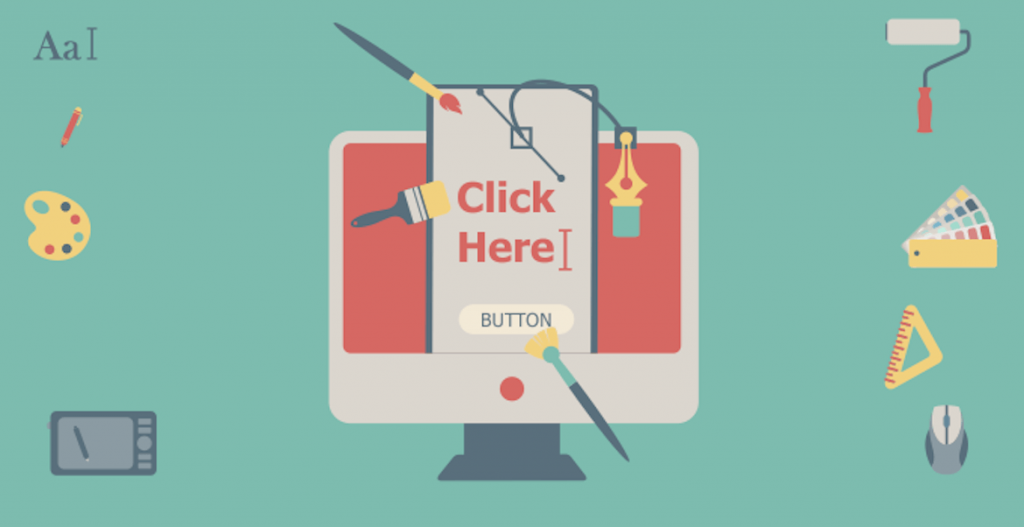
For some of you, writing a text on a banner ad is an easy thing. Just write the headline including the subject of your banner ad (maybe you sell a product, tell about a conference or say something cool about an ebook) and then insert the image and add a contrast CTA button.
It’s that all? Well, my friend, if you think just like that, no wonder that your banner ad doesn’t convert.
Emotional marketing messages are twice as effective as promotional ones. ~ CEB
Crafting copy for a banner ad is an art that goes beyond writing headlines and texts that sell.
I recommend you to work with a copywriter when it comes to create a valuable proposition for your banner ad, or just get into our article and read on how to do it.
Now that you have your text written down, let’s see how you can use it in your banner ad, so it can stand out from the crowded web, and get more clicks on it.
I found 3 smart tips with example that will help you understand how to use the text in your banner ad design.
1. Make it readable
The most important elements in the banner ad is the value proposition: how are you presenting the offer to the customers.
Now think about this. You wrote something on your banner ad and you want the audience to read it and to click on it. But if you use fonts that can’t be readable, it doesn’t matter what you write as long as it can’t be read it, otherwise, why would you insert that text into the banner ad?
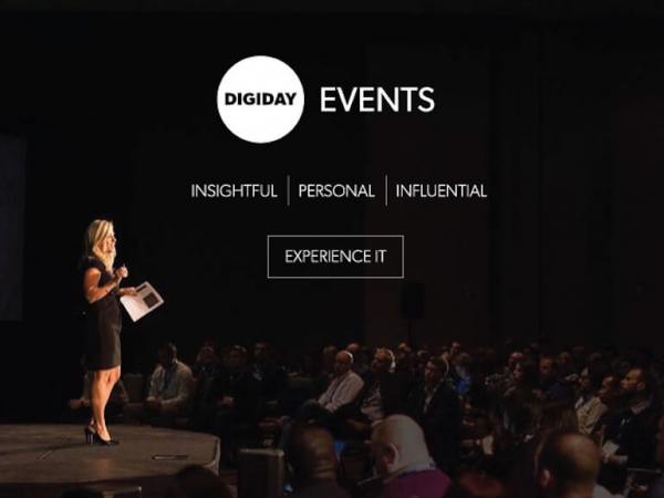
When Digiday promote their event programs, they use simple and readable fonts and words so that the customer can understand what is all about. As we see in the example below, they are using powerful words as “Insightful” “Personal” “Influential” and “Experience it” :

Another example from Digiday is when they are going deeper with their events and they are talking about events like “Programmatic Summit Europe” , “Retail Summit” or “Agency Summit”. In these banner ads we can see different kind of headlines that are creating emotional bridge between the customer and the brand:

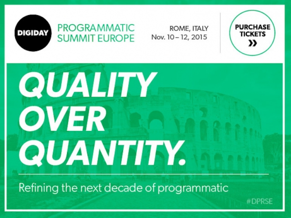

You can easily read the headlines such as “IN A GLUT OF NEW COMPETITION, MEET THE AGENCIES STANDING OUT” , „QUALITY OVER QUANTITY. Refining the next decade of programmatic” or “DIGITIZED RETAIL IS THE NEW BLACK. Meet the trendsetters”.
[Tweet “Use powerful word in your banner ads and make them easy to read. “]
Take away tip: Use powerful words but try to make them readable by using readable fonts such as Tahoma, Roboto, Arial, Verdana, Century Gothic, Futura or Georgia.
2. Use contrast color
As we saw in the Digiday Events banner ads, they are using readable fonts but also they understand that the color must be a soft one for the banner ad. You also saw that they are using the white color on the background such as black, blue, green or orange.
[Tweet “The color in a banner ad is an another important pillar in your banner ad design.”]
If you want to learn more about the aesthetic response to color combinations (preference, harmony, and similarity) you should read this great work, that I truly recommend it.
A good example on how to use contrast color comes from Crazy Egg who is using only 2 or 3 different kind of colors in their banner ad.


Look at these banner ads and see how easy you can read the text on their banner ads because they are using the black on the white, or the green and white on the black.
Also, just see how they are using the color in the CTA button so in that situation. It’s getting very easy to click on the banner ad (as a simple tip, they designed an arrow to point to the button).
I recommend you to do the next exercise: step away from your desk and look at your banner ad with the text on it. Can you read it? Do you see immediately the most important item?
If not, then you should try another color on your design and then repeat this exercise.
Another good example on how to use contrast color on a banner is coming from the gyro.


They are using 2 types of fonts: one impactful font that is bigger than the other ones – 85% and the other fonts that are having a black border behind them, so that border can help the text stand out from the banner ad design.
Gregory Ciotti wrote a good case of study about the psychology in color as it relates to persuasion and the aspects of marketing.
So, when you want to write down your text, make sure you use contrast color and make your text stand out in your banner ads.
3. Give your Text some Space
After you use readable fonts and contrast color and you still wants your text to be more readable, use the space around the text.
[Tweet “Readability also includes white space in your banner ads.”]
That means that you should give the right space of your text. Don’t just overcrowd a lot of content in the banner ad. Don’t forget that you have a limited space where you can insert your text and also you need to use a high quality image, branding elements and CTA buttons.
One of my favorite blogger out there is Neil Patel who is creating a tremendous content every day. So if you want to learn more about content marketing and SEO, you should definitely check out his blog.
I have founded that Neil is using banner ads on his personal blog to convert his audience. So he is putting on his blogs simple banner ads, that are easy to read.
The first banner ad is using a simple headline “Make $$$ while you ZZZ” and the CTA button is a simple “Click here to learn more”. You just can’t stand to click on it. Why? Because the message is simple and you can read it easy. Neil gave as much space as he can on the banner ad so that he helped the text stand out in the banner ad.


Also, in the other banner ad where one of Neil’s client wrote down the testimony, you will see how much space is around the next.


Neil answered my question about the importance of a banner ad for a content marketer:
By placing banners on your blog, you can drive your traffic to relevant landing pages and capture leads. From there you can nurture those leads and convert them into customers. This is one of the most effective ways to generate leads and sales as a content marketer.
Here you have another reason to use banner ads!
Use the right space around your text and let it stand out with the message.
If you use big fonts and try to make the audience click on it, you only create an aggressive message that nobody will see it (this is one of the reasons of banner blindness).
Conclusion:
Whenever you design a banner ad and you want to use text, don’t forget to use readable fonts, put them in contrast color and give the right space to make them stand out from the banner ad.
Now back to you, let us know how do you make you text stand out from your banner ads!