

Have you ever looked at a logo, a newspaper headline, or a subway sign and felt the need to adjust the awkward space between letters?
If the answer is yes, that means you’re good at spotting kerning issues.
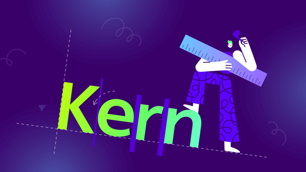
What Is Kerning?
In typography, kerning is defined as the adjustment of space between two specific characters.

The goal of kerning is to balance the perceived negative space between all the letters of a text, pair by pair, to improve readability, legibility, and make everything more pleasing to the eye.
Even though most modern fonts usually come with hundreds of kern pairs incorporated, sometimes you need to make the adjustments yourself.
Here are ten tips to help you kern like a pro.

1. Understand the Spatial Relationship between Letters
Kerning is about equalizing the spaces between characters as well as you can, but you won’t achieve the desired result if you set a mathematically equal distance between all letters.
Different combinations of letters create different sizes of perceived space between them.
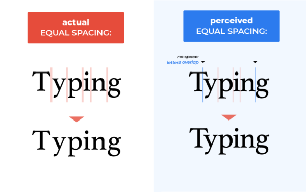

The words look best when the mathematical distance between letters varies based on their shapes.
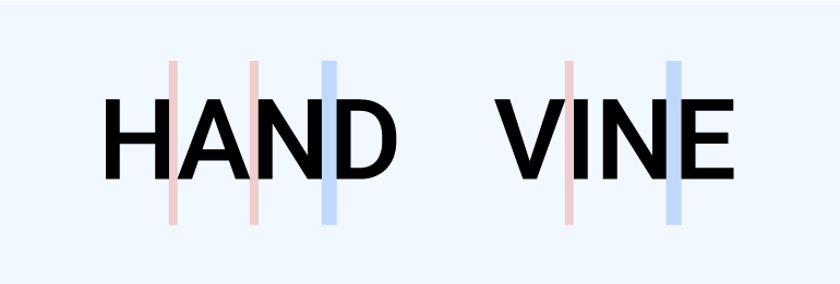
Typographer Ilene Strizver is the one that best explains this. She recommends that the distance between two straight letters should be slightly bigger than the gap between a straight and a round letter.
In turn, the distance between a straight and a round letter should be slightly bigger than that between two round letters.
Confused? Have a look at the image below.
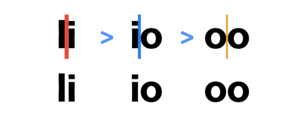
As you can see, consistency is vital.
A round-to-straight letter combination should have the same spacing as a straight-to-round one.
Also, if you settled on a certain distance for a specific letter combination, make sure you maintain it in all other instances those letters appear together.


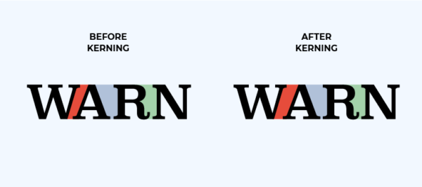
2. Watch Out for Tricky Letter Combinations
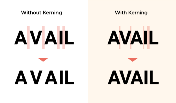
Text kerning mostly involves negative adjustments. Certain letter combinations create more perceived space than others.
In these cases, you need to slide the letters into each other’s negative spaces. This is most obvious with capital letters.
Keep an eye out for kern pairs that involve letters such as A, V, W, Y, T, F, L, P, or other similar ones.
A perfect example, in this case, is the combination between A and V—the symbol used for the kerning tool in various graphic design programs.
Usually, when set next to a rectangular letter, such as H or M, or a straight letter like I, the diagonal line of either A or V would nearly touch the horizontal line of the adjacent letter.

However, if you apply the same spacing when A and V are set next to each other, the combination will create too much negative space.
This needs to be corrected through kerning.

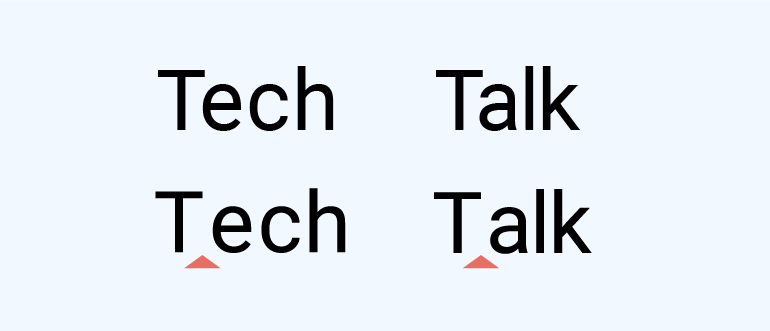
Remember to also be on your toes when it comes to upper and lowercase pairings, such as ‘Fa’ or ‘Te,’ especially when the lowercase letter is a round vowel.

Though rarer, positive adjustments do exist. They often involve accented letters or punctuation.
3. Size and Font Do Matter
When kerning font, you should settle on the size of the text before you begin the process. If you decide to resize it later, all your work might be undone.
That is because, at a smaller point size, letters require more space between each other in order to remain legible.
Conversely, at a bigger point size, letters would come closer together to increase readability.
Consider this, especially when you have to design a logo that would be printed on banners or t-shirts, as well as on small business cards.
Instead of just resizing your work, create two versions of it, each of them kerned separately. Your client or boss is bound to be impressed, even if they won’t necessarily be able to pinpoint the difference.
Pro tip: the bigger the design, the more visible bad kerning becomes.
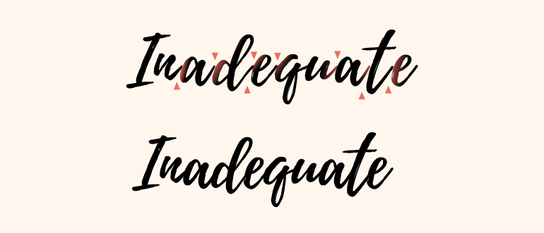
Size is also one of the reasons why you should choose the font of the text before starting to kern it. Other reasons include the shapes of individual letters and ligature issues.
For example, if you switch from a print font to a hand lettering font after kerning, your letters might not be properly connected, as in the case below.
4. When in Doubt, Less Is More
Believe it or not, under-kerning can make a text awkward or downright hard to read.
But over-kerning can make it indecipherable, especially in smaller sizes, or worse—the words can end up meaning something else entirely.
There are plenty of bad kerning examples online.
The combination of lowercase c and l can become a d, r, and n can become m, and not enough space between words create laughable misunderstandings that sometimes go viral in a bad way.
When in doubt, always err on the side of under-kerning.
5. Flip Your Text Upside Down
The familiarity of the words you’re working with might make it difficult for you to properly kern your text. A neat solution for this problem is turning the words upside down.
This way, you won’t be distracted by their meaning, and you’ll be able to focus on the spaces the letters create between each other.


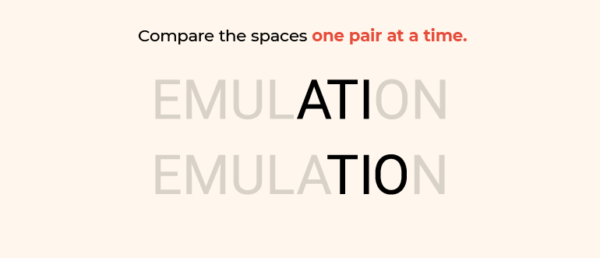
6. Kern in Groups of Three
Another great trick that works well mainly with lengthy words is kerning in groups of three. It’s easier to miss details when you’re looking at the entire word.
Start with the first three letters of the word you’re kerning and try either covering the rest or changing the color of the letters you’re working with.
Then, move on to the next group of three, one letter at a time, until you’ve reached the end of the word. This way, you’ll be able to compare the spaces one pair at a time.

7. Know the Difference: Leading vs. Kerning vs. Tracking
In typography, leading, kerning, and tracking are the three ways to adjust the space between letters.
While kerning and leading are easier to differentiate, kerning and tracking are often confused with each other.
Knowing the difference between the three is essential for any designer working with text.
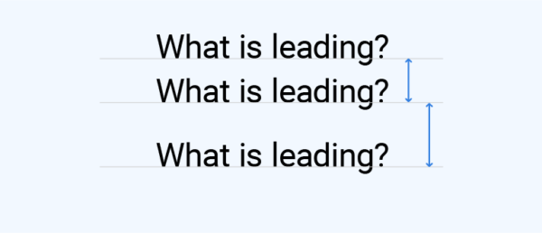
Leading refers to the adjustment of the vertical space between two lines of text. The name comes from the time when pieces of lead were used to separate lines when working with the printing press and is therefore pronounced ledding.
The leading distance is measured from baseline to baseline and needs to take into consideration special features of certain letters, such as ascenders and descenders.
Usually, this distance should be about 20% bigger than the font size, but it varies with style.
Tracking defines the horizontal distance between the letters in a text. But instead of adjusting the distance between two individual letters, like kerning, tracking increases or decreases the space between all the letters uniformly.
Negative letter tracking can make more characters fit into a certain space, but overdoing it can cause these characters to overlap, making the text illegible.
Positive letter tracking can help you fill a certain space and makes the words seem airier.
However, too much of this makes the spaces between words hard to discern.
![]()
Like with changing the size of your design, it’s best to take care of leading and tracking before kerning, so you won’t have to do it twice.
8. Kern Manually—Don’t Let the Software Do It for You
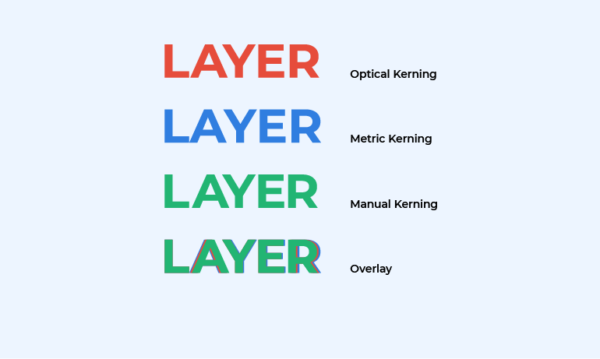
Graphic design programs usually come with two auto-kerning options: Metrics (or Auto) and Optical.
In Photoshop, InDesign, or Illustrator, you can find these included in the Kerning dropdown in the Character panel.
The Metrics setting uses the font’s built-in kern pairs, spacing the letters as the font designer specified in the font file. Many suggest using this option rather than Optical, especially when working with professional fonts.
The Optical setting overrides the built-in kern tables and adjusts the spacing between adjacent letters based on their shapes, using an algorithm.
Optical can also be used to automatically kern text that includes different typefaces.
However, any of these two options can still leave you with oddly-spaced letters.
The human eye can be extremely reliable when it comes to kerning. Additionally, manual kerning gives you the most control.
You can definitely see the difference when you overlay the results of these three kerning methods.

9. Kerning for Web Designers Does Exist
If before, kerning text was considered a matter of static design, once the internet gained popularity, web designers needed to kern too.
The CSS kerning property, font-kerning, controls whether or not the kerning parameters built in a font will be used or not.
There are three values for it:
- Font-kerning—auto. This is the default, where the browser determines whether kerning is applied or not.
- Font-kerning—normal. Font kerning is applied.
- Font-kerning—none. Font kerning is not applied.
Also, the plugin Kerning.js gives you more kerning options, such as setting a custom distance between a specific kern pair.
Controlling kerning for websites is still more difficult than for static design, but progress is being made towards a more visual approach to it.
10. Practice Makes Perfect
Like with most things, the key to mastering kerning is practice.
When going about your day, pay attention to logos, banners, magazine headlines, posters, street name signs, etc.
You can train your eye to recognize bad kerning, but beware—it’s as much a blessing as it is a curse.

Conclusion
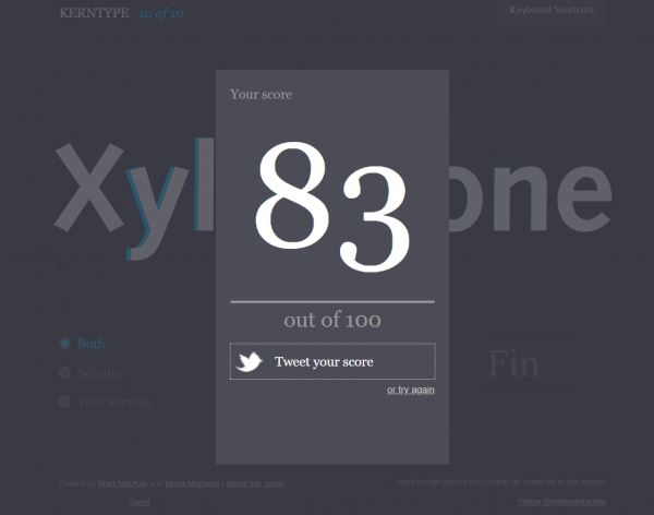
If you’re looking for something more hands-on, try this fun kerning game, called Kerntype.
You are given ten words to kern. The first and last letters are stuck in place, so you can only move the other letters.
Once done, you can compare each of your answers to those of a master typographer and see how well you’ve done.

Last but not least, use our tips to practice kerning on your own designs, and you’ll get the hang of it in no time.
We hope you now get a better understanding of what is kerning and how to apply it efficiently. Good luck!