
Typography is everywhere.
Whether we acknowledge it or not, we see it in every material that has text in it, from newspapers to blogs, advertising, infographics, or art.
This goes beyond being a simple or random arrangement of letters—it’s an art that helps brands make a statement.
In today’s article, we’ll take a more in-depth look at typography art and how it’s been used by different typography artists.

What Is Typography Art?
Typography art is defined as any form of art which involves letters, words, or phrases. This includes painting, sculpture, digital rendering, or any other creative technique that the artist wants to use.
To have a better understanding, I did some research and compiled 25 examples of awesome typography art that involve different mediums and approaches.
To make it easier for you to follow, I grouped them by the 15 typography artists that made it all possible.
Table of Contents
- Peter Strain’s Posters
- Sabeena Karnik’s Paper Letters
- Lex Wilson’s 3D Illusions
- Paula Scher’s Maps
- Alexis Persani’s 3D Digital Letter
- Pae White’s Supersized String Art
- Ralph Ueltzhoeffer’s Celebrity Portraits
- Fred Eerdekens’ Light and Shadow Play
- Farhad Moshiri’s Knives
- Nicola Yeoman’s Installations
- Stefan Sagmeister’s 250,000 Cents
- Ebon Heath’s Dancing Sculptures
- Craig Ward’s Shattered Glass
- Karl Grandin’s Festival Posters
- SEEN UA’s Graffiti
- Typography Art Tips
- Conclusion
25 Typography art examples
1. Peter Strain’s Posters
AOI award winner Peter Strain created this stunning typography poster as part of a series commissioned by Pottermore. The collection features a total of four pieces, each focusing on an iconic quote from one of the seven books.
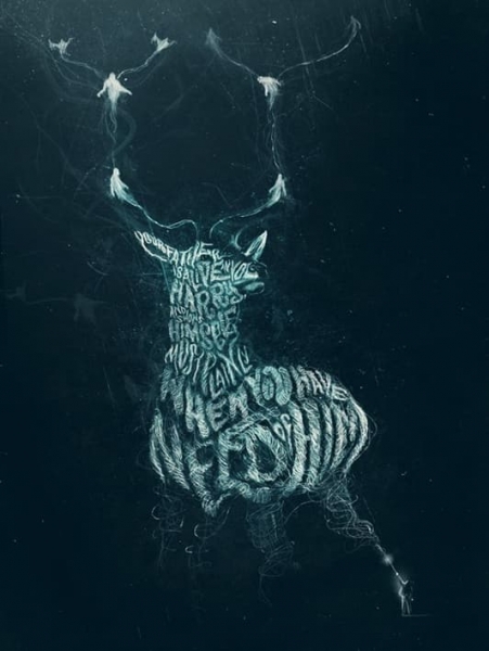

Not a Harry Potter fan?
Strain has several other eye-catching typography posters in his portfolio, including portraits of David Lynch, Joaquin Phoenix’s Joker, and Freddie Mercury.
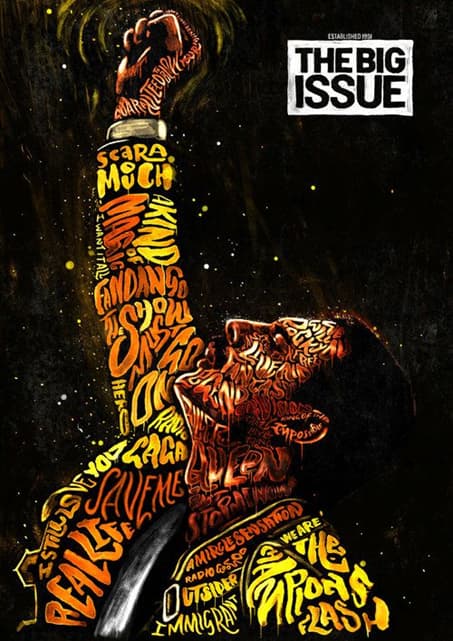

He’s also a huge fan of Wes Anderson’s movies, so you’re bound to find some of them depicted in his work.
Who wouldn’t want to have some of these typography art prints decorating their walls?
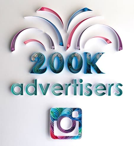
2. Sabeena Karnik’s Paper Letters
Sabeena Karnik brings a unique and colorful perspective to the typography word art world.
She creates her pieces using paper quilling. The technique involves long thin strips of paper, glue, and a lot of patience.
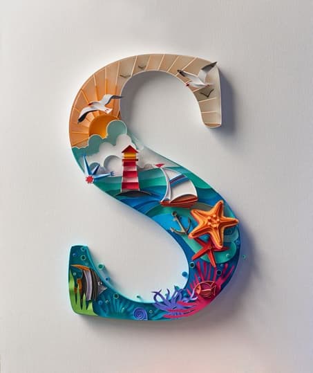

The colorful paper is either rolled, pinched, or cut into smaller pieces, and then carefully glued in place. You can see Karnik doing this with tweezers in many of her Instagram videos.
Besides individual letters like the one above, she also puts together more intricate designs, some for household names such as Google, Adobe, and Instagram.

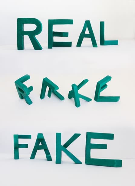
3. Lex Wilson’s 3D Illusions
Lex Wilson is a typography artist fascinated with the way the human brain is fooled by optical illusions.
He creates clever 2D drawings which the viewer perceives as 3D, like the one below, as well as 3D projections that appear 2D when looked at from certain angles.
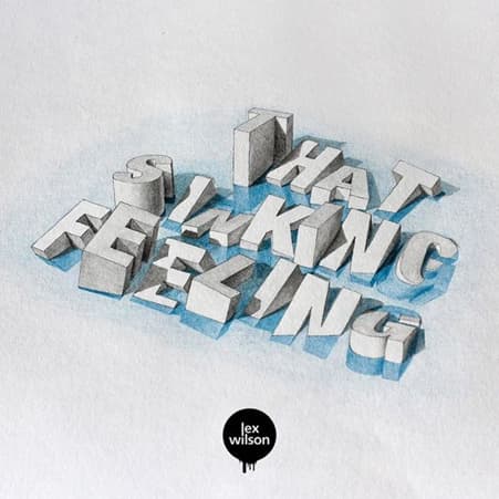

He is also interested in the duality of English words and has created several foam sculptures based on this idea. The same piece can read “REAL” from a particular vantage point and “FAKE” from another.

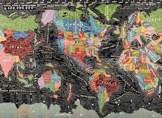
4. Paula Scher’s Maps
A partner at the renowned New York design firm Pentagram since 1991 and one of the most famous designers in the world, Paula Scher is no stranger when it comes to typography art.
Her work, like the Tiffany & Co. and Citi logos, to name just a few, greatly influenced the world of typography graphic design as we see it today.
In MAPS, a collection of 39 paintings, drawings, prints, and environmental graphics, the artist uses colorful typography to map out the entire world.
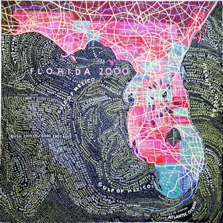
Each piece has its own theme, such as US zip codes, politics, airline routes, median home prices, and climate.
Some of them are as big as 12 feet (3.7 meters).

5. Alexis Persani’s 3D Digital Letters
French artist Alexis Persani takes typography graphic design to a whole new level, with these colorful, shiny, detailed 3D letters that make you want to reach out and touch them.
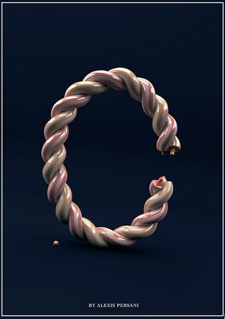

His art incorporates various materials, patterns, and objects, forming unique alphabets, words, and phrases.
On his page, Persani displays several of his typography artworks. Some look like they’re made of water, steel, or paint, but all of them are fascinating nonetheless.
Digital 3D lettering is the modern take on typography art, and Persani is showing us all how it’s done.

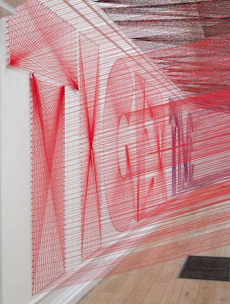
6. Pae White’s Supersized String Art
This exhibition by Californian artist Pae White takes typography string art to the max.
Titled Too Much Night, Again, it is essentially an enormous thread sculpture inspired by her insomnia.
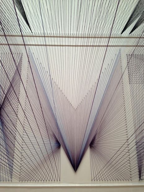

The artwork features 48 kilometers (roughly 30 miles) of yarn in the colors purple, red and black, spelling out “TIGER TIME” on one wall and “UNMATTERING” on the opposite wall.
The threads converge near the ceiling, creating a haze of different colors reminiscent of the mind of an insomniac.
While White isn’t primarily known for typography art, this exhibition definitely earned its spot on our list.

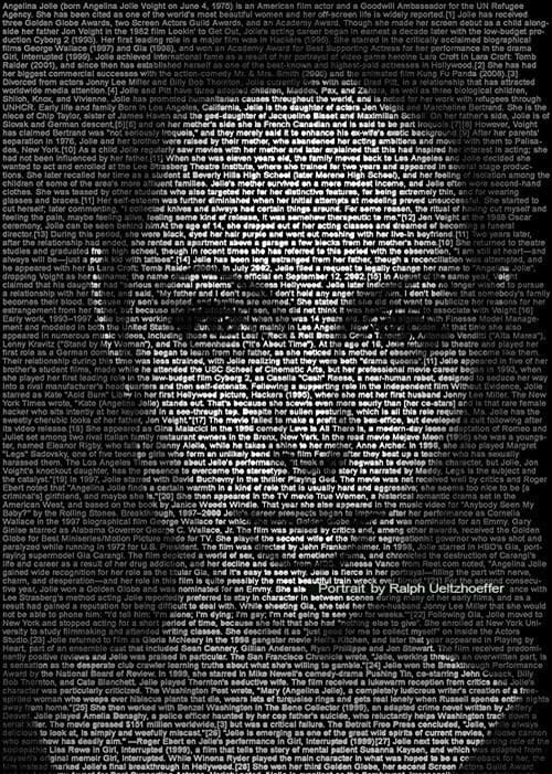
7. Ralph Ueltzhoeffer’s Celebrity Portraits
Kurt Cobain, Ian Curtis, David Beckham, Madonna, Barack Obama, Angelina Jolie, Jack Nicholson, and Audrey Hepburn are just some of the celebrities featured in Ralph Ueltzhoeffer’s typography portraits.
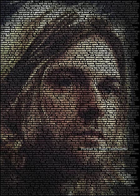

Does the font look like old computer input? That is because the artist selects biographies and other information that defines these celebrities from Wikipedia and thousands of other online sources.
Then, he sets these words, line by line, on a black background until they create the desired effect.
In doing so, Ueltzhoeffer also makes a statement about how the digital information available about us online defines us in the eyes of others.
And who can be more affected by this than celebrities?

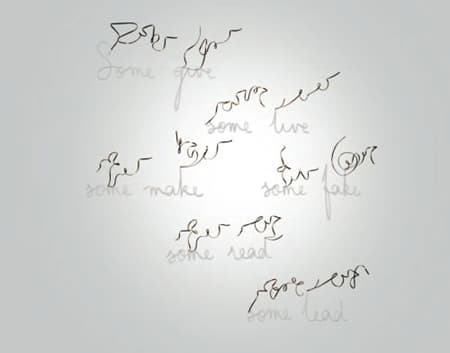
8. Fred Eerdekens’ Light and Shadow Play
One of Belgium’s most celebrated contemporary artists, Fred Eerdekens, makes typography art by combining three mediums—language, material, and light/shadow.
His work can be interpreted as a study of the connection between visual cues and the linguistic meaning behind them.
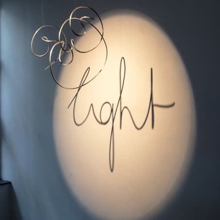

The twisted aluminum and copper coils mean nothing at first glance, but when placed in the right light, they reveal the right words.
These words are sometimes poems written by the artist himself, which often bring together opposite and even contradicting notions, echoing the play of light and shadow.

9. Farhad Moshiri’s Knives
You might have seen some of Farhad Moshiri’s typography artwork on social media—especially the knives sculptures.
What is fascinating about Moshiri’s art, besides the variety of colors and mediums he uses, is the underlying irony and humor in it.
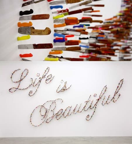

In “Life is Beautiful” (pictured above), comforting words are spelled out using knives—objects often associated with violence. Moreover, the fact that these knives are stuck in the wall suggests frustration and anger.
His work also reminds viewers that appearances can be deceiving. When you get closer to one of his sculptures and see what it’s made of, you find your expectations have not been met.
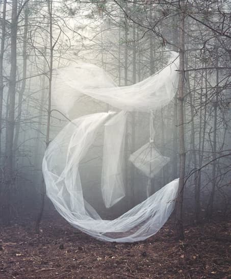
10. Nicola Yeoman’s Installations
Nicola Yeoman combines still life with typography to create masterful art installations.
For her series called “Alphabetical,” she arranged a multitude of seemingly discarded objects in what looks like an empty industrial space to spell out letters like E, Y, X, or D.
Using paint or the negative space between these objects, she makes the letters visible only from a specific vantage point.

Besides her gallery work, Yeoman has also collaborated with big names such as Alexander McQueen, H&M, Selfridges, Jay Z, and The New York Times.
In the editorial piece for the Times, she recreated the publication’s iconic first letter in an eerie and mesmerizing sculpture made of wood sticks and translucent fabric.

11. Stefan Sagmeister’s 250,000 Cents
Typography design rockstar Stefan Sagmeister is known for his album covers, commercials, typography posters, and books, as well as for his dedication and attention to detail.
In 2008, he spelled “Obsessions make my life worse and my work better” out of 250,000 euro cents on the streets of Amsterdam.
The mural took eight days and involved the work of more than 100 volunteers.
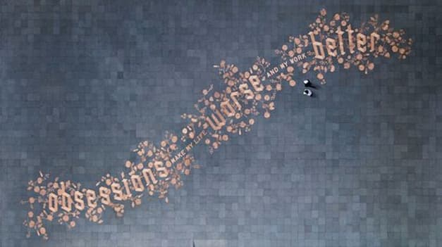

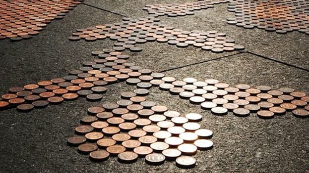

Unfortunately, after the coins were left unguarded for the public to interact with, some of them were stolen, which prompted the police to swipe up the remaining coins and take them away less than 20 hours after the opening.
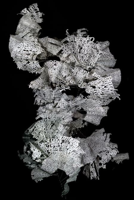
12. Ebon Heath’s Dancing Sculptures
Ebon Heath’s work proves that typography art doesn’t have to be legible to make a powerful statement.
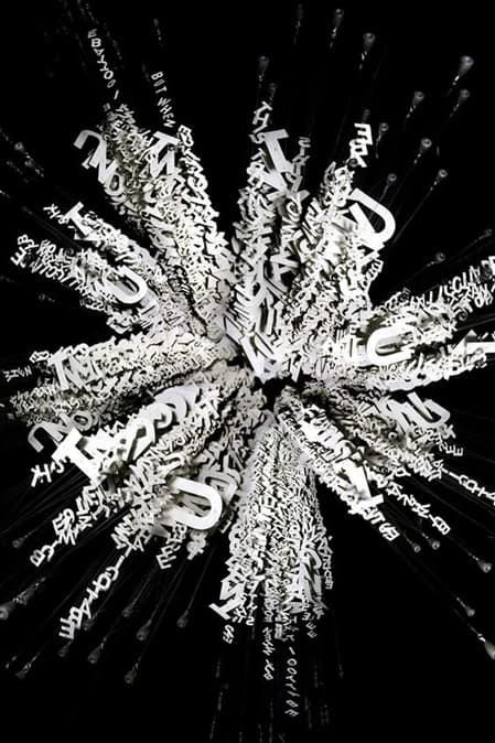

Heath creates dynamic sculptures by putting together words he creates or curates on a specific theme. To accurately mimic natural movement, he collaborates with dancers and choreographers.
His goal is to liberate the words from the dormant 2D space of the paper (or screen).
He started out by creating his typography artworks from hand-cut paper. Later, he switched to laser cutting, which gave him more freedom in choosing his materials and allowed him to experiment with larger-scale projects.

13. Craig Ward’s Shattered Glass
A well-known typography artist who has worked with brands like Starbucks, The Washington Post, Peugeot, and MasterCard, Craig Ward doesn’t shy away from telling the stories behind his work on his blog.
For this piece, titled “You Blow Me Away,” he collaborated with photographer Jason Tozer. Ward’s typography was printed on several 7mm sheets of glass, through which various objects were fired.
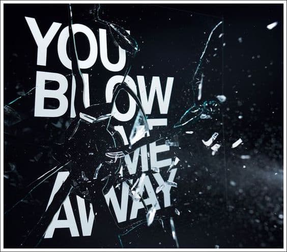

The collection of photographs resulting from this project “are also studies in the boundaries of legibility as [the artists] managed to capture the glass at various stages of destruction,” as Ward himself tells his blog readers.
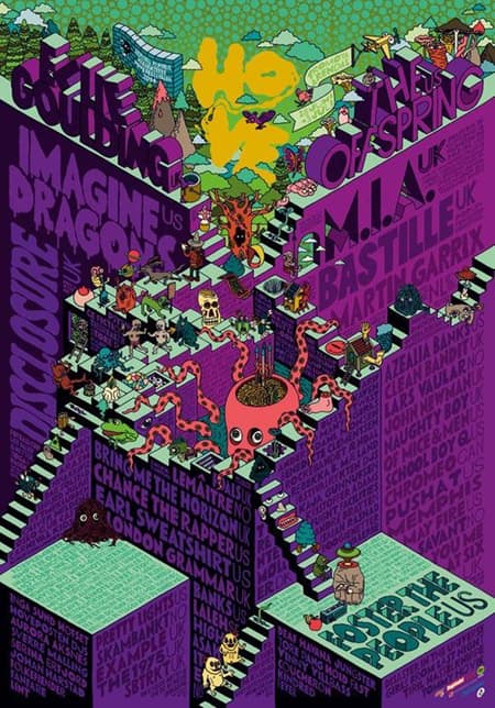
14. Karl Grandin’s Festival Posters
Created for the Hove Festival in Norway, these playful and unique posters make use of smart typography graphic design.
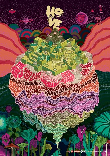

Karl Grandin’s artwork stands out from any other lineup announcements. It incorporates the names of the artists that are going to perform in a bigger picture.
From Zen masters to squid monsters, these posters are bound to draw a crowd. And they did, at least until the festival closed down after a final edition in 2014.

15. SEEN UA’s Graffiti
Finally, you can’t talk about typography art without talking about graffiti.
Graffiti is the quintessential form of typography wall art. It represents freedom, brings color to the otherwise bleak streets, and often incorporates powerful social commentary.
Artist Richard Mirando, better known as SEEN UA, is a veteran US graffiti artist, famous all around the world.
He started out spray-painting subway trains in New York City back when the trade was still in its infancy and eventually earned the title of the Godfather of Graffiti.
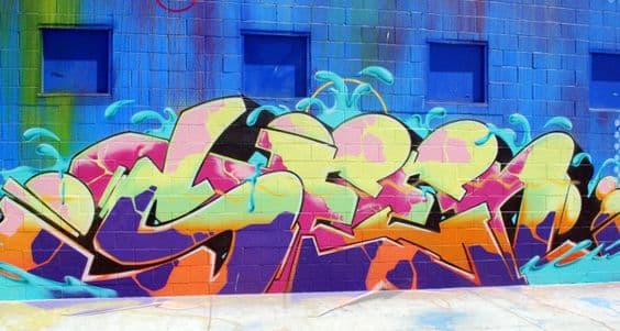

The artwork pictured above is one of his creations from the streets of Los Angeles.
Typography Art Tips
- Start with the Basics: Master the essential principles of typography—like font pairing, hierarchy, and spacing—before jumping into more complex designs. These basics are your toolkit for crafting visually compelling art that’s grounded in solid design theory.
- Experiment Boldly: Don’t shy away from pushing the boundaries. Play with typefaces, distortions, and layouts to create something unexpected. Typography art thrives on innovation, so let your creativity lead the way.
- Consider the Message: The message should always be the focal point of your design. Typography isn’t just about aesthetics; it’s about enhancing and amplifying the meaning behind the words. Ensure that your design choices—whether it’s a bold typeface or an intricate layout—serve to strengthen the message, not distract from it.
- Balance is Key: While creativity is crucial, maintaining readability is just as important. Striking the right balance between artistic expression and legibility ensures that your work remains both engaging and accessible. Remember, your audience should be able to appreciate the visual design while easily understanding the text.
- Stay Inspired: Inspiration is the fuel for your creativity. Regularly explore the work of other typography artists, whether it’s in advertisements, books, or street art. Observing different styles and techniques can spark new ideas and help you develop your unique voice in typography art.
Conclusion
As you were able to see from these 25 creative examples, typography art has no limits. It is as diverse and influential as any other type of art.
What was your favorite one out of this list?