Being a graphic designer is so much more than meets the eye. It’s hearing about an idea and turning it into a story through creating graphics. Something that will get the main idea across and that people will resonate with.
As a designer, you get to tell this story creatively with colors, fonts, elements, textures, and all graphic elements.
Each design is a new, unique piece of art birthed into this world, and while you have the opportunity to be creative and make your own style choices, there are some key graphic design tips and basics that every designer should know.
For that very reason, I went on a quest and spoke to many different professional graphic designers and asked them what graphic design tips they live by and what they would share with their fellow designers.
After gathering lots of different opinions and graphic design basics, I came up with a list of 30 graphic design tips that you can start implementing in your current and future design projects.

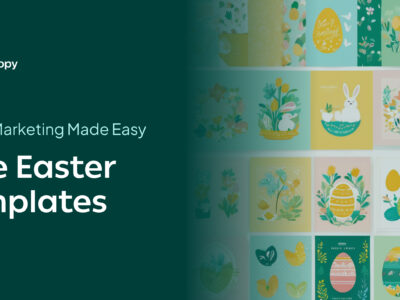
30 Graphic Design Tips from Professionals
So without further ado, let’s just go ahead and jump straight in to start learning about techniques to follow to achieve great graphic design.
1. Limit the number of fonts you use

This may be the most commonly encountered tip I received from the designers I spoke with. They highly encourage that you use different fonts in one design, but do not over-exaggerate and go overboard.
You always want to make sure that your fonts work well together and try to limit the number of fonts you use to three or less. Experiment and play around with the fonts that you already have in the software you’re working with, or you can always download free or premium fonts from reputable font websites to complement your design elements.
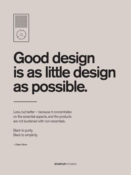
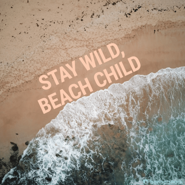
2. Change the size and height of your text to make it fit perfectly on your design
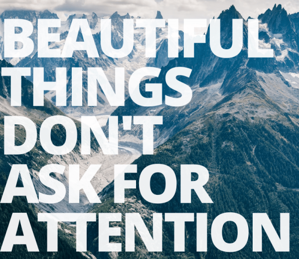
You can always play around with the text that is overlaid on an image. You can increase or decrease the line-height and spacing of letters to create a “box effect”. In this image, you can see that the line height has been reduced significantly, and the size was brought up exponentially.
Make sure that the placement of your text is pleasing to look at, and you try to achieve symmetry for this effect. I also decreased the transparency in the text so that the mountains come through the text, bringing the quote truly to life.
3. Use contrasting fonts to stick out—they make the perfect pair
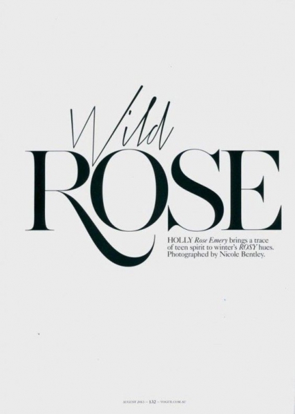
When designing, the goal is to draw someone’s attention and portray to them what you’re trying to say. You can make a big statement by using little tricks, like this one. Use contrasting fonts. For example, you can use a bold sanserif font with a cursive, romantic font to show people the mood of the text.
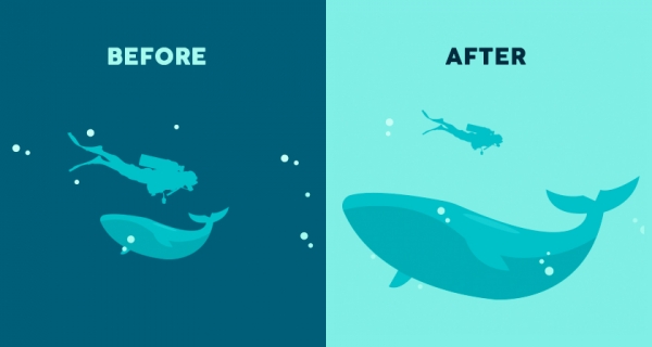
4. Don’t be afraid to go BIG
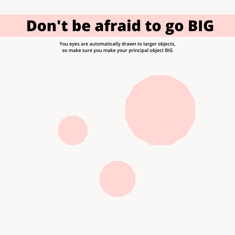
When choosing elements for your graphic designs, remember: larger objects attract more attention than smaller objects. If you’re using multiple elements, make sure that your principal object is larger than the others, as the eye of your viewer will automatically be drawn to the larger of the two objects. Scale all elements of your design: text, elements, buttons, everything.
5. Track your text—give each letter its personal space
You got to let each letter have some personal space and give them the room to breathe. Jokes aside, letter spacing and kerning typography is a huge deal. It can really make or break a design. Some fonts, by default, have some odd letter spacing, but luckily that’s something that you can take care of and handle yourself like a pro.
Increase or decrease the letter spacing depending on the situation and try, try again until it looks right, and each letter has the perfect spot of its own.
6. Use contrasting colors
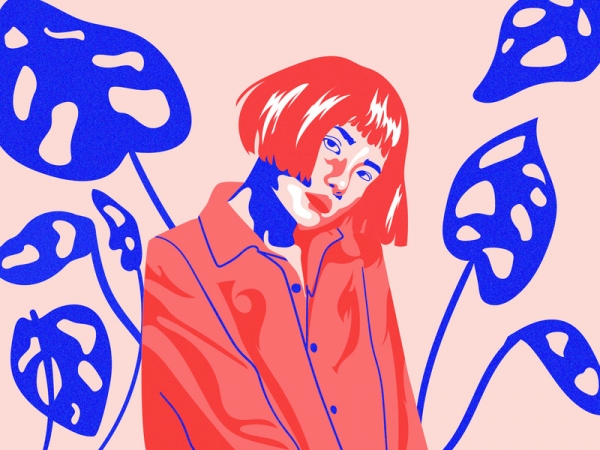
Opposites attract, and that’s a fact. It’s in our nature to be interested in the unusual, and that’s why using contrasting colors in graphic design is a must. It’s eye-catching, it makes a statement, it’s impressive graphic design.
7. Use white space when you can
As the saying goes, less is more. Sometimes, you don’t need to add tons of colors, elements, or fonts to get your message across. I was talking to one designer in particular, and he said that you should use white space whenever you can. When you use white space, you’re avoiding your message getting lost in the chaos and noise of your design.
White space is elegant, simple, but sophisticated, and beautiful. And, the great thing about this technique is that it’s almost less work for you! But then again, when is a designer ever not working?
8. Be consistent in your design
[source]
Consistency is the one thing that can take all of the different elements in your design, and tie them all together and make them work. In an awareness campaign, it is vital for people to begin put 2 and 2 together and begin to recognize your cause. Consistency piques people’s interest.
So stay consistent in your colors. Use color palettes in your designs and your typography size, spacing, and position. When your design is consistent, your client will be happy.
9. Use flat design to your advantage
Contrary to popular belief, you don’t have to work endless nights and hours to create a fantastic design by using complicated 3D elements. Flat design is your friend. Remember that. And the great thing about flat design is that it has become more and more popular over the years, which is excellent news to the beginner and advanced designer.
10. Give your text a good structure
[source]
Use the alignment tools in whatever software you use to your advantage. Whenever you add text to your graphic design, be sure to align it with other elements in your design to make it visually pleasing.
By aligning your text and giving it a beautiful structure, it will increase the readability of your viewer. Also, be sure to keep your text to the bare minimum, because the attention span of viewers can, unfortunately, be very short.
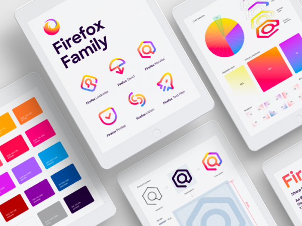
11. Icons, icons, icons
[source]
By using icons, you can lead the attention of a viewer whenever you want. Icons don’t have to be limited to famous logos like Twitter or Instagram. You can use icons of all kinds to give you that extra visual pizzaz. You can create your own icons that are simple B&W or brightly colored.
Make them have a flat design or 3D. Integrate them into your design to increase the aesthetic value of your design and enhance the viewer’s experience while they’re engaging with your great graphic design.
12. Stay in line!
Not only can you guide a viewer’s eyes to a focal point by using icons, but you can do the same thing by using lines in graphic design. You can also create a sense of compartmentalization with lines. If you have a minimalistic design, a good idea might be to add some lines for depth and create interest within the viewer.
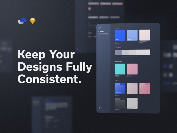
13. Use a color palette
[source]
On the note of consistency, color consistency is a MUST. If you’re not trying to create crazy contrast in your design, then a great idea would be for you to use a color palette throughout your entire design. It will subconsciously interest viewers and also is very pleasing to look at.
Any bypasser will stop to see what you have to see, even if your design has nothing to do with them, for the simple fact that it is beautiful to look at. So the main idea here is basically: please people, for the love of good graphic design, use a color palette.
14. Create a visual hierarchy
[source]
When it comes to hierarchy graphic design, it’s vital for you to know what the order of importance is. Hierarchy in graphic design helps viewers to see a clear layout of what you’re wanting to portray, and it makes it easier for them to understand. This is important because the average attention span, if we’re really pushing it, is about eight seconds. Therefore, you need to be sure that your work makes sense, yet it is still interesting.
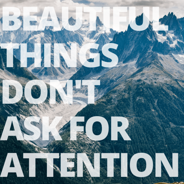
15. Adjust image and background levels for text to stand out
Just like in the image where we talked about using multiple fonts, you can see that the background in this graphic design is blurred. Whenever you put text on top of an image, it’s important that your viewers can understand the text, and sometimes that means applying a gaussian blur or desaturating the phot for the text to be readable.
16. Always think about your main audience
Like many times in life, compromise can be the answer. Whenever you are creating a design, you have to be thinking about who you are making the design for. And sometimes that means stepping out of your comfort zone to make your client happy. And that’s not always a bad thing; it definitely increases your creativity and pushes your limits.
17. Keep things simple
[source]
You may be scared to try out a minimalist design because you’re afraid that it’s just too plain. But I’m here to tell you that you can have a minimalist design without being boring. Bring your design to life with a little pop of color or a funky font. But sometimes, less is more, and that is a virtue to live by.
18. Define the mood and vibe
When you’re creating your design, you must ask yourself, “What is the tone of voice or the vibe that I’m going for here?”. This will determine lots of things for you, such as the elements you’re going to use, the color scheme you need to go with, and so many other things. Determine the mood of your design, then start making major decisions. You can create your own icons that are simple B&W or brightly colored, integrating them into your own designs to increase the aesthetic value.
19. Font families want to stick together
If you want to spice up the text on your graphic design, but don’t want to go through the process of finding another font that works well together with the one you’ve already got, then I’ve got the solution for you.
All you need to do is use the variants in the font family. Let’s say you’re using Helvetica in your design. All you need to do to spice things up is to use his brother Helvetica bold. Then his sister italic. You see where I’m going with this?
20. Get your facts straight
[source]
Before you get into designing something for a client, do your research. I can’t stress this enough. Look around at your competition, see what they’re doing, then be better than them.
21. BOLD BOLD BOLD
Stand out of the crowd and be different—be BOLD. Sometimes you have to think out of the box and ask yourself how you can be different and bold. Sometimes that means using contrasting colors to create drama in your graphic design, and sometimes that means using text that really just jumps out at you. The choice is yours, but whatever choice you make, make it bold.
22. Be different
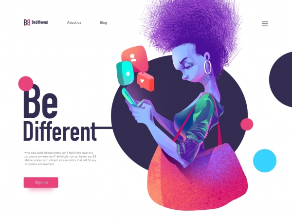
[source]
It is absolutely okay to follow trends. But why be like everyone else when you literally do not have to be? Instead of becoming just like everyone else and following major trends, look at trends, study them, be inspired by them, but put your own twist on it that makes you stand out and have recognizable content.
23. Get that aesthetic
You know it as well as I do, aesthetic is everything. Sometimes that means aligning your text with the background image. So if your image is slanted, then your text should be following suit. Align your shapes and objects if you need to. This will give you that aesthetically pleasing vibe you and your viewers are looking for.
24. Be transparent
Be transparent. Today, that quote is going to apply not only to you as a designer, but also to your fonts. Sometimes, you don’t want your text to take away from your image, but you still have a big, bold message you need to get across.
Here’s the answer for you: use transparent fonts. Use any fonts of your choosing, then just change the opacity levels, to still see the text, but to not take away from the image.
25. Get messy with it
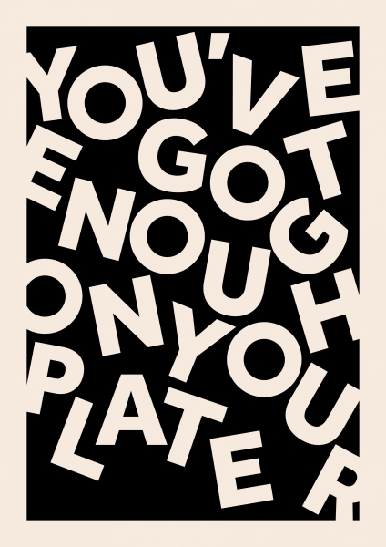
[source]
This is one of my personal favorites. This idea is just so fun and crazy that it makes me happy. And I’m sure that’s the vibe that will be picked up by all your viewers. This font is different and takes you a step out of your comfort zone.
You can do this with any font of your choosing by individually typing each letter, choosing the size and rotation of it, and then placing it in the order of the word. Definitely, a technique to remember and that you could try in the right kind of project.
26. Write down your ideas
[source]
Creativity isn’t always handy, but you know what can be? A notebook full of ideas. Start carrying around a little doodle notebook and jot down and sketch your design ideas as they come to you. Who knows, maybe you’ll be inspired while you’re walking around town and you won’t want to miss the chance to write down your next big idea.
27. Create a design per day to practice
[source]
Every day is a new day for you to improve and become a better you, a better designer. No matter how you’re feeling, from this day on, you need to create one design a day, no matter how simple or intricate. Just get your wheels turning in your noggin and let the creativity flow a little each day so you can be in better touch with your designer side.
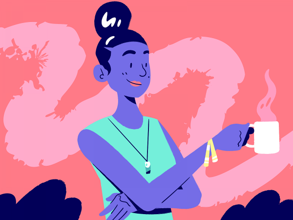
28. Take a break, then bounce back
[source]
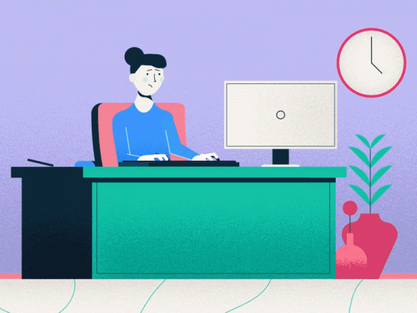
Like in every situation in life, you can burn out. Sometimes, when you’re in the zone, you need to make it a point to get outside, take a creative break, and rest your brain. Or maybe you’re in the opposite situation.
You’re sitting at your computer, but no ideas are coming to you. Go get a glass of water or a cup of coffee and go outside for a little walk and let your batteries recharge. The creativity flow will come back to you. Just rest, then bounce back. You’ve got this.
29. Make your own rules
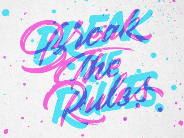
[source]
There are no rules to design. Each designer deserves the right to be authentically themselves. Obviously, you can take pointers from others and follow trends, but you’re your own creative rule maker. People will respect your authenticity, and with that, I come to my final graphic design tip.
30. Be yourself
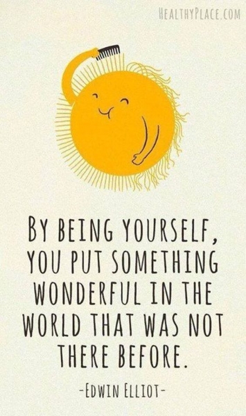
[source]
This is absolutely the best tip that any designer or any person could ever give you. Be authentically you! There’s only one you in this world, and you don’t need to be like anyone else, because everyone else is already taken.
I hope this article inspired you and made you excited to get to designing ASAP!