As a marketer or as a designer for a marketing campaign, it is never easy to always come with fresh new ideas and even harder to create something that will inspire your audience and get the most out of your campaign.
However, this is your job and if you are not doing it properly, nobody will. We’re sure that you are already doing whatever it takes to get yourself informed and study the market and everything that happens in your industry. At the same time, you need a constant source of inspiration in order to prepare yourself for the brainstorming session prior to the creative process.
We are going to offer you some inspiration to work with:
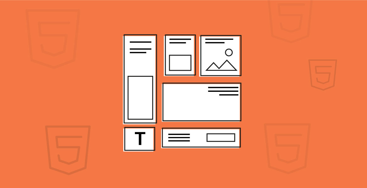
HTML5 banner examples
We’ve learned together about the importance of HTML5 when it comes to marketing visuals, and especially advertising banners. In order to create an HTML5 banner it’s useful to have some examples in mind before starting the actual creation process. Here are some of the most inspirational examples of HTML5 banners we can view online at this point.
1. Principal – Effective message through simplicity
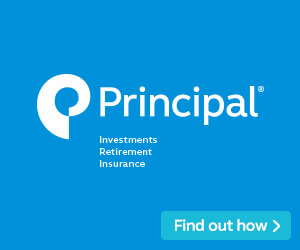
Our first example comes from Principal, a company that offers financial products and services with a history of almost a century and a half.
You’d think that they had enough time to evolve and learn how to keep things simple but believe me, sometimes this is the hardest thing to do.
Well, not always, as their banner makes the first on our list not for its design but for its quality in delivering a straightforward message by using nothing else than a logo and a call to action button set up on a monochromatic background.
2. Under Armour – The banner that makes us want to know more
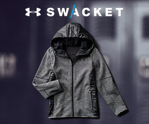
When it comes to advertising a product or a series of products, there will always be debates among marketers about how to write the best actionable message so that the clients will show some interest in their products. Well, sometimes the message is just the product itself and if you have a genuine and intriguing new product like Under Armour advertised here, then you might come as a winner.
There is no text here, besides the company’s logo and the name of the product advertised.
The focus is on the product and its name. The viewer will wonder what Swacket means and there’s a good chance they will click on the banner just out of curiosity.
3. Stack Overflow – Go for an illustration if you are offering something abstract
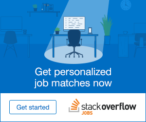
Stack Overflow is one of the most popular and most trusted online communities for developers where they can share knowledge, learn new things, and build their careers. The following banner is dedicated to those who are looking for jobs in this industry.
Why did I choose it for this list? Well, they could have made it quite easier, by mixing a stock office or computer image with their copy text.
Instead, they have chosen to feature an illustration with a spotlight focusing on an office with a computer.
This is a great example of a design based on soothing colors, a straightforward message, and a representative illustration.
4. PayPal – Match the visuals with the text message
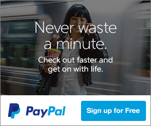
Check out this perfect banner distributed by PayPal. We all know what PayPal is and therefore I am not going to talk about the company. However, there is much to talk about their banner which is a great example of consistency between the message and the visual image.
“Never waste a minute,” they say, “checkout faster and get on with life”.
They are talking about speed and the value of time. You get to relax when daily, usual things, do not take much of your time. This is exactly what the image suggests with the speedy train passing by the relaxed woman.
5. WordPress – The banner that said it all

Can you design a banner able to tell the audience your entire story, who you are, what you are offering, and how you can help them?
Well, it seems that nothing is impossible if you are inspired to create the perfect banner for a marketing campaign. This is the case with this WordPress ad, the company that gave us the most popular blogging platform. The copy text is not only effective and straightforward, but it also says everything about the platform.
Moreover, the image in the background, suggests inspiration and consistency, the two things you need when you start a blog. The call to action button seems almost superfluous.
6. KIND Healthy Snacks – Change a mindset with a colorful palette
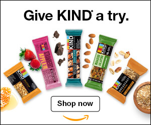
When we hear somebody talking about healthy food, most of the time, we imagine something colorless, odorless, or something without taste. This is why the following add presented by
Kind is something to look for as an inspiration. Do it, especially when you are asked to create a similar campaign for a food company.
Kind’s banner adds a color palette to their line of healthy snacks. The concept is simple, with a focus on an image that presents the products arranged in an attractive manner, accompanied by some nuts and fruits.
There’s nothing exceptional about this banner except the fact that by being simple, it manages to get the most out of the products and transmit a message. The color palette also adds to its attractiveness on a psychological level.
7. Nordstrom – When warm colors make the difference
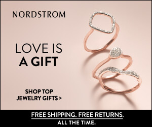
Here’s another banner that stands out from the crowd due to its colors. We have another great example of a product-based banner but this time, we are shopping for jewelry. We all know that most of the time, jewelry is being placed close to the skin, whether it’s a ring, a necklace, or a pair of earrings. This is where this Nordstrom banner makes a difference. The background color is similar to the color of the human skin. Thus, the client gets to imagine how the jewelry looks on them.
At the same time, the warmer tone is attractive, and it puts the products in focus and highlights the message of the banner.
8. Wyndham Grand – Focus on the extras
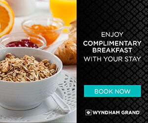
Sometimes, if you want to create the perfect banner for your campaign, you should think outside the box.
That is exactly how the marketer who created this banner thought.
A group of hotels, Wyndham Grand came up with an interesting banner that depicts not their rooms, their facilities, or their prices. There are no offers and no price cuts whatsoever.
Instead, they focused their banner on the free breakfast offered every morning and to this end, they managed to depict it with a perfect picture.
9. Phillips 66 – Attract your audience with motivational messages
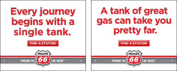
There’s nothing fancy about buying gas for your car. In fact, this is a day to day task that some of us don’t even figure out at a conscious level. We are doing it out of instinct after so many hundreds and maybe thousands of times we did it before.
How to attract your audience when you want to advertise a gas station? How to motivate them to click on your banner? Well, it seems that Phillips 66 managed to answer these questions and they did it quite easily.
How?
It’s quite obvious: in order to motivate the audience, Phillips 66 created a series of motivational banners. The messages are simple and easy to comprehend but at the same time, they are straightforward and effective. See the examples available below for a clearer understanding of how their banners talk to the audience.
10. Target – Go traditional
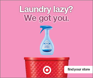
People at Target know what they are doing, although their banners, at a first glance, don’t seem to give us much to be inspired of.
However, they did exactly what people were expected of them: they have chosen a product, a traditional image, and a traditional copy text, a call to action, and a warm background.
They all mix up together nicely and appealing.
11. Tesla – Remind your audience why you are their best choice
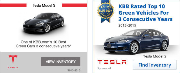
I am sure that everybody who reads this article knows about Tesla and their electric cars. We’d probably get the job done easier if we’d count those who did not hear about this company.
Therefore, why would Tesla need advertisements to send their messages?
Well, regardless of how well known your brand is or how popular your products are, there are times when you need to remind your audience that you are still there, on the market, waiting for their attention.
As the examples available below suggest, they did a terrific job, by reminding their audience why their cars are so popular these days. Unlike what we’d expect from a car company, we are not bombarded with specs or low prices. Instead, Tesla reminds us that their green cars are on the top and that they are there for the long run.
12. Samsung – Design a banner that catches the attention without being intrusive
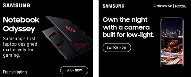
Samsung’s banners, like the two presented here for a gaming laptop and their last smartphone line S8, are a great example of a simple design that stands out from the crowd without being too intrusive. There are no bright colors; in fact, the background is monochromatic.
Why are these banners effective? Well, look at the images and analyze the backgrounds, by trying to remember how a web page looks like. Most of the web pages we know are based on a white or light-colored background. The contrast created by these banners makes them easier to notice.
13. Microsoft Office 365 – Give your audience all the details with visuals
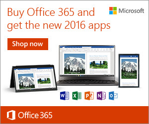
Another example of an effective banner and a great banner design comes from Microsoft. Their Office 365 ad gives us all we need to know about their product by simply looking at the visuals included there: We learn about the compatible devices and the software programs the suite contains.
14. Nike – Showcase the plus factors
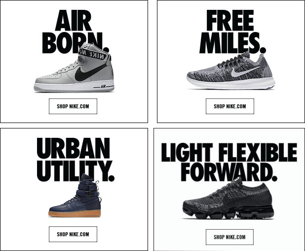
Let’s take a look at another series of banners that made it to the top of this list. This time, they come from Nike, one of the leading sportswear brands in the World. They come with nothing spectacular in particular but they have a tremendous impact on the eye of the beholder. There’s the advertised product in the center of the view and an oversized text that advertise the product’s main attributes.
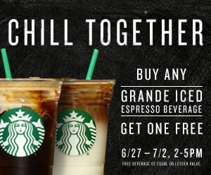
15. Starbucks – Chill together
Who likes to have a drink alone? Moreover, who wants to drink their coffee alone? Well, I guess most of you will answer with the same statement: “Nobody”.
This is why this Starbucks banner is a great example that had to be included in this list. There are many retail shops and food/beverages related venues that come with 1+1 offers.
However, Starbucks’ offer is not just about the extra cup of coffee you get when you buy one. It’s about doing it together with somebody. This is how they tapped into the audience’s social needs, relationships, and emotions.
Everything’s better when you are doing it together with somebody you like or love and this sentiment transcends from the banner into the Starbucks cup of coffee. When you see the banner, you think immediately about someone close to you. This is a positive feeling that in many cases, advertisement banners fail to trigger.
16. Pepsi – The banner that makes us thirsty
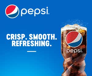
Ever wondered why when you watch a movie and someone pours something into a glass you feel suddenly thirsty? This is how our brains work and the sound of the liquid pouring into the glass serves only as a reminder that we need to hydrate.
This is exactly the message the next banner sends us only by looking at it. You can almost hear the liquid pouring out of the can.
17. Mercedes Benz – Convince the audience to learn more
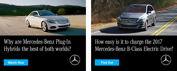
People are curious. They are always hungry for new information and if they have questions, they cannot rest until they are answered. You are a marketer and you work with visuals and messages that should trigger emotional responses. Why not take advantage of this curiosity?
Take for example these two Mercedes-Benz ads. They showcase the product and if you are not paying attention to them, they are not different from any other banner available out there.
Take another look and read the copy text. It appears to be a simple question but in many ways, it’s more than a question. Each of these two questions is also a statement. Furthermore, they trigger the audience’s curiosity and make them want to learn more, find the answers and why not, consider investing in a new car. What’s really impressive here is that the image of the car is not even important in the context. The message prevails.
18. Sony – Create a visual image of the sound
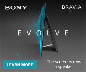
How do you imagine the sound in a visual style? Can you do it? Well, it seems that whoever designed the latest Sony Bravia banners managed to do so. This banner is a great example of creativity, imagination, and inspiration.
I know, there will not be many instances in which as a marketer, to be asked to do something similar. However, the example serves as an inspirational banner not by what it is or what it represents but for its simplicity. The simplicity of delivering the exact message in a creative design is staggering here.
19. NFL Network – Find out what people want and give it to them
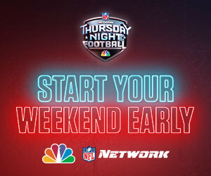
What do people want? Some will say happiness, others will say money, a family, or a holiday overseas. These are however abstract wishes that we all have regardless of the social status. However, there is something everybody wants. People want to relax, enjoy their free time, and be able to de-stress after a hard week of work.
This is where NFL Network’s banner excels. It triggers yet another positive emotion, the endless weekly longing for the weekend. This is the time when we relax, enjoy our lives, and shed the day-to-day work-related accumulated stress. For a football fan, the banner offers a positive emotion we usually associate with weekend nights.
20. Apple Music – The banner without visuals
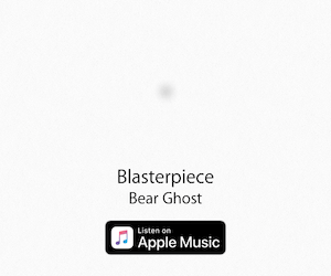
I will conclude this list with probably one of the most intriguing and yet inspirational banners I got to see in the past few months.
This Apple Music banner is a great example that if you know what you are doing and how to do it, you don’t need colors, images, or copy texts.
Apple is a company that knows how to advertise and most of all, how to take advantage of professional, clean designs. The following banner serves as a reminder that whatever you do, you can do it better even if you don’t do much. More is not always better but you have to know how to implement the “less” so that it will be effective.
Now let’s talk about the display banners and the need to adapt to today’s environment and formats available to designers.
The HTML5 versus Flash banners war
We all know that until a few years ago, if you wanted to display an animated banner you needed to learn flash or at least, hire a flash professional to build your banner. Things have changed after HTML5 was released, as the new version of Hyper Text Markup Language (HTML).
You can now create animated banners – and all kinds of other types of animations – easier than ever and without worrying about all the issues that came along with the Adobe Flash plugin. Customize and animate your ads to match your product or services.
There are many people who still believe that Flash is better than Html5 while others are already convinced that the latter is our next and most natural step towards normality when it comes to web multimedia. In order to make up our minds, however, we need to understand what each of these languages means and why Html5 banners are a better choice when it comes to marketing and advertising.
Adobe Flash is a multimedia platform and a rich internet application tool at the same time. It is used to add animations and interactivity to websites, games, and video clips but it is more valued for the excellent visual experience it provides. There are, however some issues that flash applets may cause, especially in the past few years. Why, you will ask?
The popularity costs and Flash is no stranger to security threats and breaches. Although patches were released quite frequently, people became somehow annoyed by these problems and the consequent crashes. When you patch something over and over again, it’s almost impossible to deliver a stable version indefinitely. The result? Browser vendors, including Apple and Google, moved away from flash. As HTML5 is natively supported by all browsers, it seems like the war has almost ended with the latter one arising as a winner.
Why HTML5 banners are better
HTML5, unlike Flash, is now natively supported by all browsers. It’s not a surprise, since the Hyper Text Markup Language is native to all browsers for a long time now. In other words, HTML5, coupled with CSS3 and sometimes Javascript, offers cross-platform compatibility while Flash is no longer supported by some browser and operating systems.
At the same time, in order to be able to play Flash banners and other types of visuals, you need to install the Flash plugin, a third party software that may or may not work with your favorite browser or operating system. In 2017, people expect that content to be delivered to them without the need to install anything, without putting much of an effort.
When it comes to advertising, it’s obvious that your audience will not be willing to install an unstable and outdated plugin just to be able to view some banners. Therefore, you need to adapt to the market and the society and be able to deliver ads that everyone will be able to see without investing time in making their systems or browsers compatible with your visuals.
Finally, if you choose HTML5, you don’t need to worry about adapting your scripts so that they will be displayed correctly on all web browsers. Native support is already available, past issues such as browser compatibility are long since gone and forgotten.
The differences between HTML5 and Flash
Flash is owned by Adobe while HTML5 was developed by many developers and over time, it’s more likely to adapt easier to the requirements of today’s web environment. While HTML5 is open-sourced, Flash is a proprietary script which makes it harder to patch and adapt to the newest requirements of the 2017’s environment. There are however other important differences and I will try to explain them in this chapter:
- Mobile compatibility. HTML5 is widely supported by all mobile devices, it consumes less power and thus, it does not impact the battery life. This is an important fact since all mobile users complain about batteries and that they don’t last enough. We include here smartphones, tablets, and laptops. This experiment demonstrates how Flash drains out batteries more than HTML5.
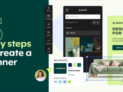
- Ease to design and create. With the help of an online HTML5 banner maker like Creatopy, creating and embedding HTML5 banners is easier than ever. You don’t need to learn how to code or how to work with complicated software. You need to access only your designer skills and implement them immediately.
- There may be compatibility issues even on desktops. Flash is updated and patched for many years now. There are so many versions available out there and this can result in the plugin being often installed on desktops, but not in the right version.
- HTML5 does not require an external player or other third party software or plugins in order to run on a mobile device or a computer. Natively, it is supported by all browsers, a feature that makes it ready for today’s requirements but also for the future.
Conclusion
As a marketer, when it comes to banner design and copywriting, you will always need inspiration and an open mind to make the best out of each campaign. Everything matters, starting with the visuals you get to use for design and up to the file format in which you save the final banner.
With this article, I have tried to pinpoint why HTML5 is better for banners, especially when they are animated or when you want to include clickable calls to action. I’ve also presented some of the best 20 banners we can view online now, and why each of them is important in this context.
What do you think about this list? Did you try to create HTML5 banners?