

Do you want to build a brand that people trust? Then you also need to be consistent both in terms of messaging and imagery.
Inconsistent branding will make it more difficult for potential customers to notice and remember you.
When you think of Netflix or Starbucks, you can easily picture the brand colors, logo, and even the font associated with them. That’s because these companies have a strong brand identity.
The first step towards ensuring you’ll have the same level of consistency is creating your own brand kit.
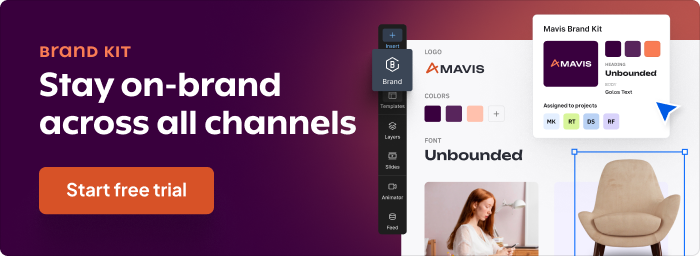

Table of Contents:
- What is a Brand kit?
- Why Do You Need a Brand Kit?
- What Should Your Brand Kit Include
- How to Create a Brand Kit in Creatopy (In 5 Steps)
- Final Thoughts
1. What is a Brand Kit?
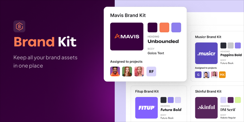
A brand kit is a collection of the visual elements of your brand: the color palette, logo(s), and typography. If you’re familiar with what a brand style guide is, you’ll find that it is almost the same thing. The difference between the two is that, unlike a brand style guide, is that the brand kit also contains many other elements like the tone of voice and collateral.
2. Why Do You Need a Brand Kit?
You might be thinking, if you already have a brand style guide, what’s the point of a brand kit?
That’s a very good question.
There are a couple of important reasons why it’s advantageous to have a brand kit, too. Both come down to being more efficient and saving time.
Whether you’re working with a large design team or a stakeholder for your ads and other creatives, a brand kit can make your job easier. Instead of going through a mountain of information, you have access strictly to the things you need to work with.
Think about it, a content writer will need to learn the tone of voice you use for your brand, which they can find in the style guide. But for a designer, it’s not as necessary to memorize that. It’s not the type of information they need to reach for every time they create new ads, posters, and other kinds of visuals. A brand kit gives you and your design team immediate access to the visual elements of your brand, helping you complete your tasks much more efficiently.
Another reason you’d want to have a brand kit is that it maintains brand alignment. Having your visual components in one place that can be accessed by everyone makes it easier to create visuals that are in tune with your brand. This allows for a consistent and professional look, making your brand more memorable to your target audience. Your Facebook profile and Instagram feed will be in perfect harmony with your website and ads.
3. What Should Your Brand Kit Include?
There are three essential elements that you need to have in a brand kit: the color palette, logo(s), and typography. These make up the visual elements of your brand, and they are the ones your potential customers are most likely to come in contact with first, so they need to be unique and memorable.
Let’s break them down using a fictitious brand as an example.
3.1. Color palette
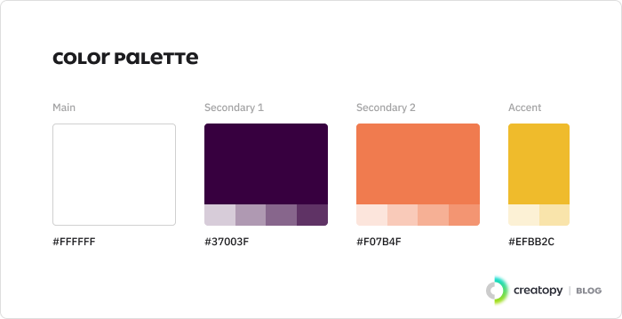

“The colors, Duke, the colors!”
Whether we’re talking about popsicle brands, inspiring small businesses, or iconic fashion houses, colors will be a crucial part of a brand’s identity.
A Reboot survey showed that brand recognition is strongly linked to a brand’s colors. More specifically, a signature color palette can boost brand recognition by 80%.
This is all due to association. Colors have the ability to elicit all sorts of emotions within us, ranging from happiness to trust and everything in between. You want your customers to associate your brand with positive feelings, and your color palette is a quick yet very effective way to make it happen.
It’s a great idea to dive deeper into color theory and color psychology when deciding on your color palette. You can even conduct an A/B test on your target audience as well as your team to see which colors reflect your brand’s identity and message the most.
And always remember to include the hex codes for your chosen colors. Specifying the exact shade or hue of a color you want to use will help you avoid frustrating situations where your promotional materials look inconsistent.
3.2. Logo(s)
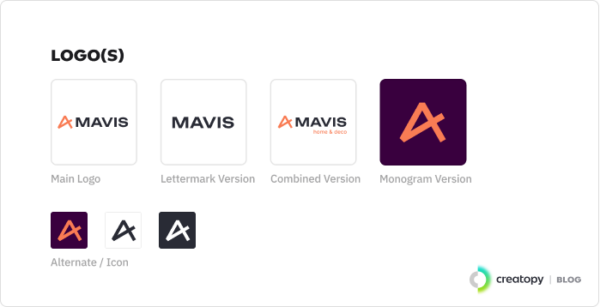
It’s hard to talk about the importance of a color palette without mentioning logos.
Designing a logo may seem simple enough, but there are quite a few aspects that need to be considered. According to a marketing study published in the Journal of Consumer Research in 2016, even the shape of your logo can influence how your consumers perceive your brand, with round and angular shapes generating associations with “softness” and “hardness,” respectively.
So if the mere shape of your logo can have an effect on your audience, imagine how strong that effect can be when you bring colors into it. If you have already decided on your brand’s primary colors, you will have an easier time coming up with a logo that reflects its identity.
If you don’t want to overcomplicate the process with colors, a simple black and white logo can also work, as proven by iconic fashion houses like Gucci, Chanel, and Louis Vuitton. It all depends on what your brand identity is and what sort of message you want to send to your target audience.
There are many types of logos you can create according to your needs and preferences. You can go for an abstract mark like Nike did or a pictorial mark like Apple or Twitter. You can also opt for a wordmark or a lettermark, like those belonging to Google or H&M. Or just combine any two categories—the floor is yours!
3.3. Typography
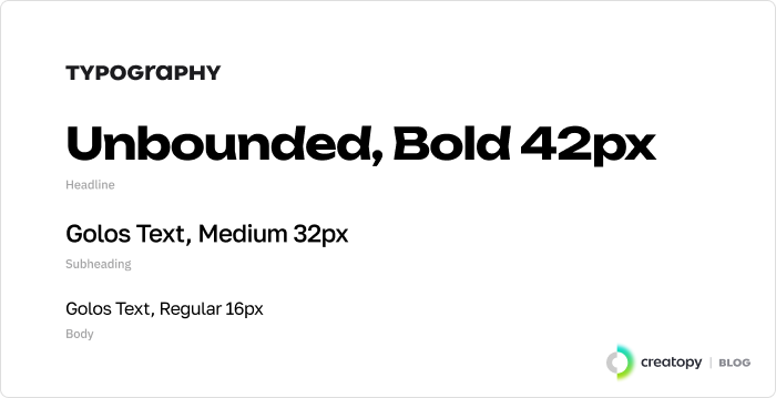
When transmitting your brand’s message, you have to pay attention to the words as well as the typography.
A unique typography can set you apart from other brands, but it’s easy to go overboard with it. You want to make sure it looks great, but it’s also readable. After all, a witty slogan can easily get overlooked if the font makes it impossible to read.
You can work with a designer to create a custom font for your brand, or you can opt for one from the Google font family.
The rule of thumb is to use two fonts that complement each other well—although it’s not totally uncommon to have three. Take your time to play with different combinations, or check out our list of 30 designer-approved font pairings for inspiration.
To avoid any awkward misunderstandings, pay attention to spacing, as well. It can make the difference between you offering fresh avocado and “free shavocado.”

4. How to Create a Brand Kit in Creatopy (In 5 Steps)
Creatopy offers the space you need to build your own brand kit. All three elements—color palette, logo(s), and typography—are ready and organized, you just have to focus on uploading your content. Your brand kit can be used in the Creatopy Editor and Generator so that you can create multiple designs with everything you need at hand. It can also be allotted to different projects.
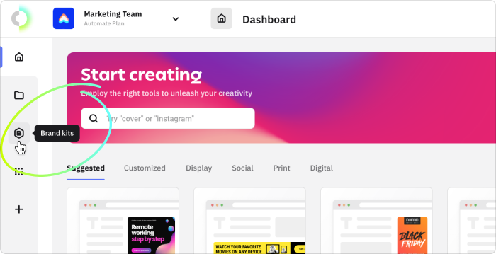
Step one: Click on the Brand Kits button on the left side of your screen, right under the My Designs button.
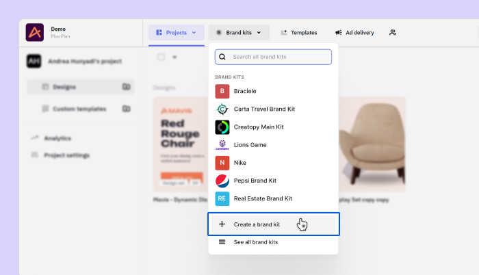
Step two: Click on Create new Brand Kit.

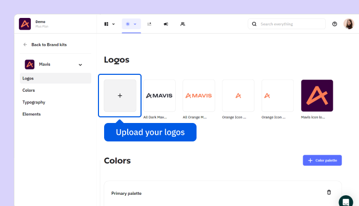
Step three: Upload your logos. You can add as many versions of your logo as you like in SVG, JPG, JPEG, and PNG formats. Each file size can be up to 10MB.
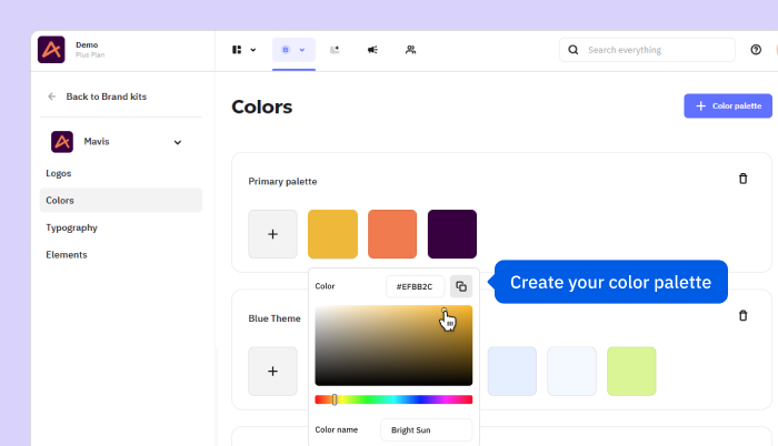
Step four: Create your color palette. You can create up to 10 palettes for your primary and secondary colors. Each palette can have up to 30 colors, so if you do the math, you can have 300 brand-approved shades in your kit.
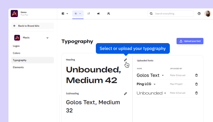
Step five: Select your desired typography from the list or upload your own.
Bonus: You may also add licensed elements of your brand, such as jingles, illustrations, or vectors. They can be uploaded in JPG, JPEG, PNG, GIF, MP4, and SVG formats.
Et voilà! You have a well-organized and easily accessible brand kit that you and your team can refer to whenever needed. Next time you create a new set of display ads, you’ll enjoy a faster, smarter, simpler process.
Final Thoughts
Branding is a key component of building a business. Your brand identity can impact how customers perceive your company.
A solid brand kit will help you keep the visual components of your brand in one place, thus maintaining consistency on all your channels, whether it’s your LinkedIn profile, website, or flyer.
It will also help you and your design team tremendously. It’s an easily accessible tool where they will find all the necessary components to create stunning display ads and more.
Are you ready to build your brand kit?