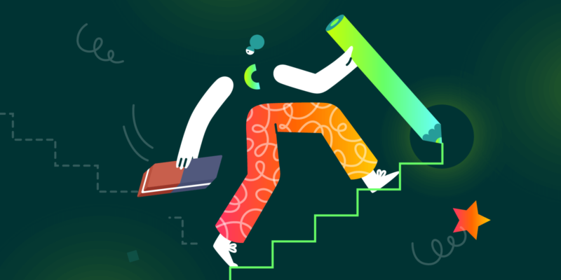
Lately, we’ve been talking a lot about the Bannersnack rebranding.
Today, it’s my turn to show you how we redesigned, implemented, and scaled our new visual identity from the inside out.
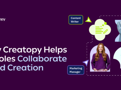
As you would expect, being a well-established online design tool, the way we communicate through design is crucial. After more than a year of hard work, my team and I reimagined how the product works, looks, feels, speaks, and shines.
This is how Creatopy was born and defined, and here are the challenges we had to overcome and lessons we learned.
1. Laying the Foundation
It all started with the name
{banner} {snack}. It was the perfect name back when we were the leading software for the banner ad design industry. But as soon as we grew, the visual identity was left behind. We’ve also lacked a solid brand identity, and we soon realized we could do so much more than our name suggested. Basically, our product became much more versatile over time, and so did we.
It was clear that we needed a new brand, a new identity, that can stand the test of time and the braveness of our goals.
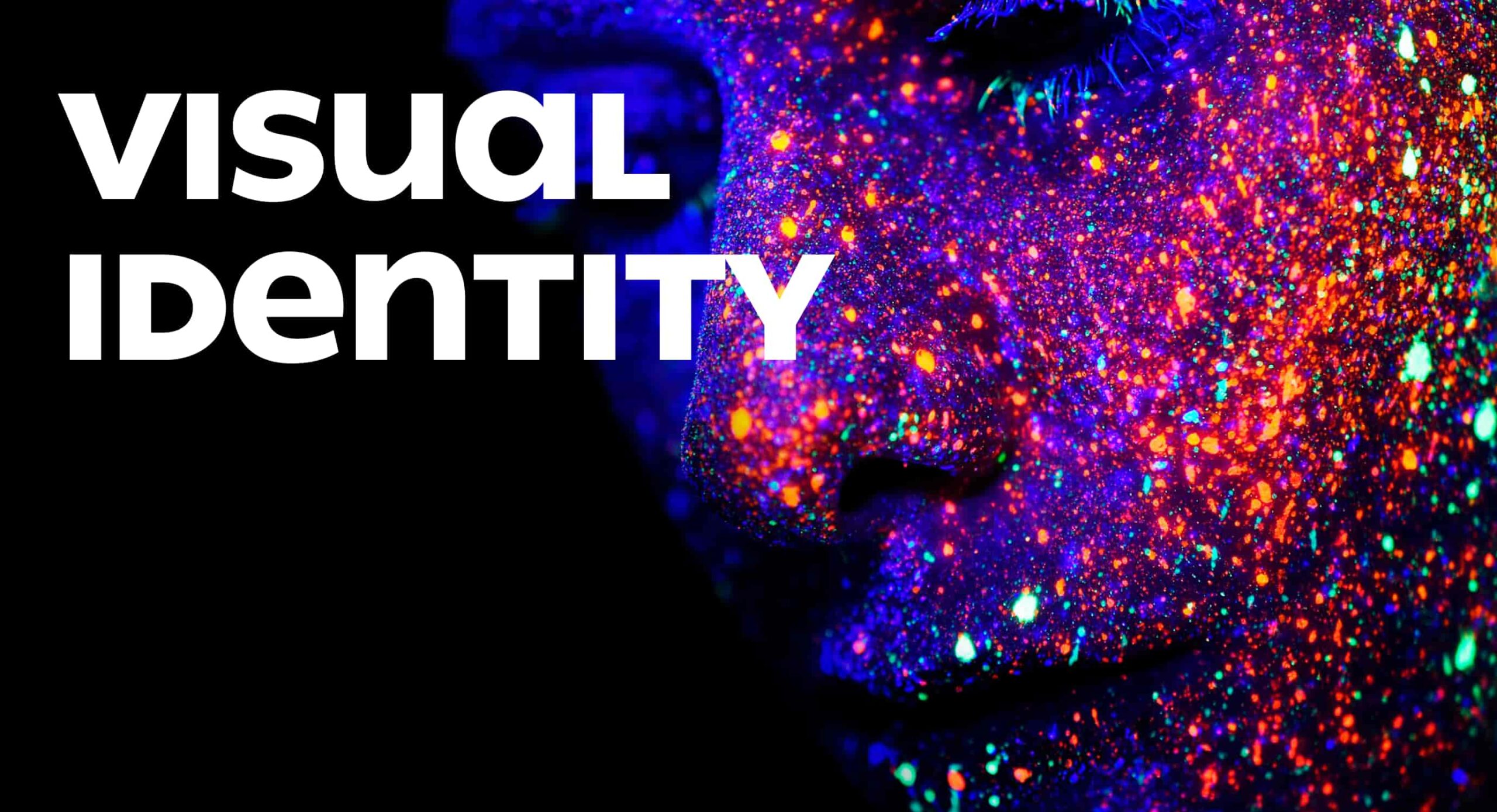
Creativity. Let it glow. The backbone of our visual language.
“Derived from “Creation/Creativity” and “Utopia,” the name denotes the idea of perfect creation and vast imaginary potential, the best place for creativity.” Brandient
We’ve chosen a bold, vibrant, and powerful representation to depict the Creative Empowerment in our visual communication. When it comes to the main pillars of our product design, we emphasized our strong customer-centric approach, which helps our customers reach their potential in creativity and productivity with our platform’s help.
The combination of these two terms is what our new design language relies on.
![]()
![]()
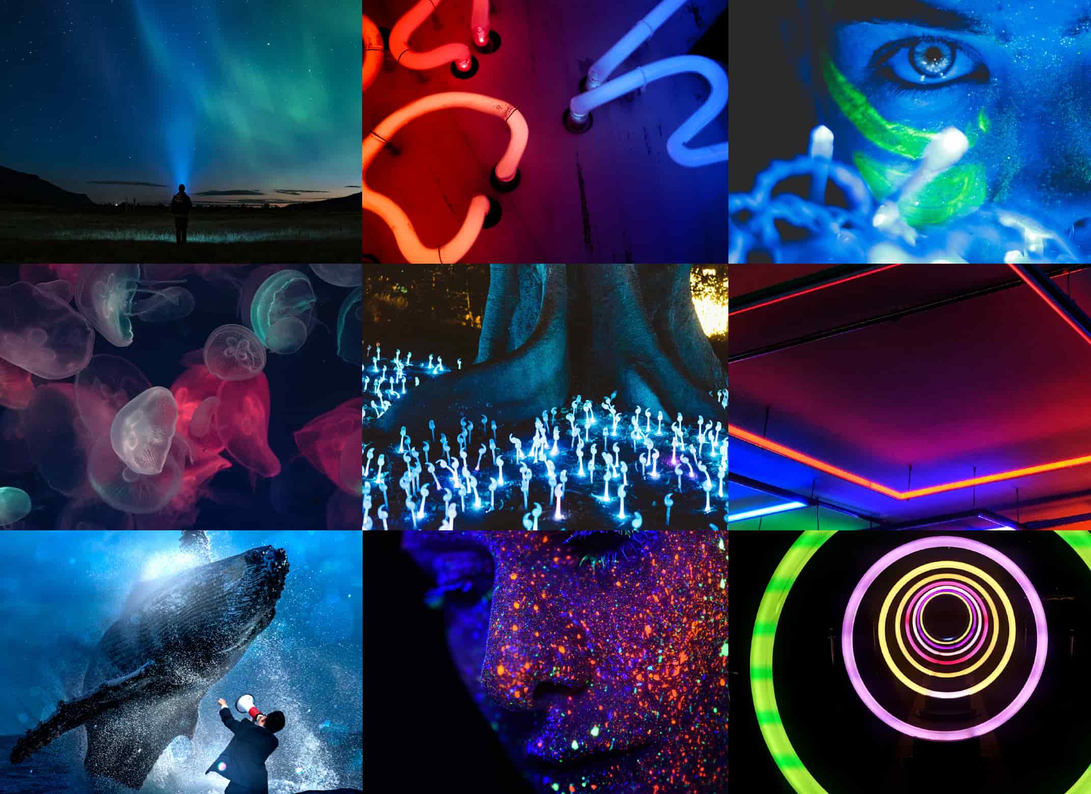
Creatopy – Look and feel of the new visual language & brand imagery.
Our choices are bold, vivid, and glowy. Creative, Techy, and Energetic. The typography is unique and strong. We really wanted to achieve a visual style that is like no other in our segment. Our visual language gravitates around creativity and the inner glow of the creative mind, that deep state of flow when you are really in that creative process. Call it magic—our new brand identity.
It would have been impossible for us to achieve all these without our magnificent creative and strategic partners at Brandient, who helped us define and build this new creative universe.
2. We Have a Brand—Now What?
The hardest part of a rebranding is making it work
Building a new brand is fun, engaging, creative, and spectacular, but scaling it through the organization, getting people used to it, making it work on all mediums, channels, formats, and systems, every time and for everyone—now that’s a complex and sweaty process.
Getting everyone on board
In a big organization with such a heritage and more than 130 driven people, adopting a new brand is not the same as kicking off a new company where you need a fresh identity. People are often used to and attached to the brand, and more than you imagine, they are afraid of change when it comes to a new name, new logo, and a completely new identity.
To accept the new identity, embrace it and start loving what’s to come, you need to get the entire company excited about the change. Everyone should adhere to the message, values, core principles, boldness, and bravery of the new identity.
After we finished Creatopy’s primary branding process, we kicked off with an engagement session to create buzz and excitement within the whole organization, showing everyone the new brand, discovering it together, and, let me tell you, it was a fantastic experience.
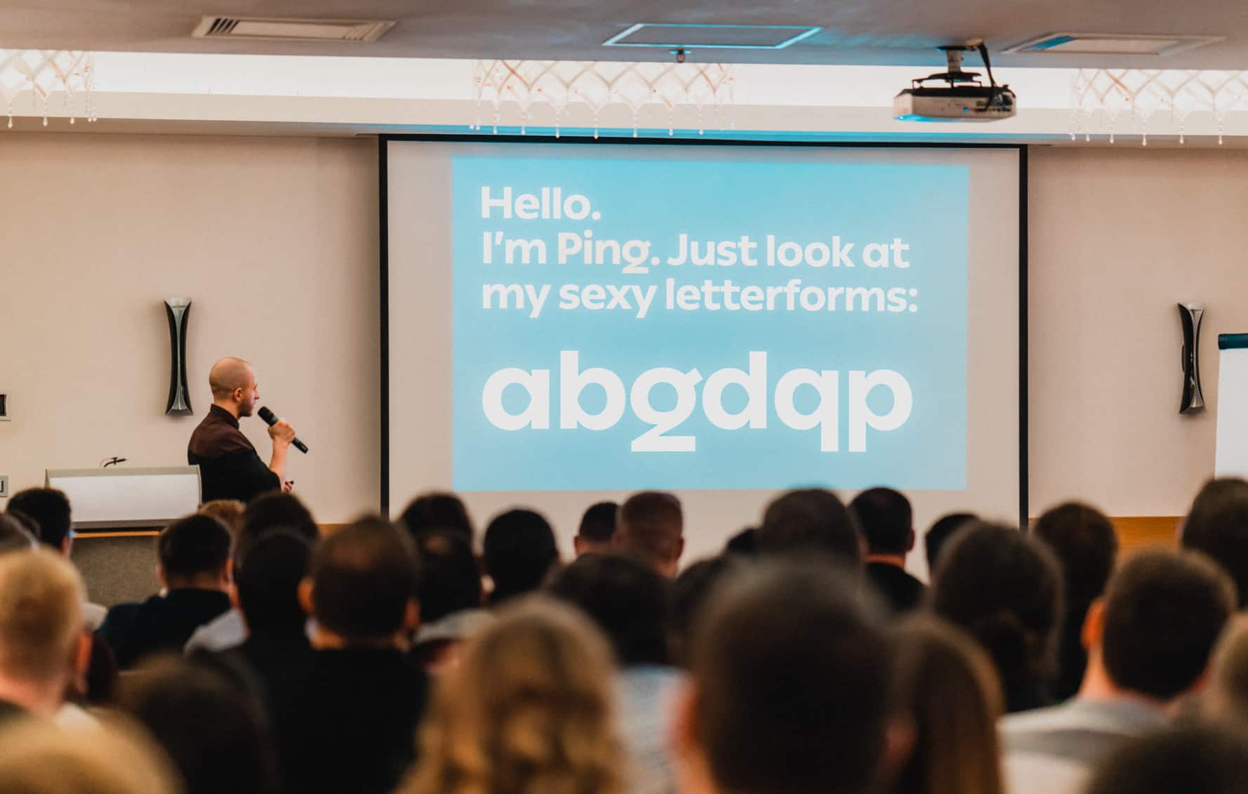
Brand Engagement Session: Ciprian Robu @ Brandient – Presenting our signature typeface
Consistency is key. Rules are essential. Creativity is mandatory
In order to succeed, you really need to think about systems and processes. There is no way around it. It doesn’t sound that creative, right? Believe it or not, this is what I love the most about our rebranding story.
For us, the design team, one of the critical elements that led us to succeed was adopting Figma. Let me say it was extraordinary.
Having everyone in the team on the same platform, collaborating in real-time, on the same files, sharing assets and components are the things that helped us scale our new brand in record time.
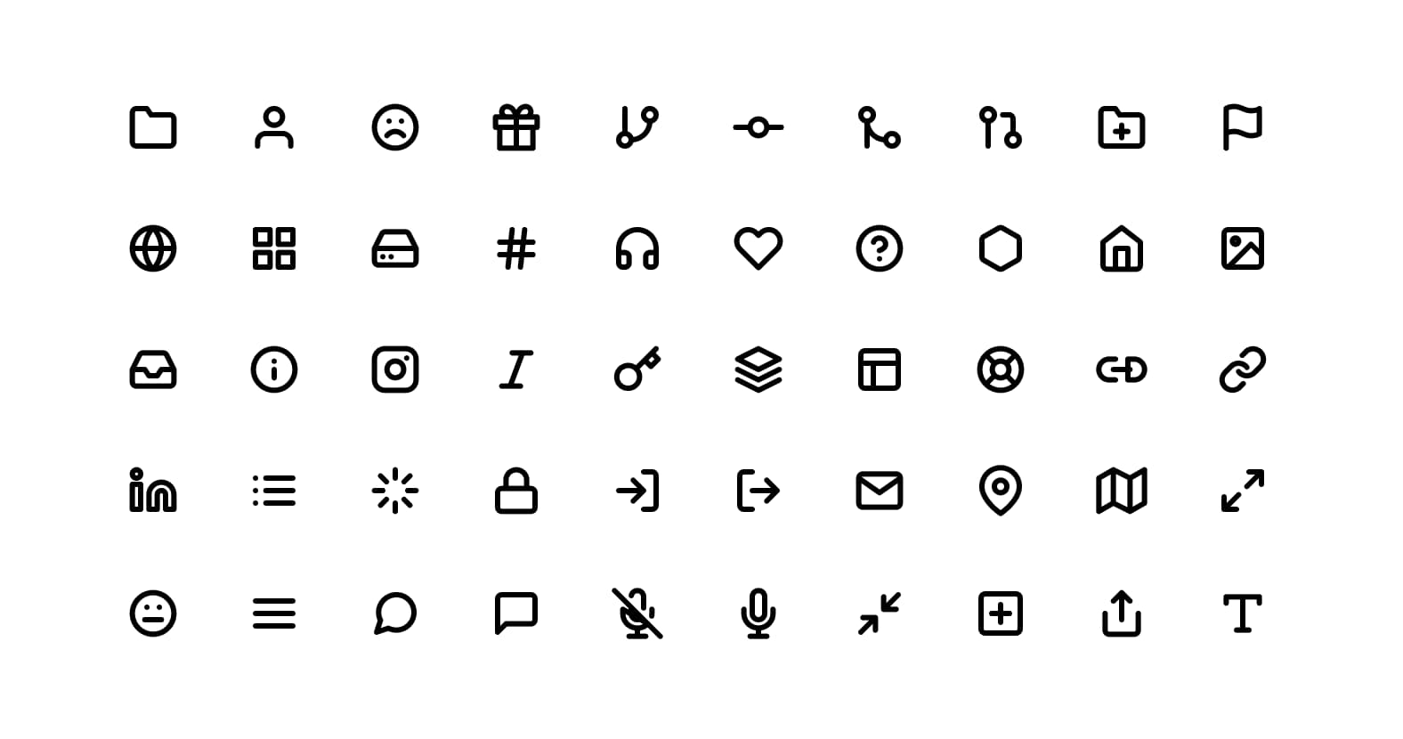
Brand iconography used throughout the website and UI
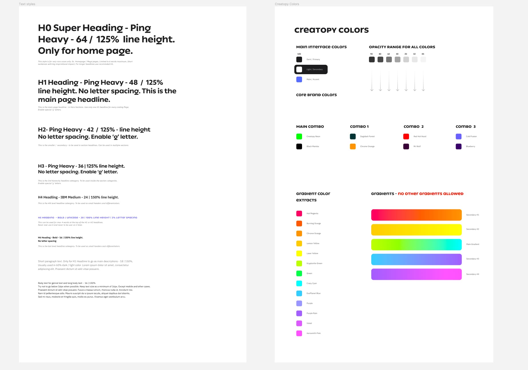
Base typography and color system
Get the feel of the new visual language
First of all, you need to make sure everyone knows and understands your brand’s mission, core values, communication guidelines. Designers need to embrace the same style, art direction and stick around your systems, assets, and processes.
Explore the digital horizon
You can achieve all of these by organizing creative workshops together with all the members of your design team.
Right after we had our first creative directions, we explored their boundaries. I challenged my team to play and explore a few innovative applications of the new brand to see how it would fit into real-world examples. We also pushed it to extreme scenarios to understand and define our design system together.
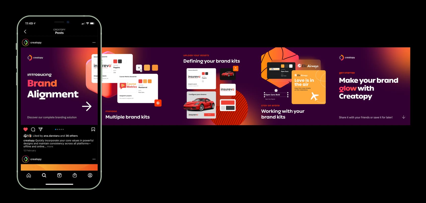
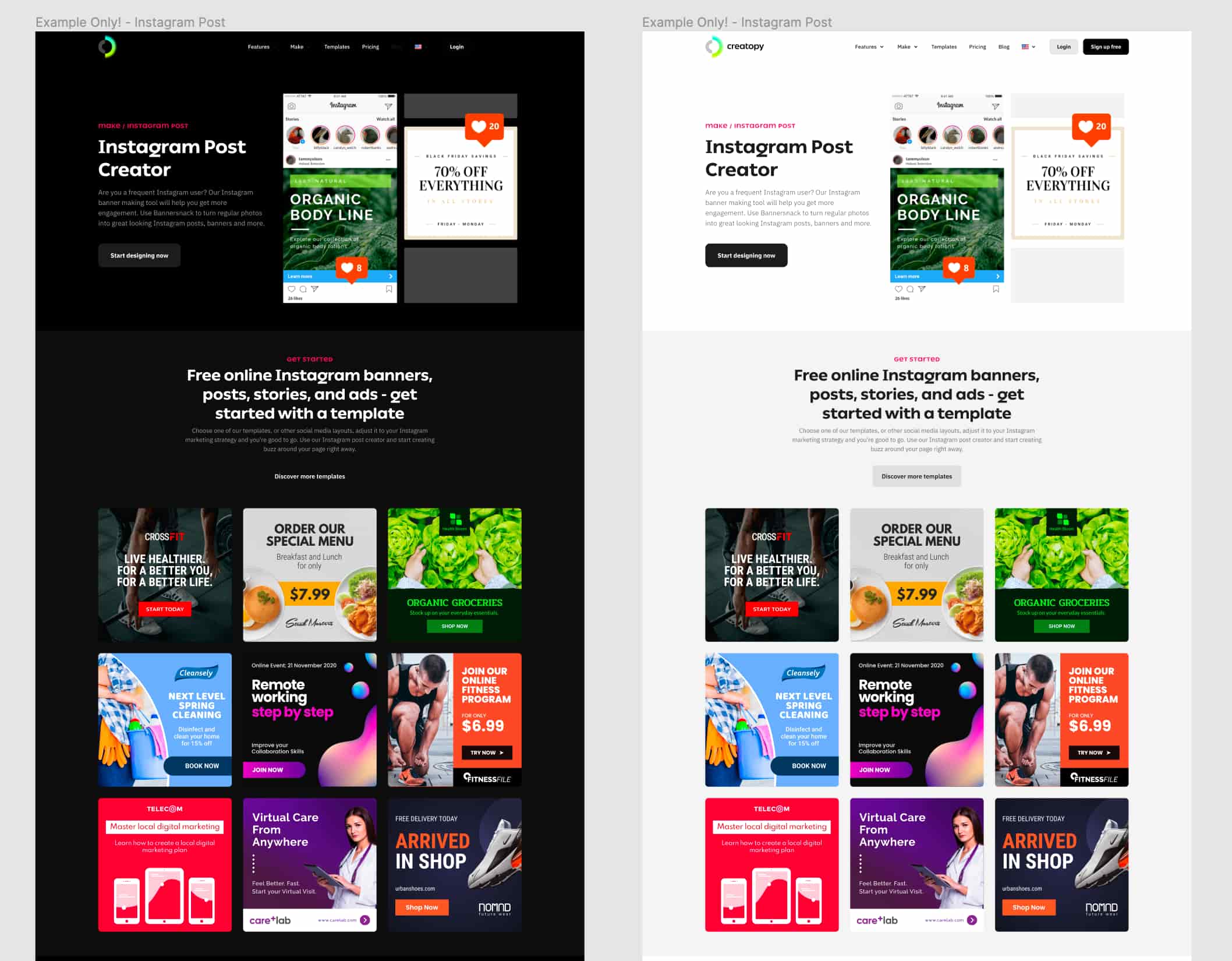
Example: An Instagram carousel post built around the brand’s key visual elements.
Building a scalable design system
Develop design systems for your team.
Once you’ve explored the creative direction, you can set rules. Set some boundaries, create the style guides, and make sure to include the following:
- Use this, don’t use this.
- Establish how a social media post and the hero section of your website will look like.
- What the primary colors are.
- How to format your typography.
- When to use dark backgrounds and when you should stick to white.
- Share the entire icon library, create buttons, atoms, components, and systems around your visual language.
And most importantly: train your team. Make sure everybody uses the same system, and they know how to do it.
We created so many systems. Presentation templates for Keynote and Google Slides, UI Systems with clearly defined style-guides, icon libraries, UI Components, illustration artwork how-tos, a dedicated system for social media visuals, and an entire modular website ecosystem. Just to name a few.
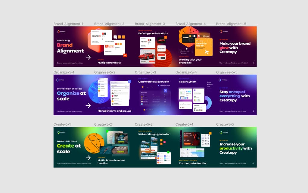
Example: Digital assets broken down into separate frames for homepage motion graphics.
Developing the illustration identity system
Illustrations in the SaaS industry are now overwhelming. I could also say they are a bit overused. But let’s face it, we still need them. Great artists can communicate things a simple picture cannot. And I’m happy to say that some of the most talented artists I have ever met are part of my team.
These illustrations are not new, and when you use a generic style, which is also used everywhere else on the web, you can easily hurt your brand. But the way we approached this is totally unique.
There are tons of libraries out there, thousands of websites that use the same styles repeatedly. Inspired by Blush, I wanted to develop our illustration style and design a system for art. We aimed to create an illustration style guide infused with our own identity and build a system that can help illustrators and creative artists stay on brand when crafting new artwork.
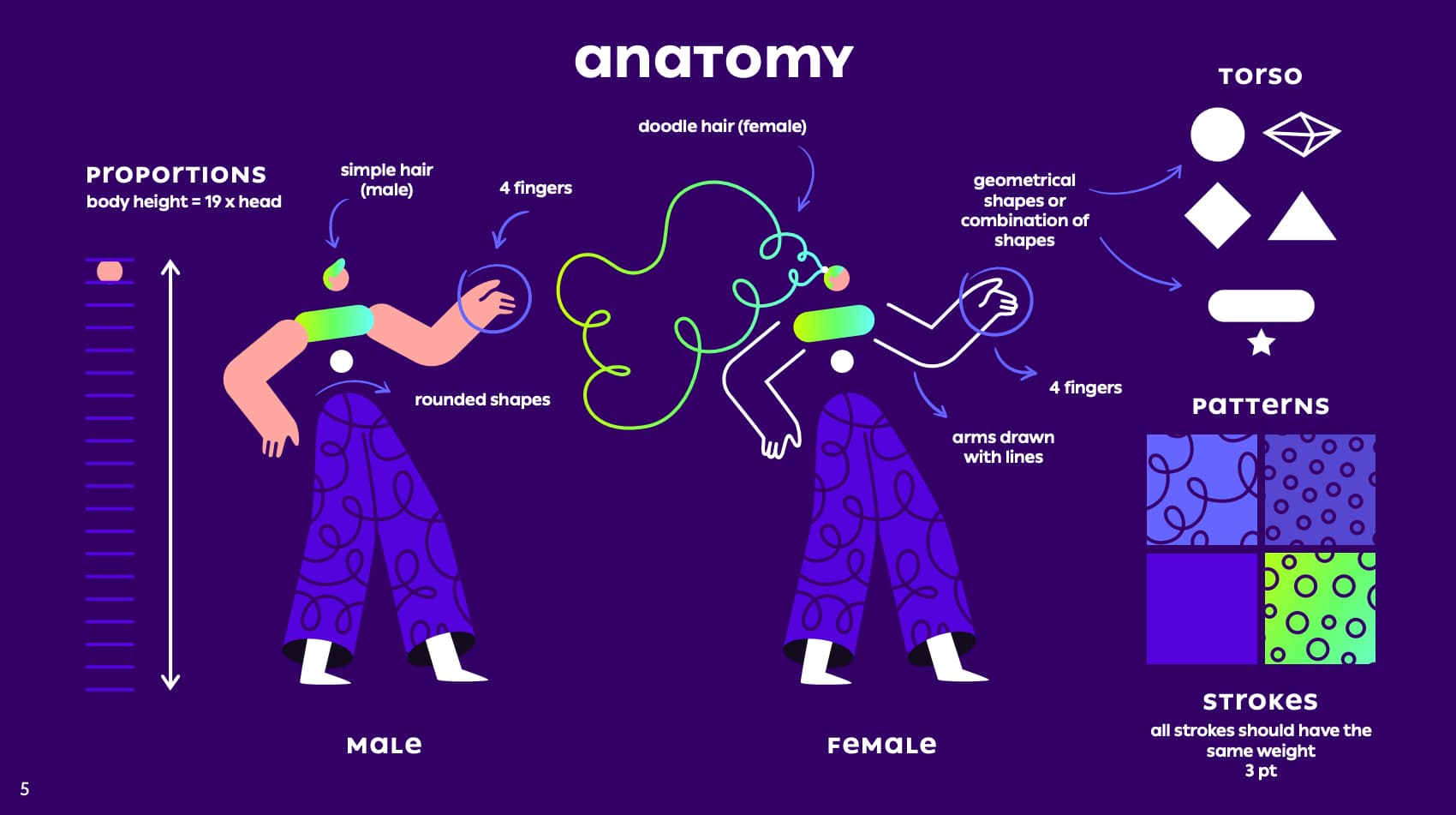
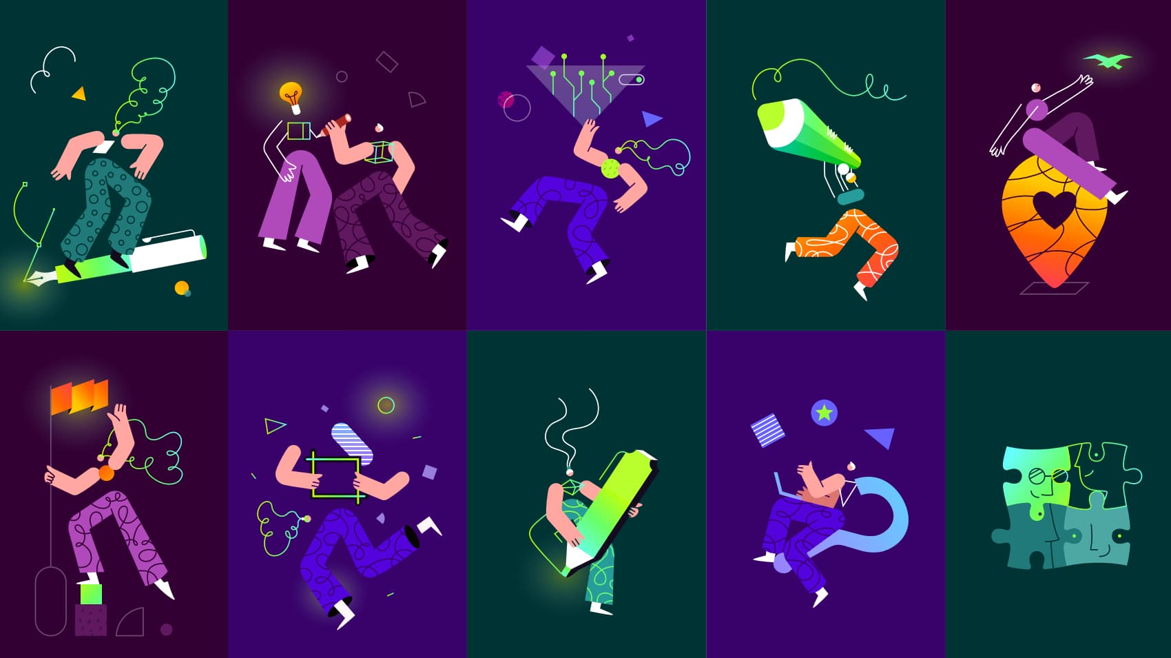
Example: Illustration guidelines and artwork
Infuse the branding in the office culture
Transforming a brand also means transforming a culture, transforming the team behind it. To emphasize, remind and drive the common passion of your team, you also need to brand the ambient too.
The presence of the new identity was really important for us. This is why, as soon as we had our brand engagement session, we decorated our office with a few props and branded items just so everyone can feel and embrace our new values.
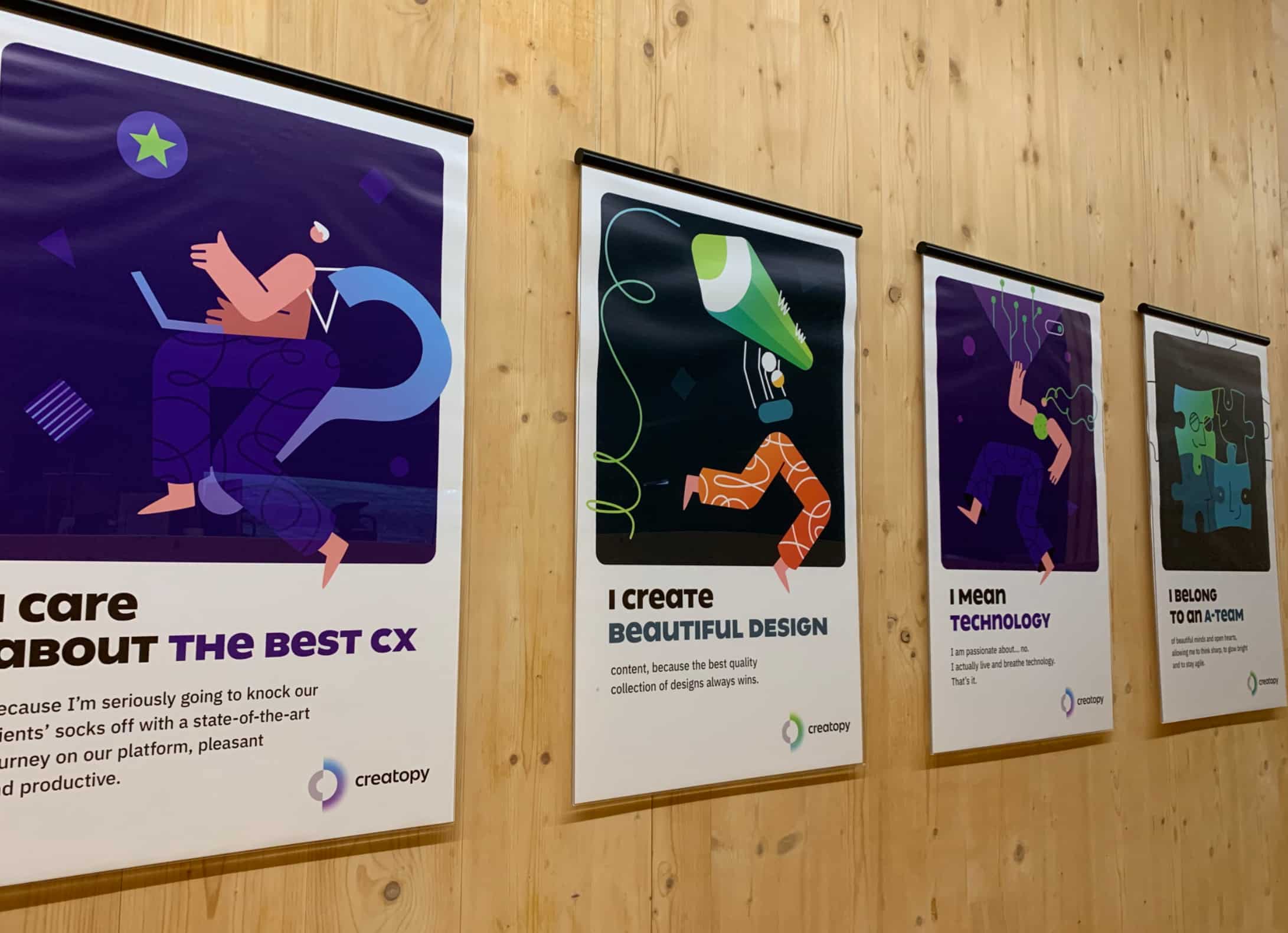
In-office brand values artwork
Modular website for consistency and efficiency
Because time wasn’t really on our side, we needed a fast and efficient approach when it came to our website overhaul, a solution that would help us change all of our website pages at once (using the same styling), including everything from contact pages to landing pages, feature pages, and so on.
Here is where modularity and scalable components can really come in handy.
Based on our core art direction, website structure, web-design practices, and SEO practice, we defined a system of over 20 different reusable sections.
We created everything from hero sections to testimonials, templates, and CTAs. Everything we know we are going to reuse over and over again and base our site structure upon.
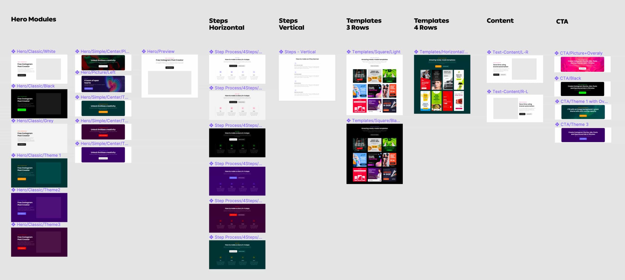
A few examples of the modules and theme colors for the new website.
The next step was to define each page with its unique content and assemble those pages using the predefined sections. We defined the boundaries of the color choices, so I know everything stays consistent and on-brand.
This approach was really fast and let us redesign the whole website in a matter of months. But to achieve this, you’ll also need a lot of focus and knowledge. I was fortunate to work with such a professional team alongside me. It was essential to have a core team consisting of product owners, developers, SEO specialists, product marketers, copywriters, and designers to achieve this together.
Example of a landing page built with modular website components and color themes.
3. Infusing the Brand Into the Product’s Identity
Designing great products is different from branding projects. A product should revolve around the user’s needs. A user interface is not a piece of art, and usability and accessibility are way more important than looks.
So UI is not always brandable. First and foremost, it should be easy to navigate, easy to understand, and accessible, but at the same time, it shouldn’t be common and neutral.
The process around how we redesigned our product will be featured in another article later on because that’s something I could write about for days. From a brand perspective, what I wanted was to let our customers experience the same magical, glowy feel of the entire product. I wanted to make customers feel like they’re on a journey, experiencing the same brand from discovery to actually using the product daily.
To achieve this, I made sure the Product Design team is also familiar with the brand’s main pillars and themes. We’ve had a lot of exploration workshops and hundreds of iterations.
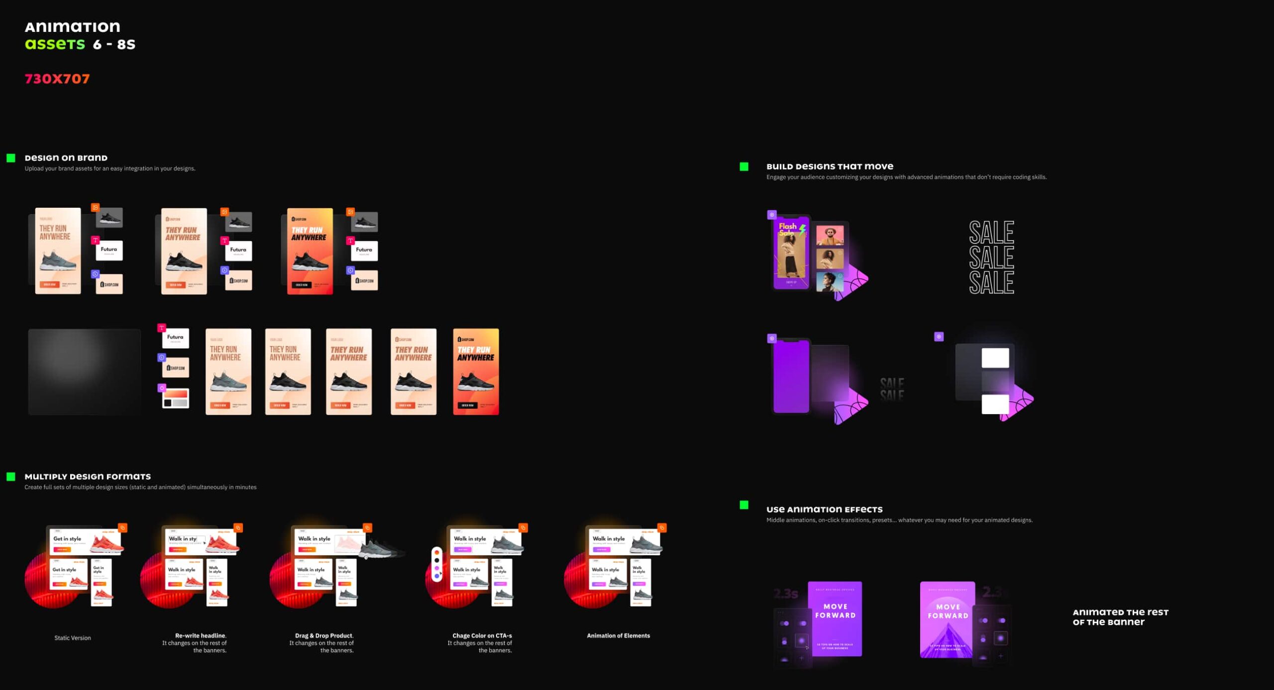
After more than six months of hard work, we developed the new UI design system—an interface that can follow the same visual style, uses the same icon system, has the same shine across the entire product’s visual communication. We matched the main themes and product pillars with the brand’s color themes and infused a little glow into the product.
Let it glow.
Example: Visual thumbnails of the design presets infused with some “glow and shine.”
Example: In-app navigation menu using the same key accent colors as the website.
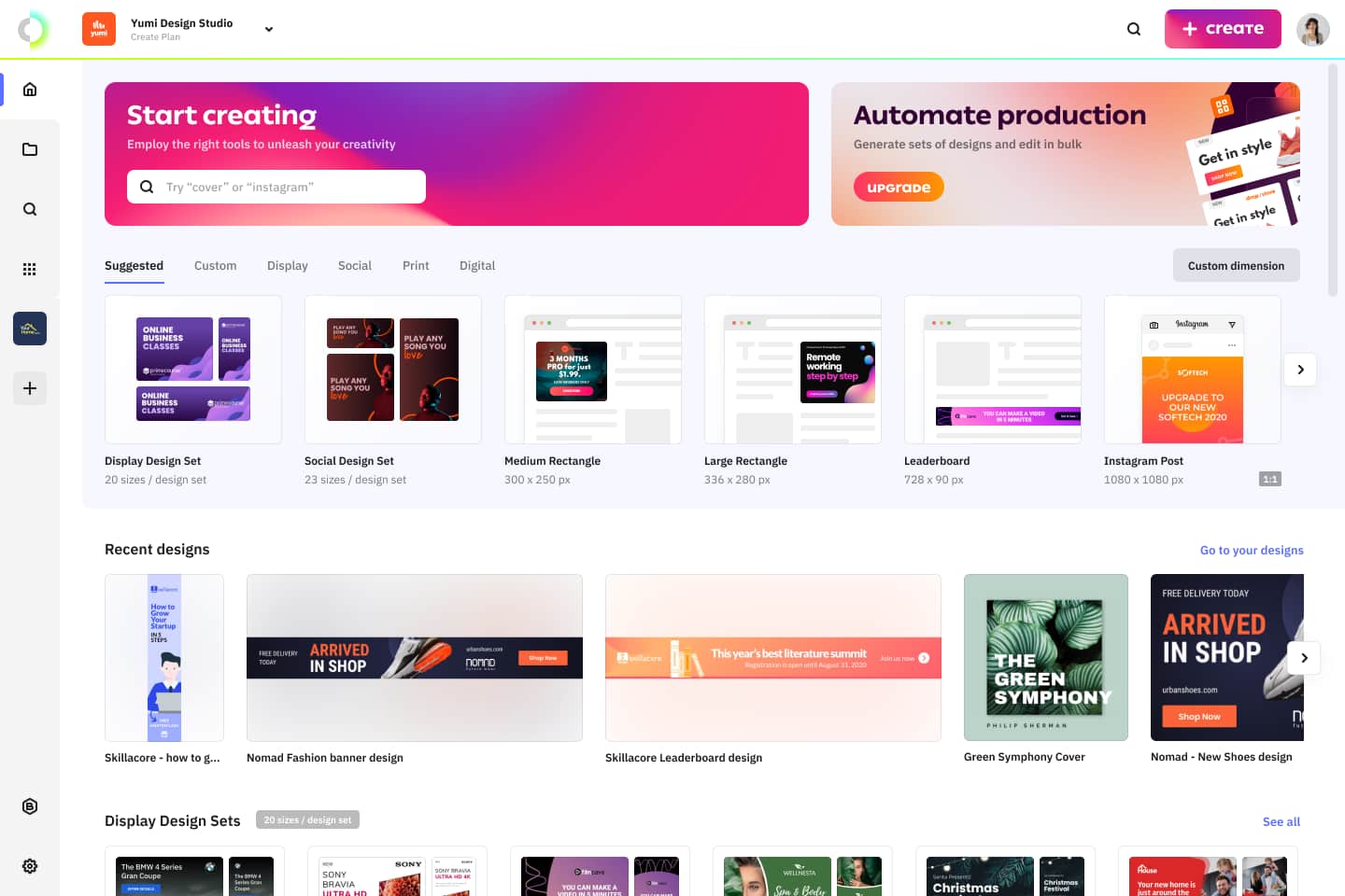
Example: Dashboard UI with a vivid, clean layout.
4. Closing Thoughts
We had eight months to do all these things from the ground up, so it’s far from perfect, but I’m a massive believer in iterative design, so we won’t stop here. Good is never enough.
Throughout this entire process, I discovered that a brand is a living organism. It scales, and it evolves together with the product and the team behind it. And it should make sense to be like that.
Until the next article, where I’ll deep dive into the process of building these design systems and do’s and don’ts of the product design process, explore Creatopy in the full launch video below and start your free trial to explore the full potential.