It’s a new year and a lot of conferences and business events are coming in town. And if you are a marketer, designer, entrepreneur or a developer, then you definitely subscribed to some of the big names you heard in your area.
I believe that going to these kind of conferences can help your business by giving new valuable information. But most of it, can help your business or personal brand growing bigger with new contacts and networks.
But this article will be for the guys behind the curtain. The ones who have white nights before the big event and for the ones who are doing the marketing before every strategy that the conference name stands on it.
This article is for the one, or two or even three persons who have the responsibility to create, design and do advertising with banner ads. These guys have the responsibility to make the user click on that banner ad and convert them to come to the event.
And it’s quite of big responsibility, right?
So today we are going through some several points where I will show you some banner ad example, how to design a banner ad that will convert the user to click on it and buy your ticket to your conference.
Are you ready?
1. Start with the “why” question

Before I start working on a new project, I have a few moments where I put a lot of question to myself.
I believe that this is the point where you can find the difference between a good marketer and a great marketer. A good marketer is doing his job without asking questions, while the great marketer will always start his job by asking himself and trying to find the right answer that will help him start his work.
So before you will start designing your banner ad to your conference, you should start with these 4 questions that you might be interested in:
A. Why people should come to this conference?
Yes, I know. Maybe it’s a stupid question for you in this moment, but you need to clarify it for you again. If you have a simple answer and you believe in this answer, then you definitely have the right mentality to design your banner ad.
B. Why this topic should be interesting for them?
Would you go to this conference and stay all day to listen all these speakers to talk about this topic? Let’s say that you organize a SEO conference. Let me ask you if you know what are the trends now? You will be on stage and will talk about this topic in a way that can make your participants be more interested in this topic and learn more about it? Because your topic of your conference is more than 50% of your branding and you need to make it relevant for your industry.
C. Why should they buy your early bird ticket?
We all know that giving early bird tickets will help the participant save some money, but why should they buy it right now? Is this discount a big one? Will they get something else before they go to the conference? Will they get something something exclusive if they buy your early bird (maybe a T-shirt, online guides and ebooks)?
D. Why should they click on your banner ad?
Now that we know why should they come to your conference, why that topic is interesting for them and why should they buy your early ticket – we are getting closer and closer to the banner ad subject. Why should they click on your banner ad? Tough question, right? Well my friend, for this question I am here to help you to design the best banner ad and to convert as much as you can. Are you ready?
2. First steps in designing: sizes and formats

Before you start to design a banner you should know some simple facts that will help you doing a better job and also being more productive.
First, you should know where these banner ads will appear, so starting from this you should understand what size you need to use to design them.
So, if you want to design a banner ad that you want to use for your display advertising on Google, here are the latest display ad sizes that you might be interested in.
| Ad size | Name | Where it’s featured | Supply |
| 300×250 | Medium Rectangle | Embedded within or at the end of articles | Good inventory |
| 336×280 | Large Rectangle | Embedded within or at the end of articles | Good inventory |
| 728×90 | Leaderboard | Placed on top or in inserted in an article | Good inventory |
| 300×600 | Half Page | Featured in the right or left hand side | Growing inventory |
| 468×60 | Banner | Featured in small spaces inside or on the left in articles | Limited, declining inventory |
| 234×60 | Half Banner | Featured in small spaces inside or on the left in articles | Limited, declining inventory |
| 120×600 | Skyscraper | Featured in websites sidebars | Limited inventory |
| 160×600 | Wide Skyscraper | Featured in websites sidebars | Good inventory |
| 970×90 | Wide Skyscraper | Top of website pages | Limited inventory |
| 200×200 | Small Square | Usually featured in the right hand sidebar | Limited inventory |
| 250×250 | Square | Usually featured in the right hand sidebar | Limited inventory |
But I strongly recommend you to start with the 300×250, 728×90 and 160×600 ad units, because most websites use this ad placements. These are the most popular ad sizes that are included in the universal ad package, a standard set by the IAB.
Other technical formats you need to know:
- for static banner you can use: JPEG, JPG, PNG and GIF (no slide)
- animated banner ads: GIF or SWF (try to make it under 15 seconds)
- all display banner ads that run on GDN (Google Display Network) must be up to 150KB or even smaller
But for other information that can help you to do a better job on google, I recommend you to read our guide for Google Display.
But Google Display is not the only place you can put your banner ads? I believe that you are familiar with social media, right? Now let me tell you this:
By 2017, social networking ad spending will reach $35.98Billion, representing 16.0% of all digital ad spending globally, according to eMarketer.
So, there is no doubt that you also need to focus on social media. And for that, you need to understand that every major social network out there have it’s own size and format.
So how you can stay updated with all of them? For this, we designed a great infographic that can help you design your banner ads.
3. The most important thing – the event’s brand

When you meet somebody for the first time, you tell him/her your name and then something else about you (maybe related to your professional life, context you meet right now or something that might me interested in). It’s a normal thing.
Starting from this point of view, let me tell you that this is the kind of approach you should have with you banner ad too. And how you do this? Be using your conference brand.
Even if we talk about a logo or your event name and of course, what the event it’s all about.
For example, Collision is one of the biggest tech conferences in Europe. So if you will look at their banner ad you will see the following points of their brands:
- “Collision” – the logo and the conference name
- The colors that they are using in their brand is also used in their banner ads and in their CTA button “Learn More”

And you can see that they are already telling the use that this conference is about the tech industry.
Another great example on how to use your brand is the big inspirational and motivational conference, TED Talk.

You will see that the logo stands out in the banner ad by it’s simplicity and color. Simple and powerful, so you can see that this conference has a name and an identity.
Here is another example on how Web Summit are using their logo in their banner ads. You can easily identify the conference and their brand in it, right?

4. The information

The other very important thing you should focus on while designing your banner ad is the holy grail information: where and when.
Tell the user in the most simple way where they can find this conference and when they need to schedule their data to come to it. Why is this important? Because giving them this kind of information will help them organizing their time in the future so you might have big chances to make them come to your event.
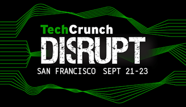
TechCrunch designed a simple banner ad with their “Disrupt” event where they are telling in simple words where it will be organized and when the event will take place. They don’t need to give any other information because they are a big name in their industry, so the participant who wants to know more about the event, will click on the banner ad.
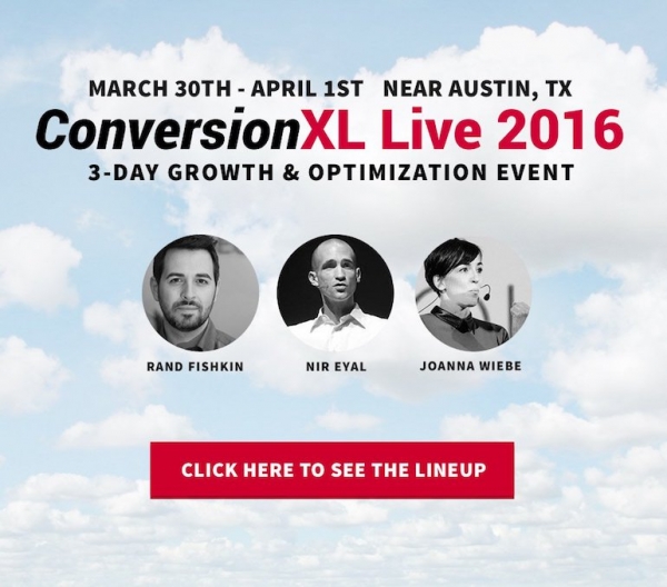
Another great example of how to use the information on your banner ad is “Conversion XL” where they insert on the headline of the banner ad the date and location of the conference.
From Content Marketing Institute we can see great examples of how to use the information in the most simple but powerful way. Also, if you want to steal an idea from them, I recommend you to look more closely at their other information, such as their hashtag or a discount code.

To resume this part, I recommend you to use clear and important information as to where the event will be organized (you can name the town or the region where it will be) and also the date (day, month, and also the year).
5. Who will speak at your conference

Now that we’ve inserted the event’s brand – the when and where information, value can be added if you put your speakers in your banner ad.
Here is the part where we will discuss about the people who will talk at your conference – the speakers. Even if they are the keynote speakers, the big names in the game, the small celebrities or anybody who will take the step on your stage.
If you choose a speaker to take the stage on your event, that means that maybe he or she is a celebrity in their industry, who can bring a lot of people at your event or maybe he or she are a professional who will raise the bar to your event.
For example, at the TNW conference you can see in their banner ads the speakers that will be there. They can be CEO’s of the big companies, co-founders, authors or others.

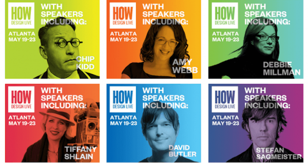
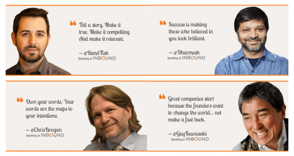
Also, make every banner ad with your speakers stand out in a different way, I suggest you to use a different element, such as graphic elements, colors, quotes or other simple idea that makes your design a little different.
Another great example where you can see on how to differentiate your speakers banner ads are from HOW design. They chose to use different color for every speaker:
Or you can use their quotes, just like Inbound have done with their speakers:
And know that you have some great ideas on what to insert inside the banner ads, such as your event brand, informations and speakers, what else can you show them through your banner ad?
6. What else will they get

Think about this: if the user that will see your banner ads and it’s a novice in this industry, that means that he or she doesn’t know the speakers that will be on the stage or something else that we talked before – still, why should they come to your event?
Now go to the event manager and ask him or she about your event: what is there else beside all of the great speakers and great topics. So if you will have a party, a networking moment, or other great moments that you can include in your banner ad, feel free to make another folder in your computer or on your dashboard (if you design it with bannersnack.com) and make another design.
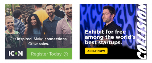
I recommend you to keep it clean but make it so interesting that even you’ll click on your own banner ad when it’s up because you’ll be so proud of yourself.
7. Include stats

Another great idea I saw on a banner ad for a digital marketing conference organized in Romania is to include stats. Everyone love stats and, let’s recognize, that sometimes we all need these stats to make our statement more powerful.
Stats are playing an important role in every fields of human activity.
So why not include some stats like this event made in their banner ads (sorry for the language, but the event was organized in Romania so they targeted only the romanian digital marketers). But I will translate you so you can understand what they just wrote there:
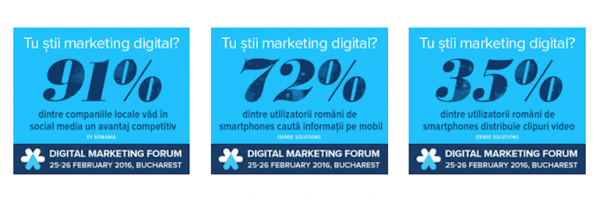
Do you know digital marketing? 91% of the local companies see in social media a competitive advantage
Do you know digital marketing? 72% of Romanian smartphone users look up information on mobile.
Do you know digital marketing? 35% of Romanian smartphone users share videos on mobile.
8. Don’t forget about the sponsors

Last but not least, let’s not forget about the sponsors or other partners you want to say a big thank you for helping you doing such a great event. So why not using a banner ad including your sponsors there.
A great example on how to insert your sponsors in your banner ads comes from SWSW.
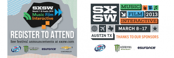
SXSW made a great example of thanking their sponsors to made this event happen. So they include them in their banner ads. Simple and effective.
9. Who is your target?

If you organize an event where you want attendees from a specific field, you can also use a simple message such as “The conference for dentists” – if you are interested in the dentistry industry. Or you can just say who is this conference for: “for social media marketers” or “for business managers”
For example, a very targeted message for who the conference is a good fit is on the following 2 banners:
Generate – the conference for web

AWWWARDS – For UX DESIGNERS and WEB DEVELOPERS
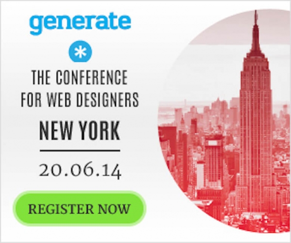
Simple and effective, right?
10. TEST and RETEST
I know that you already know that you need to test your banner ads to see which one is going better than the others. So this is just a friendly reminder :) and I only hope that you test your banner ads, find what style fits you and have a sold out.
Conclusion
So here we are, the 10 points you need to know before you design a banner ad for your conference.
Let me know in the comments what’s the most struggling point you can’t figure out when you design a banner ad for your event.

