Did you know that you can help boost your business by having the right poster design?
No matter what your business is promoting or how well-known or big your business is, advertisement posters are always a good idea.
This is because posters are visual representations of your business and are highly effective in converting viewers. That is, of course, if you have a great poster design idea.
If your poster idea is the perfect combination of memorable and catchy, you’ll have people talking about you everywhere.
There are lots of ways to advertise your business creatively, but one of my favorite and most cost-effective ways to advertise a business is by using posters. Today we’re going to go over quite a few strategies and poster making ideas so that you can have the best poster design that will make everyone want to buy your products. We all run out of creativity sometimes. That’s why I collected all of my favorite poster design ideas for you to be inspired by, in case you ever have designer’s block. I got your back.
When you start brainstorming for your poster design idea, you need to ask yourself why you’re making this poster. Is it a poster for brand awareness or is it an advertising poster? Once you’ve narrowed down your scope, you can take a look at these poster ideas and implement the one that matches your style best.
Table of contents
- Minimalist Design
- Typography posters
- Use lines to your advantage
- Experiment with different shapes
- Play with dimension
- Go vintage
- Make complimentary posters
- Contrast, contrast, contrast
- Take advantage of negative space
- Focus more on the graphics
- Embrace bright colors
- Use images and portraits
- Use colors to give off a certain vibe
- Place things in order of importance
- Be clever
- Break the rules
- Remember your audience
- Coordinate colors
- Use asymmetry
- Integrate humor
- Monochrome magic
- Utilize texture
- Infographics: Simplify and Shine
- Opt for a Collage Style
- Integrate your product into your poster
- Reasons Why Posters Can Help Boost Your Business
- Conclusion
1. Minimalist Design
As the saying goes, and how in many cases it stands true, “Less is more.”.
For the poster design idea, try using a simple background image and bold text, or vice-versa.
When you use a minimalist design, you will easily control where the attention of your viewers will go. Do you want them to focus more on the text or your image? Scale up your image and use a bold typeface in the negative space of your image to draw attention to the text. Minimalist posters are all about using minimal design for a maximum result. Here are some great examples of a minimalist poster design.
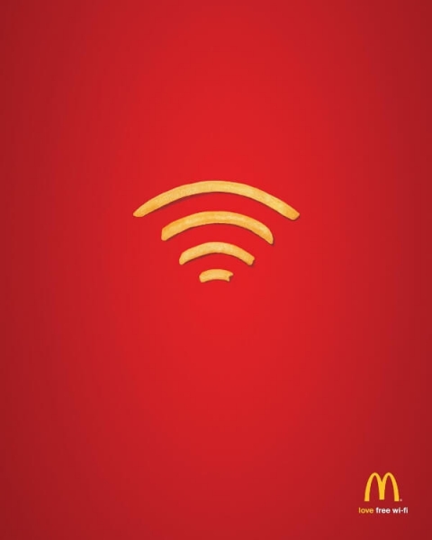
Mcdonald’s always has had great advertisement campaigns, and they were surely nothing short than excellent in this advertisement poster. The minimalist poster design for this one uses a single element and a bold background color. Because of their amazing brand awareness, people immediately recognize the red background and yellow-tinted french fries from McDonald’s. Try this minimalist approach for your next poster design project!
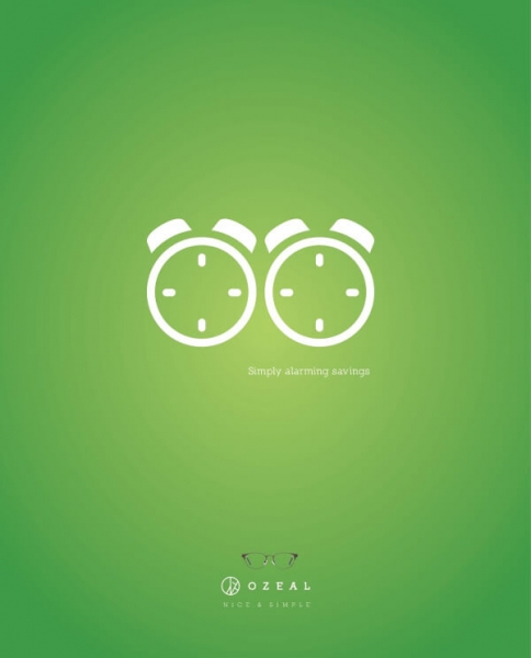
This is another great advertisement poster idea. The way they used alarm clocks to resemble glasses, and the way the slogan is about “alarming sales”, it all simply goes. And it rocks. Try a play on words and use minimal design elements to impress your viewers.
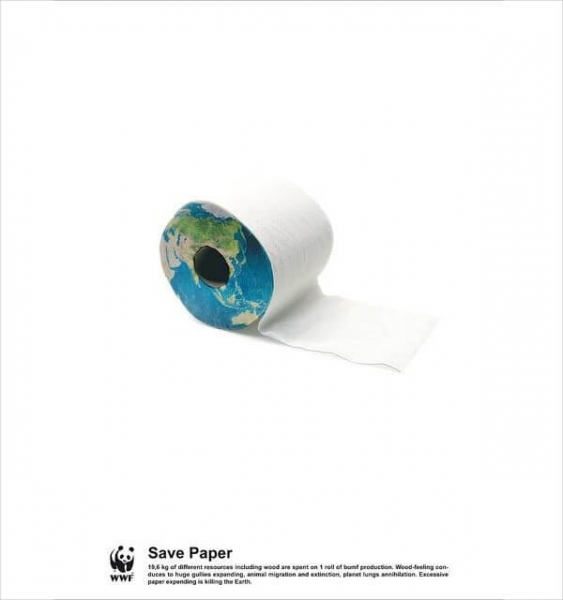
This poster is minimalist, yet awakening. This controversial poster idea really hits home. This is what you want in an awareness poster. Simple to understand, and makes the viewer really think about what you have to say. This kind of convicting poster will be in the minds and hearts of viewers, quite possibly forever. Hats off to WWF for using simplistic, minimal poster design, while still preaching such an important message in such a striking and impactful way.
2. Typography posters
You may have lots of things to say and convey to viewers, but you need to keep their attention long enough for them to take it all in. This means that you need none other than a typography poster.
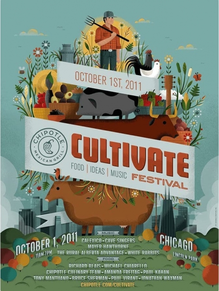
This is where you truly let your inner design out and let the creative, innovative poster ideas come out. Experiment with different bold colors and fonts. Go big, go small. Go bold, go thin. It’s all up to you. If you need inspiration on what fonts to use and you want something unique, we have 40 modern fonts that you need to use and can integrate into your new project.
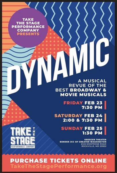
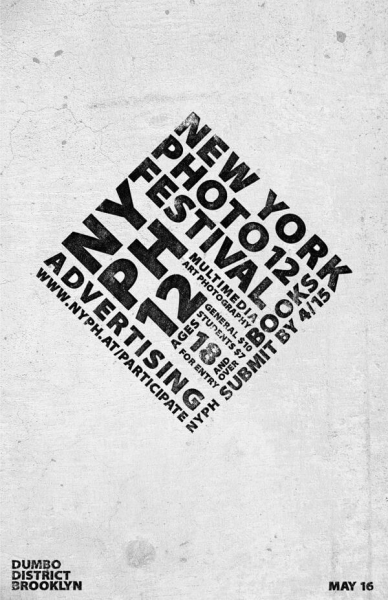
For the example above, when they use typography, they have a lot to convey. They have an event that they are trying to promote on this poster. So they need to deliver to the reader the date, time, location, actors, singers, etc, in a short time frame because you can lose the readers attention very quickly. Use bright complementary colors and an eye-catching design for this advertisement poster technique.
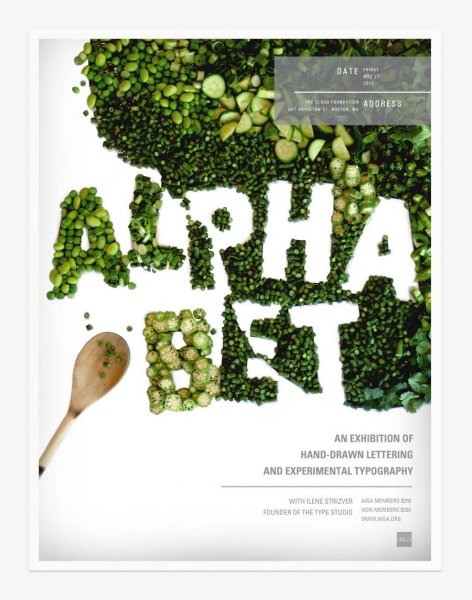
This poster is intriguing because of the typography. When making a poster, really tap into your creative side and experiment with all sorts of fonts, ideas, and typography. Just remember to keep your tone of voice when choosing a font. You can convey an attitude through your font. If you choose a bold font, you can convey seriousness. By using an italic serif, you can show people elegance. By choosing a font, you’re choosing a tone of voice. So choose wisely when creating your poster design!
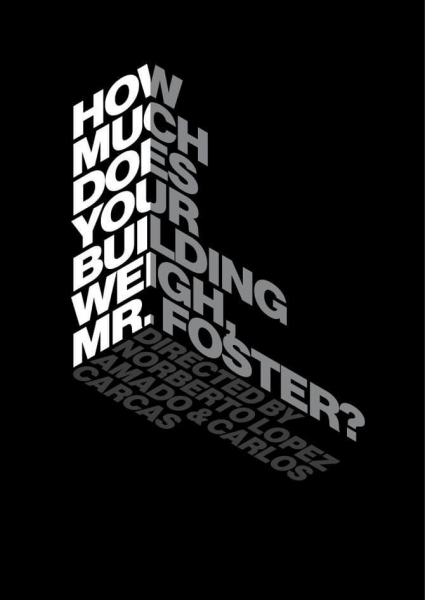
3. Use lines to your advantage
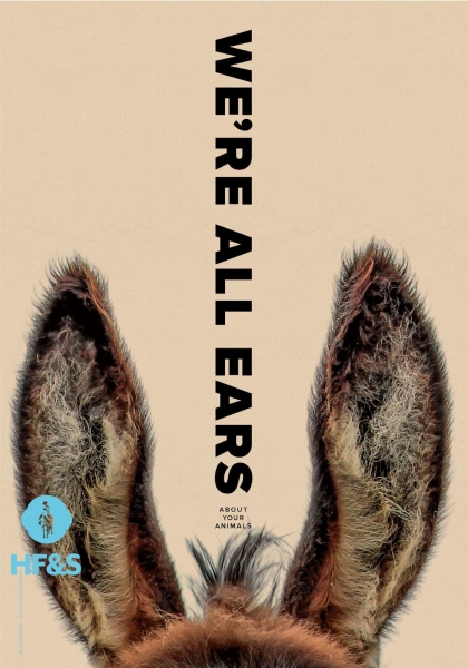
Just like in photography you can use the rule of thirds to decide where to place and frame your subject, you can use the same idea in creating a poster. By using invisible geometric lines, you can manipulate and lead a reader’s eye anywhere you want. Take for example this poster for animal feed.
source
Not only do they have a very clever combination of photo and message, but they also use a line of text to lead you to the image, which conveys the message perfectly. Invisible lines in typography can create the perfect visual harmony in poster design, and can also break up the design and bring a little pizzaz to the table. Use lines to lead readers to certain elements that you want them to see.
4. Experiment with different shapes
Another way you can lead and guide a reader’s eye is by using shapes. You can use a background full of shapes to draw attention to your organized chaos, or you can actually create shapes by using your text. The choice is yours when you create your own poster design.
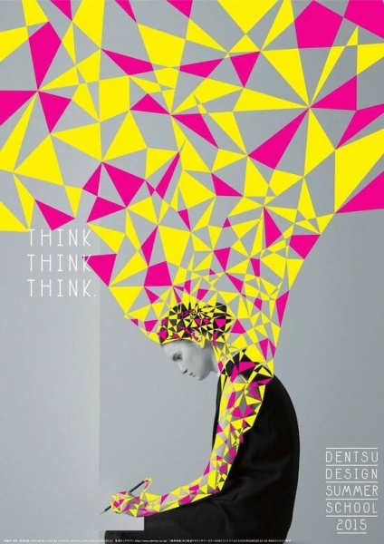
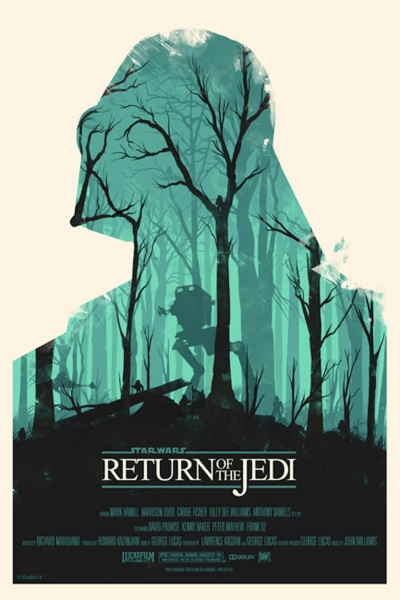
A good poster can be seen and recognized from far away. I love the way that star wars used shapes to showcase one of the main characters, while still giving clues as to what the new movie will be about.
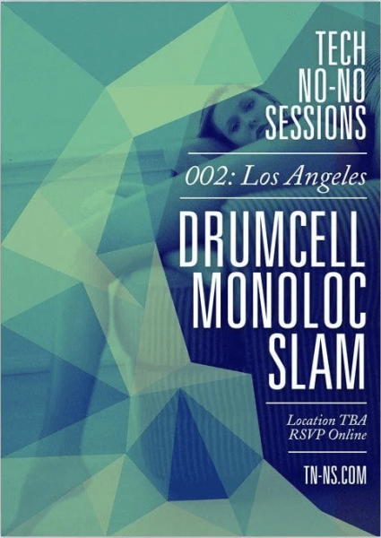
Here we have that chaotic yet organized, eye-catching poster design. The background is going to draw the attention of any viewer. Then the bold text overlayed on an interesting background will really make it pop. All of these techniques are great poster design ideas to follow in order to integrate shapes into your next advertising campaign
5. Play with dimension
Bring your posters to life by playing with the dimensions. Layer the text, the background, texts, shapes and more! Make your poster as interesting as possible by using this poster design technique. Highlight the most important elements of your poster and make them stand out so that they don’t get lost in the design. This is where using the line technique combined with the 3D technique comes in handy. Just check out the design below!
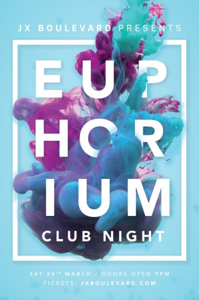
In the post above, you can see that the most important text is overlayed on a rectangular shape, bringing the text pop. This way, it doesn’t get lost. You’re still guiding the reader’s attention to where you want it to be.
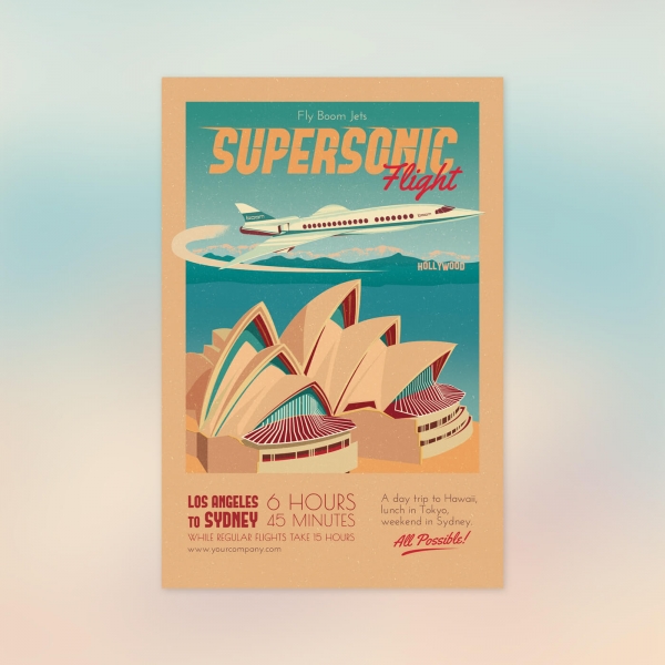
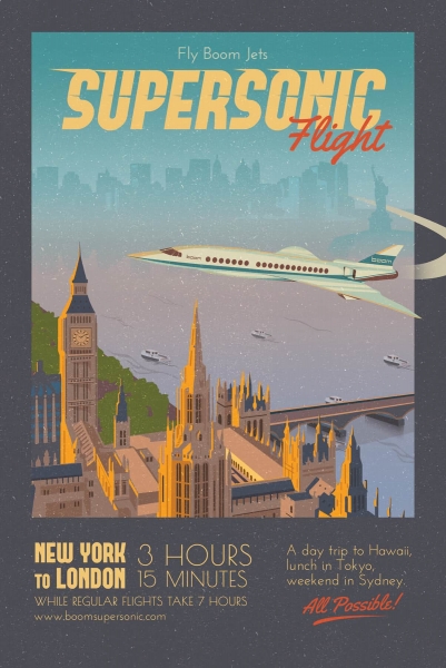
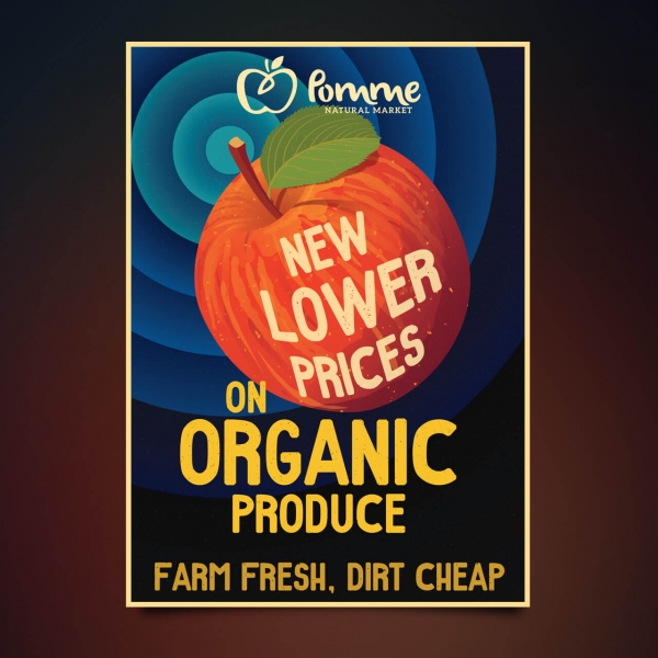
6. Go vintage
It’s no secret that vintage is a major trend right now. Between film photography and vintage clothes, and there’s no exception for your new posters design idea.
Check out some of these poster design ideas and be inspired by them!
7. Make complimentary posters
To really stand out of the crowd, make a poster and split it in half. Let’s say you have an event that has multiple dates. Create a series of posters that complement each other. Split the poster down the middle and you will now have two different posters where you can showcase two different dates. Let me show you exactly what I mean.
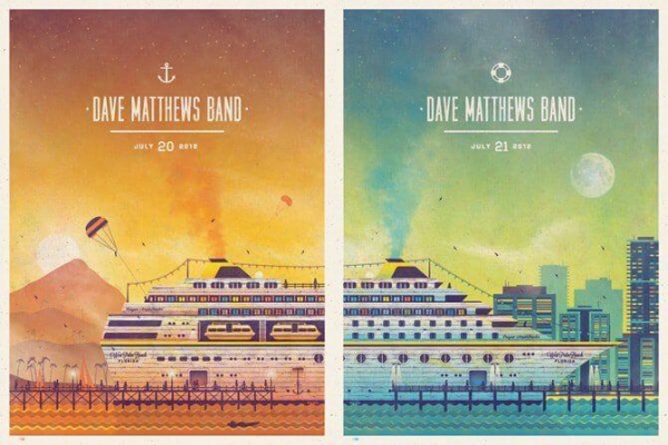
By following this design idea, you can create some serious brand awareness. People will begin to recognize your design and when they see the second poster, they’re more likely to remember what you had to say.
8. Contrast, contrast, contrast
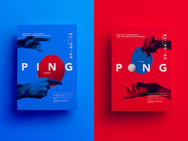
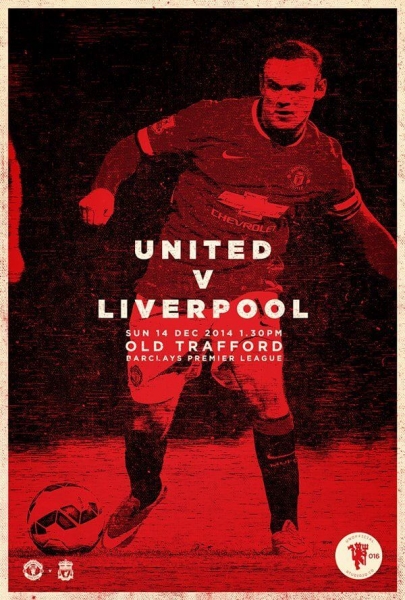
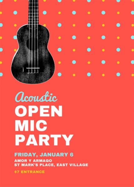
You can make your poster stand out by using contrasting colors. Pair complementary colors or use two completely opposing colors. Use some really bright colors, combine black, white, and bright colors, or just go classic black and white! There are endless color combination choices and there is no right or wrong. Experiment around with this poster design idea and see what works best with your advertising poster.

9. Take advantage of negative space
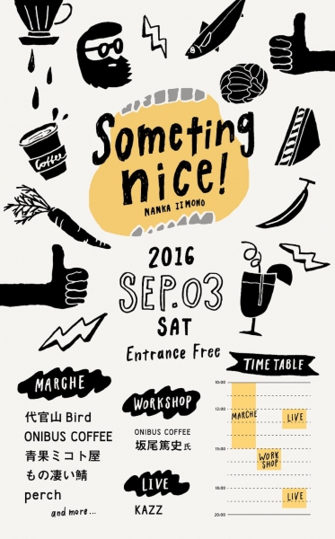
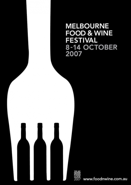
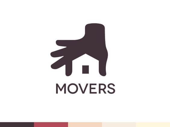
Where there’s negative space, there’s an opportunity. Negative space, as you probably know, is an empty space in an image or design. Whenever there’s negative space, that’s typically a good place to consider placing text. This is because the text will be clear and easy to read, and the eye will be naturally drawn there. We have an entire guide on how you can add text to images and the same concept can be applied to poster design ideas. Check out some of these awesome designers who did awesome at taking advantage of the negative space on their poster designs!
10. Focus more on the graphics
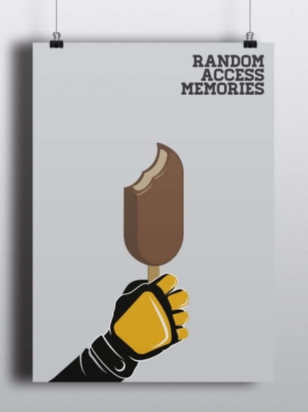
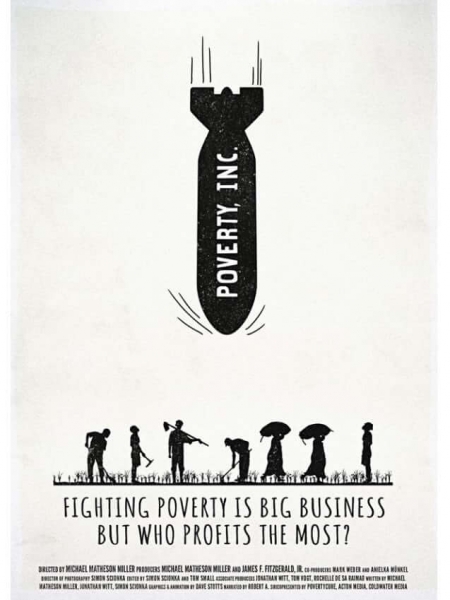
Sometimes you can convey a message clearly without using words. That’s why sometimes if you don’t know what to say, you should just focus on your design. You can promote product minimally, or you can make a powerful message.
11. Embrace bright colors
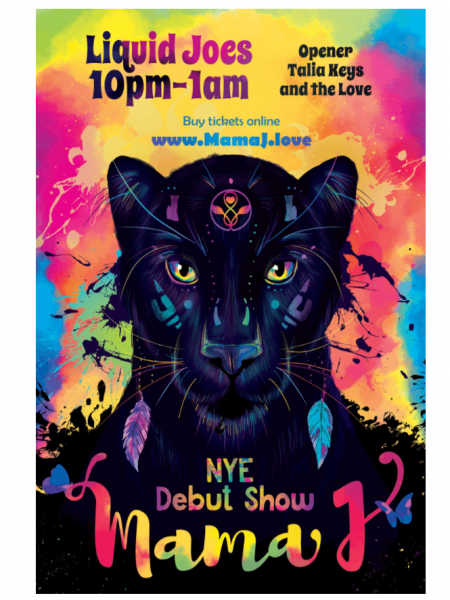
We talked a lot about the whole “less is more”, but you can totally go for the “more is more” effect. Take a chance with colors and start mixing bright colors together. Stand out of the crowd and mix unexpected colors together. Bright colors will definitely draw attention to your poster, so try out this technique.
12. Use images and portraits
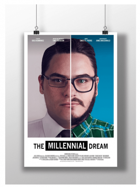
A simple poster design that is easy to achieve is the image-centric one. You can add an image that describes your campaign to your poster, add some text, and call it a day. This poster design idea is truly easy to accomplish but can look effortlessly elegant. Again, you can use images to spread a powerful message, or you can make a simple poster design. The choice is yours. This is definitely a technique I’d recommend trying when you have no inspiration.
13. Use colors to give off a certain vibe
You might know that colors are associated with feelings and emotions in our brains. Use this information to your advantage and use corresponding colors to match the mood you’re trying to portray. Red makes you start to have an appetite, and blue gives a sense of safety. Research some color and emotions correlations and use the right colors for your poster campaign!

14. Place things in order of importance
You need to create a sense of visual hierarchy. Place your most vital elements of the poster and things you want people to know at the very top, and work your way down with elements and information that are secondary. The results can also be very visually pleasing if you play your cards right.
15. Be clever
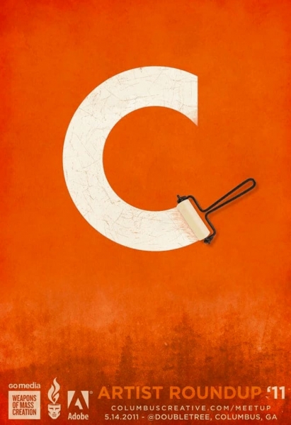
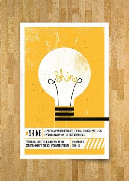
Everyone loves a good pun or play on words. Or at least, I tend to think so. Try to use an illustration that matches your message or even a pun in your graphic design.
Here are some examples of what I mean

16. Break the rules
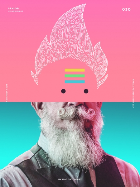
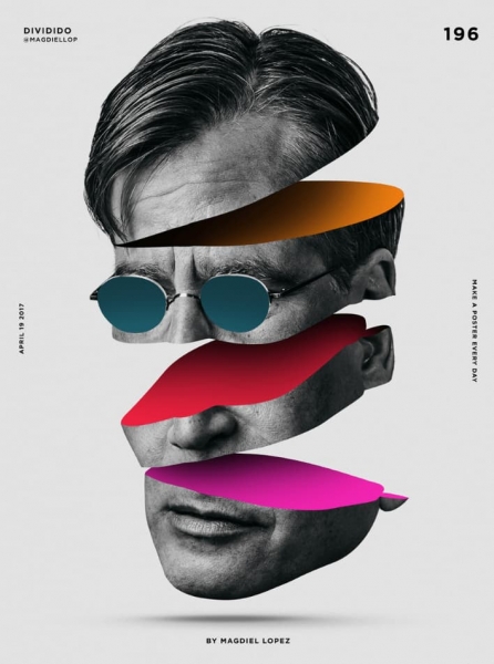
The last thing you wanna do is make a mainstream design. As a creator, you need to break the mold and break the rules. Combine reality and graphic design. Do something strange. Someone will see the value in your design. Don’t just conform to mainstream design. Be uniquely you when you create your poster to draw the right crowd.
17. Remember your audience
Who are you designing for? What kind of crowd are you trying to attract? You need to make a design that your audience will understand. You might not just want anyone to understand your design. Come up with a design that your target audience will appreciate and enjoy.
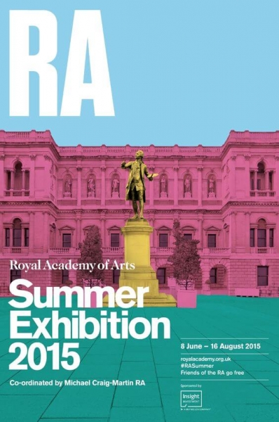
18. Coordinate colors
If you’re going to be using an image or one of your designs, match the font color with the main element of your image. To find the best matching color, use the color picker from whatever editor you’re using to create your design. This color combination technique will definitely get the full attention of any viewer.
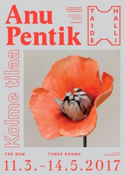
source:Tumblr
19. Use asymmetry
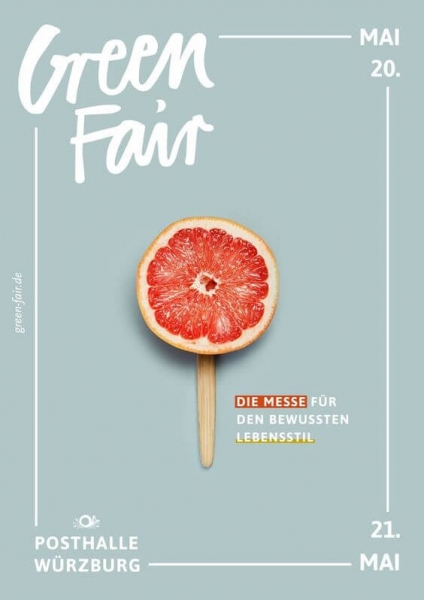
Everyone loves a visually pleasing and aesthetic design. Use lines and the ruler in your editor to create a design that is irresistible to look at. Make sure your focal point still stands out. I recommend that you put your main element in the center of your poster design, as the example below shows.
20. Integrate humor
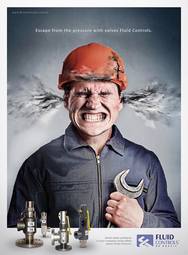
Humor can be a powerful tool in design. A witty tagline or a clever visual pun can make your poster memorable and shareable. Make sure the humor aligns with your brand and resonates with your target audience. A humorous approach is excellent for informal events, social media campaigns, or brands with a playful identity.
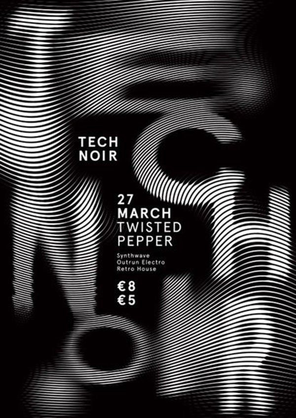
21. Monochrome magic
A monochrome color scheme can create a striking and elegant design. Choose a single color and use its various shades and tints to create contrast and interest. This minimalist approach can be very effective in conveying a clear and sophisticated message, suitable for high-end products, art exhibitions, or corporate events.
22. Utilize texture
Adding texture to your poster can create a tactile and engaging visual experience. Whether through digital effects or actual materials, texture can add depth and dimension to your design, making it more visually appealing. Textured designs are great for craft fairs, music events, or any setting where a sensory experience is a key element.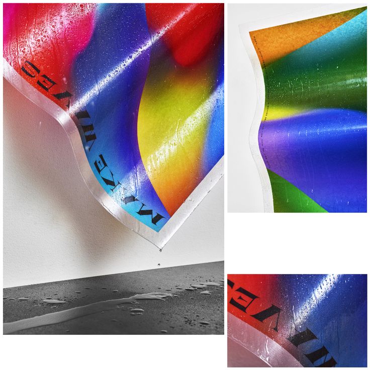
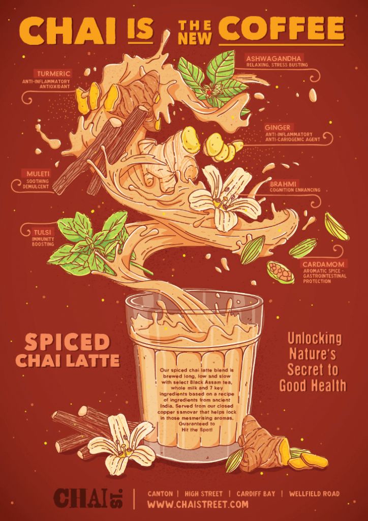
23. Infographics: Simplify and Shine
Infographics are a great way to present information clearly and attractively. Combine visuals with concise text to convey data, processes, or timelines effectively. This approach is ideal for educational or informational posters, making complex information accessible and engaging for your audience.
24. Opt for a Collage style
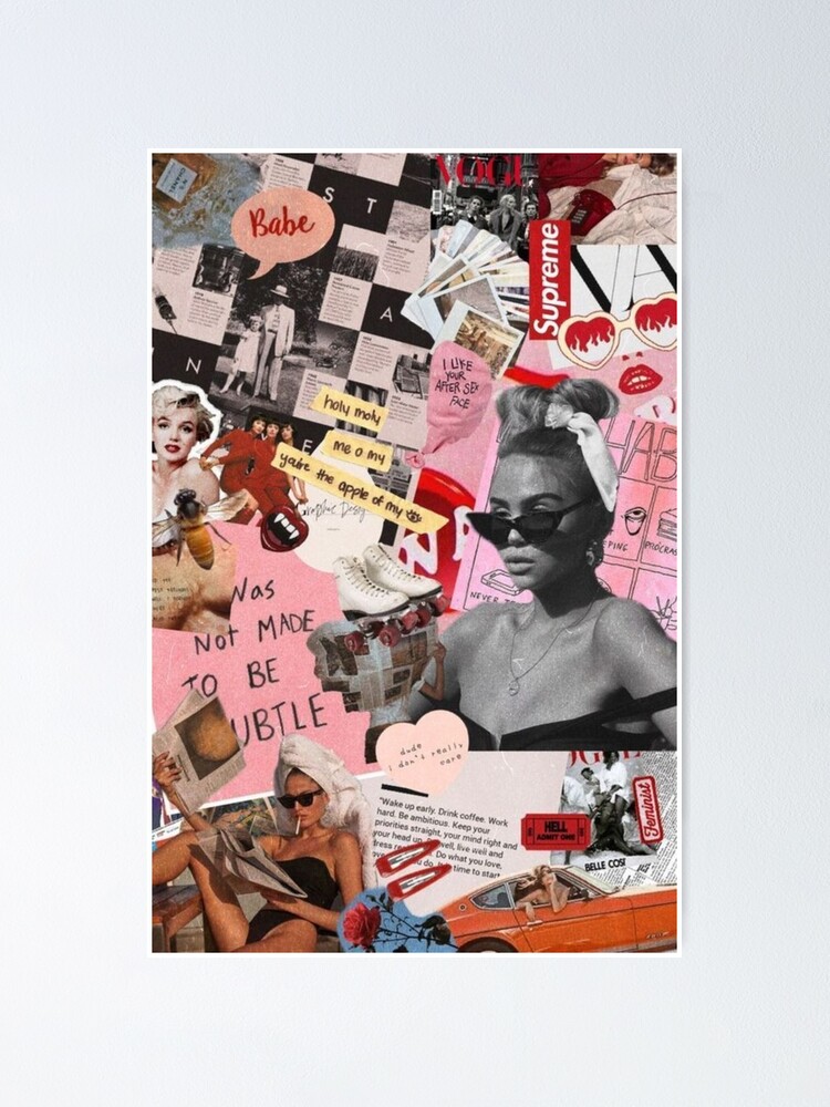
Collages can bring together various elements such as photos, textures, and illustrations into a cohesive design. This eclectic style can be visually stimulating and can convey a complex narrative in a single image. Collages are perfect for music posters, travel promotions, or any campaign aiming to tell a multifaceted story.
25. Integrate your product into your poster
And finally, we have reached our final advertisement poster design idea.
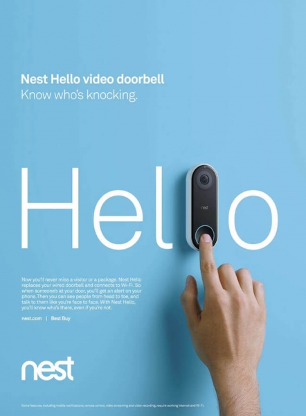
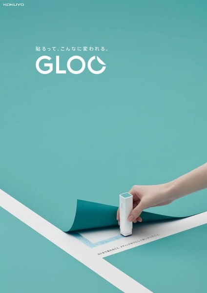
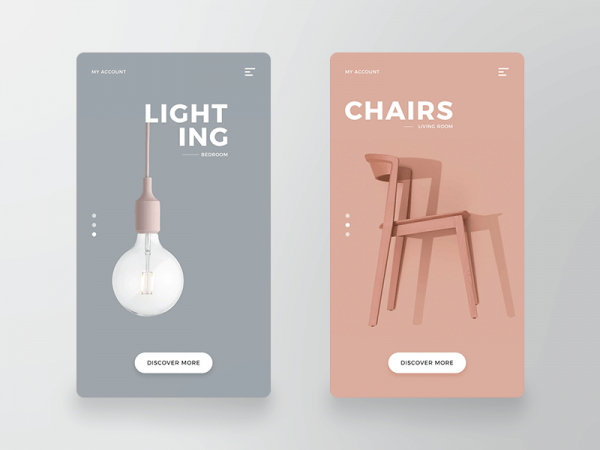
It’s time you combine your product images with graphic design. Everyone loves a flat poster design combined with a 3d product image. If combined flawlessly, this poster design will surely be hit. Make sure the image of your product is very high quality. You should also try to make your product stand out and be the focal point of the poster design.
Reasons Why Posters Can Help Boost Your Business
When you have the right poster, you can use your brand to inspire someone. When you put your message out there and have hundreds and thousands of people seeing your poster, you can leave them with an inspiring CTA. When you have a great, converting poster, you can boost interest in your brand and build authority for your brand.
When someone sees your advertisement poster hanging somewhere, whether on the street or on the side of a grand building, you have to opportunity to connect with them. When you successfully connect with a potential client, you immediately boost their interest in whatever you have to offer; whether that be a concert, your business, your services, or whatever else.
Another great thing about advertising poster is that you can make a unique and interesting poster series that people can recognize anywhere. By creating a series of similar and relating posters, if you use unique brand and poster design elements, people will start to recognize your brand. It’s a great brand awareness strategy that is really worth a try.
Advertisement posters can also be very cost-effective for big and small businesses alike. If you get to post your posters in a busy and prime location, you could have thousands of people see your poster ad. People have developed a type of ad-blindness online, and it’s refreshing for people to see an interesting, eye-catching advertisement in real life.
Conclusion
Because people want a break from online advertising, spend extra time in creating an amazing poster design to give people a refreshing sense of advertisement that they actually enjoy.
You don’t need to be a professional graphic designer in order to benefit from a professional poster design.
By using Creatopy, you can create amazing visual designs and posters in just minutes. Our banner maker is friendly for all designers, advanced and beginners alike.
Sign up with Creatopy for free today and begin designing your amazing poster for your next advertising campaign!
We really hope that you found at least a few inspiring poster-making ideas in this article. If you did, let us know in the comments which poster design was your favorite and which one you plan to use in your next advertising campaign!

