In 2025’s saturated digital landscape, the difference between banner ads that convert at 15% versus 1% often comes down to design fundamentals. As AI design tools become standard, understanding these principles gives you the edge in creating visuals that cut through algorithm-curated feeds and capture genuine human attention.
While no one can answer this question in just one paragraph, you should know that there are a few elements and principles of design that can make your work much more manageable. So, what are the elements of design?
Table of contents
- What are the elements of design?
- What are the principles of design?
- Understanding the elements of design
- Exploring the principles of design
- The relationship between elements and principles
- FAQ
- Final thoughts
A. What are the elements of design?
The elements of design are the parts that define the visual, the tools and components that a person uses to create a composition. In other words, they represent the base of graphic design.
B. What are the principles of design?
The principles of design are fundamental concepts that guide the arrangement and organization of elements within a visual composition. These principles help designers create aesthetically pleasing, balanced, and effective designs.

These elements and principles of design represent a set of guidelines that have the purpose of helping you create aesthetically pleasing visuals.
The most significant difference between design principles and elements is that the latter can be labeled as rules, while elements are the components that are going to help you follow those rules for the best design outcome.
And even though rules can be broken, they have been created for a reason.
Design is all about carefully combining design elements and using the right principles to create a visual representation of an idea.
In today’s article, I will walk you through some of the most essential design elements and principles of design that will hopefully provide the inspiration you need for your next projects, whether you want to create ads manually or by using an AI marketing technology.
C. Understanding design elements
1. Line
Lines are the most basic element of design, and they make up pretty much everything. They can also be defined as linear marks that can describe a shape or outline something.
You’ll often see that lines are also used to create perspective or evoke a certain feeling. They can be thick or thin, vertical, horizontal, or diagonal, or they can create texture. A straight line can send the feel of order and neatness, while a wavy line can create movement.
A technique that’s often used with lines is directing the eye towards a particular area of a design. You can play around with this type of element and see how you can implement it in your visual materials.
The great thing about using a design tool such as Creatopy is the fact that you don’t need to create lines from scratch. In the Elements section, you can now find 80 new, end-to-end scalable, flexible lines and arrows.
These elements will help you create more diverse content, such as infographics, mind maps, flows, or routings. You can also use them as connectors or separators.
The design possibilities are endless thanks to these elements.

2. Color
Color is one of the most important elements of design because they can evoke certain emotions. It’s well-known that the color red is usually associated with love, passion, or anger.
There are also cultural differences that you need to take into account when using colors in design. For example, a color that’s happy in a particular country can send negative emotions in another one.
Also, something as simple as changing the hue or the saturation can send a different type of feeling. The key here is to know a little bit of color theory.
Color has three different properties:
- Hue, which is the color name;
- Saturation refers to how intense the hue is;
- Value refers to the lightness and darkness of the hue.
You can use color as a background, or to support other elements in your design. Combining colors between them is the key to creating a visual that matches your brand.

3. Shape
I talked above how lines can create shapes, among other things. By reversing this, we can define shapes as something enclosed by lines, which are its boundaries.
Shapes can be geometric (rectangle), realistic (animals), or abstract (icons), and they have two dimensions: height and width.
If you want to suggest feminity, then you can use curvy shapes such as circles. If, on the other hand, you want to induce a more masculine feeling, then use angular shapes.
The Elements section in our banner maker has a Shapes category as well, where you can find anything from arrows to stars, ribbons, labels, badges, frames, speech bubbles, or blobs.

4. Space
You’ll often hear people refer to space as white space or negative space in graphic design, which can be defined as the space between or around objects, known as positive space.
If you want to be creative with your designs, you can leverage negative space by manipulating it and forming an object, a shape, or an animal. When you use it strategically, you can genuinely create stunning designs that draw people’s attention. By skillfully balancing positive and negative space, designers can create compositions that are visually compelling and dynamic, capturing the viewer’s interest and imagination.

5. Symmetry
According to science symmetry is one of those things that us, humans, find extremely pleasing, and this happens because we love familiarity and when we see something that has symmetry in it, it’s easy for us to recognize it. It’s also one of the shortcuts we use to make sense of the world around us.
There are plenty of brands, such as Starbucks, Target, or Chanel, that use symmetry in their logos, and not only in their designs.
However, note that there’s a fine line between symmetry and making it seem like the other side of the design was copied and pasted from the other one. It’s recommended not to strive for perfect symmetry but to add elements that suggest this idea.

6. Scale
Scale refers to the size of an element in relation to another one, and it can help bring balance, proportion, and hierarchy in any design.
Usually, scale is used in design to represent the accurate size of an object or to emphasize the difference in size between two objects. However, if you want to create something that you will make an impact on your audience, then it’s best if you forget about scaling objects according to reality.
For example, you can make an elephant dramatically smaller than a cat and make the cat the size of a dinosaur.
If you want to draw attention to a particular object, then this is the way to go.
7. Texture
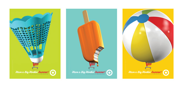
Texture refers to the surface quality of a design, which can be smooth, rough, glossy, etc. It can be physical or visual. For the purpose of this article, we’ll talk about visual texture.
Clean designs are nice and all but adding a little bit of texture can make it pop even more. You can use it to accentuate a specific part of your visual, so you draw people’s attention to the dominant part.
The use of a font or a background image that mimics a particular texture is going to help you create a memorable design.
The rise of haptic feedback and sensory marketing has transformed texture from a visual element into a multisensory experience. Modern banner ads on tactile-enabled devices can now trigger subtle physical sensations that correspond to visual textures, creating a deeper connection with potential customers.
8. Direction
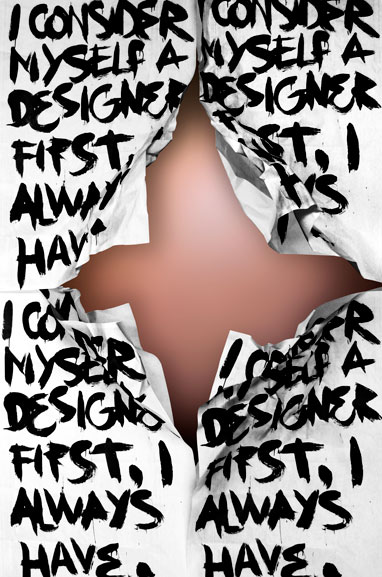
Direction not only gives the illusion that there’s movement in your design, but it also lets people know where to look and how to move their eyes across the visual.
Generally, the human eye starts with the top left of a page and then gravitates towards the bottom right corner so you can take advantage of this pattern whenever you’re designing.
9. Form
In the context of design, the term “form” refers to more than just an object’s outline or shape. It encompasses all three dimensions—height, width, and depth—to create a tangible and substantial presence. This adds depth and meaning to visual compositions, turning them into fully realized entities that occupy physical space. Form breathes life into static elements, transforming them from flat representations into dynamic entities that demand attention and elicit emotional responses.
Form plays a vital role in making shapes look more substantial and grounded, giving them a sense of weight and presence. This helps objects feel more natural and tangible as if they are within reach. Tactile realism not only enhances the visual appeal of designs but also creates a stronger emotional connection between the viewer and the subject being portrayed. Whether art, architecture, or product design, the mastering form allows designers to create experiences that appeal to our senses and aesthetic sensibilities.
Designers can manipulate perception by altering their designs’ form. They play with light, shadow, and perspective to create illusions of depth and dimensionality. This artistic technique adds layers of visual complexity to compositions, making them more attractive. By strategically arranging forms, designers can guide the viewer’s gaze, evoke emotions, and shape narratives. In essence, form is the cornerstone of spatial expression, allowing designers to move beyond the 2D canvas and unlock the limitless possibilities of the third dimension.
10. Size
Size is an essential aspect of design that refers to objects’ physical dimensions and proportions. It determines how prominent and impactful they appear within a composition. Designers can use size to establish visual hierarchy, emphasize certain elements, and create balance. Objects of different sizes draw varying levels of attention, guiding the viewer’s focus and shaping their perception of the composition’s focal points and overall structure.
Varying the size of elements in a composition creates a dynamic interplay of scale that draws the viewer’s attention to significant focal points while imbuing lesser elements with subtler roles. More prominent elements assert dominance and prominence, serving as anchors around which the composition revolves. More minor elements assume supporting roles, providing context and nuance. This deliberate juxtaposition of sizes cultivates a sense of balance and harmony, ensuring that no aspect overwhelms or diminishes the overall impact of the design.
In addition, designers can use size manipulation to strategically create visual stories and guide the viewer through a curated journey of discovery and engagement. By placing elements of different sizes side by side, designers can develop a sense of rhythm and movement in the composition, inviting viewers to explore the visual landscape with curiosity and intrigue. Ultimately, size acts as a conductor, orchestrating the different visual elements of a composition to evoke emotions, convey messages, and elicit responses from the audience. Size plays a crucial role in distributing visual weight within a composition, influencing the viewer’s perception and interpretation of the design.
Related articles:
Geometric Shapes in Design: How to Use Them Creatively
How to Use Geometric Patterns To Create Brilliant Designs
30 Amazing Graphic Design Tips Professional Designers Want You to Know
D. Principles of Design
1. Balance
You know how sometimes you look at a design, whether it’s a poster or a banner ad, and everything feels right about it? That means the composition is balanced.
Balance is all about how your elements weigh in the visual, and it can be achieved through symmetry, asymmetry, or radial symmetry, including asymmetrical balance.
Shapes, colors, objects, textures, or values can create balance in a design. This is an essential principle because imbalance can cause discomfort for the viewer.

Sometimes, creating balance can simply mean cropping an image and placing it on one side of your design, leaving the other side empty for other elements. Dividing the space like this creates a harmonious effect through symmetry, and it doesn’t require advanced design skills.

2. Contrast
When you want to emphasize key elements in your design and make it pop, then using this principle is one of the best things you can do. Contrast helps you grab people’s attention and generate interest in your visual by making an object more distinguishable than the other objects present in the design.
A good example of contrast is negative space or the use of complementary colors, which is going to redirect someone’s attention to a particular portion of the visual. Other common forms of contrast are dark vs. light, large vs. small, or thick vs. thin.
Another significant advantage of using contrast is the fact that it improves the design’s readability and legibility.

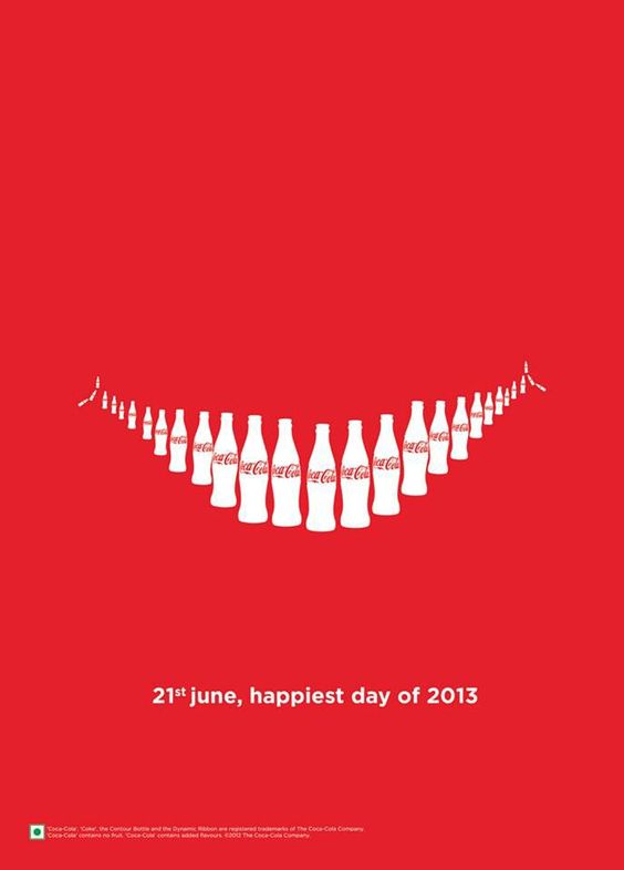
3. Repetition
Repetition is boring and monotonous only when there’s no variation. When some degree of variation is added to a design where certain elements are being repeated, it changes everything.
You can repeat colors, fonts, shapes, and other objects to create consistency and unity. Moreover, repetition is a crucial principle in branding because it’s going to keep your design on the same level.
4. Emphasis
Emphasis is all about highlighting the most important area in your design. For example, if you want to accentuate the headline in your visual, then make sure to use a font size that will stand out and will draw people’s attention. Similarly, you can utilize a bold color to make the text pop.
If you want to make a particular element more prominent, you can use scale to make it bigger or smaller than it is in real life.
Let’s say that you want to use a bunny in your design. You can make it look humongous, or you can make its eyes look bigger and bolder.

5. Movement
You’ve probably heard before someone explaining a piece of art as having a lot of movement. Even though a visual is static, it can still give the feeling as if the design is actually moving.
For movement, you can use shapes, lines, edges, or color, the purpose being to direct the human eye.
When designing something, you can take advantage of certain elements to control how the human eye travels over a design.

6. Unity
Unity is all about how the different elements of your design come together and form a relationship. You’ve most likely seen before designs that give you the impression that the fonts and everything else were chosen at random, so there wasn’t any sense of unity.
All the visual elements you use in your design should be connected to one another. Also, unity is going to help you communicate your message in a clear, organized, and concise manner.

7. Rhythm
The same way spaces between musical notes create rhythm, spaces between design elements can give rhythm as well to a visual.
Visual rhythms can be regular, flowing, progressive, random, and alternating.
Regular rhythm is when the spacing between elements is the same. The flowing rhythm gives a sense of movement through curves and bends. Progressive rhythm is all about changing and iterating with each step. The random rhythm doesn’t have any clear pattern. Alternating rhythm uses a set of graphic design patterns.
E. The relationship between elements and principles
The connection between the elements and principles of design is a fundamental aspect of creating visually appealing and effective designs across different mediums. Design elements are the essential building blocks designers use to create their work. Meanwhile, design principles serve as guidelines for organizing and arranging these elements to achieve the desired outcome. Designers must understand how these elements and principles interact with each other to effectively communicate their message and evoke specific emotions or responses from their audience.
Here’s a breakdown of the relationship between elements and principles of design:
Elements Support Principles: Design elements—such as line, shape, color, texture, space, and form—provide the raw materials designers manipulate to convey their message. These elements serve as the foundation upon which design principles are applied.
Principles Guide Element Arrangement: The principles of design—such as balance, contrast, emphasis, movement, pattern, proportion, rhythm, and unity—act as guidelines for organizing and arranging the elements within a design, helping to create visual interest. Designers use principles like balance to distribute elements evenly or emphasis to draw attention to specific areas.
Synergy and Harmony: When elements and principles work harmoniously, they create visually pleasing and cohesive designs. For instance, using complementary colors (an element) to create contrast (a principle) can enhance the overall impact of a design, thus creating visual interest.
Balance and Unity: Elements and principles often work together to achieve balance and unity within a design. Balance ensures that elements are visually distributed throughout the composition, while unity ties all elements together to create a cohesive whole, captivating the viewer’s attention and creating visual interest.
Emphasis and Contrast: Elements like color, size, or typography can create emphasis within a design, while principles like contrast help highlight this. By strategically contrasting elements, designers can direct the viewer’s attention to specific focal points, enhancing the overall effectiveness of the design and generating visual interest.
Movement and Rhythm: Elements like line and shape can be arranged to create a sense of movement within a design, while principles like rhythm help to establish patterns and repetition that guide the viewer’s eye through the composition. This relationship adds visual interest and flow to the design, making it more engaging and dynamic.
In summary, the relationship between design elements and principles is symbiotic. Elements provide the building blocks, and principles offer guidelines for organizing and arranging those elements. By understanding and leveraging this relationship, designers can create visually compelling and impactful designs across various mediums.
F. FAQ
What’s the difference between design elements and design principles?
Design elements (line, shape, color, etc.) are the basic building blocks of a composition, while principles (balance, contrast, rhythm, etc.) are guidelines for organizing those elements effectively.How does contrast improve a design’s effectiveness?
Contrast highlights differences between elements (e.g., light vs. dark colors, large vs. small shapes) to create visual interest, guide attention, and emphasize focal points.Why is white space critical in modern design?
White space (negative space) reduces visual clutter, improves readability, and helps prioritize key elements, making designs feel intentional and professional.How do balance and unity work together in compositions?
Balance ensures elements are visually distributed (symmetrically or asymmetrically), while unity creates harmony by tying elements together through consistent colors, shapes, or patternsCan design principles like hierarchy improve user experience
Yes. Hierarchy organizes content by importance (e.g., larger headings, bold colors) to guide users intuitively through interfaces, websites, or ads, enhancing usability.
G. Final Thoughts
Graphic design has its principles and rules that you generally need to follow to create stunning visuals. You can learn some things by following these principles and using the elements I talked about, but in the end, you’ll also do a lot of learning on your own.
Trust your instinct, take every principle with a grain of salt, and feel free to dismiss any rule when you feel like it doesn’t make sense to apply it.
As a beginner, however, these elements and principles of design will definitely come in handy and will help you develop a personal style.
If you have any other tips you’d like to share, feel free to leave us a comment.


