There’s no need for us to find a reason or specific explanations when it comes to art. It can simply be Art for Art’s Sake, like many writers and artists believe(d).
Beauty exists. It’s everywhere, and it’s subjective. We don’t have to find completion in it. But, as humans, we do search for balance.
And here’s where the Golden Ratio comes to help whenever we want to create something harmonious.
The Golden Ratio is an example that math can help fine arts. This doesn’t mean that just using this theory will suddenly make everything look beautiful, but it will be of great help for everyone who’s looking to achieve equilibrium.
So, let’s dive right in, starting with the Golden Ratio definition.
Table of Contents
2. What’s the origin of the Golden Ration term?
3. What is the difference between the Golden Ratio and the Fibonacci Sequence?
4. How to create the Golden Ration by yourself?
5. How can you use the Golden Ration in graphic design?
6. Where can you find the Golden Ration being used?
7. What tools can you use for the Golden Ratio calculation?
8. Conclusion
1. What Is the Golden Ratio?
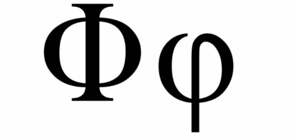
The Golden Ratio also referred to as the Golden Mean or Divine Proportion is a mathematical ratio with its roots in the Fibonacci sequence. This ratio, approximately equal to 1.618, is used to create harmonious compositions in various fields, including design projects, paintings, illustrations, photography, music, and other compositions that thrive on balance. The Golden Ratio symbol is the Greek letter ϕ (Phi) or τ.
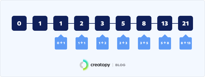
In the 1200s AD, the mathematician Leonardo Di Pisa, known as Fibonacci, made calculations resulting in a series of numbers called the Fibonacci sequence. The sequence begins as follows: 1, 1, 2, 3, 5, 8, 13, 21… Starting with 0 and 1, each subsequent number in the sequence is the sum of the previous two numbers. As the numbers in the sequence grow larger, the ratio between them approximates 1:1.618.
2. What’s the origin of the Golden Ration term?
In 1815, the mathematician Martin Ohm coined the term Golden Ratio in his study “Die Reine Elementar-Mathematik” (The Pure Elementary Mathematics), where he addressed this for the first time as “goldener schnitt” (golden section).
Before this, the Golden Ratio was called the Divine Proportion by Luca Pacioli and Leonardo da Vinci.
Earlier, I mentioned the Phi number, which comes from the Greeks. This number was first mentioned in Greek history in a book by Eukleides of Alexandria, where he called it the “extreme and mean ratio.”
Even though the Greeks are known for their mathematical calculations, the connection between the letter Phi and the Golden Ratio was made only in the 1900s.
3. What is the difference between the Golden Ratio and the Fibonacci Sequence?
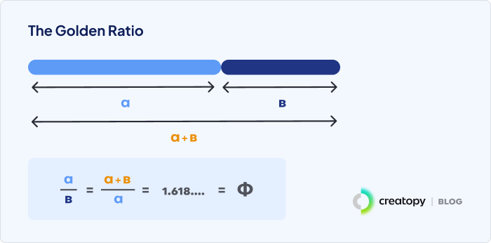
The Fibonacci sequence isn’t exactly the same as the Golden Ratio but is very similar, often leading to confusion between the two terms. When creating the Golden Ratio scheme, we use separation to show its purpose. The Golden Ratio calculation involves dividing two quantities so that the ratio of the sum of the quantities to the larger quantity is the same as the ratio of the larger quantity to the smaller one. This results in the Golden Ratio number of 1.618, called Phi. While the Fibonacci sequence starts from 0 and grows to larger numbers, forming golden rectangles separated into squares with Fibonacci numbers inside each one, the Golden Ratio is characterized by its extreme irrationality and beauty. Irrational numbers cannot be represented by fractions and have an infinite increase, making the Golden Ratio challenging to observe in nature, though it can often be spotted as the Golden Ratio Spiral.
4. How to create the Golden Ration by yourself?
Because the Golden Ratio is approximately equal to a 1:1.618 ratio, it can be illustrated using a Golden Ratio Rectangle. From a mathematical point of view, you can take a square and multiply one side by 1.618, and you’ll get a balanced rectangle. You can also create it out of shapes. Here’s how:
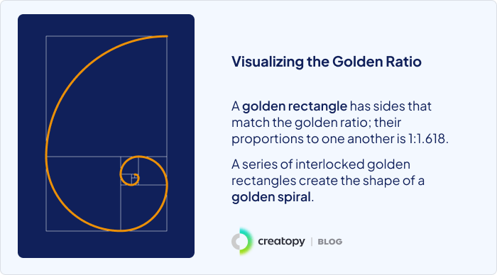
Golden Ratio Rectangle
The Golden Ratio Rectangle has a shape from which, if you cut off a square with its side length equal to the shortest side of the rectangle, the part of the rectangle that’s left has the same proportions as the original rectangle. You can repeat this action as many times as you wish, and the rectangle ratio will remain the same.
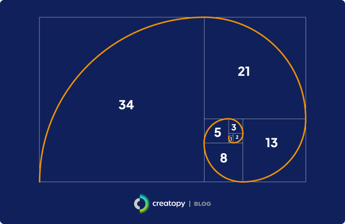
Creating the Golden Spiral
If you keep cutting the Golden Ratio rectangle to get squares out of it, you’ll end up with progressively smaller squares, which will be your base for the Golden Ratio spiral. Draw an arch in each square to form the Golden Spiral. You can even draw circles inside the squares, and they’ll all be in balance with each other, following the 1:1.618 ratio.

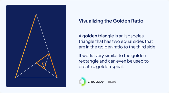
Golden Triangle
A golden triangle is an isosceles triangle with two equal sides that are in Golden Ratio to the third one. You can create the Golden Spiral based on the resulting diagram by continuously cutting the golden triangle into smaller triangles.
5. How can you use the Golden Ration in graphic design?
The Golden Ratio can be applied in several key areas of graphic design to enhance visual appeal and effectiveness:
Layout and Composition
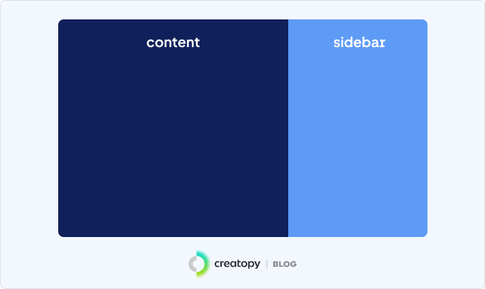
Placing elements on a layout with careful consideration of spacing and balance is crucial for a pleasing user interface. Applying the Golden Ratio can simplify this task. Many websites follow a simple two-column layout, and the key is knowing how to make it visually appealing and where to place important information. Using the golden rectangle as a guide, designers can create balanced and harmonious compositions without overcomplicating the grid.
Typography
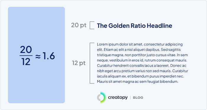
The Golden Ratio can also be applied to typography to achieve the perfect balance in text sizing and arrangement. Start by choosing a dimension for your body text, then multiply it by 1.618 to get the size for your headlines. For instance, if you choose 12pt for the body text size, multiplying it by 1.618 gives you 19.416, which can be rounded up to 19 or 20. This simple application of the Golden Ratio ensures harmony and visual appeal in your typography.
Logo Design
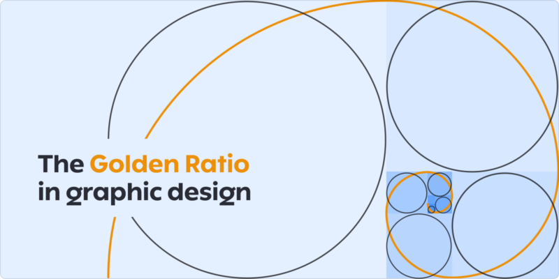
Understanding the importance of logo design is vital for your brand. A well-made logo helps create brand identity, brand recognition, and differentiation from the competition. Once you understand what defines your brand and have a vision for your logo, the Golden Ratio can help achieve harmonious proportions. Many brands, such as Pepsi, Apple, and Twitter, have used the Golden Ratio to create their logos. For example, if you want a round-shaped logo, you can use the Fibonacci sequence to create a series of circles that are in perfect ratio to each other and place them to form a grid as a base for your future logo design. The Twitter bird logo, for instance, was made based on Golden Ratio circles.
![]()
![]()
Images and Graphics
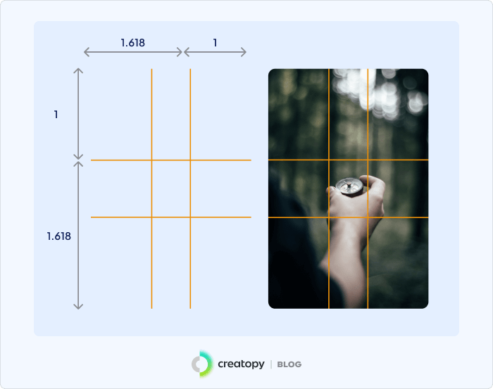
A balanced, eye-pleasing composition is essential when working on designs for ad campaigns, websites, or blogs, especially when incorporating images. Whether you choose images from a premium stock photo library or take your own photos, applying the Golden Ratio can help achieve perfectly balanced compositions. Consider using the rule of thirds or the phi grid. For the phi grid, split the picture into three unequal sections, then use the lines and spaces between them to create your image. The ratio of 1:1.618 is very close to 35mm film and digital camera dimensions, meaning you can place your image details while taking the photo without adjusting the image size. The ratio is 1:0.618:1, as shown below.

6. Where can you find the Golden Ratio?
Nature
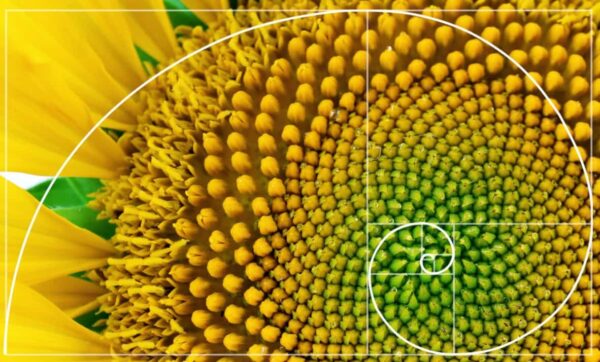
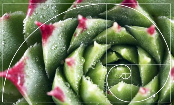
Although it’s said that an irrational number can’t be easily found, we can still spot it in nature. The most popular examples of the Golden Ratio in nature are those characterized by the Golden Ratio Spiral. This sequence can be found in the spirals of sunflowers, pinecones, and shells, where the arrangement of seeds, scales, or spirals creates a visually pleasing pattern.
Art and Architecture
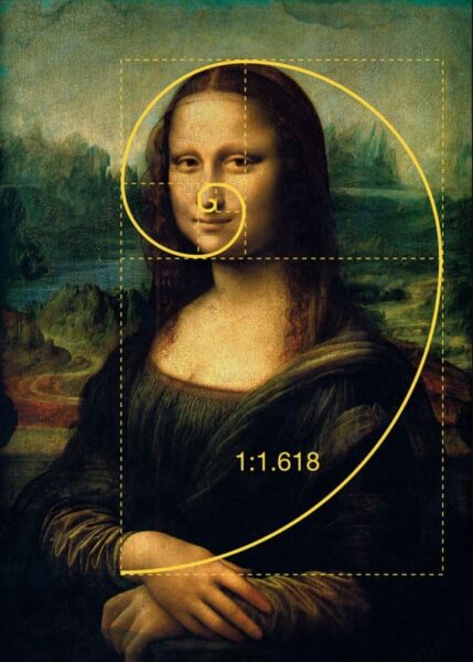
Historical structures like the Parthenon and artworks by Leonardo da Vinci, including the “Vitruvian Man” and the “Mona Lisa,” utilize the Golden Ratio for their proportions. The Parthenon in Athens, Greece, is often cited as a prime example of the Golden Ratio in architecture. Its facade is said to be designed around the proportions of the Golden Ratio, creating a sense of balance and aesthetic harmony that has been admired for centuries. Leonardo da Vinci, a master of the Renaissance, used the Golden Ratio in many of his works to achieve balance and beauty. His drawing “Vitruvian Man” is a study of the proportions of the human body and their relationship to geometry and mathematics, embodying the principles of the Golden Ratio. The “Mona Lisa,” one of his most famous paintings, is also believed to incorporate the Golden Ratio in its composition, contributing to its timeless appeal.
The Mona Lisa by Leonardo da Vinci
7. What tools can you use for the Golden Ratio calculation?
If math scares you, there are almost always workarounds. At least there are a few tools to help you with the Golden Ratio calculation.
- GoldieApp
- This app is made for artists and designers who want to check if their work is Golden Ratio compliant by placing overlays on their designs.
- Golden Ratio Typography Calculator
- Remember how I said you could calculate the size of the fonts you use in your designs or blog? There’s a calculator for that.
- Enter the font size, content width, or both, and get your Golden Ratio Typography.
- Golden Ratio Calculator
- With this calculator, you can calculate the shorter and longer sides of a shape and their combined lengths to determine the Golden Ratio.
8. Conclusion
Despite its irrationality, you can find the Golden Mean in nature or create a Golden Ratio composition yourself to reach that state-of-the-art balance.
The Golden Ratio is a mathematical tool, which proves to us that there’s also science in art, but at the same time that this formula is not here to create something instantaneously beautiful.
The Golden Ratio is used in design to reach the equity that anyone appreciates.