What is white space?
In graphic design, “white space” refers to the space that surrounds the elements. You may find the term “negative space” here and there, indicating the exact same thing. However, this space is neither white nor negative. It’s simply the space in a design and it can have any color, texture or pattern.
White space is a very important design element, just as all the other elements: pictures, different kinds of modern fonts, graphics etc. When you see a lot of white space in a design, that’s not because the designer didn’t know what to put there. It was created intentionally to emphasize other elements of the layout and/or to convey a specific mood.
White space is used to:
- Help the eye scan a design/text
- Increase legibility and readability
- Create a certain aesthetic/mood
Table of Contents
- Types of white space
- Why is negative space important in design?
- 10 examples of white space design in various media
- FAQ
- Conclusion
Types of white space
1. Micro white space and macro white space
Micro white space is the space between the small elements like letters, text lines, paragraphs, icons, and buttons.
Macro white space, on the other hand, is the space between bigger elements like text columns and graphics. It also refers to paddings and margins.

2. Passive and active white space
There’s another way to categorize negative space by the way it draws attention or not.
Passive space is the space between small objects that goes unnoticed. The designers use it to create texts or arrange paragraphs or icons. Though it goes without being noticed, this white space is intentionally added there in a very subtle way, to allow the eye to easily read the design/text.

On the contrary, active space is used to draw a user’s attention and to emphasize certain elements like a headline, logo or graphic.
Macro space is always used intentionally to create more focus on a certain area, so we can say that macro space is active space.
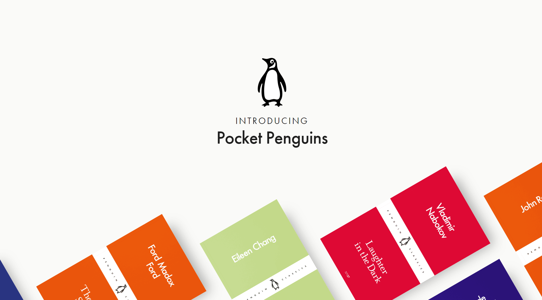
Credit: Pocketpenguins
Why is negative space important in design?
1. White space separates and groups elements
White space provides clues as to what elements belong in which group. It also helps separate individual elements and groups of elements.
Looking at the ad below, we can see clearly that there are three groups of elements: the headline, the body copy, and the logo and slogan.
By placing white space between these three groups, the viewer is guided to understand that:
- the first one is the most important section, the statement of the brand.
- the second group follows in importance, and it may actually be optional, as the viewer has already understood the message.
- next, on the bottom right, there’s the signature of the brand.
When grouping elements, the designer employs both macro and micro white space. Macro space is used to separate groups and micro space to separate elements of the same group. We can see this in action in the third group, which has two lines: one for the logo and one for the slogan.

Credit: PiazzaItalia
2. White space helps build hierarchy
Because white space helps in placing the focus on some elements it is used by designers to create hierarchy.
Hierarchy makes content easy to understand.
Let’s take a look at this website’s homepage. As you can see, there’s a lot of negative space. The design only has 4 elements: a graphic image illustrated by a white circle, the name of the brand, the slogan and a tiny menu section on the right-hand side.
Because it’s a homepage, it must inform the visitor what the website is about (or whose website it is). Therefore, the name is placed at the center of the layout, emphasized by a graphic image, a circle that rotates continuously. Under the company name, there’s a slogan (their promise) in a smaller font.
So, the hierarchy goes like this:
#1 in importance – the name, Rotate
#2 – the circle, the symbol
#3 – the slogan
#4 – the menu

Credit: StudioRotate
3. White space helps build a certain look
The use of white space also contributes to creating a certain atmosphere or look. Some brands use negative space as part of their brand image to convey luxury, high-quality or avant-gardist modernism.
Luxury
Many luxury brands make use of white space to make a simple banner design, where the focus goes entirely on the product.
Generally, we tend to associate heavy white space with luxury and premium quality. A balanced white space is seen as rather affordable and medium quality and little white space in a design (clutter) conveys cheapness.
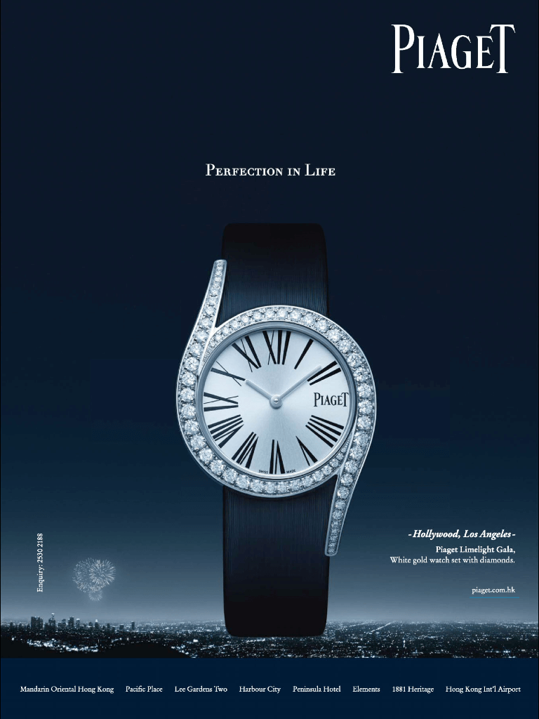
Premium quality
High-quality brands, such as Apple, rely on their products’ intrinsic values and less on additional graphic design. All of their communication materials, starting from their website to display banner ads and packaging, have a clear focus on the products’ design and premium quality. Of course, white space helps them to put their products in the spotlight.
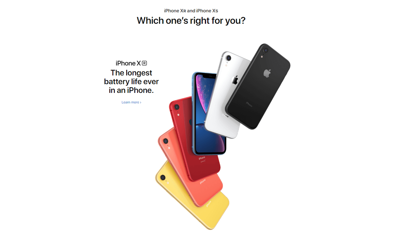
Credit: Apple
Ultra-modern style
More and more brands use white space to position themselves as ultra-modern. In recent years, minimalism has been associated with modernism and brands have rushed to adopt this style.

Credit: affinity
Use these white space Facebook banner templates from Creatopy as a starting point for your ads. Customize them with your texts, details, and logo and download them for free.
10 examples of white space design in various media
And now, let’s go through a few examples of white space use in various media, from website pages to banner ads.
1. White space in web design
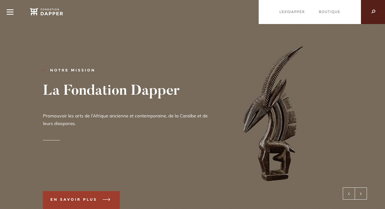
Credit: dapper
White space is extremely helpful in web design as it can help developers and designers to create an easy to navigate website. White space allows a user to easily and quickly scan and understand a website and its journey.
As you may have noticed, websites today have plenty of white space in their graphical interfaces, as opposed to websites 10 or 15 years ago, when everything was cluttered.
2.White space in landing pages

Credit: MailChimp
Landing pages are created with a goal in mind. We want a user landing on these pages to take a specific action, like filling a form or downloading an ebook. That’s why landing pages must be kept simple and guide the visitor to take this action.
The role of the white space in landing pages in to place the focus on a call to action button (download, learn more etc..)
3.White space in print ads

IKEA is an adept of white space in graphic design as well as in their furniture design. Their minimalistic approach is by now their trademark.
White space has gained a lot of attention recently and more and more brands use it in their print ads. You’ll see white space in ads for fashion brands, homeware, beauty products, and gadgets.
4.White space in banner ads

Google is another brand that prefers white space. In fact, the company’s visual communication has white space at its core and they stick to this style in everything they do, from product design to display banner ads.
5. Negative space in business cards
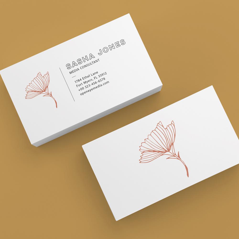
Credit:TowerPress
As I’ve said before, white space can create a certain look. In the case of business cards, white space can position someone as an expert in their field, conveying things like premium quality and sophistication.
6. Negative space in newsletters
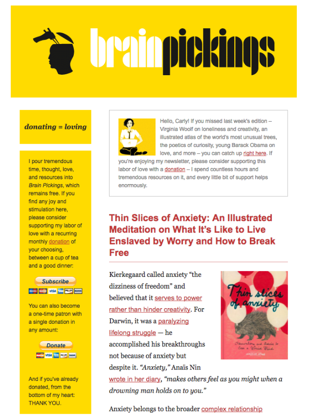
Credit: BrainPickings
When it comes to newsletters, marketing people often tend to cram lots of information in an attempt to notify the customers about their upcoming promotions and news. But the truth is that people feel bombarded with so much information. So, a good way to design newsletters and help people read them is to introduce healthy chunks of white space.
7. White space in billboards

Credit: Billboardsprints
Because they are huge, billboards offer a great opportunity to play with white space. Especially when you’ve got a product that prides itself with its dimensions.
I find this billboard ad truly creative and I like how they used the available space to make a statement about the benefits of the product.
8. White space in packaging
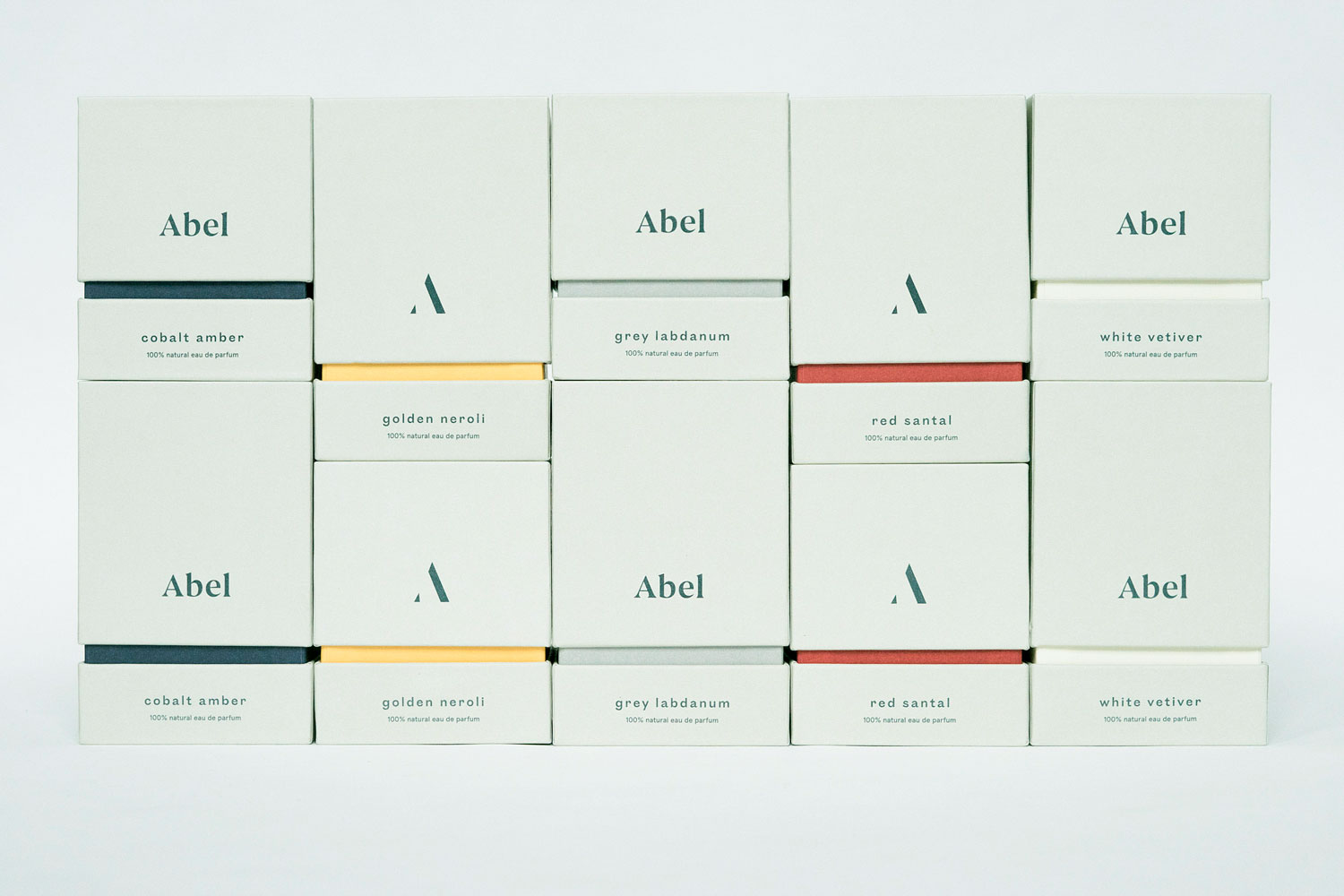
Credit: ProgressPackaging
Packaging has the power to persuade someone to buy a product. As we’ve seen, white space can create a premium quality look, especially when the rest of the design elements (fonts, graphics, texts) are elegant or modern style.
9. White space in social media ads

Credit: Dexyp
Our social media newsfeeds are so crowded that we can barely understand what’s going on. Imagine scrolling down the feed and seeing an ad that’s half white space. Wouldn’t that catch your eye?
10. White space in signboards
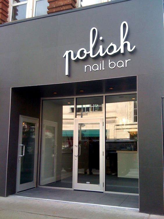
Credit: Fachadas-casas
I choose this example to illustrate how white space in signboards can make a huge difference. Not only does it help the logo stand out but it also conveys an air of elegance and high-quality.
FAQ
What is white space in graphic design?
White space, or negative space, is the empty area around design elements. It doesn’t have to be white; it can be any color, texture, or pattern. This space helps to separate different parts of your design, making it more readable and aesthetically pleasing.
What are the different types of white space?
1. Micro White Space: Space between small elements like letters and lines of text. It improves readability and reduces clutter.
2. Macro White Space: Larger spaces between major elements such as images and text blocks. It helps structure your layout and guides the viewer’s eye.
3. Passive White Space: These are the margins and spaces that occur naturally in a design, contributing to its readability without being actively planned.
4. Active White Space: Deliberately added spaces that highlight specific elements or create focus areas, directing attention where you want it.
Why is white space important?
White space is crucial for enhancing readability and creating a clean, sophisticated look. It helps balance your layout, makes content easier to digest, and reduces cognitive overload. Using white space effectively can also give your design a modern, high-end feel.
How does white space influence the viewer’s perception?
When used well, white space can make your design feel open and elegant. It creates a visual hierarchy, emphasizing important elements and making your content more engaging. This often results in a more enjoyable user experience and can elevate the perceived quality of your design.
Can white space be used in different forms of media?
Absolutely. White space is versatile and can enhance the visual appeal of web designs, print ads, packaging, social media graphics, and more. Whether you’re working on a website, a business card, or a billboard, strategic use of white space can significantly improve your design’s effectiveness and overall look.
Conclusion
As you’ve seen, white space can be used in all kinds of media. It can help you draw attention toward your product and create a premium look. Considering the rise of minimalism in recent years, due to the increase of information intake, white space is a design element more important than ever.
Illustration by Anita Molnar

