They say you should never judge a book by its cover, but it’s something quite hard not to do since it’s the first thing we notice about a book. And we all know first impressions matter.
That’s why meaningful cover design that gives an insight into the book’s content is so important, and an easy way to achieve that is by playing with typography.
Typography can make or break a book cover design. A book cover with smart or creative typography can engage the viewer in an instant and help them decide if they want to learn more about the book.
In the world of book cover design, it all starts with curiosity, and you only have a few seconds to get the reader’s attention. A great design will leave people wanting to see more.
Get your book noticed with ideas from famous covers and find out how to create a best-selling typography cover design.
Let’s take a look at some of the best examples of book cover typography to get some inspiration and learn how to create a book cover that’s memorable and fascinating.
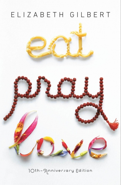
1. Eat, Pray, Love by Elizabeth Gilbert
Eat, Pray, Love has one of the most iconic typography book covers out there. Each word illustrates and reinforces its meaning with simple, yet powerful elements. Once you read it, you realize how the simple illustration also foreshadows the book’s story and makes you appreciate it even more.
The beautiful design made by award-winning art director Helen Yentus is simple, yet has a powerful message and has undoubtedly contributed to the worldwide success of this bestseller book by Elizabeth Gilbert.
2. Extremely Loud and Incredibly Close by Jonathan Safran Foer
A powerful book cover with bold typography and intense colors, all included in the shape of a hand that’s almost too close. The bestseller has a book cover that makes you curious, and that’s the best choice for a book that you won’t be able to put down until you finish it.
The beautiful typography is signed by famous book cover designer Jon Gray, who has designed some of the most notable book covers of recent years and creates covers for the most prominent authors and publishers around.
His design style has set the bar for the industry, so it’s understandable why his work earned more than one place in our top favorite typography book covers.

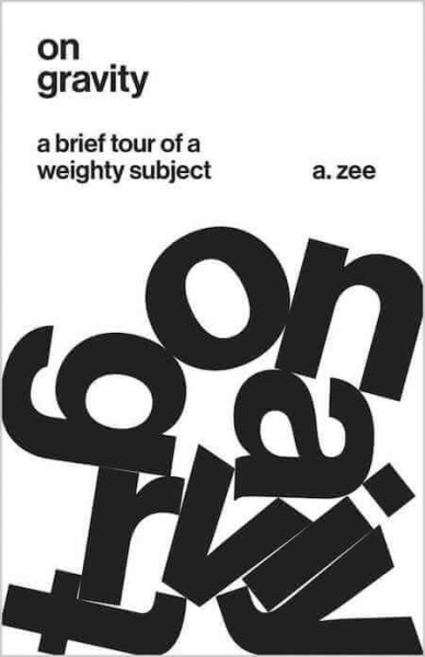
3. On Gravity: A Brief Tour of a Weighty Subject by A. Zee
Playing with the letters has worked out great for this typographic cover that depicts a book about Einstein’s theory of relativity, written by physicist A. Zee. The typography makes us aware of the subject’s weight and enhances the idea that nothing can escape gravity, not even this book cover.
Designer Jason Alejandro from Princeton University Press is known for the great use of typography in his work. He definitely has a unique style that makes you take the first steps on a journey that continues with the book itself.
4. Competition: The Birth of a New Science by James Case
Since everything is a competition, the letters in the title also seem like they are competing for the best book cover design typography award.
This beautiful black and white book cover is an excellent example of how typography evokes an emotion, creating an engaging design. The layering of the letters gives the competition effect, where letters are fighting to stay on top and pushing their way through.

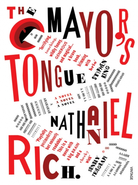
5. The Mayor’s Tongue by Nathaniel Rich
This typographic book cover by Tony Sallinen evokes the book’s title, mixing typography and illustration creatively and uniquely. Surprising, yet powerful and enigmatic, the cover uses uneven letters to suggest mystery and chaos, without decoding the content of the book itself.
The reviews and quotes are used as postmodern collage elements to generate interest and captivate the audience.
6. The Courage of Hopelessness: Chronicles of a Year of Acting Dangerously by Slavoj Zizek
Word games in book cover typography are easy to remember and, if used correctly, send a powerful message. And this book nailed it by arranging the words and letters of its title so it can be read in more than one way.
In the vision of designer Richard Green, who bravely plays with the meaning of words and their antonyms, the age of hope is crossed out and becomes the courage of hopelessness, the actual title of the book.

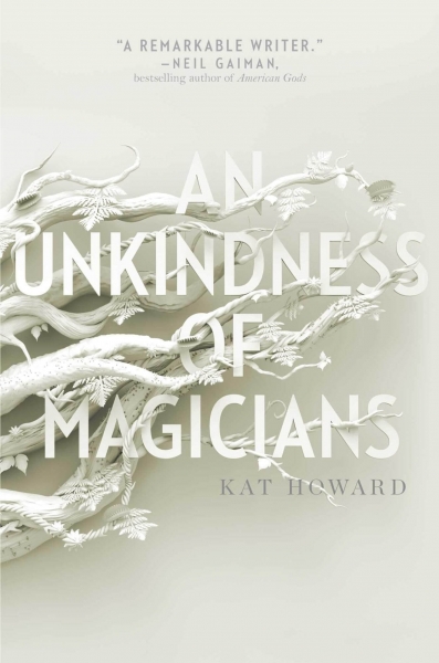
7. An Unkindness of Magicians by Kat Howard
Decorated and botanical typography increased in popularity in the last years, and here’s a rather unique, monochrome example.
The level of detail in this book cover illustration by Lizzy Bromley is striking, and it’s probably one of the most beautiful and mesmerizing book covers we’ve seen in years. It transports you right away into the atmosphere of the book, giving you that fascinating mystery vibe.
The clean typography book cover design is enhanced by layers of illustrated details that give depth and suggest that there’s always more than the eyes can see.
8. Too Big to Fail: The Inside Story of How Wall Street and Washington Fought to Save the Financial System–and Themselves by Andrew Ross Sorkin
The best book cover designs are often the most suggestive and straightforward, where you can read the title in a split of a second, and you can also get an idea of what the book is about.
The beautiful typography design by Carla Bolte, where oversized typography seems to lose balance, perfectly suggests the idea of how nothing is too big to fail.

9. The Invention of Murder by Judith Flanders
This typography book design is Victorian in every detail. Mysterious and fascinating, this cover uses typography to enhance the topic of the book and give you an idea of what to expect.
Dark shades, victorian decorations, skulls, and vintage textures complete the book’s idea and create an atmosphere that makes you curious about the story.

10. The Innovator’s Cookbook: Essentials for Inventing What Is Next by Steven Johnson
3D typography is excellent for creating depth and suggesting that there’s more to be discovered within the pages of a book. Here’s another legendary book cover created by famous designer Helen Yentus.
The process of creating this innovative cover art combines both digital and non-digital components, as the final result was born by actually taking a photo of the 3D book title.

11. The Complete Poetry of Edgar Allan Poe
Here’s a beautifully designed book cover that illustrates The Raven, the author’s symbol. The iconic raven is so well known, that it will instantly transport you into the dark and dramatic world of Edgar Alan Poe.
The monochrome handwritten typography design inside the black raven illustration is the perfect way to describe the author’s work.

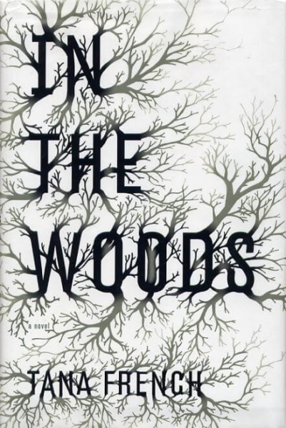
12. In the Woods by Tana French
This book has a beautiful and detailed botanical typography cover that transports you into the novel’s atmosphere (and gives you the chills). Jennifer Wang designed it with great attention to detail and exquisite taste.
The botanical design almost conquers the typographic book cover, so you have to look twice to be able to read it right, just like the book itself.
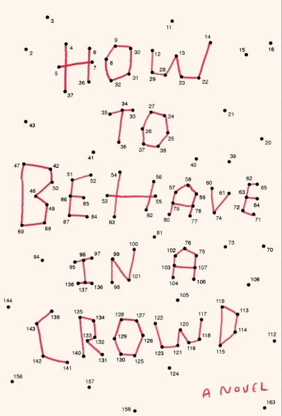
13. How to Behave in a Crowd: A Novel by Camille Bordas
As you can see from some of our examples, playing with the letters and their meaning is a notable trend in book cover typography. One of the most essential tips in book cover design says you shouldn’t overcrowd your work—unless that’s precisely the point.
The concept and execution of this typography cover design are the work of Christopher Brand, who connects the dots to create emotion with this beautiful work.
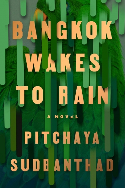
14. Bangkok Wakes to Rain by Pitchaya Sudbanthad
Layers upon layers of vivid green color wash away the peacock photograph as well as the typography of this book cover.
Designed by Grace Han, Senior Designer for Riverhead Books, the bold cover inspired by nature’s colors stays with you long after you close the book.
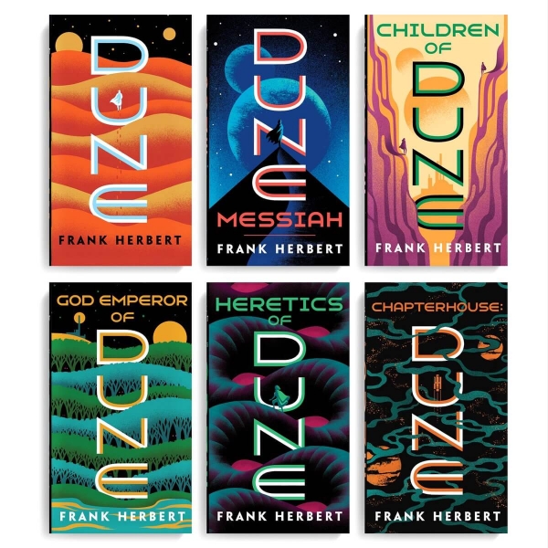
15. The Dune Series by Frank Herbert
As one of the most extraordinary book sagas of all time, Dune had numerous memorable cover designs, but somehow I like this new minimalist vertical typography approach the best.
Designed by Jim Tierney, this new series of covers managed to capture the essence of the novel without being too graphic or oversharing.
With neon colors and tinny illustrated silhouettes that lose themselves between the letters of Dune, these covers complete the story and make you smile every time you see them and remember the book.
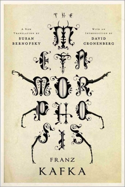
16. Metamorphosis by Franz Kafka
In this legendary cover, letters are metamorphosed to give you the feeling that something is crawling under your skin. Just like Franz Kafka’s character, Gregor, the title of this book becomes something else, and the more you look at it, the more fascinated you become.
Designed by Jamie Keenan, the beautiful cover can make you lose yourself in the details and completes the epic experience that reading the novel is.
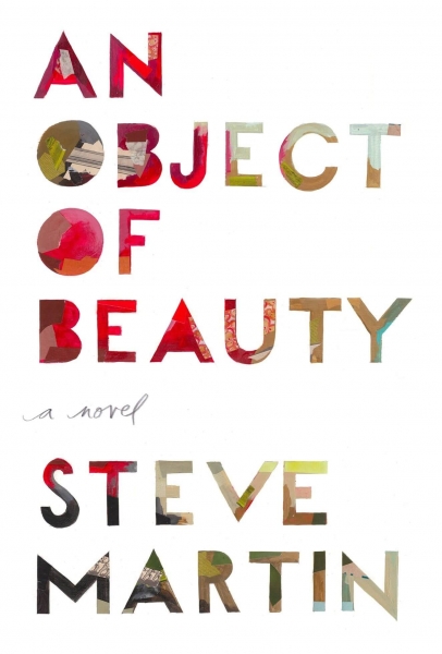
17. An Object of Beauty by Steve Martin
Here’s a beautiful typography book cover that transports us to the fascinating world of art and painting. An Object of Beauty was designed by Darren Booth to mimic an actual canvas with all the textures and layers of vivid paint.
This is a good example of a minimalist book cover, yet so intricate and beautiful, telling a story about art and the art world as we never knew it before.
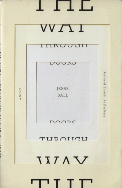
18. The Way Through Doors by Jesse Ball
If your book cover design has a great concept beneath it, you can always break a few design and typography rules. Not all titles have to be readable at first glance.
Sometimes, you need to make the viewer take a second look, or even open the book to see what’s that about. Remember, it’s all about piquing curiosity. This great concept by designers Jason Booher & Helen Yentus manages just that—to make you curious enough to look twice.
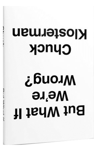
19. But What If We’re Wrong? Thinking About the Present As If It Were the Past by Chuck Klosterman
Sometimes, all you have to do is take a different perspective. What if everything you thought was true is actually wrong? Here’s a great book cover where everything is upside down, as an excellent metaphor for the book’s content.
Paul Share did a great job by surprising the essence of the book with a simple twist. No images, no colors, no particular font—just a black title on white background, turned upside down. And the effect is remarkable.
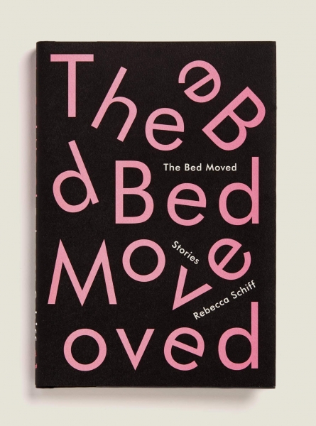
20. The Bed Moved by Rebecca Schiff
Janet Hansen always finds new ways to make the letters speak more than the actual words they compose. Here’s a great example of that, the book cover of The Bed Moved, Rebecca Schiff’s stories.
Even with all the letters moving around, the title still manages to be readable and clear, attracting you like a magnet towards the book.
Final Thoughts
As you can see, typography book covers can be diverse, fun, and creative, and there’s always more to them than meets the eye. And, if done right, they sell big time and make a lasting impression, becoming one with the story.
I hope you enjoyed our journey in the world of books, and you found the inspiration you need to create a book cover for the next bestseller.


