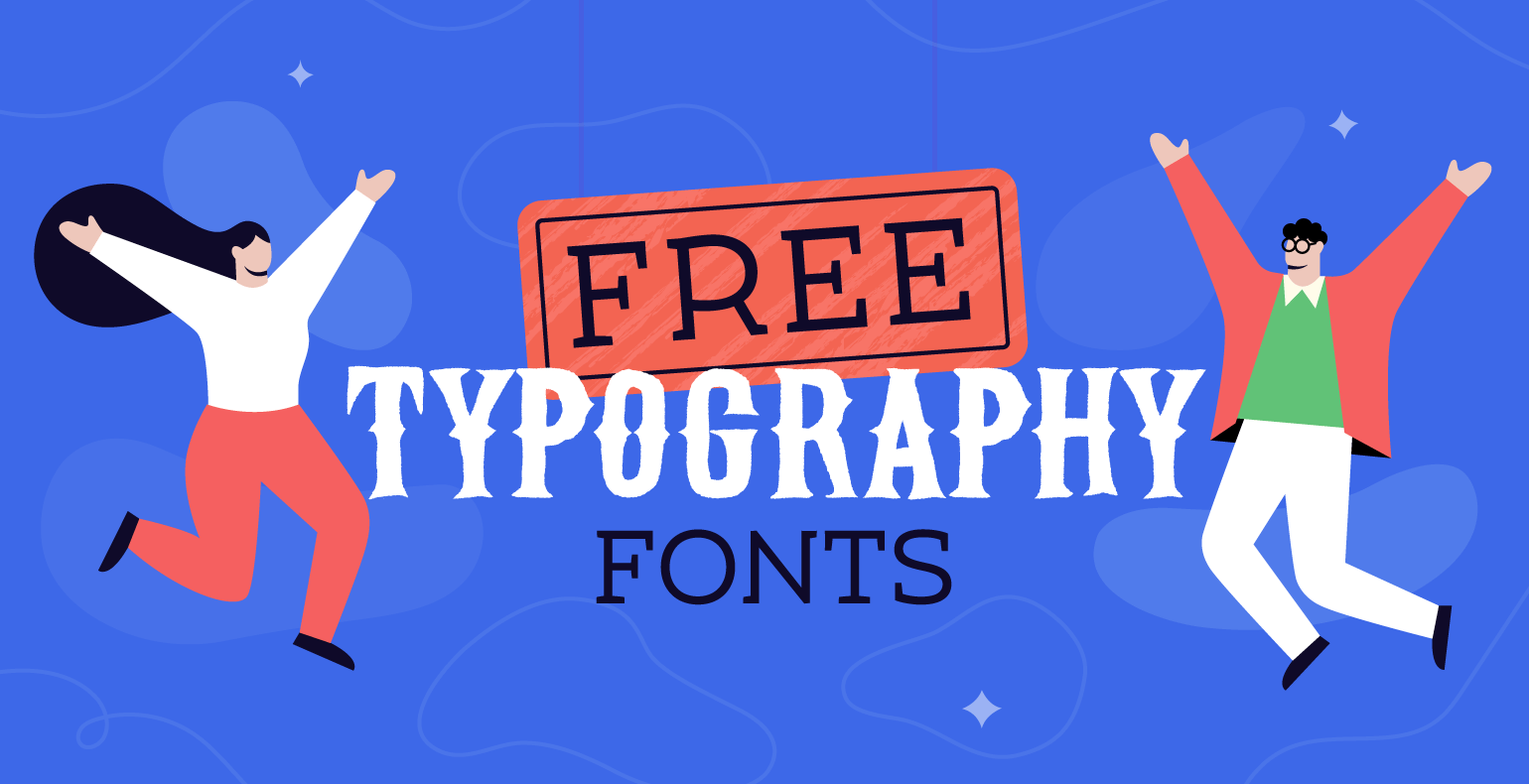
Typography fonts are powerful.
Designers’ job is to use this power to propel projects forward and get their work noticed. Otherwise, it can work against their goals if it’s not put enough effort into research.
It’s no rocket science, though, that you need a solid library with many cool typography fonts for designers, so you can create the atmosphere you want.
If you’re like us, always on the lookout for the best typography fonts out there, building your font collection becomes second nature after a while.
It doesn’t have to cost an arm and a leg either, because the web is full of free creative typography fonts that you can use.
You just have to find the right one for your project.
We realize this takes time that you often don’t have, so we did some of the legwork for you.
At Creatopy, we live and breathe web typography, so we’re always on the hunt for the coolest banner fonts anyways, so it’s a win-win.
Check out some of what we consider to be the best free typography fonts online, and give your well-crafted content the visual appeal it deserves.
1. Helltown
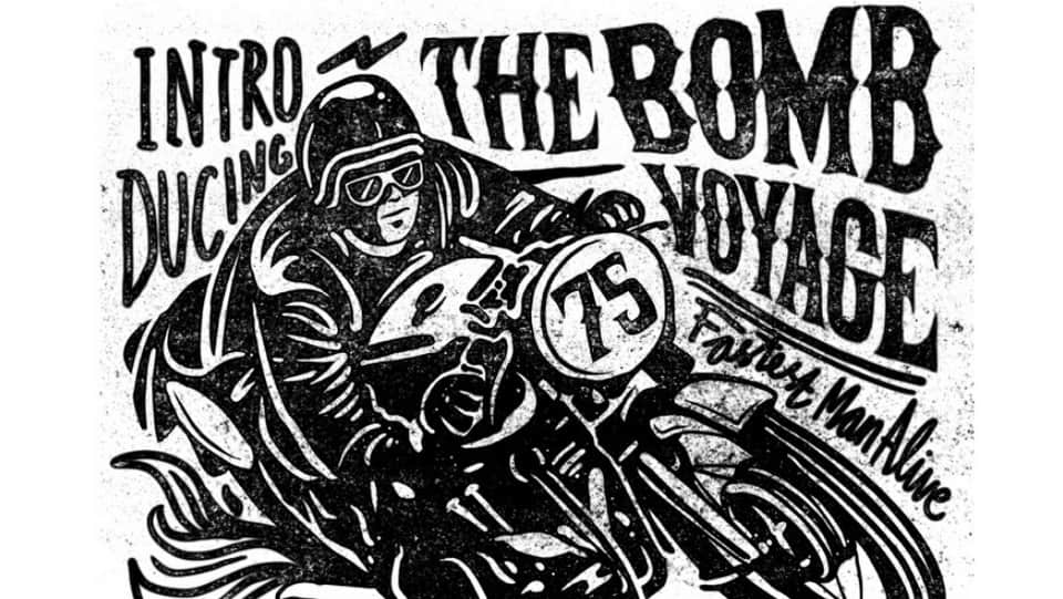
Born to be wild—this one is not for the faint-hearted.
Inspired by the smell of gasoline, cigarette smoke, and liquor, Helltown is an entirely handmade lettering typeface that reeks pure testosterone.
The pointy ends resemble metal spikes that you’d find on leather biker jackets.
The vintage concept with a rebellious retro vibe lends passion to your design. Helltown is ideal for tattoo artwork, posters, apparel and music-themed projects, and other authentic designs.
2. Parseltongue
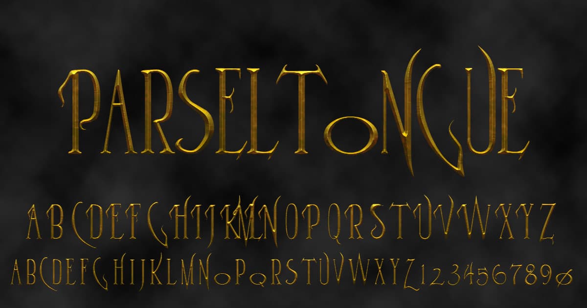
Finally, we have an answer to the question that plagued an entire generation: what font would Lord Voldemort use if he was a web designer?
If the serpentine aspects, slender vertical lines, exaggerated serifs, and distinctive texture are not obvious that this font was inspired by the Harry Potter series, the name gives it away.
Parseltongue is the language used in J.K. Rowling’s books by dark magicians to summon snakes, other creepy serpents, and by the protagonist—mainly to scare his best buddies.
So if you want to add a mysterious and unearthly vibe to your design, or if you suspect that your client is a reptilian, give Parseltongue a try.
I mean using the font, not speaking in tongues. It works best for display ads.
3. Bilbo
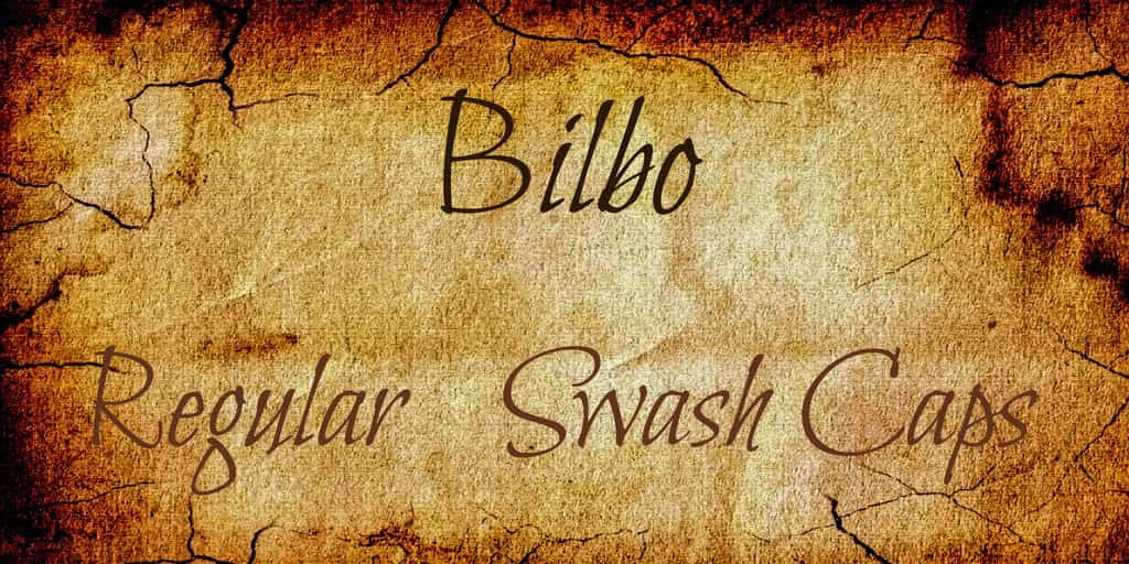
Another fantasy-inspired font, Bilbo is an easy-to-read calligraphic typeface with a fairytale vibe.
This is a style that would have fit perfectly into J.R.R. Tolkien’s books or the Lord of the Rings movies.
It’s much more versatile than your average display font, primarily if used in conjunction with its sister typeface, Bilbo Swash Caps. The latter is ideal for headlines.
If you have body text with a message that needs a bit of added warmth to come through, keep Bilbo at hand.
4. Hey November
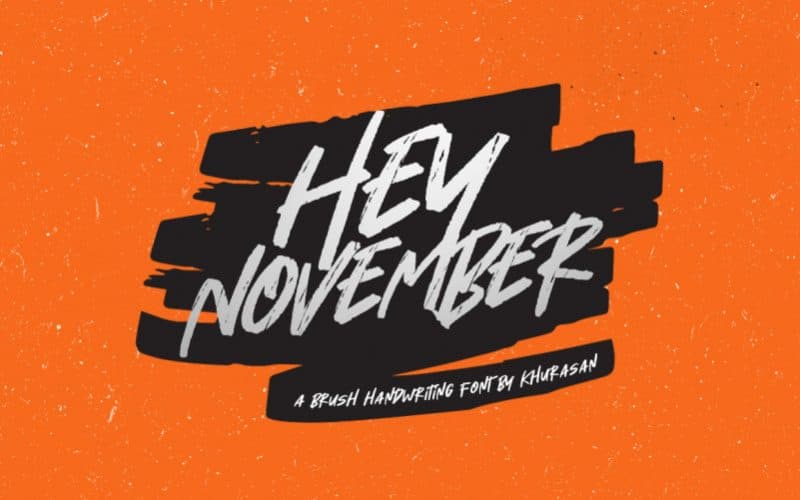
Hey November is a handwritten brush font, and by the looks of it, it was sketched up by a very confident person blessed with a massive dose of authenticity and charisma.
If the project you’re working on needs to put these same traits forward, you can make your job easier by having Hey November do the talking.
This free typography font has an elegant and vintage feel. The cleverly designed character set makes it suitable for branding, social media posts, ads, packaging, photo watermarks, stationery, and even logos.
5. Nine by five
Oh, the golden age of IT!
Remember the times when the keyboard had a coiled cable, the mouse a ball in it, and we were starting to think the blue screen of death was going to remain a part of our earthly existence forever?
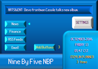
What was once the cutting edge of technology has now become nostalgia. If you want to tap into these feelings, Nine by five is perfect.
The low-res, pixelated effect takes you straight back into the nineties and beyond.
The name is easy to remember: the characters are drawn into 9×5 grid tiles. Seriously, we counted the squares, and we know you will too.
6. Tangereen 1 & 2
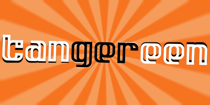
You know what they say: when life gives you tangerines, make a font out of them. Or something along those lines.
Life must have been really generous with the folks at Pixel Kitchen because they brought us a typeface with two different styles.
Tangereen is an all-lowercase, double-line design that supports Dutch and English.
This one is perfect for simple projects, but if you want something more versatile, Tangereen 2 has a more sophisticated design, completed by uppercase letters and twice as many glyphs.
The catch? You probably think Tangereen 2 is the paid version, but you’d be wrong.
Both of them are entirely free, and you can use them for personal and commercial projects as well.
7. Cubik
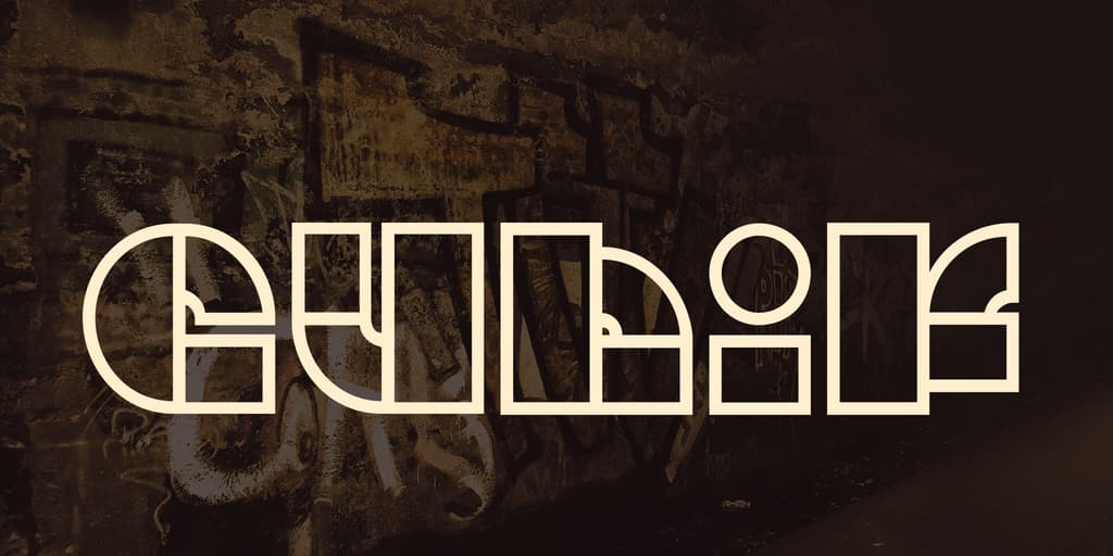
You know those fonts that you know you’d seen somewhere, made a mental note that you’d use them one day, and when that day comes you can’t remember their names for the life of you?
Cubik is not one of those, and it deserves a place among the best free typography fonts for this aspect alone.
Of course, it’s not genius because you can remember its name, but because you can’t forget its shapes.
And no wonder you can’t forget these shapes, because they’re some of the most basic ones: circles, triangles, and of course, rectangles.
In other words, Cubik is further proof that simplicity is the ultimate sophistication.
The font has a capital letter set, and a wide range of punctuation marks too. It’s perfectly suitable for typographical posters and other graphic design illustrations.
8. Tetris Hollow
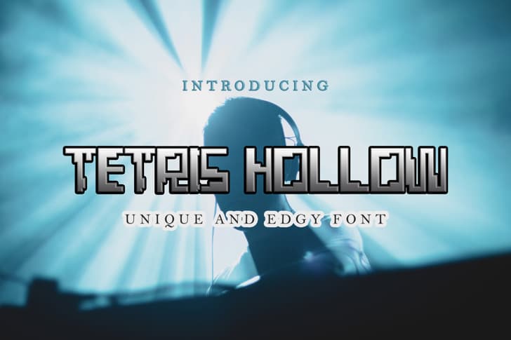
Although it clearly stems from the world of vintage video games and the binary simplicity of the 80s computer displays, Tetris Hollow’s retro air still carries a modern vibe.
However, this may have something to do with the fact that old-school is the new modern these days.
Regardless, if you want your project to look the way an old Game Boy sounds (excuse the synesthesia, but you know exactly what I mean), you can use Tetris Hollow for logos and illustrations.
Still, its legibility allows for quotes even or social media posts.
9. Tumult

Did you know Jackson Pollock created Tumult Regular by accident when Andy Warhol replaced one of his paint cans with alphabet soup? Google it.
No, of course, it’s not true! But it could be, couldn’t it?
In reality, it has been designed quite recently using a combination of food coloring and a little ingenuity. Its creators claim it’s been inspired by the movement of water.
But in the world of fake news, it may have actually been Pollock for all we know.
The legibility of the uppercase letters is a struggle if you look at them individually. In context, they’re surprisingly easy to read.
It’s still best to use at 20pt or above. Otherwise, the words get lost in that beautiful mess.
10. Smokum
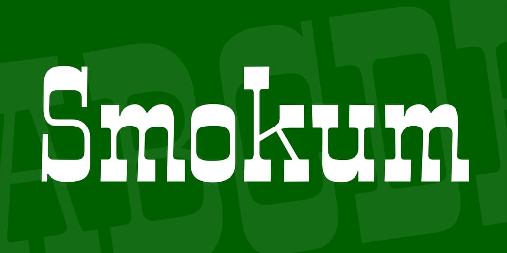
If Wyatt Earp was alive, he’d certainly agree that this slab-serif font brings back the days of the Old West. Moreover, if it had a smell, it would be a mix of gunpowder, firewater, and chewing tobacco.
This font is suitable for headlines and display use when you want to go for a little old-fashioned country flair.
The contrasting thick horizontals and thin verticals make it ideal for the web, too, as long as you use at least in a medium size.
11. Cabal
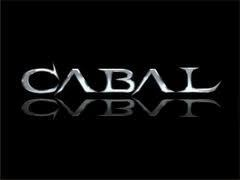
This beautiful font looks as though it was carved with a sword. By the Prince of Persia. While riding a flying carpet and reciting heroic poetry.
Some fonts just make your mind wander. It’s difficult to tell why, and especially how they do it.
Smooth, organic lines, grand proportions, and unique serifs—the recipe for this typography font looks so simple, right?
But I’d argue that it requires a hell of a talented designer to squeeze this much romance into a couple of letters.
As though there wasn’t enough mystery around this font, here’s one more: how come it’s free to use?
Well, don’t think about it too much. Just download Cabal and run with it.
12. Ride the Fader
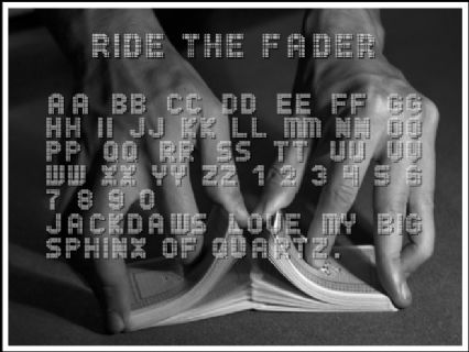
Scoreboards, old-school low-res public LED displays, and the analog screens of almost any gadget up until the late nineties—Ride the Fader has a lot of memories to bring back. And it does, at first sight.
It’s also highly legible and impactful when used as a heading or on a poster design.
13. Broken Glass
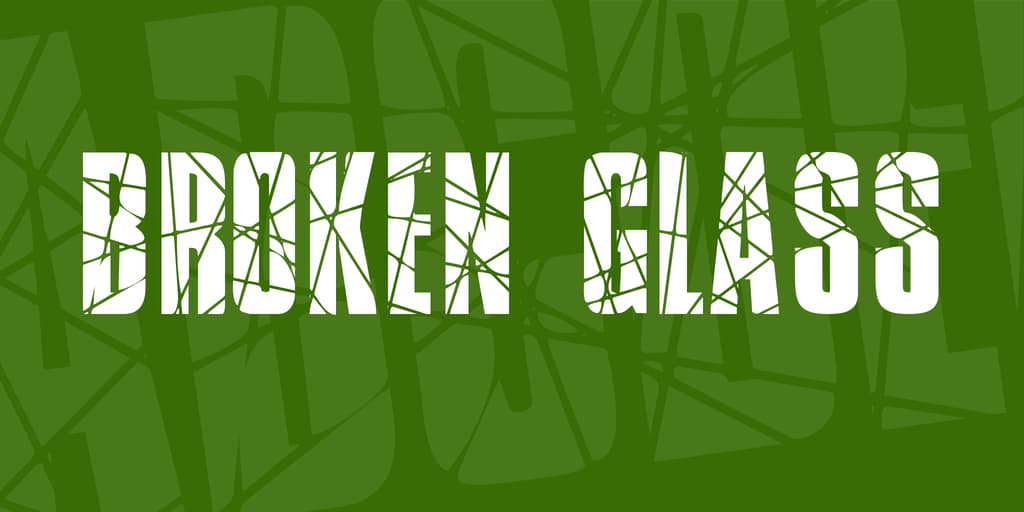
You wanted impact? Nothing spells impact quite like Broken Glass font.
The pun was very much unintended, just like breaking actual glass is most of the time, and reading it hurts like walking on shards.
I must have made it quite obvious by now—it’s hard to comment on this particular font, probably because it hardly needs any commentary.
If you want to attract attention to something, you can achieve this by simply “breaking” it.
14. Kitchen Sink
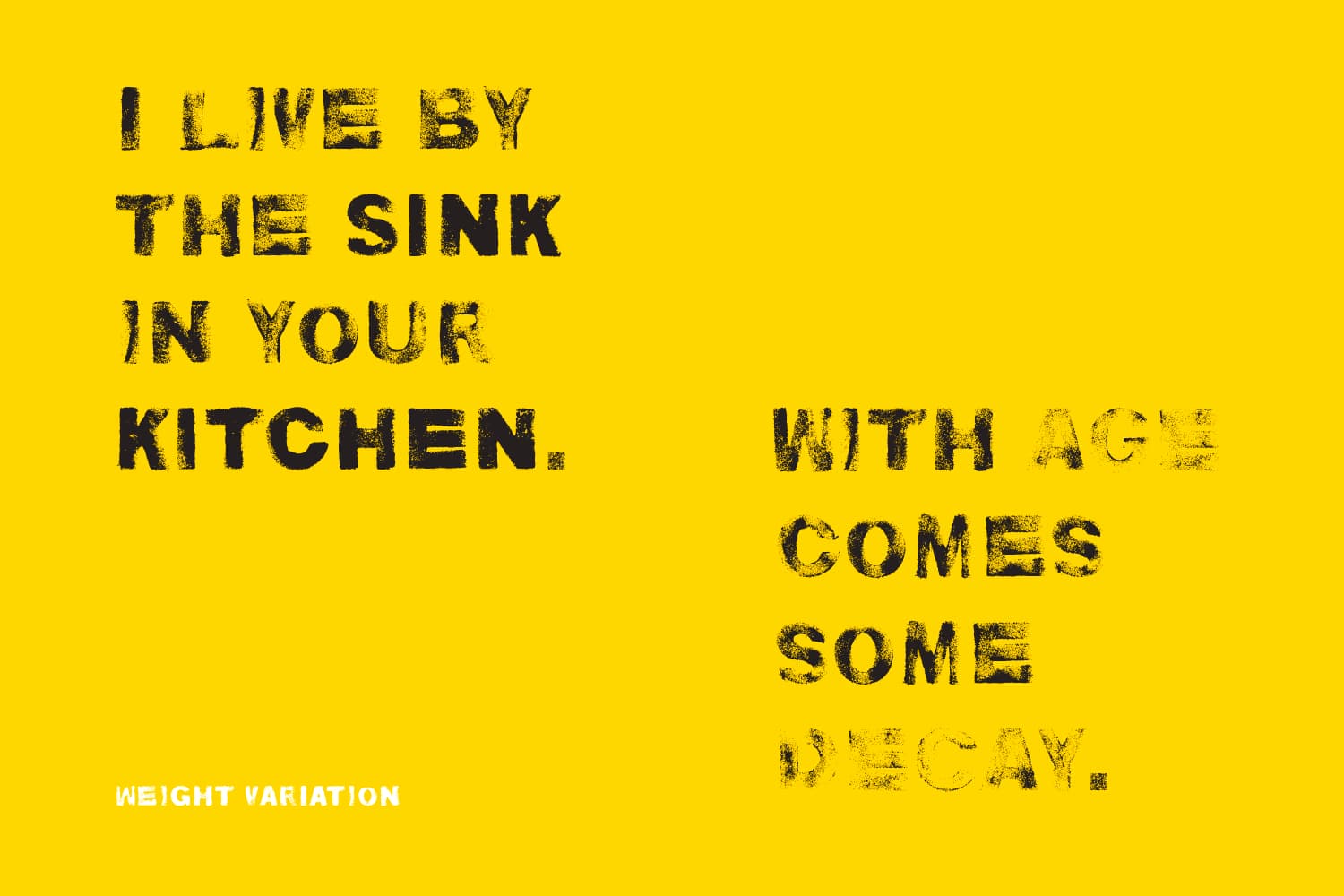
As I said, imperfection attracts the eye, and good thing it comes in many shapes.
In the case of the Kitchen Sink font, it’s the dusty, spongy texture, the degree of which you can even vary with the three weights (light, regular, and bold).
It was, in fact, created using sponge cutouts dipped in acrylic paint. Smart!
Each letter has two different versions, which you can toggle by switching between uppercase and lowercase. It also includes international characters.
15. Mindfuct NBP
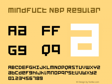
Perhaps not one to yell out loud around the office when there are client meetings next door. Aside from the impractical name, Mindfuct NBP is a useful font to have in your arsenal.
With its square letters, it resembles the Cyrillic alphabet at first sight. You only realize it’s not once you’ve read a couple of words and actually understood what they say.
Maybe there is something to the peculiar name, after all?
As a typeface, it’s unicase, and it goes well with Ubuntu, Neo Sans, Microsoft Sans Serif, and Verdana.
To stay true to its unique charm, the font does support Cyrillic, greek, and bopomofo characters on top of the basic and extended Latin alphabet.
16. Black Friday

Black Friday is the day when the rest of us lose our minds and spontaneously reenact scenes from the Hunger Games at our local stores in hopes of a good deal.
If you like this font, don’t wait until a week after Thanksgiving.
It’s already free, so get it now because it won’t be any cheaper than this.
17. Batik Gangster
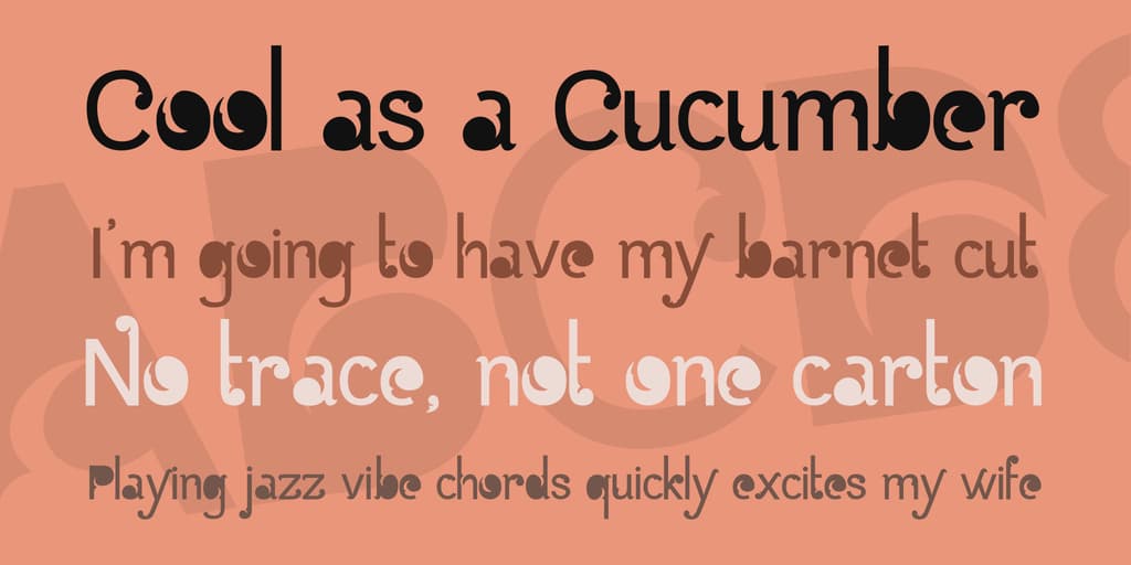
There has to be a Bollywood supervillain with this name, at least in a script at the bottom of some producer’s drawer.
Until our antihero makes it to the big screen, we’ll have to content ourselves admiring the elegant lines of this fabulous font.
Inspired by batik itself, an ancient Southeast Asian textile painting technique, this sans serif typography font is distinguished by the unique ornaments at the tips of both its uppercase and lowercase letters, the filled counters, and the clever use of negative space.
Romantic and dreamy, Batik Gangster is hard not to like. Just like the charming bad guy that most certainly exists.
18. Topeka
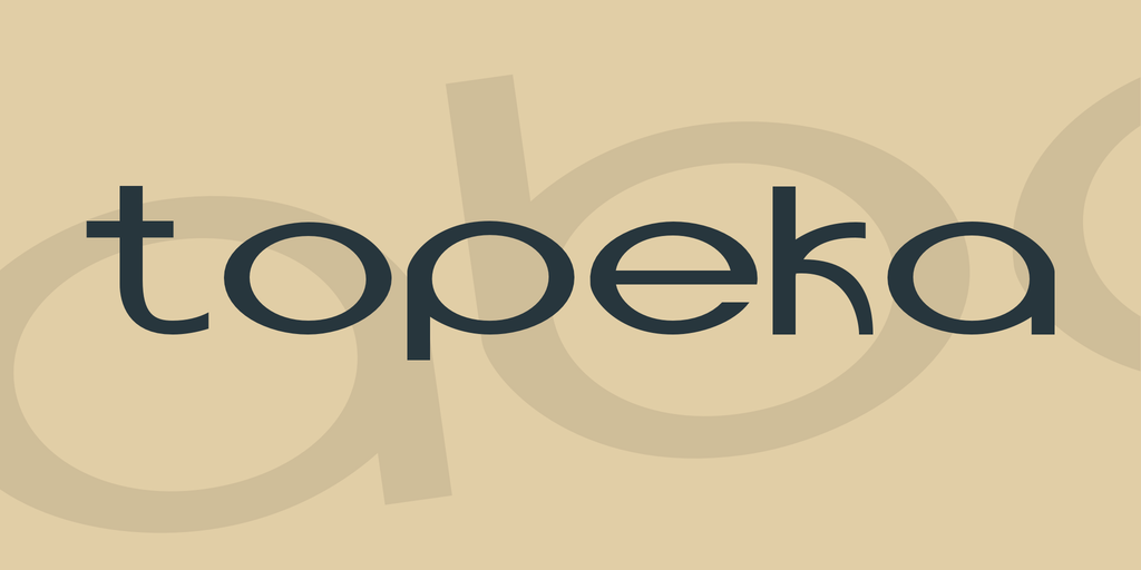
The thing is, Topeka cannot be the font used for the first iteration of the Bing logo (you’re welcome). This typeface was created in 2013, the year Microsoft retired the first design after having used it for about four years.
But the letters do look almost identical, or at least similar enough to put your mind in this dreaded spiral.
If you like this font or just want to ruin someone’s afternoon, there’s good news: Topeka comes with the entire alphanumeric range as well as punctuation, currency symbols, and international characters.
Final Thoughts
If you liked the fonts and typography examples above, it’s proof that a suitable typeface doesn’t have to be expensive.
In fact, it doesn’t have to cost you anything.
Add the best of them to your personal collection, give them your creative touch, and amaze your clients with outstanding designs.
Have you used any of these before? What are some of your favorite free typography fonts?
Let us know so we can make them famous.
