Many of us have been applying color theory in our lives without even realizing it.
Let’s talk about lipstick shades, for example.
Each color creates a different mood. Red is for sexy, pink for playful, and black is for feeling like Wednesday Addams.
You can apply color theory in every industry: interior design, graphic design, painting, makeup and beauty industry, fashion, and the list goes on.
Today we’ll focus on learning all about color theory for designers and marketers.
Colors are a powerful psychological ally in any advertising initiative.
They can enhance your message and determine people to take action. Incorporating deep, moody tones—like a sleek black wallpaper design—can add a dramatic effect and help key elements stand out. But there’s a tricky part to it: how can you pick the right color combinations without making your visuals scream for attention or turning them into something really dull?
Understanding color theory and the fact that every color has its meaning, subtleties, and impact upon an audience will help you get your brand in the right direction.
So, without further ado, let’s deep dive into color theory.
B. The Importance of Color Theory
H. Hue, shade, tint, and tone (or saturation)
I. Additive and Subtractive Color Models
K. The Psychology of Colors in Marketing
M. What Research Tells Us About Colors
N. Cultural Meanings of Colors
A. What Is Color Theory?
Color theory guides the creation and use of color palettes so you can create visual content that’s aesthetically pleasing and can easily communicate your message.
Once you step into the basic color theory and learn the color components, you’ll start mastering the color palette theory, too, with all the tints, shades, hues, and tones.
Moreover, in exploring color theory, you’ll discover color schemes that will help you get different design combinations. You can create monochromatic, analogous, complementary, and triadic color schemes.
But more about all these notions later on in the article.
B. The Importance of Color Theory
Every great design is based on an interesting idea illustrated by a perfect color combination, paired with the right text and other visual elements. To reach that state-of-the-art visual, you need a solid understanding of color theory first.
Colors influence the meaning of a design and the way people feel while looking at it.
By picking a color scheme and sticking to it for brand consistency, you’ll also create powerful associations between your brand and people’s perception of it. Just think of a very popular brand color and how you would react if they’d change it overnight.![]()
![]()
Knowing the basic color theory and the ideal ways of creating a harmonious color scheme will help you send the desired message.
With a solid foundation of color theory in graphic design, you’ll know how to apply it to your branding and all the advertising that follows to get the most out of it.
Now that we’ve scratched the surface a bit, let’s start digging deep into color theory for designers and marketers.
C. Primary Colors
Primary colors are the ones that help us create all the other colors.
These are red, yellow, and blue, and you can’t obtain them by mixing other colors.
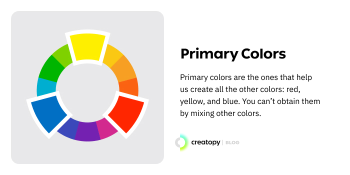
They are also a great starting point for any of your designs. Picking one of them will show you the right way to choose other shades, tones, or tints to place near the main color.
This doesn’t mean, however, that your entire visual should begin or focus on one primary color. There are plenty of choices to make if you want to concentrate on others. But you can think of primary colors as a safe start.
D. Secondary Colors
These represent a combination of two primary colors.
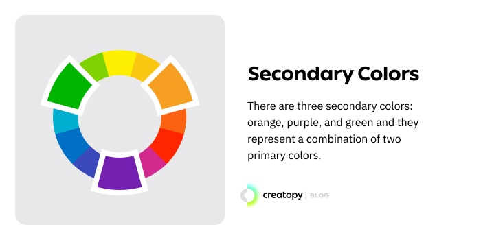
There are three secondary colors: orange, purple, and green. Here’s how you can create each of them:
- Red + Yellow = Orange
- Blue + Red = Purple
- Yellow + Blue = Green
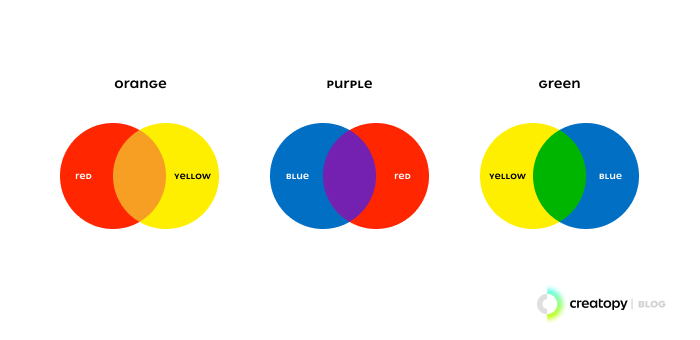
However, these colors can result only from primary colors at their cleanest state (or from their hues—a term we’re going to discuss later).
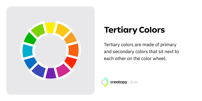
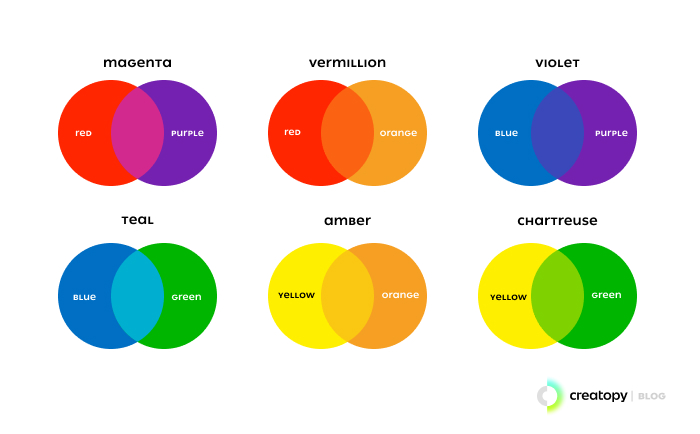
E. Tertiary Colors
Tertiary colors are created from a combination of primary and secondary colors.
And with this category, we enter a more detailed part of color theory.
This is because not every primary color can match with a secondary color to create a tertiary color. Red doesn’t create a harmonious color when mixed with green or blue with orange.
Tertiary colors are made of primary and secondary colors that sit next to each other on the color wheel. There are six:
- Red + Purple = Red-Purple (magenta)
- Red + Orange = Red-Orange (vermillion)
- Blue + Purple = Blue-Purple (violet)
- Blue + Green = Blue-Green (teal)
- Yellow + Orange = Yellow-Orange (amber)
- Yellow + Green = Yellow-Green (chartreuse)
Now that you know all about colors let’s talk about the color theory chart and color wheel.
F. The Color Theory Chart
A color chart looks like a catalog that has many different color samples. They can be placed on a single-page chart or as swatch books.
There are two different types of color charts:
1. Color reference charts
Color reference charts are used for color comparisons and measurements, either for checking the color reproduction of digital devices or in traditional areas such as photography or cinema, where the cameras on film are adjusted according to the lighting from the room.
Examples of such charts are IT8 and ColorChecker.
2. Color selection charts
Color selection charts are used by manufacturers who create specific color combinations of substances so that the resulting color is what they want.
These colors can be for paints, crayons, pens, and others. Pantone, NCS Palette (Natural Color System), or RAL systems are examples of color selection charts.
G. The Color Wheel
The color wheel is a visual representation of primary, secondary, and tertiary colors, along with their corresponding hues, tints, tones, and shades. It was first pinned down by Isaac Newton, in 1666, after experimenting with a prism. Newton showed that a prism could divide the white light into a range of colors, which he called the spectrum.
This idea was illustrated in a color spectrum circle, and it’s the foundation of all color theories that followed.
Newton also observed that the primary colors would mix in precise ratios to achieve secondary and tertiary colors.
In physics, colors are connected to the electromagnetic radiation of a range of wavelengths visible to the human eye. This may sound a bit too scientific, but the term wavelengths is important in this article as it will appear in understanding why people like certain colors or why those with color blindness can see clearly only some colors.
Warm colors are yellows and reds, while cool colors have a blue, green, or purple tint. The color temperature has a great impact upon the viewer, which we’re going to discuss extensively later on in the color psychology theories.
So, this is the basic color wheel, but there are certainly more than 12 colors.
The complex color theory chart is a visual representation of colors, together with their tints, tones, or shades.
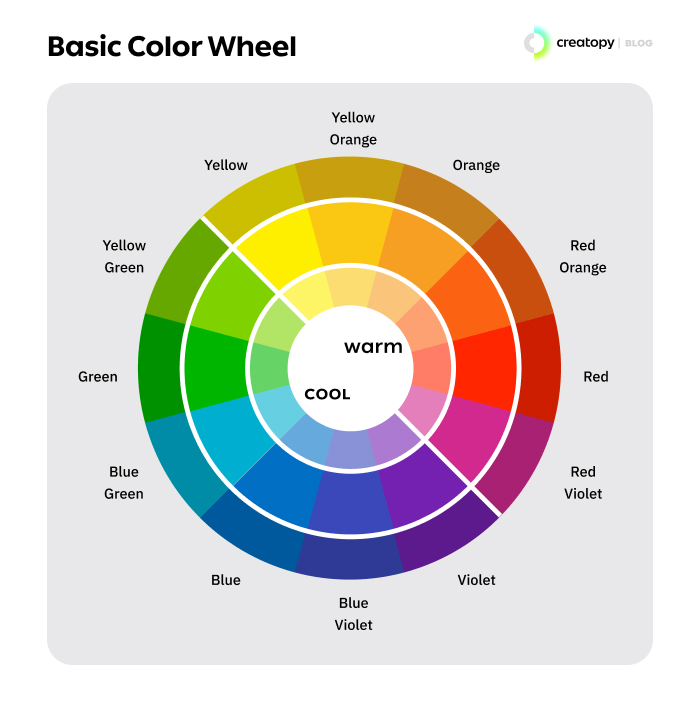
This type of color theory chart helps designers create harmonious color palettes, being guided by the visualization of how each color relates to the color that comes next to it on the circle.
H. Hue, shade, tint, and tone (or saturation)
Like I said before, a more complex color wheel won’t show just the primary, secondary, and tertiary colors, or in other words, the hues. You’ll also see their tints, tones, and shades.
Here’s what each of the terms refers to.
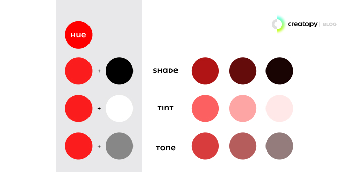
1. Hue
Hue is a pure pigment of color or the color itself. Because of this, all the primary and secondary colors are hues.
But, to get pure secondary colors, you’ll have to use the primary colors in their cleanest states, or you won’t get hues but other shades or tints.
2. Shade
Shade refers to the color resulting after you add black to a hue. So, when you say shades, you basically mean darker levels of the same hue.
Or, to say it even more simply, a shade is a darkened color.
3. Tint
On the other hand, tint means a lighter version of a hue because you need to add white to get different tints of a certain color.
4. Tone (or saturation)
When you add both white and black to a color, you create a tone. Or, we can also say that a tone is when a pure grey (only black and white) is added to a color.
Tone and saturation mean the same thing, but we use the term saturation when talking about digital colors.
Saturation defines the brightness or dullness of a color.
If you describe a digital color as pale pink, or blueish-gray it means the color is desaturated. A fully desaturated color is grey.
On the other hand, if you describe the color as neon green, it means it’s highly saturated.
Before moving on to and talking about color schemes, let’s see the difference between additive and subtractive color models.
I. Additive and Subtractive Color Models
Color has two different formats: the one you see on the surface of objects surrounding you and the one produced by light (or the digital colors).
With the evolution of digital screens and modern printing, the color spectrum was adjusted for these two different mediums, so there are two types of color models: additive and subtractive colors.
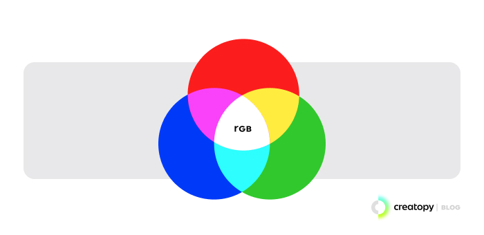
1. The additive color model (RGB)
This is the model that we use on different screens and in the color theory for designers, as this is something that they’ll work with most often.
The RGB color model can be confusing because the acronym stands for the colors red, green, and blue instead of red, yellow, and blue, which are the primary colors.
This is because the RGB model is made of colored light, and when red and green light are put together, they create yellow light, which would make yellow a secondary color in this RGB model.
RGB is called the additive color model because the more light you add to these colors, the closer the colors get to white.
You can start experimenting with colors on a blank color theory chart and see how they mix.
2. The subtractive color model (CMYK)
The CMYK color model was introduced in 1906 by the Eagle Printing Ink Company.
They tested different pigments to see which ones will work best in print and concluded that the three best colors to achieve the largest number of other colors were cyan, magenta, and yellow.
While the RGB color model works by adding more light into it, the CMYK is a subtractive color model that works on the subtraction of light.
Subtractive color mixing refers to combining the primary subtractive colors (cyan, magenta, and yellow). If you add equal parts from each color, all the light is subtracted, resulting in black.
Because we talk about physical colors, subtractive color mixing happens when we mix paints, dyes, or pigments.
When the primary subtractive colors mix, wavelengths are reduced from what we see because each paint will absorb some wavelengths from what other paints reflect. In subtractive color mixing, the number of wavelengths that remained is fewer than before mixing.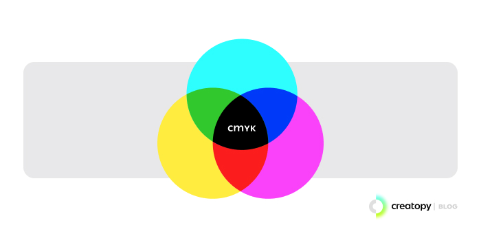
J. Color Schemes
Color schemes are all about harmony in design. That’s why we can refer to these schemes as simply color harmonies. Getting that perfect color arrangement is a must if you want to get people’s attention.
Although you’ll find that simplicity is key in color theory for graphic design, you can still go a little extra and combine two or more colors in a visual for a more powerful impact while keeping a harmonious color scheme. For that, you need to learn to adhere to the color theory chart to keep everything in a pleasing order.
It all comes down to the purpose of that visual, the brand you’re creating it for, the audience you address, and the result you want to obtain.
As everything is about creating a harmonious color scheme, the following models are part of the color theory for designers.
Still, you will find it applicable in other industries where the visual impact matters, such as film color theory.
1. Complementary colors
Complementary colors are the ones that will help you create a beautiful contrast for your designs.
This is a method that brings together two colors that are opposite on the color wheel. So, by doing this, you’ll put together a warm color and its complementary cold color (blue-orange, for example).
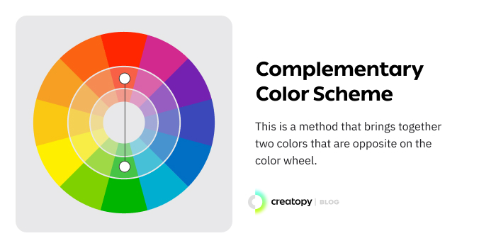
A complementary color harmony helps both colors shine, but to keep everything balanced, try to make one of them dominate the visual and the other just a splash of color that complements and contrasts the main color and emphasizes certain elements.
Using two complementary colors in the same amount may not bring the focus on what you desire.
Here’s an example of complementary color harmony used for the very well-known FedEx logo.
![]()
![]()
A complementary color scheme will always make your design stand out, even if you use the second color in small amounts.
If you need a color harmony example with this color scheme, here’s one template from our platform, which you can use straight away.

2. Split-complementary
This one is similar to the complementary scheme, but it uses more than two colors. So, if you choose blue, for example, you won’t pick just its complementary color, which is orange but pick two of them that equally split from orange, like in the image below.
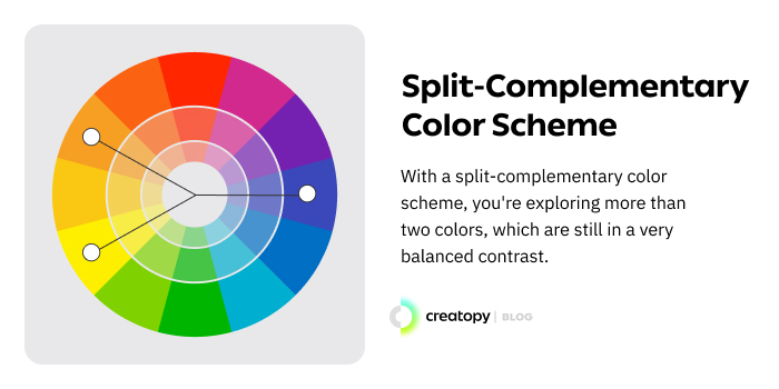
With a split-complementary color scheme, you’re exploring more than two colors, but which are still in a very balanced contrast.
Mountain Dew chose a split complementary color harmony for their logo.
![]()
![]()
And here’s a split complementary color harmony from one of our templates.

3. Analogous colors
Analogous color harmonies or color schemes consist of three colors that sit next to each other on the color wheel. These combinations don’t offer high contrasts but rather a blended look, where one color dominates the visual and the other two or three (tops) back up the main one.
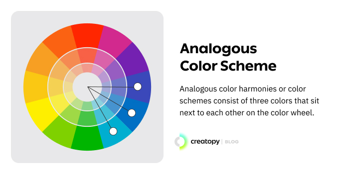
Analogous colors create delightful visuals, where everything seems in harmony.
You’ll need to insert a contrast with a complementary color if you need to make one particular element stand out from the analogous color harmony.
You’ll find one of the best color harmony examples is Mastercard branding visuals. They used an analogous scheme in their logo color combination.
![]()
![]()
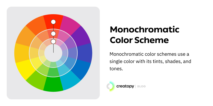
4. Monochromatic colors
Monochromatic color schemes use a single color with its tints, shades, and tones. This is a wonderful way to create a background color to which you can add a contrasting hue for making an element pop.
This is always a safe choice when you want the perfect harmonious color scheme.
One of the best monochromatic color harmony examples is the logo from Animal Planet.
![]()
![]()
5. Triadic colors
A triadic color scheme is formed by three colors that are equidistant on the color wheel.
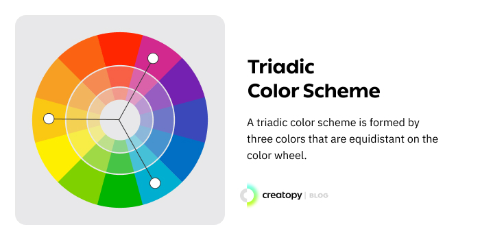
Here, because you have three different colors, it’s best to choose one as your main color and use the other two for highlighting. This way, you’ll keep your visual balanced.
One example of triadic color schemes is Burger King’s former logo.
![]()
![]()
And an example of triadic color schemes from one of the templates available on Creatopy’s platform.

6. Tetradic colors
A tetradic color scheme is made of four colors that consist of two sets of complementary colors.
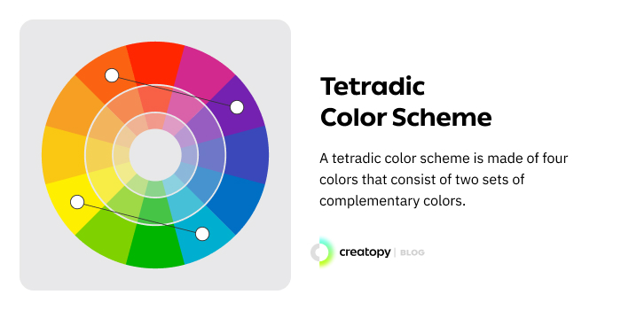
Creating a color scheme with tetradic colors can be a bit tricky if you’re not balancing them well enough. But to stay in the safe zone, apply the same rule as in the triadic color scheme: let one color dictate the visual and make the others come to its help and accentuate the design.
Or be as playful as eBay was using the tetradic colors.
![]()
![]()
How to choose the right color scheme
Now that you know which are the harmonious color schemes with a few color harmony examples, how should you choose yours?
Here are a few simple guidelines you can use:
1. Think of your audience
Before designing your visuals, you have to consider some aspects regarding your audience, like gender, age, or cultural background.
Once you have that established, it’s easier to focus on a color scheme.
When you want to address a certain category, it’s important to know what makes a design feminine or masculine, if you should apply it to your visuals, or keep the focus on gender-neutral elements.
2. Consider contrast for a sharper look
Even if your visual is based on a monochromatic or analogous color scheme, you can still insert contrasting elements to represent your design elements better and shed light on each element’s individuality.
If you want to focus your audience’s attention on a particular item of your design (e.g., the CTA button), the ideal thing to do is to bring all the focus on that element with high contrast.
The rest of your visual elements can be set on lower contrasts or other color schemes to blend better in the image as a whole and to maintain the overall harmonious color scheme.
3. Don’t oversaturate
Since you’re sticking with one of the color schemes mentioned before, your design should be pleasing to the eye.
But keeping your colors under control means also picking a dominant color with the other colors as accents.
If everything is way too saturated, your design will be tiring to look at, making the viewer confused while trying to process everything.
Moreover, the oversaturation will not bring everything together like it’s supposed to.
A good rule of thumb for keeping up with your design’s harmony is the 60%–30%–10% proportions.
This one is mostly used for website interfaces, which actually came from color theory for interior design, but it can help you in other designs too, and it works like this:
- One big part, or 60% of the design, has the dominant hue. Then, everything changes gradually.
- 30% goes to the secondary color.
- 10% is for accentuating the previous colors with another one.
Since the proportions are increasing progressively, the viewers can perceive everything naturally.
4. Keep everything on-brand
In the color scheme you choose for your designs, don’t forget about your brand’s aesthetics.
Or, maybe you can go already with the colors you chose for your brand’s color palette. If that’s the case, you can integrate the colors into all the future visuals.
Keeping your visuals on brand is not that difficult as it may seem. If you can’t use your brand’s colors every time, you can always use them in different tints, shades, or tones and indicate that the visual is part of your brand.
A good practice is to save the color schemes you used for your visuals in one place. Creatopy is the platform with a beneficial feature called Brand Kits to help you with your brand alignment.
And the last tip is an essential aspect that deserves an entirely separate chapter: theories of color psychology in marketing.
K. The psychology of colors in marketing
Colors can dictate a visual’s hierarchy, set feelings, moods, and thoughts. Colors are also the ones that help the viewer grasp the whole message better.
While colors are still a subjective part of our lives, there are a few general guidelines regarding the psychological aspect of each color in marketing.
Keep in mind that these psychological meanings of colors depend a lot on the context you’re using them in. To simply state that red means fury without adding a suitable copy to indicate this may not get you the desired reaction from the audience.
Let’s look into the meaning of the most frequently used colors.
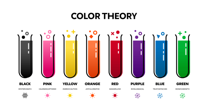
1. Red
Probably no other color shows such strong and contradictory emotions. Therefore, knowing the red color theory will come in handy when creating your visuals.
On the one hand, red can express love, passion, strength, energy, and increased attractiveness towards someone that wears red.
Put in a different context, red can symbolize aggression, terror, or fear.

You’ll also find red in the fast-food industry, as it encourages your appetite and desire to buy that food.
If you want to get people’s attention fast, red is undoubtedly an excellent way to do it. It can create a sense of urgency when used, let’s say, in a CTA button or a sale banner.
It can even stimulate the human body, accelerating your heart rate, so use it sparingly to avoid falling into an unwanted category.
Due to its long wavelength, red is one of the most visible colors in the color spectrum. Because of this, red is used for stop signs, sirens, and other things that imply a warning.
If we are to discuss a bit about film color theory, red is a very expressive color that suggests anger or feelings of overexcitement. With red, you can set a whole new level in a visual or motion picture. Just think of the movie Sin City.
2. Yellow
As kids, when we had to draw and color the sun, we obviously made it yellow, and that was always a symbol of summer and happiness.
Yellow’s symbolism stayed with us, and it’s still used to illustrate cheerfulness and optimism.
It’s also the easiest color to see by everyone. This is the reason why yellow is a good choice when you want to catch people’s attention.

You’ll find yellow in combination with red in the fast-food industry as they increase one’s appetite. And all can be traced back to The Ketchup and Mustard Theory. When we see these colors together, we instantly think of food.
Whenever you want to uplift someone’s mood or create something inspiring, you should think of yellow as a choice for your design.
But it’s also the most tiring color to the eye when used excessively, due to its high amount of reflected light. It can also cause feelings of anxiety and anger.
Once again, balance and harmony are key.
3. Orange
Orange is a secondary color that mixes red’s strong presence with yellow’s playfulness. This color helps create a feeling of happiness, creativity, and motivation.

Reading more into orange color theory, we see that this color is associated with comfort, food, and warmth, reminding us of the sunny days in the tropics and an overall feeling of wellness.
Although this color can stimulate logic and bring joy, it can make people anxious when used abundantly.
Remember the color ratios.
4. Green
Green is the most encountered color in nature, reflecting harmony and peace like no other.
This color stimulates the balance between our bodies and emotions, helping us make rational decisions.
It is also a sign of growth (in nature, in wealth) and of progress—when we’re digitally checking something we’ve done, the symbol for it is a green checkmark.
Green symbolizes life, fresh air, it relieves stress, and it has mostly good connotations. Among the few negative aspects of green, probably the most common one is associated with envy and jealousy.
In marketing, the green color theory is useful for environmentally friendly products or to promote an environmental cause.

5. Blue
Blue seems to be the universally accepted color and the most likable one.
Depending on the context you’re using blue in, it can show calmness, purity, or peace. It can increase one’s productivity, or, on the other hand, it can mean sadness (feeling blue).
But analyzing the blue color theory, we can see that it mostly shows trust and reliability, triggering a positive mental reaction rather than a physical one (like red does). Blue calms and brings feelings of serenity. It’s often seen as tranquil and secure.
Blue can provide a sense of confidence and professionalism, which is why many corporations use it in their marketing aesthetics.
This is why blue is also the preferred color by tech companies. In this ever-changing world of technology, brands must show they’re reliable, starting with their choice of colors.

But, as always, in just the right amount.
Used in greater quantities, it can imply coldness, and people can see your materials as distant and aloof. Just think of Picasso’s “blue period.”
The blue color theory shows us that this color is the least appetizing in food. That’s why some weight loss plans include blue food or plating in someone’s diet. The explanation would be that blue rarely occurs naturally in food (except blueberries and plums), so we tend to associate this color with something poisonous.
6. Purple
Purple is the color of spirituality and magic. Think of the great purple infusions in some fantasy games that are taking you to other realms.
Purple is associated with imagination and mystery but also with luxury and royalty. This color represented the higher ranks in Roman times, for example. People who wore the purple togas were the most powerful.
It was associated with royalty because purple was an expensive and difficult color to procure. In the 15th Century, purple dye was produced by crushing the shells of a small sea snail.
It’s a secondary color resulting from the combination of the strong red with the conservative blue. The mixture between colors created purple, the color of balance.
In marketing, you’ll find purple in creative services and various beauty or luxurious products.

7. Pink
Pink is usually associated with femininity, love, kindness, and compassion. It’s a warm, soothing color that relaxes and brings a calm mood.
This softer, sweeter version of red is a color of hope with a calming effect.
But used in big amounts can take us to the more negative side. Extensive use of this color can mean immaturity and weakness.
You’ll find pink in beauty products, skincare, clothing, and it’s absolutely perfect if your target audience is mostly female (talking about stereotypes, huh).

8. Gold
Gold is the epitome of luxury and abundance. You can associate this color with richness and treasures almost exclusively in every country.
This is why you’ll most likely find the gold color in jewelry ads.
Be careful, though. Too much use of gold will make your design look too proud and somehow dismissive.
Even if this is an ice cream company, Halo Top uses gold color in their branding aesthetics: packaging, ads, and website.

9. Brown
Brown is another color that we often see in nature, and it gives a sense of reliability, security, and strength. These are the feelings that are evoked when used in branding as well.
It’s a conventional color that can bring a feeling of warmth and comfort, but it can convey a sense of emptiness and void when used in large amounts.

10. Black
Black is yet another color that holds different meanings at opposite poles. While black is the color of sophistication, expensive products, seriousness, reliability, and oftentimes intelligence, in some cases, it can mean a mysterious evil or even death.
Black is the color with no light added to it. You won’t find it on the color wheel because it isn’t considered a color (although it’s easier to address it like this).
Black shows power and elegance. This is why many law or business cards are simply black and white.
Infusing this color in your marketing aesthetics will offer a sense of dependability and trust.

Black is also the color that can create the illusion of smaller items.
Use it sparingly because, in digital space, the usage of too much black can send a feeling of sadness and negativity.
11. White
While black is the absorption of all colors, white is the lack of them. Whenever you want to express something pure, white is your color. It also expresses peace and cleanliness.

White helps you bring light to any color and the feeling of free space in any design.
It is the foundation color for any minimalist design. White can be associated with a clean slate that sparks creativity when being looked at.
In advertising, white can suggest simplicity in high-tech products, but you can also associate it with medical products or dairy products.
When used excessively, white can become an unfriendly empty space, so play with it creatively.
12. Grey
Grey is a neutral color, the combination of black and white, therefore of no light with light. This means you can use gray to express either something in between and unclear (the “grey area”) or combine it in a positive way and show wisdom and sophistication.
Because of its neutral character, grey can also mean practicability and timelessness.
As with every other color we’ve talked about before, this one too can suggest feelings of depression and nothingness when used abundantly.
But when used in proper amounts, this color can advertise your products or services effectively.

L. Color Blindness
Marketing and design go hand in hand when it comes to creating visuals for advertising and better communicating the meaning of a product/service.
But the perception of colors used in advertising or branding can not be the same for everyone.
Some people who are color blind (or have CVD—Color Vision Deficiency) see colors differently, in an altered way, or they don’t see them at all. This means they won’t receive the message in the same way as the rest of the population because the color-text association is different for them.
What is color blindness?
Color blindness or color vision deficiency (CVD) manifests when one or all the pigments from the human eye’s cone cells are missing.
A very short biology explanation would be that our eyes have retinas, and they host the cone cells (functioning better in bright light, reacting to different light wavelengths) and rod cells (which help our night vision).
When all the pigments (photopigments) are present in the cones, your eyes perceive all the colors.
If you have missing pigments, the colors appear differently, leading to color vision deficiency.
Every color has a different wavelength of light. Reds have long wavelengths, while blues have shorter ones.
Color vision deficiency affects around 1 in 12 men and 1 in 200 women worldwide, and it can manifest in different ways.
Let’s take a look at them.
a. Red-green color blindness
This manifests when the photopigments in your eyes’ red cones or green cones don’t work as they should. It mostly affects men and is rarely encountered in women’s cases. This can be split in:
- Deuteranomaly. In this case, the yellow and green appear redder, and it’s also difficult to distinguish blue from violet—all due to the malfunction of the green cone photopigment.
- Protanomaly. Because the red cone photopigment doesn’t work properly, the orange, red, and yellow look greener, and the colors are less bright.
- Protanopia. The red cone cells are not working at all. Therefore, red will appear dark grey, and some shades of orange and green will look yellow.
- Deuteranopia. In this situation, the green cone cells are not working, so reds will appear closer to brown or yellow, and greens will be dulled down and look beige.
b. Blue-yellow color blindness
In this situation, the blue cologne photopigments don’t work properly or are simply missing. This deficiency affects men and women equally.
- Tritanomaly. This happens when the blue cone cells work minimally, so the blue appears greener, and it’s difficult to distinguish pink from yellow and red. This deficiency, though, is extremely rare.
- Tritanopia: This too is extremely rare, and it means no blue cone cells. Because of their absence, blue looks green, and yellow appears light grey or violet.
c. Complete color blindness
This color vision deficiency is also called monochromacy, and there are two types:
- Cone monochromacy. It occurs when only one cone pigment works and two out of three photopigments (red, green, or blue) don’t work. When that’s the case, it’s difficult to distinguish colors. If one of the cones that doesn’t work is blue, then the vision is also unclear.
- Rod monochromacy. It is also called achromatopsia, and it’s the harshest color blindness because all the cone cells are faulty, and as a result, everything appears in black, white, and grey. Because of this deficiency, the eyes can be more sensitive to light.
Tips for designing for color-blind people
If you want to create visuals for color accessibility and address the colorblind population, you have to think of ways to make them visible for everyone. While you don’t necessarily have to change the color palette you already chose for your designs, there are a few simple ways to create them so that the message should be clear to everyone.
- Try to avoid certain color combinations that are known to be difficult to perceive by color blind people, such as green and red (which is the most problematic), green and brown, blue and purple, green and blue, light green and yellow, blue and grey, green and grey, or green and black.
- Use high contrast and supporting text because while color blind people can’t see colors properly, they can still discern colors at a higher saturation in high contrast. Also, don’t rely your visuals strictly on colors when you’re communicating something. You must use a copy to support your design.
- Use the monochromatic color scheme if you want to be in the clear and avoid any color vision deficiency backfire.
- Use textured visuals when you’re presenting important information, for example, in maps or infographics, so that everyone could distinguish all the details.
- Use symbols or icons when you’re trying to signal or really point out crucial information.
M. What Research Tells Us About Colors
We know now that Newton pinned down the color spectrum, which helped us with all the future color theories. Still, there was also Goethe’s color theory, which is not really a theory since he didn’t want to prove anything but rather explain things.
This came to life from his interest in paintings. Unlike Newton’s more scientific approach, Goethe’s color theory analyzed human’s perception of colors.
We can discuss further some interesting findings related to colors and human behavior towards them.
Besides the great impact that color has on our psychological or even physical responses, as we’ve seen earlier, there are more places where colors are used to shift our perception in a certain direction. And some studies show us this.
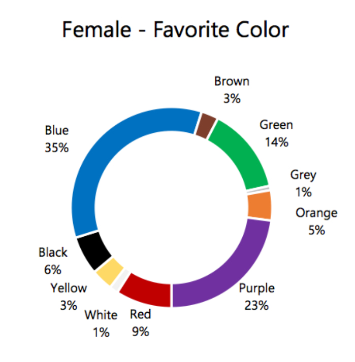
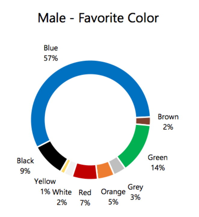
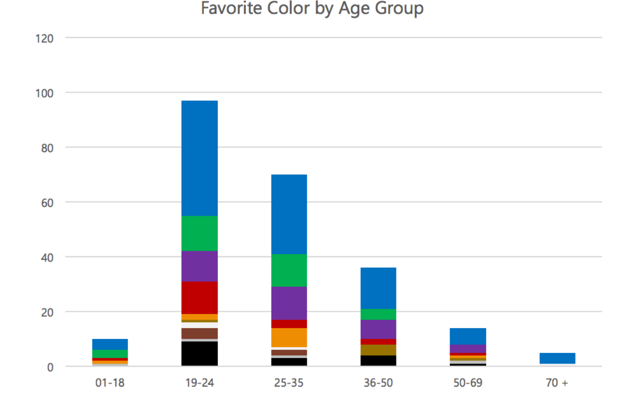
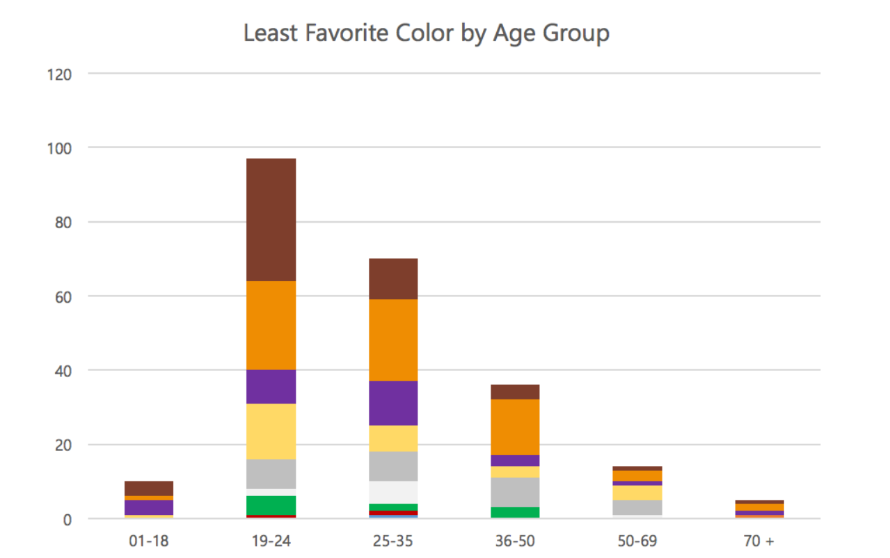
1. Colors, genders, and age
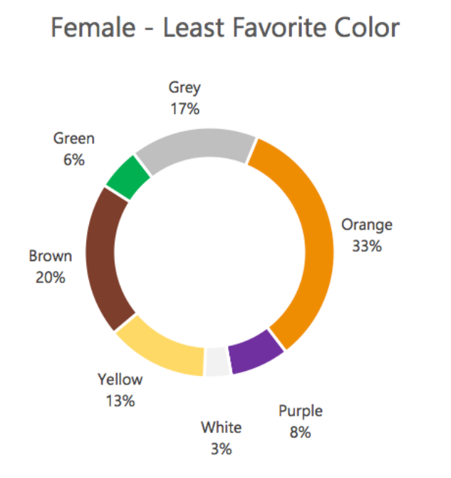
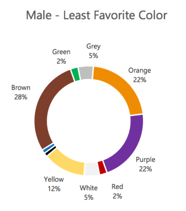
It shouldn’t come as a shock that some colors are preferred according to gender, but it goes further than girls love pink.
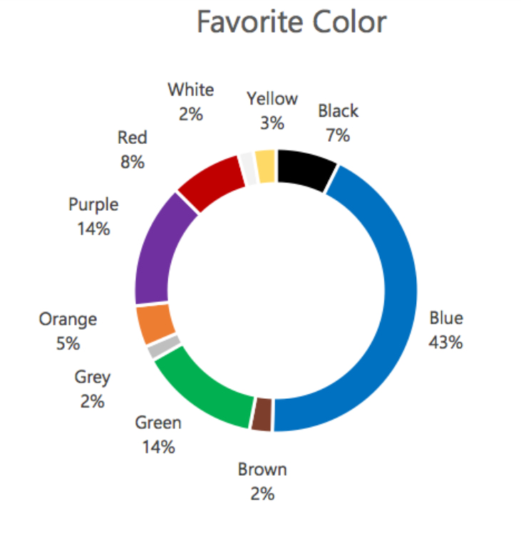
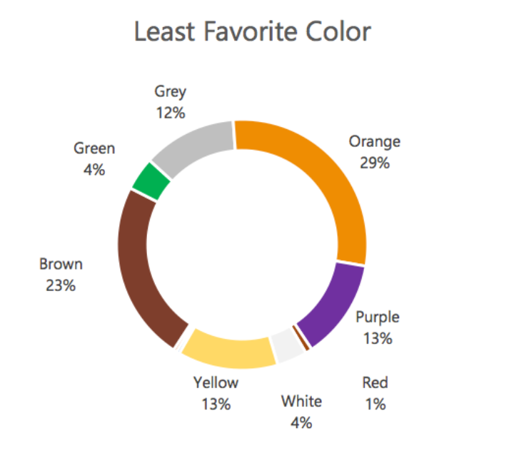
While our background, personality, and the way we want to feel or look in certain situations influence these likings, there seem to be a few common answers when people are asked about their favorite and least favorite color. Blue is considered a universal favorite, while orange is the most unliked one.
See the following answers from Joe Hallock’s study:
Color preferences change with age. Although blue and red remain among the preferred ones no matter the age category, some colors are not picked anymore once people get older. For example, this happens with yellow, which is liked by children but not chosen by adults so much anymore.
A scientific explanation for it would be that with maturity, we tend to prefer colors with shorter wavelengths, like blue or purple.
Moreover, as people get older, their preferences are also changed by their past experiences and cultural influences.
2. Colors and study
As Joe Hallock says in his study, a researcher named Gilbert Brighouse conducted a study where he analyzed several hundred college students’ reactions under the colors red and green. Those placed under a red light gave 12% faster responses than those placed under green light.
But, for longer and more sedentary tasks that need our attention throughout the day, green lights are preferred.
In the same study, we have Birren’s statement that says: “Activities of a muscular nature are better performed in bright light and amid bright surroundings. Exacting mental and visual tasks are better performed with softer and deeper colors in the environment (though with ample illumination over the task)”.
3. The Isolation Effect
How can something or someone stand out from the crowd without using words or sounds? With a bright color, or at least a different one from all the rest.
In marketing, once you have a clear brand positioning, you need to continuously create visuals to impress, and using the right color combination is one powerful way to do it.
We’ve also seen the color psychology, and you can surely rely on that when picking the colors for your designs.
But there’s one more trick you can use to make your visuals outshine all the rest, and it’s called the Isolation Effect (or the Von Restorff effect).
This theory shows us that when an item is placed in isolation, it impacts the viewer, and it’s much more likely to be remembered.
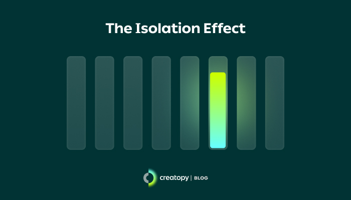
So, whether you want your visual to have one particular item to stick out or a product that needs packaging like no other, this psychological principle is going to help. When, for example, a visual has a monochromatic combination applied, you can use the isolation effect on your call-to-action button so that it won’t blend with all the other colors.
4. Colors and their nicknames
In an article about color findings, Gregory Ciotti mentions a study called A rose by any other name… that analyzed responses from their subjects when presented with the same color but under two different names, for example, mocha and brown.
Even if the colors were the same, mocha was preferred over brown.
You’ll find very interesting names in makeup (on eye shadow palettes, lipsticks, etc.) that make the experience much more enjoyable.
Another study says that consumers prefer paints with more creative and alluring names, and they even find the colors more attractive because of that.
And this theory applies to almost everything that’s out there.
This shows us that with a name full of pizzazz, people will perceive colors differently.
5. Colors as expressions
Not only can colors be used in design to imply certain meanings to which people react, but we use colors in our everyday language.
Colors are used in expressions or metaphors, and they brighten up our conversations or give a more symbolic meaning to our texts.
For example, one can see the world through rose-tinted glasses (they’re rather optimistic) or can be purple with rage or green with envy.
Some other examples refer to the color red. We can say a situation is in the red to describe financial instability and loss. Or we use the expression red flag to tell when there’s something shady about a person or case. Another common saying that implies a person is angry is to say they see red.
Moreover, think about the color blue and in how many instances we usually use it: once in a blue moon, blue Monday, blue blood, the blues, blue ribbon, feeling blue.
Another color that has created many expressions is black. You’ll find it in: Black Monday, The Black Death, black magic, blackball, black sheep, blackmail, black hat SEO.
6. The pink controversy
When we say pink, we instantly think of femininity or girly products.
But the history of this color holds much more to it than we may think.
Since pink started to be associated with femininity (during and after World War II), it was also a subject of experimentation inside prison cells to see if this color can tame aggression.
In 1980, some wardens started painting the prison cells with a shade of pink dubbed Baker-Miller Pink. But because it was bright pink, they did not notice a calming effect among inmates.
In 2011, a Swiss psychologist named Daniela Späth retried the experiment across ten prisons, but with a softer shade of pink, a Cool Down Pink.
This experiment’s controversy is that while some say these shades of pink helped to calm and relax the inmates, some of them felt like they’re living in a girl’s bedroom, being, in fact, degrading.
7. Colors behavior in art
There’s certainly no art without colors. Therefore, we’ll find color theory in art too.
Some researchers took the time to analyze just how important color theory in painting is.
Unlike his predecessors—Newton, who analyzed colors mathematically, and Goethe, who wanted to explain the human approach to colors–, Josef Albers was the one that observed color behavior in art.
Josef Albers’ color theory exists because he wanted to offer a scientific examination of colors for artists.
He even had an extensive course taught at the university, in which he analyzed together with his students how colors behave in different contexts.
He also wrote a book called The Interaction of Color, which deals with his discoveries about how colors interacted, plus a scientific color theory in painting. There are detailed explanations about how some colors can neutralize or alter others or the effect of light on hues.
As presented in his book, Josef Albers’ color theory explains how the human eye can’t grasp certain colors as they physically are because of their perceptual shortcomings. These limitations, which he wanted to point out, are meant to help artists. If they understand how humans interact with art, they will expand their reach through the colors they use.
His work influenced big movements like Minimalism, color field painters, Abstract Expressionism, and not only. Josef Albers’ color theory is still a big deal today. It keeps influencing and helping young artists who seek to understand how humans perceive color and color theory in art through a more scientific eye.
N. Cultural meanings of colors
The purpose of understanding color theory in marketing is to know how to use colors to reach more audiences. But there’s one other important side to all of this color theory: learning about how the color you choose for your visuals is perceived by audiences coming from different cultures.
If you want to address a certain audience, this information is vital for your brand’s success and positive perception and all the marketing campaigns that will follow.
Here are a few of those meanings according to different regions of the world.
- Red
In Western countries, red induces feelings of love, passion but also of fear, danger, or other negative emotions.
In India, red means purity, this being the reason you will often see brides wearing traditional red wedding dresses.
In China, this is the color of the Chinese New Year, which also symbolizes luck and happiness, while in the East European countries, this is the color that still creates associations with the past communist regime.
It’s best to read into the red color theory first because of its strong character and different connotations according to each culture.
- Blue
This is the color of authority, security, and safety in Western cultures.
Because it evokes trust and doesn’t bear too many negative connotations, blue is frequently associated with banks, security officers, and many brands that want to appear as trustworthy to their customers.
In Eastern and Latin American cultures, blue is correlated with spirituality. Almost the same goes for Hinduism, where blue reminds people of divinity and love.
Understanding the blue color theory and the main differences in certain cultures will help you use it accordingly.
- Green
In Western cultures, green is related to the environment, health, and growth. It means a totally different thing in Indonesia, raising more negative feelings, such as infidelity. Here, it’s considered a forbidden color.
In China, green holds the same meaning as in Indonesia. They even have the expression wearing a green hat, which translates to a man being cheated on by his wife. Precisely for that, you will never see a man wearing a green hat in China.
In Mexico, however, green is considered the color of independence. It is also their national color.
In Islam, green is associated with religion, while in South America, this is the color of death.
With such different meanings according to countries, it’s important to read carefully into green color theory before applying it to your designs.
- Orange
Orange is the color of Halloween and autumn in Western countries. So, applying orange color theory in designs addressed to these countries would be a definite win.
In Eastern cultures and Japan, this color means love and happiness, while in the Middle East, it is linked to mourning and loss.
In Indian cultures, orange is seen as sacred.
- Yellow
The color of the sun is also the color of happiness and optimism in the U.S., while in South America and Egypt, this is the color of mourning.
For some African countries, yellow reflects a high rank in society, and only certain people can wear it.
In Germany, yellow carries feelings on a more negative side, like jealousy or envy.
- Brown
Like all the colors mentioned above, brown holds both positive and negative meanings according to countries.
In the U.S. and the Middle East, this color symbolizes stability and harmony with nature, while in Eastern Countries and India, brown is related to mourning.
- Black
Black is associated with mourning and death in many cultures but is also a color that shows elegance and sophistication.
Because it’s such a strong presence (even associated with masculinity in Latin America), we also associate it with quality. That’s why many luxury brands use black.
- White
White bears very contrasting connotations according to different cultures. While in Western society and many other countries, white is the color of weddings and purity, in Asian cultures, this is linked to death, mourning, and even humility.
There are certainly more cultural meanings associated with colors. The ideal thing to do before creating visuals and extensive marketing campaigns based on them, you should analyze your target audience to avoid any mishaps.
Conclusion
Understanding color theory brings you one step closer to creating visual content that will engage your audience. It improves your branding, marketing and ultimately increases sales.
This knowledge will come in handy for everyone working in an industry where creativity is involved. Therefore, you can start with an introductory color theory study and dive deeper into what interests and adheres to your niche.
Get a strong head start and experiment with mixing colors on a blank color theory chart to learn them better.
I’m curious to know: what’s the main thing you learned from this article? Let me know in the comments.
For me, it was learning about all the cultural differences colors can hold. Also, that experiment with the pink color got me thinking.