You probably found yourself at least once staring at a poster online, on the street, or even in an establishment. And you most definitely must have spotted one in a dental clinic.
Which is why we’re doing to delve deeper into the world of dental posters.
Nowadays, when the world of advertising is bubbling with creativity, we have very high expectations when it comes to choosing a specific product or business.
And the dental scene is no exception.
Advertising for toothpaste, dental clinics, or even floss is done in very eye-catching and impressive ways everywhere we look.
However, not all are created just for the sake of advertising, and some contain handy information to raise awareness. Usually making use of colorful and bright imagery, dental posters are meant to be attractive to a broad audience, ranging from kids to elderly people.
To provide some inspiration for those looking to create dental health posters, we put together a list of the most creative posters out there, so check them out:
1. Hide and teeth
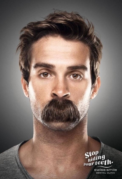
Here’s one dental care poster that definitely makes you wonder what’s happening here? Then you read the text, and it all makes sense. It’s a great example of cleverness that relies on simple elements that perfectly send the right message.
2. Glow in the dark
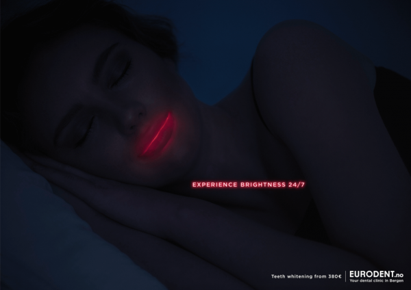
Remember when you were a kid, and you used to put a flashlight under your hands and see if the light goes through it? This is precisely what this poster is alluding to, except it’s using teeth and their brightness here. Advertising for teeth whitening, this is probably one of the most ingenious dental treatment posters out there.
3. Don’t settle for the Tom-Toms
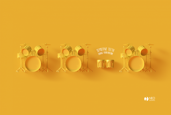
A poster on the care of teeth like this one will almost always focus on a common dental issue–teeth sensitivity. Using images of several instruments, this poster is playing with the viewer’s imagination and suggesting that the instruments are metaphors for our daily habits. By changing our routine and trying out something different, we can definitely improve our oral health.
4. Even vampires need checkups
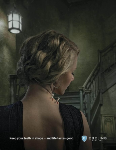
This is a dentist poster that’s just perfect for Halloween. It’s basically saying that if you don’t take care of your teeth (even if you’re a vampire), you might find yourself without them one day. That being said, it’d be best to visit this clinic and keep your teeth in good shape.
5. Enjoy Valencia’s vibes without a worry
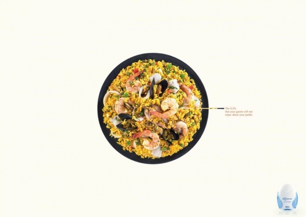
Another one of the best oral hygiene posters, this particular one is advertising for dental floss. It’s using a simple image of food to say that even though your guests might love it, they won’t do it 100% because some of it is bound to get stuck in their teeth. The image is appealing, and the text, despite its conciseness, it’s highly clever.
6. Don’t overdo Halloween
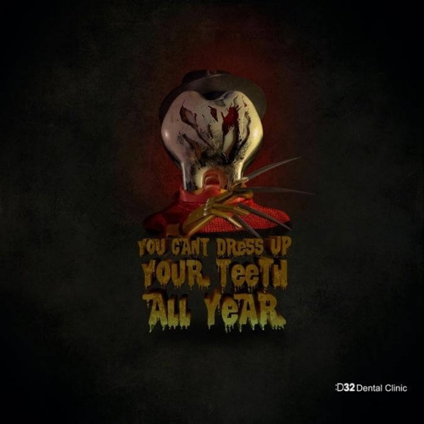
Another one of the best Halloween-themed online dental posters is so ingenious that it deserves all the candy. It’s using the holiday as a metaphor for teeth health by saying that teeth should be taken care of and not be hidden or neglected. The visual is also a bit scary-looking, which is why this poster is bound to get a lot of attention.
7. Catch the thief of joy in time
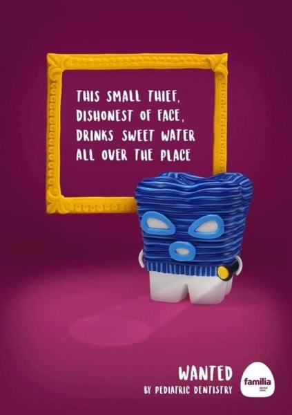
Dental clinic wall posters need to be appealing, and this is an excellent example of a poster that is targeted at kids. Using a cartoon-like image and bright colors, the poster can be hung in a pediatric dental clinic and is sure to attract the attention of both parents and kids.
8. Fool me once, strike two
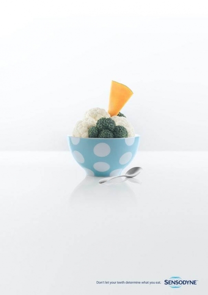
Another tremendous dental poster for clinic is this one that has a compelling message. It’s relying on an image of what seems to be ice-cream, but at a closer look, you’ll realize it’s actually a bowl full of vegetables. The message is clear–you should not let your teeth determine what you eat.
9. Did the chicken cross the road?
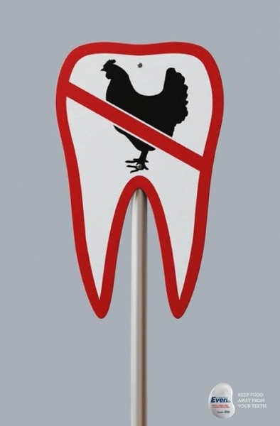
Although much simpler and straightforward than the previous posters, this one does an excellent job of telling the audience what’s it about, in a very clear way. Advertising for dental floss, the poster is using an image of a tooth as a traffic sign to show that meat has no business getting stuck between your teeth. The campaign has two more variations of this, featuring other images of animals.
10. Do you want to live a dental horror story?
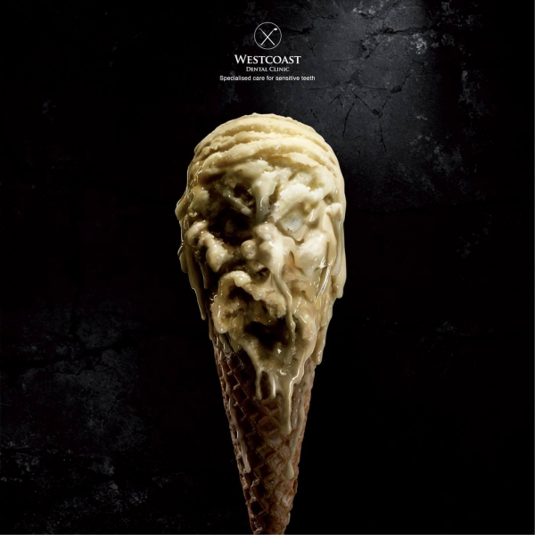
This one is undoubtedly one of the best dental clinic advertisement posters, due to both the idea and the graphic design that goes with it. It could be used around Halloween as well, but it would actually be suitable all year round. As scary as it might look, the poster is depicting how many people with sensitive teeth look at specific types of food. Ice cream, in this example, seems as terrifying as possible when you know the discomfort it gives you when your teeth are sensitive.
11. Struck by highlighting
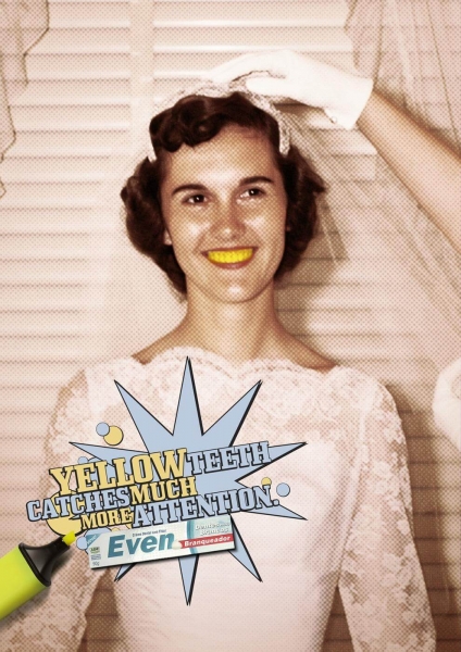
Here’s a brilliant way of taking advertising for teeth whitening to another level, by highlighting the issue (pun intended). It’s pushing the idea of yellow teeth to the extreme by using a yellow highlighter and therefore creating a visual impact.
12. Avoid turning your teeth into drama queens
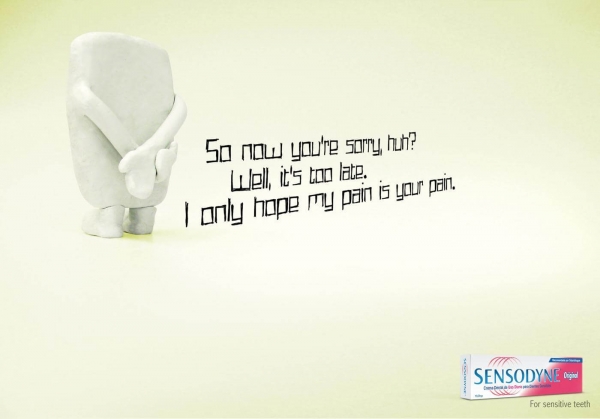
If you thought that dental humor won’t work for dental office posters, think again. Teeth are sensitive “beings,” too, and they will take things way too personal. It’s the perfect combination of excellent copy and simple but good design that makes this poster just brilliant.
13. Chew and run
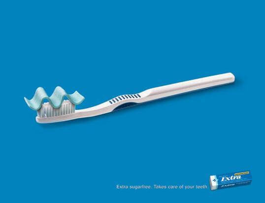
Most of us have probably reached for some chewing gum plenty of times whenever we couldn’t brush our teeth, and this ad is using precisely that idea. Although chewing gum is not as efficient as brushing or flossing, it can be an additional step in taking care of our teeth.
14. Life gets tough; your teeth should too
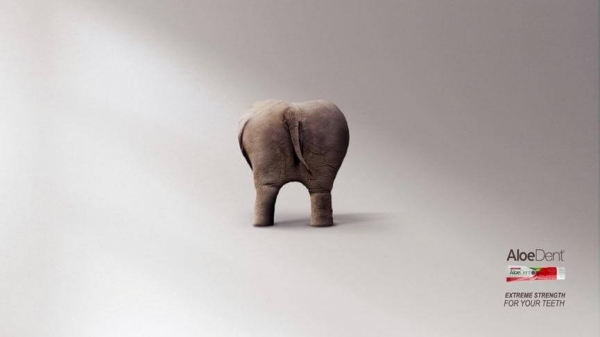
Stronger teeth? As strong as a rhino? You got it. This is one of the most creative dental posters for clinic out there. It’s a great concept, and it has multiple variations featuring other animals shaped like a tooth. It’s great that they also added the copy necessary for interpreting the visual since it might not be that obvious at first glance.
15. Can the dentist’s humor loosen the tension?
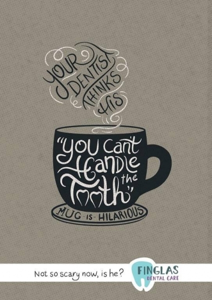
You don’t see much cursive in poster copy nowadays, mostly because some creatives might think that it would not look as legible as your standard font. However, combined with the right colors and images, it can look great and be perfectly readable, as in this example. The reason why this poster is one of the best is not just because of the font, but also because of the brilliant copy which brings just the right kind of humor to the table.
16. Do the flossing
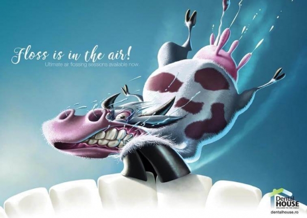
Here’s another example of how funny dental posters can get. This one relies on the use of cartoons of animals as a metaphor for pieces of food stuck between your teeth. The poster conveys humor very easily both through the image and copy, doing a great job at advertising for a dental clinic.
17. You, too, can help Princess Peach
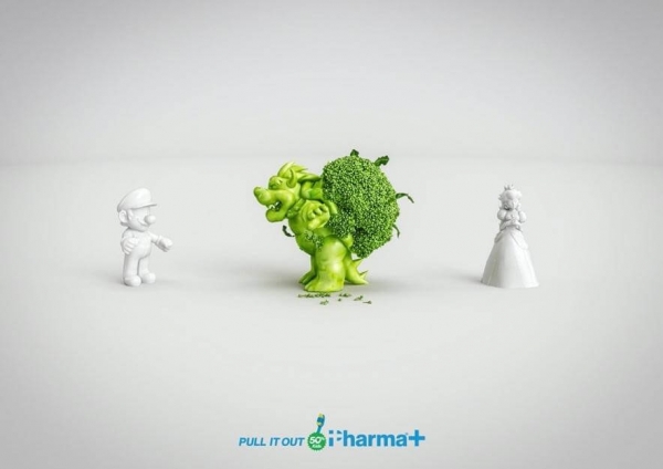
This one is actually aimed at dental hygiene for children featuring characters that are very popular among this particular audience. The broccoli is depicted as a monster, while the teeth are represented by Mario and the princess. It’s an effective method of using things kids can relate to, getting them to be interested in what the poster is conveying.
18. It may look unnatural, but not for your teeth
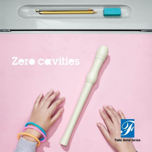
Creativity at its best. This particular poster was created by the public dental service in Stockholm to inform citizens about their right to dental care. The campaign is using holes as a reference to cavities, and by removing the holes of familiar objects, they manage to correctly send the message across and create an impact at the same time. Most people would be intrigued to see such a visual representation and would naturally want to know more about it.
19. Don’t lose your uniqueness
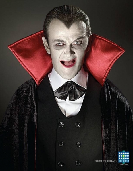
What’s the first thing to come to mind when you hear Dracula? You’d probably imagine those sharp teeth of his–but there are none in this poster. The creatives behind this example did a great job of using a well-known mythical character and highlighting the absence of one of its most popular features, pointing out that you should take care of your teeth before it’s too late.
20. You can run, but you can’t hide
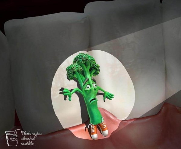
The copy that reads There’s no place where food could hide works great with the image of a scared piece of broccoli being caught in the spotlight. Adding human attributes to food is another excellent way of making a poster funny, and this example not only looks funny but also the idea behind is what probably made you chuckle a bit.
21. It’s over. Let it go.
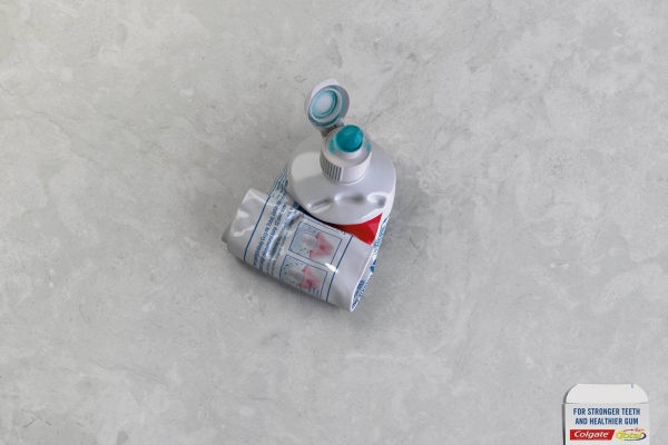
This particular Colgate ad offers a very fresh perspective on toothpaste that could help you strengthen your teeth. You might be used to seeing images of actual teeth in these types of posters. However, for this one, the image is only alluding to teeth by showing some bite marks on the toothpaste. Through this, it’s implying that your teeth will get to be so strong that they’ll be able to make a dent in a toothpaste tube. Despite its simplicity, the poster is powerful and really innovative.
22. Out with the old, in with the new
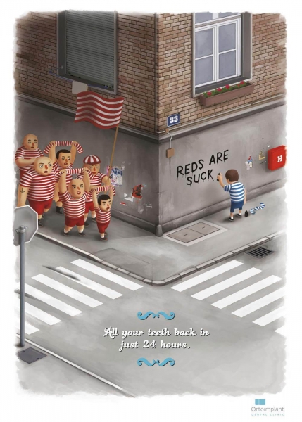
Another brilliant example, this time advertising for teeth implants. It’s funny, creative, and fresh. The visual is really well put together, portraying teeth as teams–the old ones are part of the blue team, and the new ones, the implants, are part of the red one. While there’s only one remaining tooth from the old team, right around the corner, we see the new team eagerly doing their march. The copy also goes excellent with this, it’s simple and to the point–you can get your teeth back in just 24 hours.
23. Get rid of the giant neon in the room
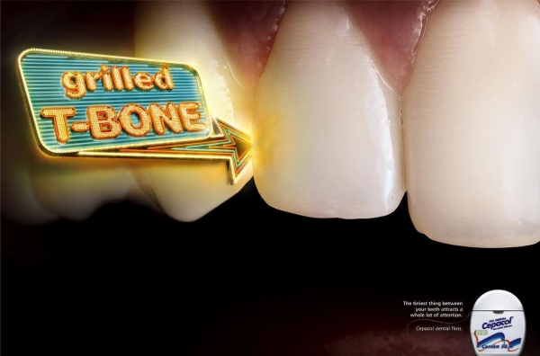
Using dental floss should mainly be done to keep our gums healthy. However, another purpose for it is to get rid of any pieces of food that can get stuck between our teeth. Whenever this happens, it attracts attention; many of us have indeed found ourselves in the position of being told that we have a little something between our teeth. This is what this poster is pointing out, with the use of exaggeration–a giant neon sign attached to your teeth might be the perfect representation of the embarrassment one might get when they find themselves in this position.
24. Enjoy the simple things in life
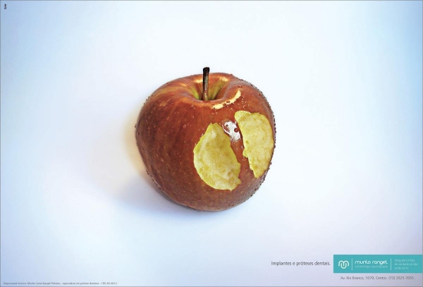
The image of an apple might give you some anxiety if you have sensitive teeth or missing some. What this poster is trying to show is that there’s a solution for that through the use of implants. Being able to take a bit out of an apple should not be a struggle, and this is perfectly shown by using this particular visual. The message is so straightforward that it doesn’t even need text.
25. Your teeth are not your sins
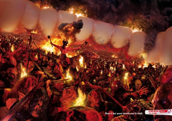
Now here’s a visual that is sure to attract plenty of attention. It’s so compelling and thought-provoking from the visual to the copy. A hell of a dental poster (pun intended) that’s comparing dental issues with the idea of hell, and many of us can actually attest to the fact that it can sometimes feel like you’re going through absolute torture whenever something’s wrong with our teeth. It’s a great concept that definitely stands out.
Final Thoughts
While the task of creating dental posters might not be an easy one, as long as you have the right ingredients like creativity and good graphic design skills, you should be able to handle it.
It’s essential to keep in mind that health ads have to be visually appealing, and they should get some kind of reaction out of the viewer.
Also, avoid as much as possible not to rely on typical cliches or overused ideas–bring something new to the table, and you’re sure to create an impact through your dental posters.
What was your favorite dental poster out of all of these? Let me know!