Creating ads that catch the eye is more difficult than ever in today’s world, where everyone is fighting for online attention.
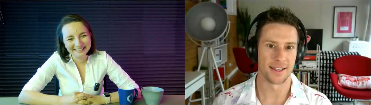
To find out some secrets on how to create scroll-stopper ads that get your audience to click and convert, we decided to invite Jacob Cass to Creatopy’s webinar sessions.
Jacob Cass is a brand designer, strategist, educator, podcaster, business coach, community builder, and the founder of JUST Creative, an award-winning branding & design consultancy that doubles as an industry-leading blog.
I turned the webinar into a written format for those of you who absorb the information better this way. Otherwise, you can access the webinar recording on-demand.
Now, let’s get into the subject.
B. What makes a good ad campaign?
C. Million-dollar ad campaign case study
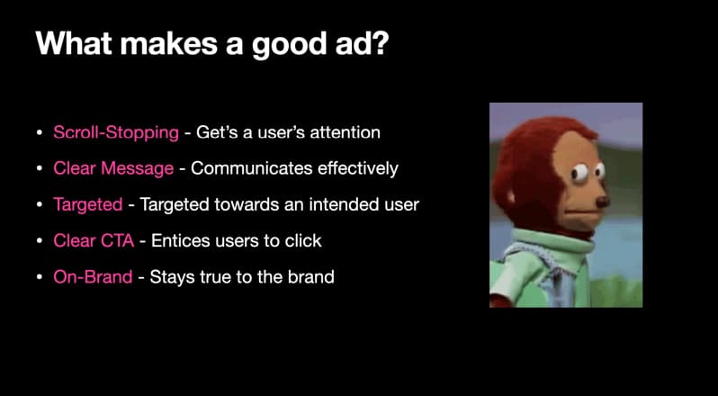
A. What Makes a Good Ad?
A good ad stands out and speaks to the user. It automatically gets them to read the message or click the ad, so they take the actions you want them to.
A good ad has the following:
- It’s scroll-stopping, managing to get the user’s attention.
- It has a clear message, meaning it communicates effectively with or without words. The ad copy is essential, but the ad as a whole also sends a message.
- It understands its audience. Knowing how to communicate in a way that appeals to different kinds of people is necessary.
- It has a clear CTA and entices users to click.
- It’s on-brand. You need to maintain the same tone of voice and visual identity across all brand materials to ensure consistency and cohesiveness.
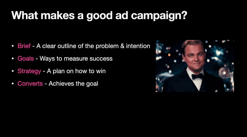
B. What Makes a Good Ad Campaign?
First, let’s clarify the difference between ads and campaigns.
An ad is an online graphic promoting products or services that people see and click on, while an ad campaign is a series of ads meant to help your brand achieve goals, such as generating sales or leads.
But what do you need to build up a good ad campaign?
- Write a clear brief outlining the problem and the intention of the ad campaign.
- Set goals to know why you are creating this campaign. This will help you measure your success. It’s important to be granular with your goals specifying as many details as possible (e.g., “I want to have X number of customers by this time next month”).
- Create a strategy to reach your goals.
- Have an ad that converts to achieve your goal. Design strong creatives that speak to the right users, sending the right message while also staying on brand.
C. Million-Dollar Ad Campaign Case Study: TechInformed
Ad campaigns can be successful if you set them up the right way. For this purpose, you need problem-solving, proposal writing, and sales skills.
Jacob Cass offered a detailed case study of how he built a lucrative ad campaign for the TechInformed company, whose goal was to earn millions of dollars with an ad campaign.
Following the elements mentioned about how to make a good ad campaign, here are TechInformed details.
1. The brief
TechInformed is a tech news website. They are research-led, and independent, and deliver news analysis and unique information to empower professionals to make more informed decisions.
They demanded a strategy for the brand’s position, personality, identity, messaging, colors, and fonts.
2. The target
This banner ad campaign was about selling advertising on their side. TechInform sells sponsorship packages that include web banners, reports, newsletters, social media, and ad banners on its website.
3. The goals
TechInformed sells sponsorship packages. They aimed to sell several packages from their three offerings (gold, diamond, and platinum).
4. The strategy
Now, they needed a plan to succeed.
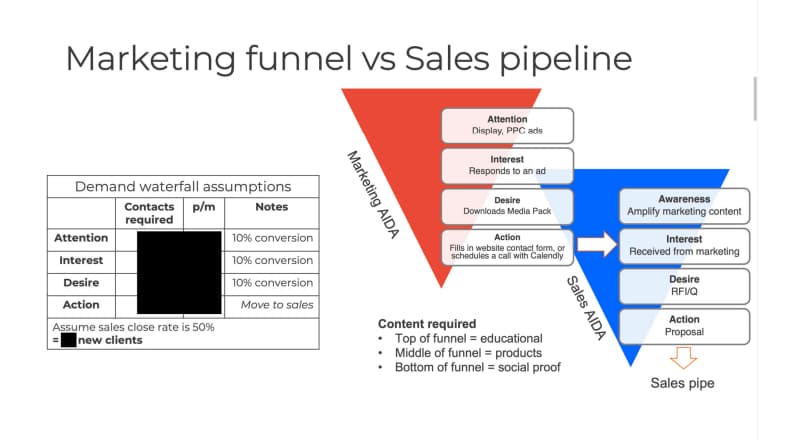
For the sales plan, they’ve used the AIDA strategy. AIDA is an acronym for Attention Interest Desire Action. It’s about getting customers’ attention, sparking an interest that leads to desire, and ultimately making them take action.
For TechInform, the AIDA strategy looked like this:
- Attention. Get customers’ attention with scroll-stopping ads;
- Interest. Make customers click on the ad and fill in a form with their details;
- Desire. Download the brochure describing each package in more detail;
- Action. Schedule a call with the sales team.
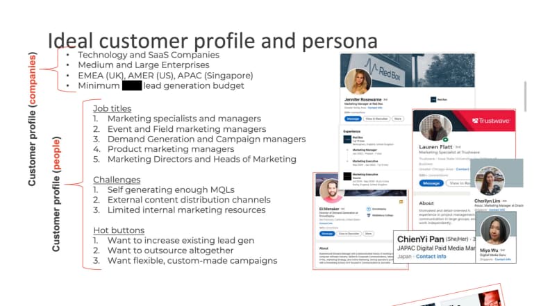
5. Ideal customer profile
Before taking further action, it was also necessary to know the ideal customer profile for TechInformed.
Even if they targeted billion-dollar companies before working with Jacob, the people targeted weren’t CEOs, but the persons behind the team, middle management, or C-level executives.
TechInformed’s ideal customer profile is people who try to stay on top of their job and would visit a new website like TechInformed to stay informed. These people are smart. They are marketing specialists who aren’t paying attention to flashy banners and want solutions to their problems.
Project Overview
The TechInformed company sent all the details mentioned above, but Jacob took this brief and structured it to diagnose their problem and give them a solution.
1. The challenge
TechInformed is looking to achieve X million dollars by selling its packages to sponsors.
2. The plan
Jacob first needed an audit of the website, marketing materials, and funnels to achieve its goals.
They had to explore new opportunities and optimize the funnels to improve and make the plan work.
The next step was to build up the creatives and the messaging.
And finally, to suggest new improvements beyond ad campaigns (e.g., email campaigns, new landing pages).
3. The goals
The goal was to create on-brand scroll-stopping ads with compelling messaging to connect with the target audience.
The other goals were to increase CTR, the traffic to the TechInformed landing pages, conversion for the contact form, and to optimize the sales funnel.
4. Key focuses
For TechInform to sell its sponsorship packages, they need to focus on some key elements in its ads, such as MQLs, distribution, connection, brand awareness, growth, and benefits.
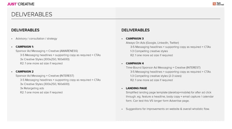
5. Deliverables
TechInformed will have an advisory consultation, strategy, four campaigns, and a landing page template.
Why four campaigns? They had an interest in different areas of the funnel, and they wanted to have ads for their awareness phase, interest phase, then advertisements that could be rotated through LinkedIn, Google, and Twitter. The last campaign was a time-bound campaign.
For each campaign, Jacob went into detail and explained how he built the ads to make them scroll-stopping.
First Campaign: Attention Phase
The first campaign was for the awareness stage, where customers learn about TechInform.
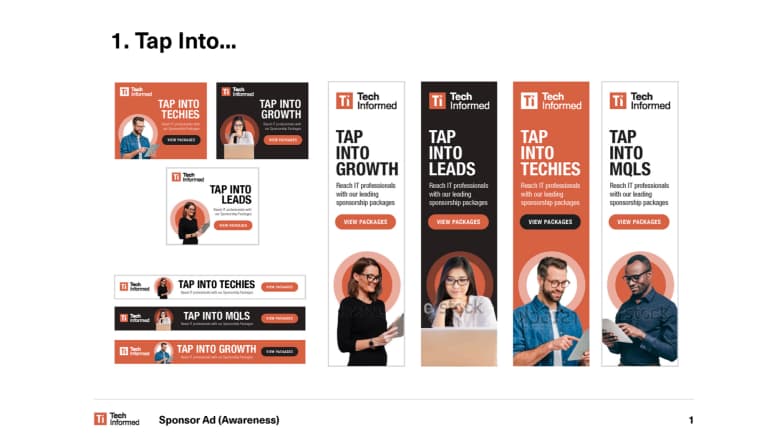
1. The first ad: Tap into
It comes in three sizes and maps out who is targeted with this ad.
If you look at the people chosen for this ad, they all wear glasses and convey the tech vibe as they are all using devices.
The campaign’s title is called “Tap into” because it’s very versatile, and you can complete the title with whatever suits TechInform, such as growth, lead, techies, and MQLs.
It also has the same initials as the brand “t” and “i.”
The headline is bold, and the message is clear. The ad has a descriptive copy with extra information before tapping the button.
The CTA is also clear.
The colors of the ads are different depending on where they’re going to be displayed. For a black background, you would choose to display the white one to have better contrast and attract the user.
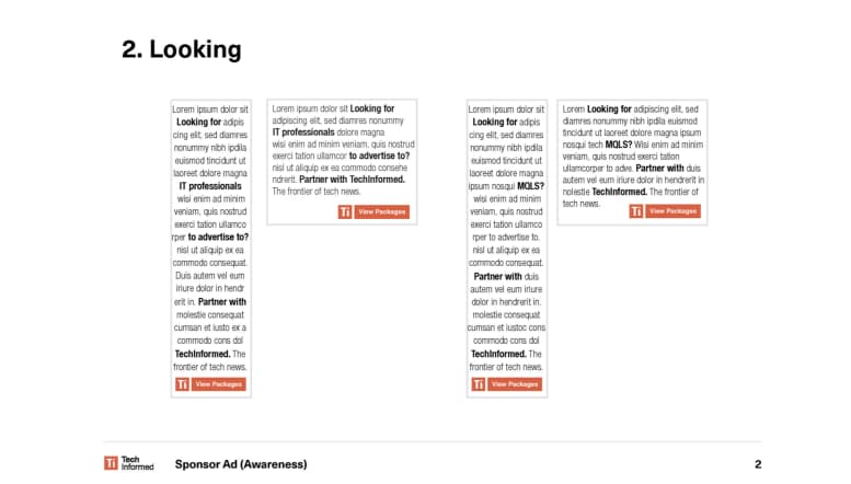
2. The second ad: Looking
You never know which type of ad will work, so you must try different things.
That is why for this ad, they tested a creative with roughly 90% words.
If you see an ad with a lot of text and a couple of bolded words, it gets your eye, and you stop scrolling. People want to know the message to figure out the bold text.
The text was addressed to marketers with words like “MQLs” to get the target audience’s attention.
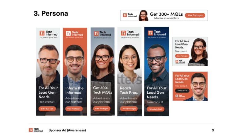
3. The third ad: Persona
For this campaign, they used faces because the human brain is more receptible when seeing faces.
When you are on a website and see an ad with a strong face, it creates a scroll-stopping effect.
You always want to consider the context when choosing a stock photo. For this campaign, the ads will appear in different countries, including Singapore, the UK, and the USA. To ensure the audience in Singapore relates to the ad and feels represented, they will be shown a version featuring a picture of an Asian woman.
The copy they used is short and to the point, informing viewers about the benefits of advertising on TechInformed.
The CTA is “schedule a call,” which repeats on the landing page. Matching the ad with the landing page is essential for a better conversion rate.
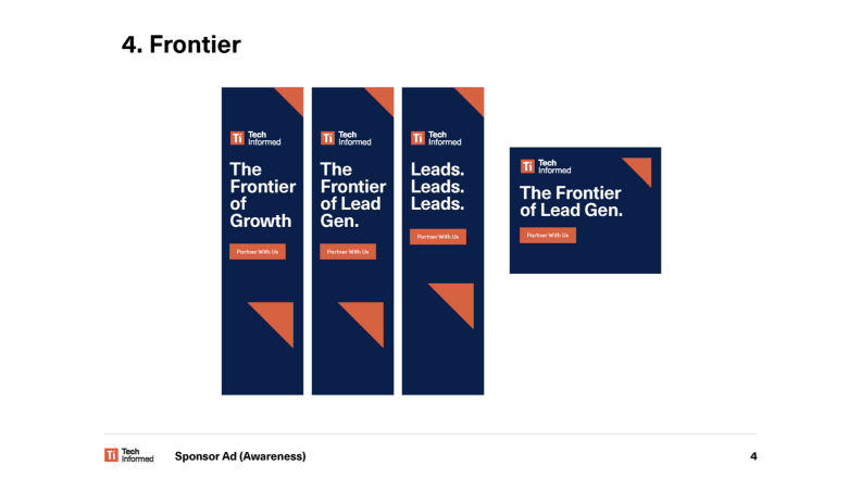
4. The fourth ad: Option frontier
This ad plays with the TechInform tagline. It’s also tied to their brand and colors, and the triangle seen in the ad is an element from their logo. The messaging and the CTA are clear and catchy.
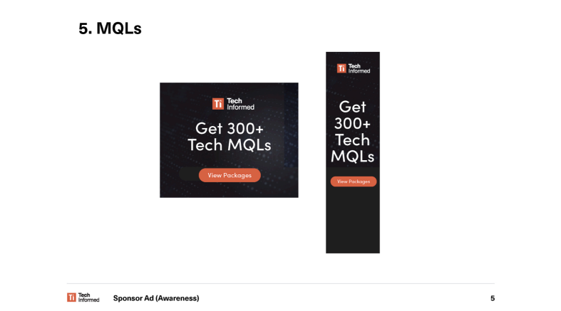
5. Fifth ad: MQLs
You don’t always have to create mind-blowing ads. Sometimes simple ads can convey a message the best.
Take this ad, for example. You have the TechInform logo, a short text about benefits, and a clear CTA.
Second Campaign: Interest Phase
This campaign is based on the second layer down the funnel, where the customers are interested in TechInform.
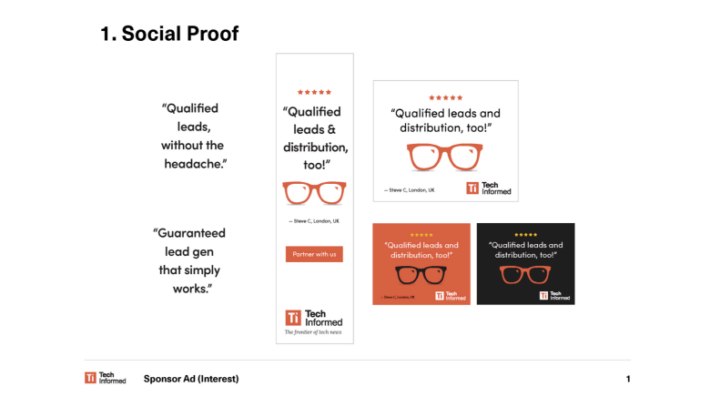
1. Social proof
Since people are already interested, you need to give them social proof and extra information about why they should partner with you, work with you, or buy your product.
For these ads, Jacob used testimonials. The five stars are a graphic element showing this is premium service. The ad also has a lot of white space and clear copy. It speaks to the tech.
The reflection in the glasses is the TechInform logo, and little touches like this can elevate an ad.
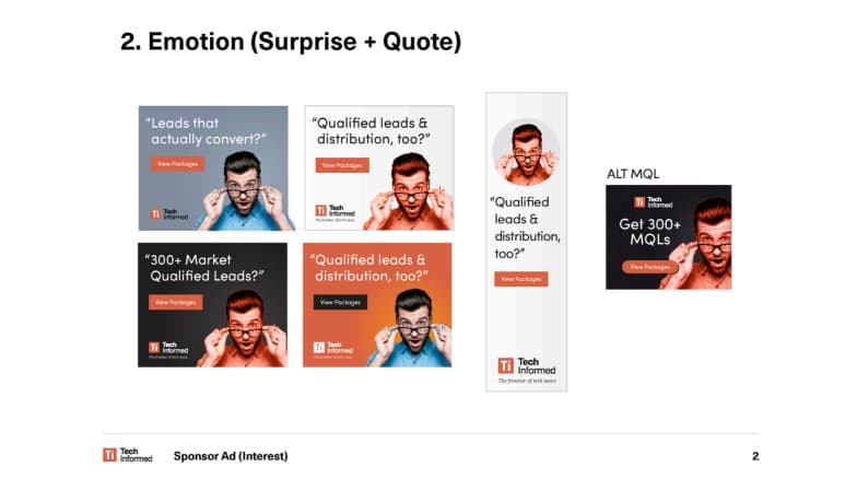
2. Emotion: surprise & quote
This next ad uses people’s faces and emotions to draw viewers’ attention. The emotion conveyed here is a surprise that perfectly combines with the other elements of the ad.
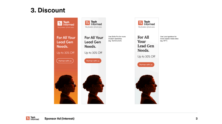
3. Discount
How do you get people to buy your offerings? You give them discounts. Therefore TechInform offered a slight discount on their packages.
Jacob updated the typography for this ad depending on where the ad will appear.
The typography is still on-brand.
The thought behind it is that if the ad appears in the New York Times, the classy typography will appeal more to users.
4. Retargeting
Jacob used Google’s dynamic ads, where you can type in some copy and choose a photo, and Google will change the ad’s layout and make it responsive based on Google magic.
For this, Jacob and the TechInform team created different types of copy and uploaded them into Google to get ad variations. Afterward, they searched through data to see which headline worked best.
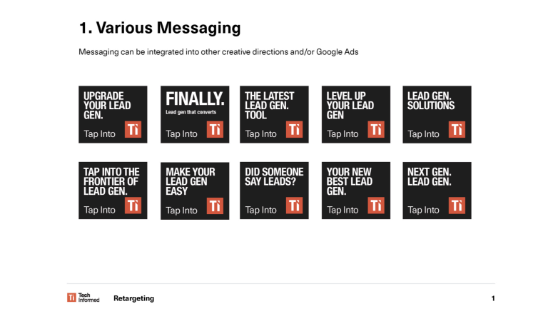
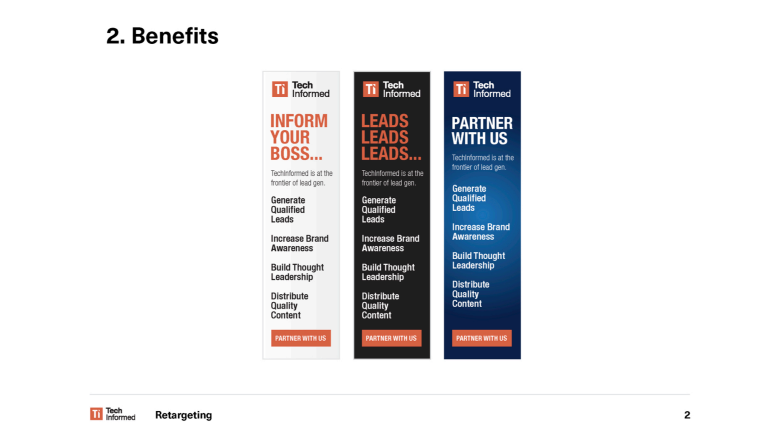
5. Benefits
Being a retargeting ad, the customers may have seen the targeting page and maybe even clicked on the ad before.
Thus retargeting is more informational, used mainly to remind about the benefits. The design has the same color scheme as the previous ads and mentions the benefits.
Third Campaign: Always on Ads
In this campaign, they’ve used ads that have a key idea to attract users.
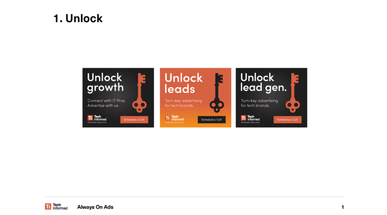
1. Unlocking
The key idea in this ad is “unlocking.” You can see a system you can use if you have a clear idea of what you want to say in your ads.
In this case, the “unlock” refers to growth, leads, and gen, and it could just as well work with other benefits that fit the campaign.
They used the symbol of a turned key to tie the message to the design, and the two go together like bread and butter.
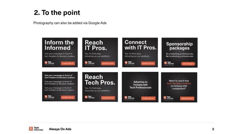
2. To the point
This ad was created using Google’s system, where you can input text and add photography to their system to swap photos easily. All you have to do is plug in a different copy.
The copy for this ad is very to the point. It talks about the benefits these marketing managers want in a few words. As Jacob Cass said, “Don’t underestimate simple.”
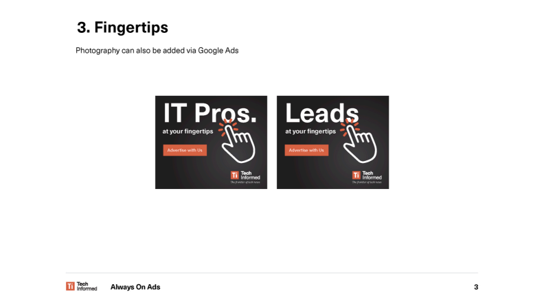
3. Fingertips
For this ad, they’ve used a simple visual, playing around with different text variations. The hand cursor symbol gets attention, pointing to the most significant word in the ad copy. It also encourages viewers to click.
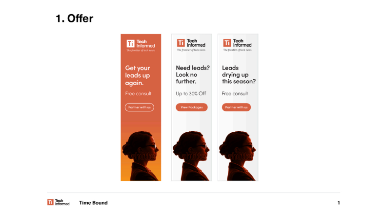
Forth Campaign: Time-Bound
Around July and August, people usually go on holiday, and companies’ leads tend to go down. Thus Jacob created a time-bound campaign.
1. Offer
Since people are less inclined to spend money in this period, you should have some offers to lure them in, such as a free consult or a 20% discount, as shown in the ads they used.
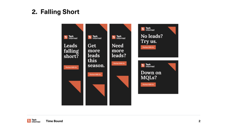
2. Falling short
This ad has a short message based on the problem and solution approach. It brings techniques used in previous ads into a more time-bound campaign.
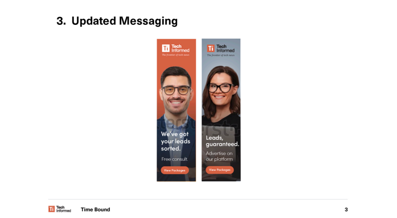
3. Updated messaging
They’ve reused the previous visuals and copies to create new ads. Remember, you must always test different ad variations and see what works best.
Customer Ad
The previous ads were for selling sponsorship packages, but the following ads target regular customers.
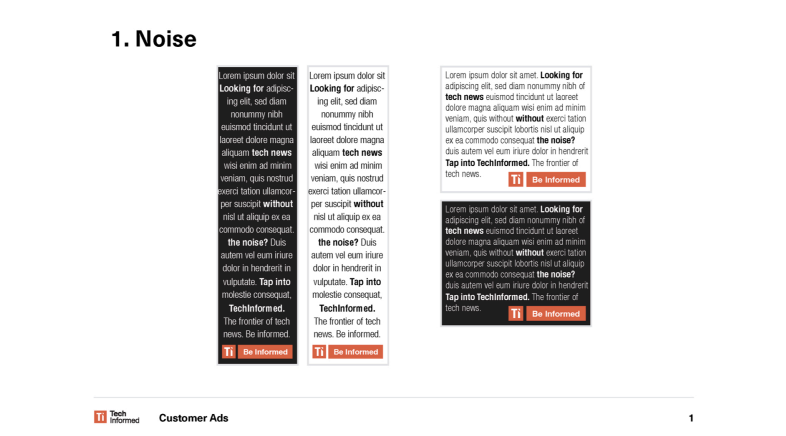
1. Noise
People may not know about TechInform. But let’s assume someone browses New York Times’ IT section and comes across an advertisement saying, “Are you looking for tech news without the noise? Tap into Techinformed”.
Using a block of text with a few bolded words to convey the message is clever and makes you want to remove all the noise and focus on being informed. Even the CTA simply says “be informed,” which is a TechInform key benefit.
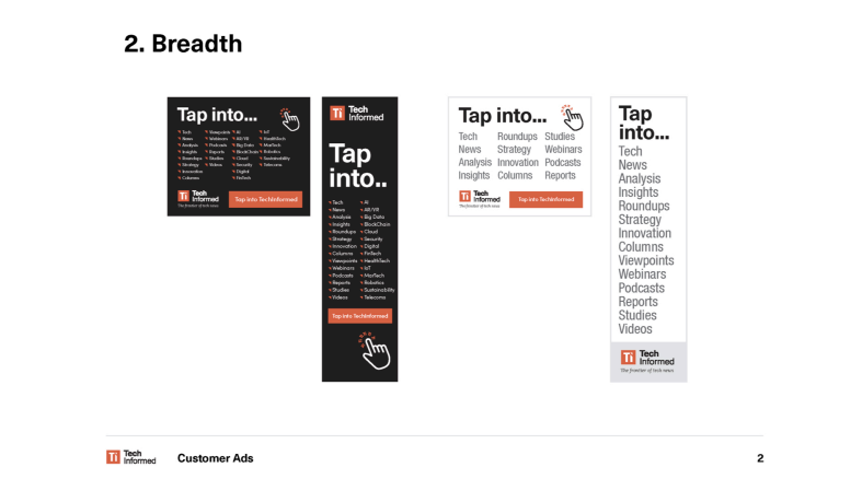
2. The breadth of the offering
If people have never heard of TechInfom before, it is an excellent strategy to show them the breadth of offerings TechInform has.
The focus areas in these ads are tech, news, analysis, and more. The design gets people’s attention with the short and direct message “Tap into” written in a large font and then introduces them to a wide list of possibilities.
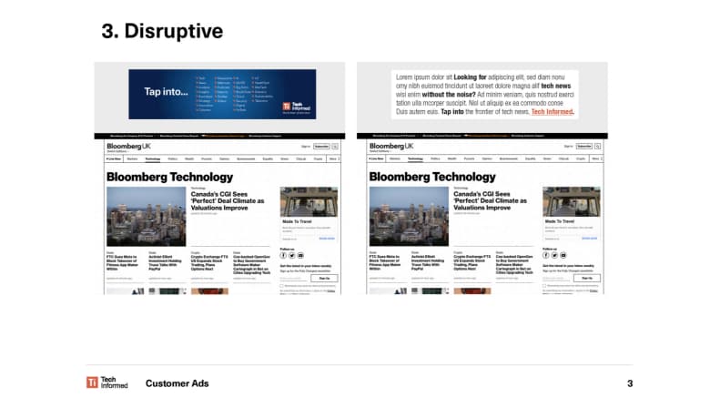
3. Disruptive
TechInform used the ads presented earlier in different sizes.
Here are two different types of ads on the Bloomberg website. On the left, the blue design showing the breadth of the offerings stands out, completed by the logo for brand awareness.
The one on the right blends with the Bloomberg page, but the bold words catch viewers’ attention, and the orange text in the CTA encourages them to click.
Ads and Landing Pages
You first need to get people’s attention for ad campaigns to work. They need to read your message, understand your benefit, click your ad, and finally land on a landing page.
Below are some landing pages created for the campaigns mentioned below.
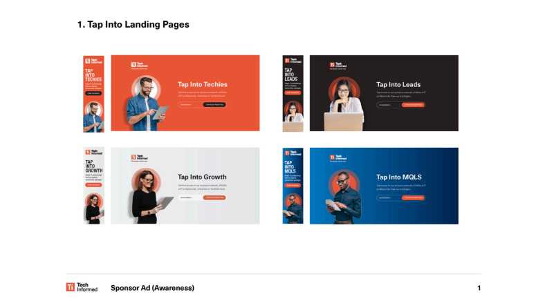
1. Tap into: Short landing page
When creating a landing page, its content and design must match the ad.
The “tap into” ad campaign had a bold and brand-consistent ad design, with a clear headline and a strong CTA.
Its landing page has the same background color, image, and depth. It’s also on-brand, uses the same headline, plus a more supportive copy. It employs words like “exclusive” and numbers, which are very powerful in advertising.
The copy and the ad visual on the landing page speak the customers’ language while staying in line with the brand’s identity.
The copy “Get access to an exclusive network of thousands of IT professionals” promises a desirable pool of qualified leads not everyone can get their hands on, thus making an offer prospects cannot refuse.
Thinking of TechInform’s goals, this campaign aimed to get people to download the pack. To achieve this goal, it introduced users to what TechInform sells, where it sells, how its system works, what each package does, and how it will benefit them.
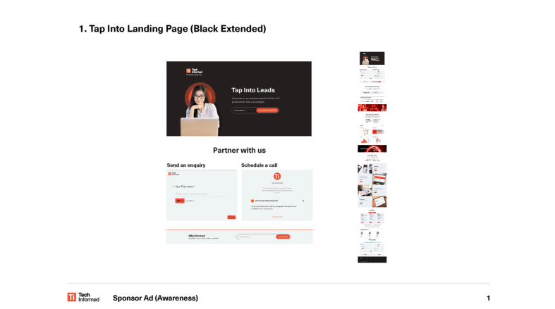
2. Tap into: Extended landing page
In the image below, we have the extended landing page for the “Tap into” campaign, which talks about Tachinform, who they are, and who they work with. It also shared some of their data, information about their packages, and the biggest benefits, finishing off with details about scheduling a call.
This page has many options to capture the user’s data, including sending a message, scheduling a call, and subscribing to the newsletter.
Jacob suggested TechInform update the “schedule a call” module with Calendly so users can choose a date and time for a meeting to find out more details.
Also, for the “send an enquiry” module, he suggested they should put three fields, specifically name, email, and comment. It reduces friction and drives better results than having a Typeform embed where users type, then click next to see the following field.
The reason for making two pages for this ad campaign was to see which one performs better, as, in advertising, testing is the key to success.
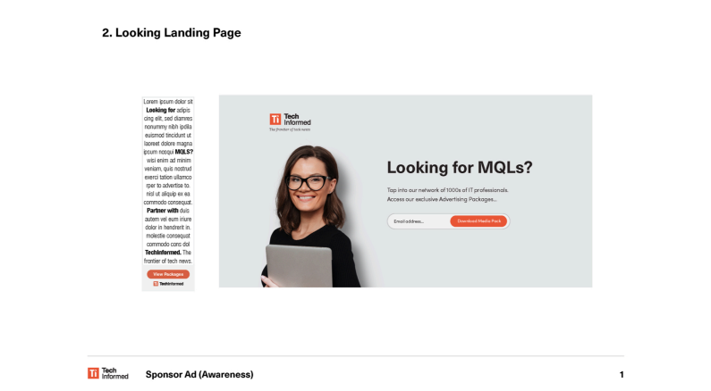
3. Looking: Landing page
This landing page has the exact copy and the same feel as the ad, using keywords strategically to convey benefits. For instance, “large network” tells users TechInform has an extensive distribution system they can take advantage of.
Once again, the copy references thousands of professionals employing the word “access to make it more exclusive. By using all these techniques, the landing page makes the offer look very lucrative.
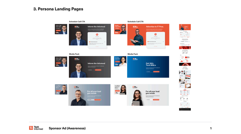
4. Persona landing page based on the sponsorship ad (Interest)
The “schedule a call” button on this landing page matches the ad’s CTA, so it does not confuse users. The content describes the same offering, just in a more detailed way.
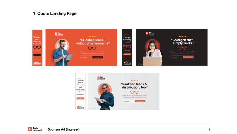
5. Quote landing page
The style of this landing page differs from the ad. Jacob and the TechInform team have introduced the graphic elements from the quote and on the landing page, but they’ve also added photos of buyer personas to show the face behind the words. The copy matches the one written in the ad, slightly more elaborated.
The Results
The Million Dollars Ad Campaign’s results helped TechInform achieve its initial goals, therefore, it was a success for them.
Q&A
Question via chat: How do you measure the success of a campaign in a cookieless world, especially if you run more campaigns simultaneously?
Jacob: There are more methods these companies use. You log into Google, LinkedIn, and Twitter, with a dashboard to see the results.
I wouldn’t measure just based on clicks but the goals mentioned in the proposal. Do you want to get their attention? Their email? Download a brochure? Schedule a call? To understand the process and flow to reach the goals.
Ioana: Do you remember when was the last time you stopped scrolling and clicked on an ad?
Jacob: Yes. You may have seen these. It’s a baseball bat; someone hits the baseball bat, and the ball comes and hits you in the face. It always gets me. I am like, “you got me again.” I always know what’s coming, but I always get tricked by them.
Final Thoughts
We hope you have gained some new ideas on building a scroll-stopping ad and designing a landing page that matches it.
You can watch the webinar here on-demand to see what else Jacob mentioned and get responses to other questions participants asked.
See you next time!