Colors are one of the most important things to consider when creating your logo. Using the right logo color scheme is crucial because it will impact the perception people have about your brand.
In this article, we’ll look at the best logo color combinations used by some of the most famous brands to help you get the inspiration you need for your next project.
We’ll also analyze each logo color meaning to help you understand how to choose the best logo color palette.

40 Beautiful Logo Color Palettes to Get Inspired By
We curated and analyzed some of the best logo colors to see what color combinations they used, looked into the brand colors meaning, and what we can learn from them. Whether you use a logo maker or ask for a designer’s help, it’s good to know about this.
Check out this list of 40 color combinations in logos, grouped by the primary color. If you want to read about a specific color combination, just click on it to jump straight to that section.
1. Yellow Logo Color Combinations
Yellow logos suggest optimism, brightness, friendliness, and clarity. The color yellow in design symbolizes the sun, so it’s reminiscent of life, light, and warmth.
A yellow logo color palette is excellent for brands that want to project a friendly and happy image. Yellow is mostly combined with a contrasting color to give it structure and character.
- Black and yellow logo – Nikon
The Nikon logo uses yellow as the primary color, paired with a strong contrast of white and black. This logo color combination reveals a friendly and bright brand that puts the customer at the center of their interest.
Nikon uses the iconic black and yellow color combination from 1949, and the current logo was introduced in 2003.
- Yellow and red logo – Shell
Yellow and red logos are bright logos with a warm, sunny, and creative side, just like this next example.
The Shell logo uses a yellow shell surrounded by a red contour that is optimistic, trustworthy, and joyful. The brand chose the sunny, bright corporate colors to suggest its connection to California and Spain.
- Yellow and green logo – Subway
The Subway logo uses yellow and green to suggest freshness, natural ingredients, and optimism. The slogan used with this logo is “Eat Fresh.” The branding colors indicate just that.
- Yellow and blue logo – Pokemon
The Pokemon logo was created in 1998 and uses a yellow type with a blue outline, which is perfect to suggest playfulness, fun, and games. Yellow is also the color of Pikachu, one of the most well-known characters of the franchise.
- Yellow and purple logo – Los Angeles Lakers
The logo combines the three primary colors of the famous basketball club: gold, purple and white. The powerful complementary contrast suggests optimism and strength.
This logo color palette is both eye-catching and fascinating.
2. Orange Logo Color Combinations
Orange is a combination of the bright, sunny yellow and the passionate red, resulting in a bright, bold, and cheerful color used by brands to show a powerful, creative, yet friendly personality. Some of the most iconic logos that use orange as their main color are creative and energetic.
An orange logo also makes us immediately think of the fruit, leaving a fresh, sweet, and sour taste in our mouths.
Let’s take a look at some of the most famous orange logo color schemes out there.
- Orange and black logo – Harley Davidson
The iconic Harley Davidson logo uses orange as the main color and speaks of freedom, courage, and power—the brand’s core values.
Combined with a black outline and white text that provide a strong contrast, the logo is bold and stylish, well-suited for this legendary brand.
- Orange and red logo – Mastercard
Technically, the Mastercard logo uses a combination of two intense colors, red and yellow. However, the two colors combine, and in the center, you can see orange as well. The red color represents life, courage, and vitality, while the orange color stands for happiness and prosperity. They combine to suggest that a happy, prosperous life is possible using their services.
- Blue and orange logo – Tide
The Tide logo is an excellent example of using a complementary color combination to enhance a design using a dynamic contrast.
The distinctive orange-and-yellow bullseye design has suffered a few alterations throughout the years, but it still remains one of the most eye-catching logo color palettes out there.
- Orange and green logo – Crush Orange
The orange and green logo color combination takes us directly to the taste realm, suggesting the freshness of orange soda. It’s directly inspired by nature and sends off a dynamic and optimistic vibe.
3. Red Logo Color Combinations
Red is the color of life, and red logos are passionate, vivid, and powerful. Red brand logos spread joy, playfulness, high-energy, and excitement and go hand in hand with the values that represent these companies.
Let’s look at some of the most iconic red logos and see what color combinations they use to stand out and express their values.
- Red and black logo – Netflix
The Netflix wordmark needs no introduction. The Netflix Red on a black background creates a premium cinematic feel.
On the other hand, the Netflix symbol, which is the letter N, uses two tones of red to give dimension and stand out from the N in the logo.
- Red, black, and yellow logo – Lego
Red, black and yellow with a black outline provide a bold and robust logo color combination, suitable for a legendary toy brand. The Lego brand is all about unleashing your playfulness and creativity.
- Red and white logo – Coca-Cola
Vivid, candid, energetic, and passionate. That’s how we would describe the legendary Coca-Cola brand, which features a red and white logo color combination. The intense red has a clean, neat, white accent that sweetens the color scheme.
Red is also a color that can trigger an impulse buy and stimulates the appetite, making it an excellent choice for a beverage brand.
The Coca-Cola logo has changed very little in the last 130 years, and it remains one of the most iconic red and white logos of all time. Studies show that 94% of the world’s population recognize this logo.
- Red, black, and white logo – YouTube
A triangle on a red background that urges you to click “play,” enhanced by the black lettering of the YouTube logo, creates one of the most recognizable and robust brand logos out there.
Using a color combination that is energetic and bold, with contrasting black and white elements to enhance the red even more, the brand shows the will to act and create. It’s also one of the best-known red and black logos out there.
- Red, white, and blue logo – Suzuki
The iconic Suzuki logo was created in 1958, featuring the stylized S letter. Completed with the full Suzuki name, it has become one of the most recognizable logos with red and blue in the automotive industry.
This energetic and creative color combination uses passionate red paired with intense blue that stands for excellence and tradition.
- Red, yellow, and blue logo – Burger King
It takes courage to use all the three primary colors or the spectrum in one logo, and it’s not something we often see in the design world.
But Burger King pulled this off in grand style.
The color combination is perfectly balanced and speaks of a friendly, open, and energetic brand.
- Red, blue, and green logo – Mountain Dew
Featuring a complementary color combination, enhanced by a second contrast made of a white and black outline, this logo is quite dynamic. Vivid, yet in touch with nature, this logo’s color scheme speaks of movement and energy.

4. Pink Logo Color Combinations
Pink logos can be playful and innocent or vivid and energetic, depending on the colors they are paired with. Pink is an intense color that gets people’s attention right away, but it can be tamed down or enhanced by combining it with backgrounds or outlines of different colors.
- Blue and pink logo – Baskin Robbins
The famous American ice cream chain uses a simple yet appealing color scheme that is well-balanced, formed of one pastel color—pink, in contrast with a darker blue. The latter has been a part of the brand’s identity since 1953. After all these years, the company decided to keep the number 31 as part of the logo.
While some voices argue that pink logos are a rather unusual choice for a food chain, this logo color scheme is optimistic, youthful, and playful.
- Pink and orange logo – The Dunkin Donuts
Sweet and appealing—that’s how this color combination looks like, and it’s the perfect choice for the brand it represents. Along with the white background, it evokes a happy and cheerful mood to whoever sees it.
- Pink and white logo – Victoria’s Secret PINK
Victoria’s Secret PINK is the brand’s division and line that targets younger women between the ages of 15 and 22. The bright pink logo color scheme paired with white is clean and invites teenagers and young adults to discover the colorful world of lingerie and apparel.
5. Purple Logo Color Combinations
Purple stands between red and blue on the color wheel, and as a result, it’s both energetic and reliable. Purple also has a festive and distinguished look used by brands worldwide as a symbol of celebration and friendship.
Let’s see how some of the most important brands out there used purple in their logo color scheme to add a sprinkle of hope and love to the mix.
- Purple and white logo – Milka
The purple color is distinctive, luxurious, and festive, and it’s the perfect choice for a chocolate brand. Paired with the innocent and impeccable white, the purple logo stands out and perfectly captures the chocolate’s essence.
The Milka chocolate uses the distinctive purple packaging since 1901, but the logo as we know it was trademarked only in 1960.
- Purple and orange logo – FedEx
A strong contrast that combines the distinguished purple with a vibrant orange is just the perfect color scheme for a delivery services company. Suggesting both trust and speed, the colors combined provide a dynamic, perfectly balanced logo.
The great thing about the FedEx logo is that, if you look closely, you’ll see the arrow between the E and X that also suggests movement.
The current logo saw the light of day in 2000, and the company has been loyal to this design ever since.
6. Blue Logo Color Combinations
Blue is the color of the water and the sky, and thus it speaks of infinity and trust. It’s a color suited for strong brands that are reliable and trustworthy.
Let’s see how big brands used blue logo color schemes and what they mean.
- Blue red and white logo – Pepsi
While Coca-Cola has always been using a red logo color scheme, Pepsi didn’t always go for blue. The iconic blue appeared along with the white-red mix in late 1950.
This logo color combination stands for the product’s core emotional values. Red is energetic, while blue is cool and fresh.
- Blue and yellow logo – Ikea
Ikea uses an eye-catching blue and yellow logo color combination, but it also speaks of the Sweedish company’s origin, as the colors can also be found on the Sweedish flag.
At the same time, blue stands for trust and excellence, and yellow symbolizes happiness, imagination, and energy.
- Light and dark blue logo – PayPal
The Paypal branding colors include two different shades of blue, and they’re all about trust, openness, and communication. The color palette also differentiates the company from its competitors.
PayPal has always used the color blue since the company was launched in 1999, but the different shades from the current color scheme were added in 2007.
- Blue and white logo – Oreo
The white and blue color scheme, with a gradient blue, makes us think about the sea, but it’s also a symbol of reliability and trust. The logo looks fresh and eye-catching with its layered approach.
Oreo changed their logo drastically back in 1952 when they went through a change by replacing red with blue. Blue may be an unusual choice for something food-related, but it distinguished them from the competition and helped the brand stand out.
- Blue, black, and white logo – BMW
Even though the BMW logo received the most significant redesign in over 100 years, we still decided to include the logo that was used before this one, that featured white and blue, the colors of the State of Bavaria in Germany, and BMW’s home. The BMW emblem symbolizes a spinning airplane propeller.
Trust, power, and reliability are the words that best describe this color combination, and they are well-suited for this iconic automotive brand.
7. Green Logo Color Combinations
Green is all about nature, freshness, and purity, and it’s an excellent choice for brands that want to be associated with nature.
It’s also a soft color that’s often associated with growth and health. Let’s move forward to see some green logo color schemes by famous brands to get your creative juices flowing.
- Shades of green logo – Animal Planet
One of the most popular green logos is the Animal Planet logo, which used several shades of green as a symbol of nature. The brand is all about preserving wildlife, sustainability, and harmony.
However, the brand decided to replace the green geometric font and bring back the elephant from the 1996–2008 logo, with the only difference that the animal in the logo is blue now.
- Green and yellow logo – Sprite
This green company logo is fresh, natural, and optimistic, just like the brand itself. The yellow lemon also appeals to our taste and gives us an insight into what the beverage will taste like.
The Sprite logo also tried the green-red and green and blue logo color combination until 2014, when it settled for the green-yellow color scheme we know today. The Sprite logo is also one of the best-known green and yellow logos out there.
- Green and black logo – Tripadvisor
Even though the “Ollie the Owl” on the TripGreen background is the secondary logo, it’s still worth mentioning because it’s a good color combo.
- Green and white logo – Starbucks
The Starbucks logo is both fascinating and straightforward, using a combination of green and white. Green stands for nature and protection, but it’s also a color that signifies wealth. Starbucks uses these branding colors to be seen as the top of its niche, with great corporate social responsibility.
Since 2011, the Starbucks logo has been simplified to display the white siren on a green background.
- Red and green logo – Heineken
Bold complementary contrast is at the center of this great logo. In this case, green is a reminiscence of the beer bottle’s color, and the red star provides excellent contrast and stands out.
One of the iconic Heineken logo’s unique features is the red star, a symbol used by brewers since the Middle Ages, referring to its ingredients.
8. Black Logo Color Combinations
Black logos are exquisite, elegant, and fascinating. They often speak of luxury, professionalism, and sophistication.
Let’s take a closer look at some of the most famous black logos and see what color combinations they used to stay on top of their consumer’s mind.
- Black and white logo color – Chanel
Chanel’s trademark is the monochrome palette, and the logo can be used in both versions—black lettering on a white background or white logotype on black background. We can find this color combination in the brand’s fashion collections, and it also reflects on the company’s logo.
Chanel’s black and white branding is all about excellence, elegance, and atemporal beauty. The symbol is representative of the brand’s roots and has never been changed since 1910.
- Black and yellow logo color – Caterpillar
Caterpillar uses a contrasting combination of black and yellow to speak of excellence and power, combined with optimism and openness. The yellow triangle warms the strong typeface and brings a touch of optimism. It’s one of the best-known black and yellow logos out there.
The color combination has been a distinctive feature of the logo since 1989. The earliest logotypes were red or black-and-white.
- Black and orange logo color – Amazon
Another example of a logo that uses a drop of color to warm the whole ensemble is the Amazon logo.
Amazon is all about professionalism and delivering on its promises. Still, the logo uses a hint of orange to suggest the brand also has a human, optimistic side that puts its customers first.
They first introduced this color palette in 1998 and have remained loyal to it since then.
9. Grey Logo Color Combinations
A grey logo symbolizes wisdom, knowledge, balance, and calm—different shades of grey mix well with black, blue, or other colors in famous logos worldwide.
Let’s check out some of the most prominent grey logos and see what their color scheme stands for.
- Grey, white, and black logo – Wikipedia
The Wikipedia brand is all about knowledge and sharing it with the world, and that’s just what the gray color stands for.
Grey or black and white logos are also neutral, balanced, and equidistant, meaning that brands like Wikipedia don’t take sides and just present the information.
The Wikipedia logo was always monochrome, except a version from 2003, where the puzzle logo was colorful.
- Blue and grey logo color – Volkswagen
Grey and blue logos are a symbol of elegance, durability, and force. It’s a masculine color combination, with a touch of sensitivity and creativity offered by the silver glow.
Even though Volkswagen unveiled a new logo in 2019, the blue-silver color combination is still recognized as its trademark.
10. Brown Logos
Brown logos are warm, sweet, and have a retro, classic vibe that’s perfect for some brands. This color looks great combined with yellow, black, or white, but it can also be combined with a touch of red or green if you’re feeling bold.
At the same time, it’s a tricky color because you know, if you use it the wrong way, it will stink. Let’s get to know a few brands that nailed the brown logo.
- Brown and yellow logo – UPS
UPS’s iconic brown and yellow logo has the shape of a badge as a symbol of tradition and continuity. It makes you think of a brand with history and is ready to be there for its clients no matter what.
UPS has stayed loyal to this brown-gold color palette for more than a hundred years. The colors appeared in the first version of the UPS logo in 1916, and they are still present today.
- Brown, black, and white logo – M&M’s
Brown seems like the obvious choice for a chocolate brand, but there’s so much more to it. It’s a color of tradition, confidence, and warmth that makes you trust the brand. Along with the monochrome outline, the logo stands out and attracts attention.
M&M’s has stayed loyal to its logo color scheme and lettering since the beginning, almost 60 years ago.
11. Colorful Logos
A multicolor logo is all about diversity, inclusion, and embracing our differences. Companies that use colorful logo combinations are global, diverse, and multicultural.
Let’s see some of the most prominent examples out there.
Google is a global, multicultural brand that values diversity, which is also reflected in its multicolor logo. The letters follow the primary color pattern, but they also added a secondary color on the letter L to symbolize that Google doesn’t always follow the rules.
This colorful logo changed many times over the years, but the only thing left untouched was the signature color scheme.
- NBC
The stylized bird with the multicolored feathers symbolizes the richness of colors the television network used. The colorful logo speaks of creativity and diversity, and it stayed with the brand for almost 60 years.
The use of clean lines and simple shapes keeps the logo color scheme from being overwhelming or busy.
What You Need to Know About Color Psychology
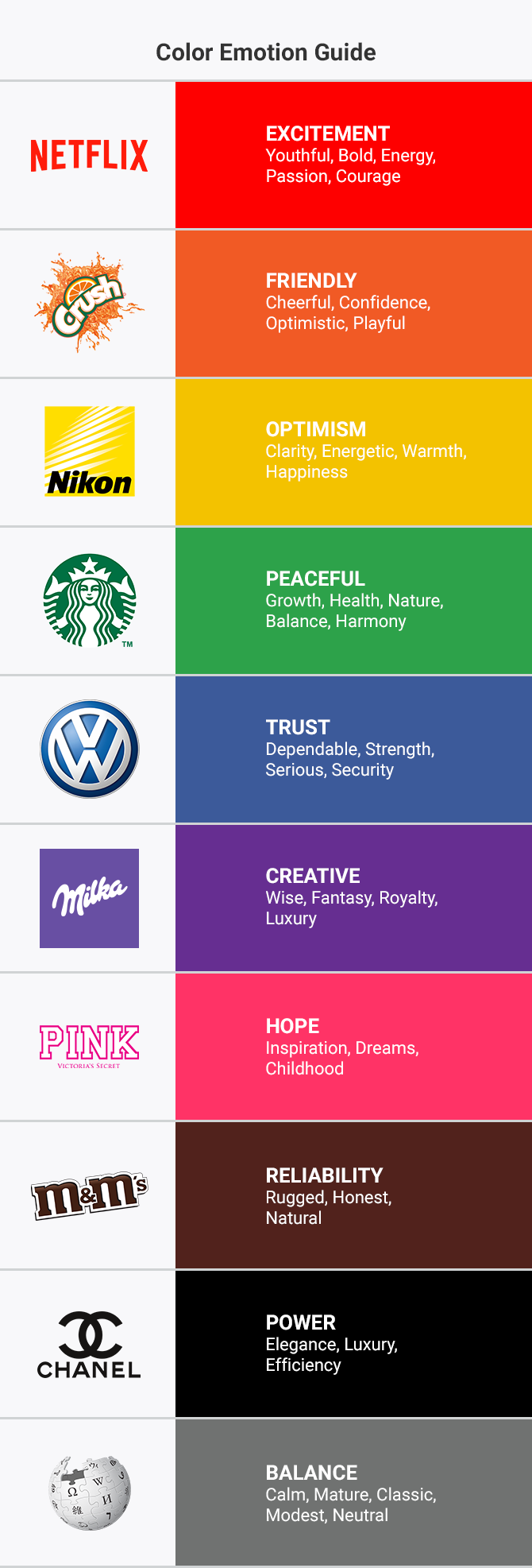
The psychology of colors states that each color represents a different feeling and impacts how we think and behave. Different color combinations can affect our day to day decisions, such as the items we choose or buy.
Branding colors can evoke emotions, help position brands, and make them stand out amongst others.
The image above depicts how does the psychology of colors applies to different types of logo design colors and what emotions transmit some of the most famous logo colors.
Frequently Asked Questions
What Are The 5 Types of Logo Color Combinations?
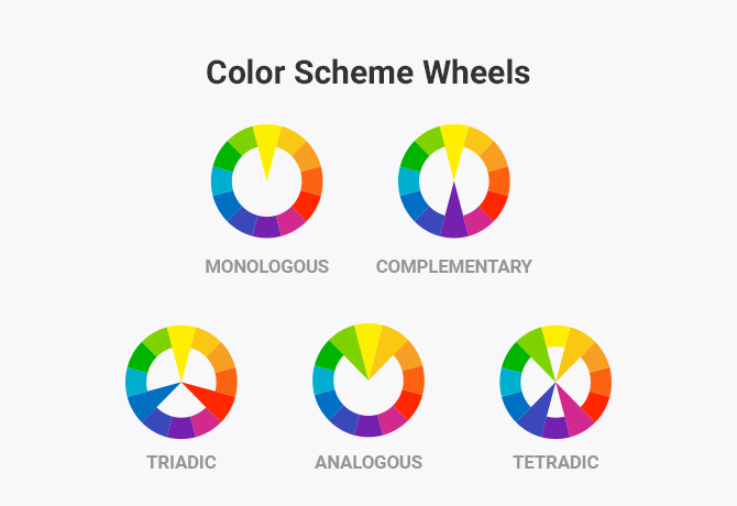
To see how we can create beautiful color combinations, we have to visualize the color wheel. To create a beautiful color combination, you can choose one of the following types of color combinations, which are an essential part of color theory:
1. Monologous color combinations
This type of color combination uses a primary color paired with black or white.
2. Complementary color combinations
Complementary color combinations are made between colors that are on opposite sides of the color wheel.
3. Analogous color combinations
These are color combinations between colors that are next to one another on the color wheel.
4. Triadic color combinations
Triadic color combinations use three colors that are evenly spaced on the color wheel.
5. Tetradic color combinations
A tetradic color scheme uses four colors that are equally distanced on the color wheel.
What About Bad Logo Color Combinations?
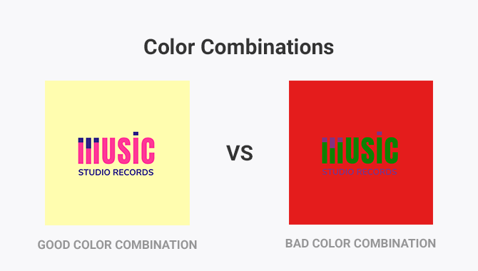
Let me start by telling you that bad logo color combinations exist, and they are more frequent than you would think.
You might believe that branding colors are subjective and that there are no terrible color combinations.
But you would be wrong.
Combining the right colors is a science that includes everything from design to psychology, so choosing random logo design colors without having proper knowledge can lead to a catastrophic outcome.
But you don’t have to take my word for this—just take a look at the illustration below and see for yourself.
Moreover, there are logo color schemes that just don’t go with a brand’s personality.
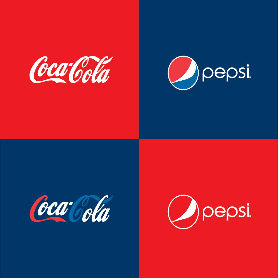
Well-known brands use color combinations and shapes for logos that match their personality and are already a trademark of their company. Not to mention that they are so well imprinted in our visual memory that we think of the brand every time we see something similar.
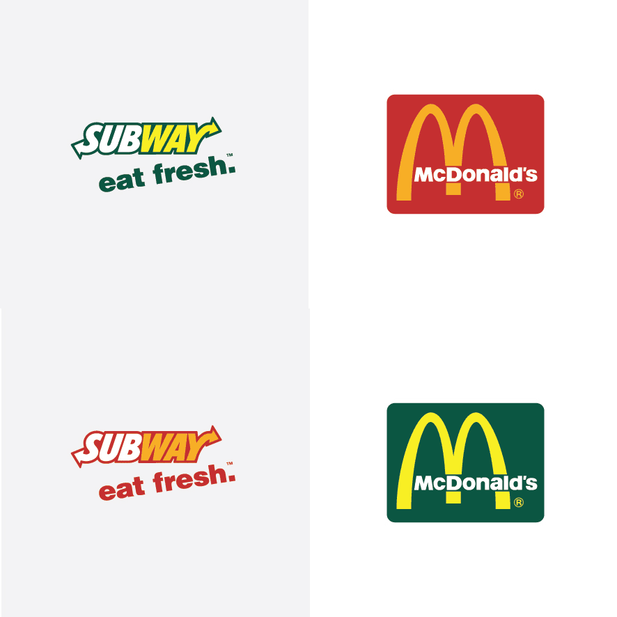
Here’s the proof. A Brazilian graphic designer, Paula Rupolo, swapped branding colors on famous company logos to show how much color matters when it comes to our perception of a brand.
How do I Choose a Color Palette For My Logo?
Choosing a color palette for your logo is critical in defining your brand’s identity. Here are some steps and tips to help you choose the right colors:
Remember the following information:
1.Understand Color Psychology
Different colors evoke different emotions and associations. Here are some common interpretations:
– Red: Passion, excitement, urgency, love
– Blue: Trust, professionalism, calm, security
– Green: Nature, growth, health, tranquility
– Yellow: Happiness, energy, warmth, caution
– Orange: Enthusiasm, creativity, friendliness
– Purple: Luxury, sophistication, mystery
– Black: Power, elegance, sophistication
– White: Purity, simplicity, cleanliness
2. Consider Your Brand’s Message and Audience
Think about what your brand stands for and who your target audience is. The colors should align with your brand’s values and appeal to your audience.
3. Analyze Your Competitors
Look at your competitors’ logos. While you want to stand out, you must also ensure your colors suit your industry. Avoid colors that are too similar to competitors unless you have a compelling reason.
4. Choose a Primary Color
Select a dominant color that represents the core of your brand. This color will be the most prominent in your logo.
5, Choose Secondary and Tertiary Colors
Select one or two additional colors that complement the primary color. These can be used for accents and details in your logo.
6. Use Color Harmonies
Utilize color harmonies to create a visually appealing palette. Some typical schemes include:
– Monochromatic: Variations of a single color
– Analogous: Colors that are next to each other on the color wheel
– Complementary: Colors opposite each other on the color wheel
– Triadic: Three colors evenly spaced around the color wheel
– Tetradic: Four colors in two complementary pairs
7. Test for Versatility
Ensure your color palette looks good in different contexts. Check how it appears on various backgrounds, in grayscale and digital and print formats.
8. Get Feedback
Gather opinions from others, especially those who fit your target audience. Their feedback can provide valuable insights.
Final Thoughts
I hope the incursion in the world of logo colors inspired you and helped you understand how colors influence our feelings, perceptions, and decisions.
Now all you have to do is get creative and choose the best logo colors for your brand.


