Your brand logo is not necessarily the first thing people notice about your brand, but it’s definitely an integral part of your brand identity, one that can impact how consumers perceive your company.
A good brand logo acts as the foundation of your company and will help customers understand what you do, who you are, and what your values are.
Whether you need to make your own logo for your brand with a logo maker or you want to redesign your existing one, you’re probably asking yourself what makes a good logo.
In this article, we’ll go through all the basics.
- What is a logo?
- What is the purpose of a logo?
- What are the elements of a logo?
- What are the 5 characteristics of a logo?
- Why are logos important in advertising?
- How to create a brand logo
What Is a Logo?
A logo is a symbol that’s represented by an image, text, shape or a combination of these elements. When designed properly, a business logo conveys what a company does, its core values, ideals, and mission.
There are several types of logos: emblems, pictorial marks, logotypes, lettermarks, abstract logos, mascot logos, and combination logos.
What Is The Purpose of a Logo?
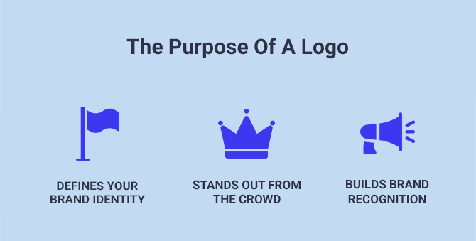
A logo is not just a symbol that you place on your website, social media, and marketing materials. It serves various purposes, such as:
- Helping you define your brand identity. A good logo can help customers determine your industry, the products/services you offer, the target audience, or brand values.
- Making you stand out from the crowd. The fact that you can use your brand logo to distinguish yourself from competitors is among the most important reasons why you should spend a lot of time coming up with a unique mark that helps you make a stand.
- Building brand recognition. A well-crafted, creative logo can create a strong visual association, which means that you’ll be able to build a solid brand in the long run. Integrating your logo onto your products and merchandise not only reinforces brand recognition but also transforms everyday items into compelling brand ambassadors, strengthening your brand’s presence in the daily lives of your customers.
Now that you know what a logo is and its purpose let’s break down each element it’s made of.
What Are The Elements of a Logo?
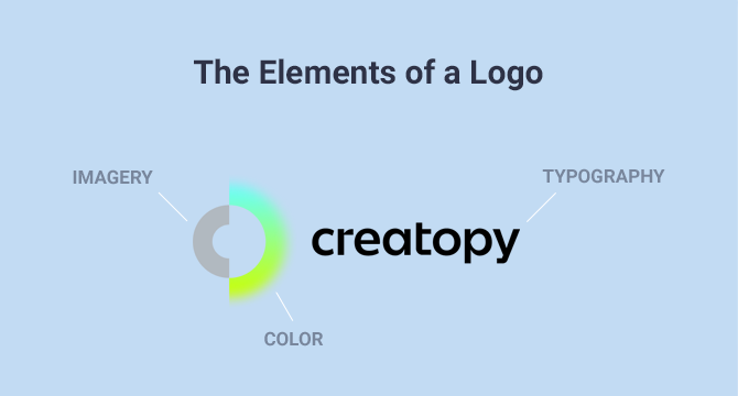
Company logo design doesn’t necessarily have to contain all of these elements. It can consist of at least one element or a combination of at least two.
Here are the three main elements of a logo:
1. Typography
A few examples of famous brands that use typography in their creative logo are Disney, Google, LinkedIn, Coca-Cola, or Netflix.
Some companies go for the full business name in the logo, which works great if the name is short enough, like the examples above. You also have the option to use an abbreviation of your business’s name (like NASA), or only the first letter, in case the company name has only one word.
2. Imagery
The imagery can be anything from an icon to a shape, a symbol, an abstract geometric element, or an intricate image.
In case you end up using something more complex, it’s essential to make sure that your logo will look clear even after you resize it to fit smaller placements.
3. Color
We’ve talked about logo colors quite a lot in a recent article where we analyzed 40 logo color combinations that go great together. So it’s safe to say that color plays a significant role in a company logo design.
Choosing the best colors for your brand logo goes beyond what colors look best or what you personally like. It’s a strategic decision that tells people how you will be perceived.
Usually, a logo color palette is made out of up to three colors, carefully chosen to send the right message.
What Are The 5 Characteristics of a Logo?
A logo is a strategic tool meant to give your company identity. To make sure that happens, your business logo must check a few crucial characteristics that will help you stand out from the competition.
Yes, it’s important to look nice, but it’s more important for the logo to prove viable in the long run.
The characteristics of a logo also answer the question “what makes a good logo.”
The majority of famous logos are defined by these five characteristics. Let’s go through them.
1. Memorable
Not many brand logos are memorable from the first time you see them, but this definitely something you should aim for.
When people can easily recall how your logo looks and your brand’s name, they are more likely to connect with you.
Your brand’s story should help you with the logo’s authenticity because aside from being memorable, it should also be unique. Define the things that make your brand different from the competition and strive to come up with something that will differentiate your company while creating a powerful visual identity.
2. Relevant
The entire purpose of designing a creative logo is to have an element that helps you build a strong brand identity, so the business logo must be relevant to your audience and industry.
From logo colors to the font, every decision will impact how people perceive your brand when they look at the logo.
For example, a company that sells kids toys can choose bright, fun colors that suggest entertainment, playfulness, and energy. On the other hand, a jewelry company can use a hand-written, cursive font, while tech companies can go with a geometric kind of font.
Before starting the design process of your brand logo, thoroughly research your audience and industry, and guide your creative process according to the emotion you want to trigger.
3. Simple
If you think about it, many of the world’s most famous logos are surprisingly simple. Nike is probably the best example here.
The reason why simple logo design works is that most consumers focus on logos briefly, and so a simple design has a greater chance of being understood.
The trick here is to find and use a symbol or wordmark logo that can convey your brand’s personality and values. Think of ways of designing your creative logo for it to be concise and easily readable.
4. Timeless
Think long-term. When you make your own logo, ask yourself whether it will work years from now. The key is to create your own logo that remains fresh and relevant over the years.
Even though many popular brands have tweaked their logos during their existence or went through the process of rebranding, you don’t want to do that too often. Changes that occur too often can impact consumers’ understanding and perception of your brand.
The best thing to do is step aside from the logo design trends, remove clutter, and keep only the elements that express your brand’s core ideas and values. The best logo design doesn’t aim to be popular for a season, but for many years to come.
5. Scalable
A brand logo can be used in various situations, such as on the website, on social media visuals, in presentations, packaging, merch, or print marketing materials.
With that being said, the best logo design should keep its quality regardless of the medium, platform, or device it’s being used on.
Whether you put your creative logo on a billboard or resize it to fit on a small cup, it has to look legible no matter what. To create a responsive brand logo, focus primarily on its simplicity, as we’ve seen before. In this case, less is more.
Now let’s move on to another important topic—logo importance.
Why Are Logos Important in Advertising?
Since logos are a crucial part of a brand’s identity, they are used in advertising as well.
You’ve probably seen all kinds of ads, whether online or on TV, where the company’s logo appears throughout the ad or at the end. And there are a few reasons why that happens.
Here’s why logos are important in advertising.
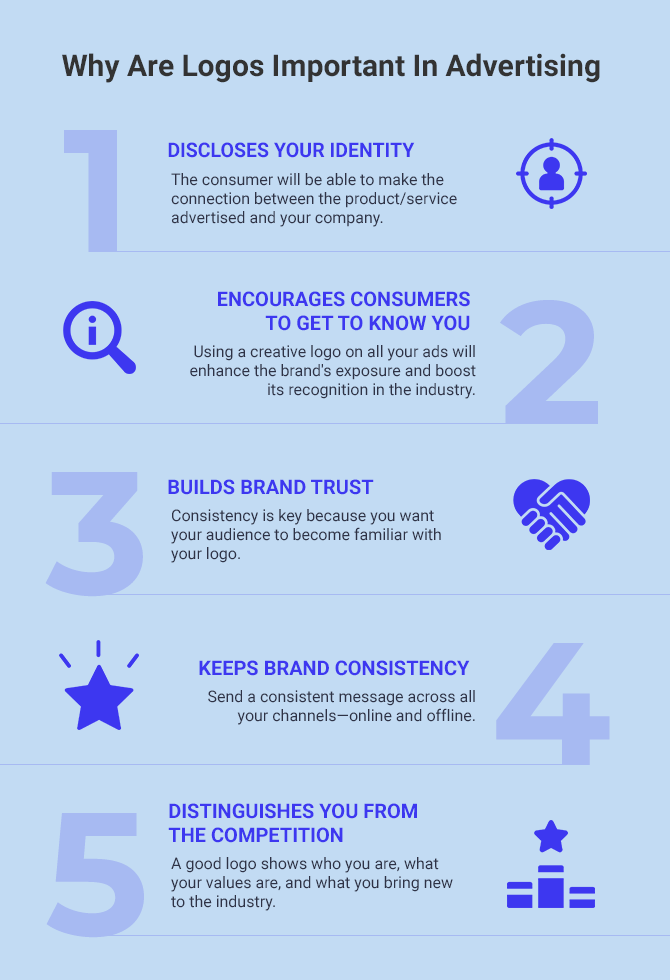
1. Discloses your identity
Suppose your audience is watching one of your ads for the first time online or on TV. In the ad, you talk about the product or service you’re offering, and you show it, featuring the logo as well.
At that moment, the consumer will be able to connect the product/service advertised and your company.
Even if you run a brand awareness campaign and your company logo design is visible at the end of the ad, it still serves the same purpose. It helps the consumer connect the dots between the problem you referred to and how your company is involved in assisting people in solving it.
So if you plan to expand your reach, imprinting your business logo when doing advertising is a must. After all, how would potential customers know which brand it’s being advertised if there’s no brand logo?
2. Encourages consumers to get to know you
Needless to say that using a creative logo on all your ads will enhance the brand’s exposure and boost its recognition in the industry.
On top of that, if you have an attractive logo design and you pair it with an inviting ad, you will surely pique your audience’s curiosity. People love discovering and trying out new brands, so put yourself out there and let the world notice you.
3. Builds brand trust
Incorporating logos in advertising will help build brand trust overtime. And the more people see your ads next to your logo, the faster they will get used to your brand.
Consistency is vital because you want your audience to become familiar with your logo.
When people look at ads, they also look at the logo, especially if they can’t tell right away the company’s name.
4. Keeps brand consistency
One of the great things about using your business logo in advertising campaigns is sending a consistent message across all your channels—online and offline.
Sometimes, you may not have the time to create an elaborate advertising campaign. What you can do is create an ad with only a few elements: text, colorful background, compelling image, and your brand logo.
You can also use your logo in advertising to come up with something creative, so a versatile logo can have many different purposes.
5. Distinguishes you from the competition
A logo is like a fingerprint—unique and rooted in a company’s DNA. While certain symbols are associated with particular industries, you can create your own logo that’s different and can make people pay more attention to you.
For example, if you have a tech company that includes an animal’s name (like Lion Enterprises), you can create a logo that features the symbol of a lion. That will surely draw people’s attention because you don’t typically associate lions with tech companies.
A good logo shows who you are, your values, and what you bring new to the industry.
Now that we’ve walked through the theory let’s get more practical and go through all the major steps of designing a logo.
How Do You Create a Brand Logo?
People see first and read after. If they don’t see anything interesting, they won’t stay for further discovery, so the key is to design a brand logo that’s not generic and is not easy to forget.
Easier said than done, right? But not impossible.
Creating a business logo is a process that requires time and a solid understanding of your company’s values and where you want to be years from now. Logo trends are not part of the equation.
Visual identity is absolutely essential to your brand, and so is your logo. Let’s see what the steps for creating a brand logo are.
1. Define your brand identity
We’ve already established that the logo is part of a brand’s identity, which is why you can’t have one without the other.
There are a few questions you can answer to define your brand identity and start this process:
- What’s your company’s story?
- What values and beliefs are important to you?
- Why do you do what you do?
- What makes you different from the competition?
- Who is your target audience?
- Who are your top competitors?
- How would you describe your brand’s personality?
- How would you like to be perceived by your target audience?
You can do this exercise and answer the questions with other people from your team, so you’ll have higher chances of achieving the best results.
After you complete this step, the goal should be to have an overall view of your brand and use it to guide the next actions.
2. Do your research to find logo inspiration
This can take a while because looking for logo inspiration has two parts: studying your competition and collecting ideas on how you want your business logo to look.
First, take a look at your competitors and see how their logos are. You need to do this because you want to avoid coming up with an idea that’s similar to your competition.
Then, you can read about the use of color, typography, and imagery in popular logos. This will give you an idea of the best direction to take, even if your personal preferences might differ.
Next, take a look at your industry as a whole to see what are the standard practices used by companies.
You can also gather logo inspiration from sites such as Dribbble or Behance, where graphic designers post their work all the time, and you can find some really good ideas there.
To not let all of this research go to waste, create a mood board containing all the images you find inspiring for your future brand logo. You can use Pinterest, a pinboard, or other tools to gather all the ideas.
3. Choose the type of logo you want to go for
Before you even start thinking about designing your logo, you need to determine what type of logo you’re going to create.
There are seven types of logos you can choose from:
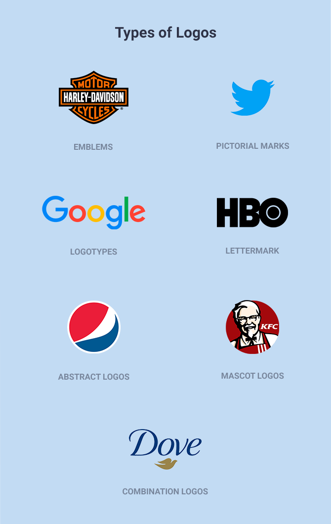
- Emblems. They feature text, a symbol, or imagery inside a geometric shape and can be used by businesses that want to convey a feeling of stability, maybe even sobriety and professionalism. Stella Artois and Harley-Davidson are just a few examples.
- Pictorial marks. These types of logos use imagery that is reduced to a symbolistic meaning, so they are ideal for well-established businesses, and if your goal is to create a simple logo design. Apple or Twitter are a couple of good examples of famous logos.
- Logotypes. They’re composed entirely of the company’s name, whether it’s one or more words, so the focus is on the logo colors and typography. Coca-Cola and Google are two famous examples.
- Lettermarks. These types of logos are acronyms of a brand’s name. It’s a good option if your company name has several words, and you still want to use typography for your logo design. NASA or HBO are a few examples.
- Abstract logos. They are a visual representation of a feeling you want your brand to convey. Nike and Pepsi are good examples of brands that used abstractness the right way.
- Mascot logos. They represent a drawing or representation of a person or a non-human entity that received human attributes. The KFC and Michelin logo fit this category perfectly.
- Combination logos. They are exactly as their name suggests: a mix between two types of logos, so you can have a symbol and typography. Dove and Burger King are two great examples.
As you can see, there are quite a few categories you can choose from, and it’s an important decision to make. Until you decide on the type of logo, you can’t move on to the next steps, which refer to the logo elements.
4. Pick a style for the logo
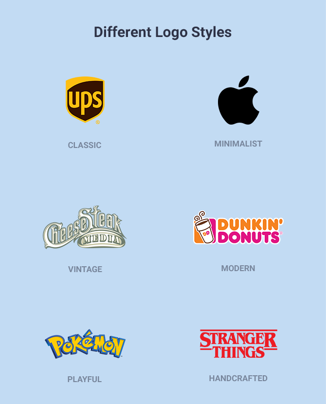
The type of logo you chose in the previous step will most probably define the style as well.
For example, an emblem logo is almost always classic, so that’s one style you can go for.
Pictorial mark logos definitely have a minimalist feel to them, but they can also look modern.
Logotypes can have different styles depending on the logo font you’ll go for. It can be anything from vintage/retro to handcrafted or classic.
Lettermarks can be modern or minimalist, while an abstract logo will hint towards a modern look.
Mascot logos definitely have a playful style, but you can also add a vintage touch to them if that defines your brand.
Combination logos can hardly be minimalist, but you can make them look modern, vintage, or handcrafted.
To sum it all up, there are several styles you can pick for your logo, and this decision will be most impacted by the type of logo you’ll go for and your industry.
Logo trends usually last for one season, so it’s best to avoid them.
5. Decide on the logo elements
As we’ve mentioned at the beginning of the article, a logo can consist of three elements: typography, imagery, and color.
Let’s take each element and discuss it:
5.1. Typography
The logo typography depends mostly on the type of logo you choose, so you might not need this element if you go for a pictorial mark logo, abstract logo, or mascot logo.
The best font for your logo is the one that matches the company’s personality and industry. Consumers make assumptions about brand logos, so it’s essential to choose one that defines your business.
Before even making a shortlist of font logos, keep in mind that legibility should be a priority at all times.
Here are the main logo font categories you can choose from:
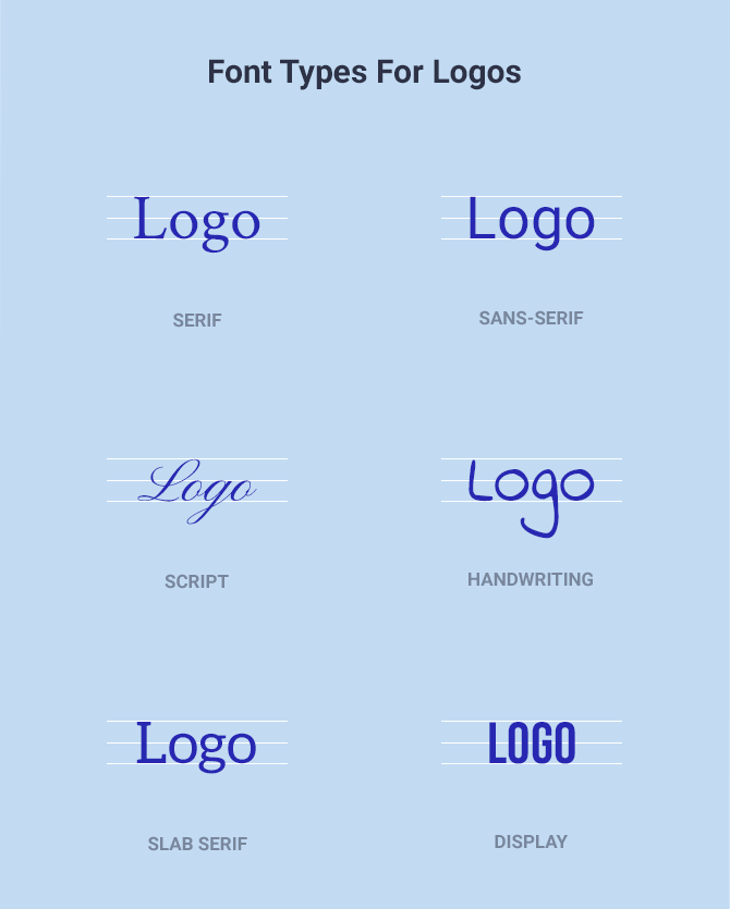
- Serif fonts have decorative strokes at the end of each letter, making them classic, traditional, refined, reliable, trustworthy, and timeless. A few examples of serif fonts are Times New Roman, Baskerville, Georgia, Freight Text, Bodoni, Cambria, Minion, and Didot.
- Sans-serif fonts lack the serifs at the end of the letters, making them clean, modern, minimalist, extremely versatile, and legible. Akzidenz-Grotesk, Arial, Avenir, Calibri, Futura, Frutiger, Gill Sans, Gotham, Helvetica, Impact, and Roboto are good examples of sans-serif fonts.
- Slab serif fonts are defined by thick serifs, which can be angular or rounded, and attract attention even from a long distance. This is why they are mostly preferred for headlines. Clarendon, Courier, Rockwell, Egyptian Slate, Glypha, Memphis, and Soho are just a few examples.
- Script fonts have a softer look and can add a feminine, elegant appeal to your logo. However, they can be less legible than in the first two categories. A few examples of script fonts are Brush Script, Cézanne, Edwardian Script, Monotype Corsiva, Kaufmann, Loster, Pacifico, Rochester, and Scriptina Pro.
- Display fonts have a personality and a unique look to them. If you want to have an original font for your logo and add fun into the mix, then this is the way to go. Allegro, Banco, Bauhaus, Broadway, and Forte are a few font examples in this category.
After you decide on the main font category, it’s time to choose the font-weight and style. Most logo fonts come in various styles, so it’s best to take your time and review them before making the final decision.
Also, make sure to look at all the letterforms because some fonts may add particular characteristics to a few letters.
How you combine the logo elements depends on the type of logo you choose, but as a rule of thumb, you shouldn’t use more than two logo fonts. You can have your company name written in one font and a tagline or short description with a different font.
Of course, you shouldn’t forget about kerning, so find a font that allows you to play with the space between the letters.
If you go for a logo like a logotype or a lettermark or even a combination logo, where the focus is on the logo typography, it would be ideal to have a custom typeface created especially for your brand.
5.2. Imagery
The only types of fonts that don’t use imagery are logotypes and lettermarks, so you can move on to the next step if your logo fits one of those two options.
However, if you need a symbol for your logo, you need to know that it all breaks down to what you want to evoke through the logo and how you can tie it to the brand identity.
The imagery you choose can be related to your company’s name, the product/service you’re offering, or an abstract representation.
It’s up to you to decide what type of imagery, such as a symbol, icon, glyph, or mascot, matches your brand best.
When you combine imagery with logo fonts, make sure those two go well together. If, on the other hand, you decide to use imagery alone, ask yourself whether your brand can be easily recognizable by the symbol alone and if it truly makes you stand out.
Come up with different ideas, then select the one that conveys your brand best.
5.3. Colors

The colors in a logo are just as important as the other elements, so it’s a step that must be carefully analyzed by reading into color theory. As you can see in the image above, color psychology is a thing, so you need to choose the right logo colors based on the emotion you want to evoke.
Feel free to read our article on logo color combinations to learn about which colors go best together.
Also, your logo needs to stand out on light and dark backgrounds since dark mode is trending.
Let’s go through the meaning of a few colors:
- Black exudes sophistication, seriousness, luxury, sleekness, and mysteriousness. Works excellent for luxury products, perfumes, jewelry, or watches.
- White is all about purity, innocence, cleanliness, novelty, and peace. It can be used for various companies, from wedding planners to luxury products or apparel.
- Brown represents security, stability, seriousness and can add a vintage vibe to your brand. It works well for home decor companies or coffee shops.
- Red is a powerful, dynamic color that expresses excitement, love, passion, or anger. It can be successfully used in the food industry, entertainment, or automotive.
- Orange is a vibrant, feel-good color that’s perfect if your brand is playful and lively. You can use it in the food industry, for delivery services, or in tech if you want to stand out.
- Yellow represents cheerfulness, friendliness, youthfulness, energy, and accessibility. It is also the most visible color for the human eye. It’s best used in the fast-food industry, for toy companies, or entertainment.
- Green means balance, harmony, life, and growth, but it’s a versatile color used in many different industries. That means it works for restaurants, clothing, or skincare brands,
- Blue represents trust, calmness, stability, and reliability. It’s the perfect color to use if you want to inspire confidence. It’s recommended for gyms, hospitals, spas, or tech companies.
- Purple is a luxurious, mysterious color that can be perceived as playful as well. It can be used for luxury products, jewelry, or kids’ clothes.
- Pink is not used just for girly brands. It’s a bright, playful color that can have different meanings, depending on the shade, from cool to youthful or feminine. It works best for lingerie, kids’ products, or home decor.
- Gold represents luxury, charm, and prosperity. It’s mostly used for luxury products, hotels, jewelry brands, or investment companies.
You can always pick more than one color for your company logo, so it’s essential to know how to combine them the right way. If they’re pastel colors, your job can be much easier, as they allow you various safe combinations.
Before choosing the logo colors, ask yourself what message you want to send to your audience and how you want to be perceived.
Besides paying attention to color psychology, remember the logo has to look good on any marketing material and be legible on light or dark backgrounds.
6. Bring everything together
After you’ve gone through all these steps, now it’s time to put everything together to make sure that it all works out as you imagined it. And if it doesn’t, you can go back, rethink certain decisions, and make necessary changes.
You can even narrow certain down certain aspects until you have a few different options instead of making the final decision.
7. Start designing
Once you have all the information mapped out, the only part left is to start designing.
If you plan to do it yourself, you can use a logo maker like Creatopy. Alternatively, you can collaborate with a designer. Every option has its pros and cons, so you should weigh all the factors depending on your budget, timeline, and expectations.
Working with a freelance designer or an agency is all about communicating your ideas to keep track of the process. Collaboration in design is the only way to get the desired outcome.
While working with a designer can be easier, creating your own logo can be more fun, so you can become your own designer.
Whether you’re collaborating with a designer or decided to make your own logo, take your time and brainstorm all the ideas, put them down, even the bad ones, and see what fits best your brand’s personality.
To Sum It All Up
Designing your company logo is as decisive as anything else that’s part of your brand identity. It’s part of the bigger picture, so don’t rush the process. In the end, you still have to ask yourself if your logo:
- Reflects the brand identity
- Is distinctive
- Is memorable
- Is timeless
- Is scalable
- Appeals to the target audience
Creating the logo is just one of the many steps towards building a solid brand, and now you know what makes a good logo.
I hope this article gives you a good idea of approaching your company logo design, and you’ll be able to start your business on the right foot.

