In this digital age, when new online advertising types and promotional channels surface more often than ever before, it’s easy to forget about the power of print advertising.
And we shouldn’t really. Here’s why.
On one hand, print is one of the primary mediums that have stood the test of time. Almost as soon as Gutenberg invented the printing press in the early 15th century, the western world grabbed print advertisements and ran with them.
Moreover, block printing was known in China long before that. Archaeologists found printed paper package ads that were dated over 700 years ago, and resemble some of the ad copy structures that are still in use today.
On the other hand, despite being stigmatized as tech-addicts, in reality, the millennial generation prefers print.
Call it a testament to the versatility and impact of print advertisement, or just a generational whim, but it doesn’t change the facts.
Print ads not only have a rich heritage, having proven their worth over centuries and centuries, but they are also clearly here to stay for a long time to come.
Since we mentioned the history of print advertisement, before diving into what makes today’s best print ads work, it’s only fair to pay homage to their rich past and see where today’s print media advertising stems from.
Ye Olde Print Ads
One of the first English printed advertisements was a handbill created in 1477 by an English merchant, diplomat, and writer, named William Caxton.
This small broadside was intended to be displayed in the neighborhood outside his shop in Westminster Abbey.

It’s quite clear that for today’s reader, it’s nearly indecipherable because of the archaic spelling. The overly ornamented typeface doesn’t help either.
You’ll have to take my word for this—it advertised Caxton’s edition of the Sarum Ordinal or “Pye”. It was the priest’s manual of variations in the office during the year.
So why is this relevant today? Because it doesn’t work anymore. Bear with me, it will make sense in a minute.
From Text-Only Print Ads to Images That Tell an Entire Story
You see, back in its time, Caxton’s handbill was probably very effective for a number of reasons.
For one thing, it must have been viewed as a novelty simply because most people hadn’t previously seen fancy printed text, at least not on the streets.
Literacy was also the privilege of a select few, so the simple fact that it was printed text appealed directly to the relatively small audience Caxton was targeting.
Having no other eye-grabbing visual element other than the roughly six lines of uninterrupted text itself—which would be unacceptable in a modern magazine ad design—was no problem back at the dawn of print advertisements.
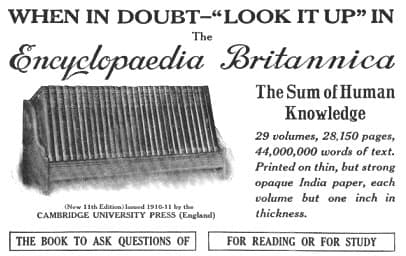
It wasn’t long, though, until printers started using xylographs and other line-work to add imagery to the ads. But for the image to break the text’s dominance in print advertisement took much longer.
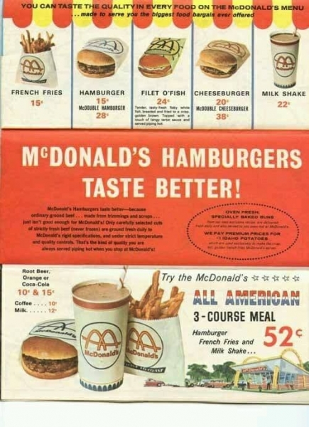
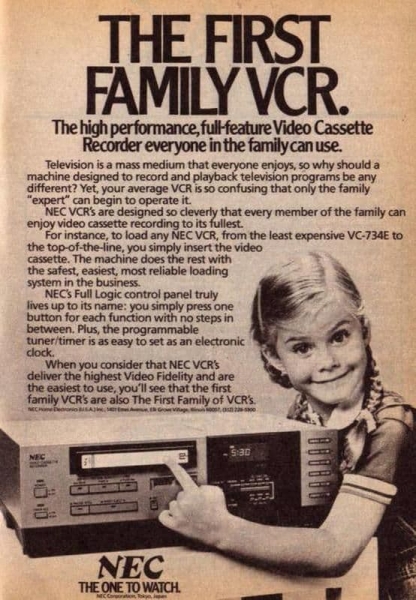
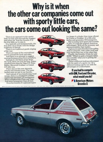
Up until the late 20th century, it was common practice to have enormous amounts of text in a print ad. In most cases, the image was just an illustration, something to grab the eye and lead it to the text, which then did the heavy lifting.
It took more than 500 years to reach this point, but a text-only ad containing that many words or even the much more recent print ad examples above would be ignored today.
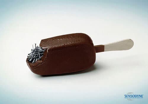
Ironically, in a time when reading a couple of words shouldn’t be a problem, some of the most creative print ads are those that have little to no copy.
So fast-forward half a century from Gutenberg and you get this.
What’s Changed?
The average consumer is exposed to thousands of ads every single day. As a result, our attention span is now a fraction of what it used to be.
Time has become a luxury, which means that your audience’s attention turned into a commodity that has to be earned.
Although understanding the written text is no longer a problem for most people, we barely have enough time to catch up with the news, let alone read magazine ads.
The competition for this small amount of attention is fierce, so today’s marketers have their work cut out for them.
Technology resolved the problem of reaching masses, but grabbing attention is only possible through creativity.
How to Tell a Story Through a Print Advertisement
Let’s start with a quick disclaimer.
If the answer would fit into a blog post, the world’s greatest marketing gurus could start looking for a new job.
But you know what Picasso said: good artists copy, great artists steal. Though he may have taken the quote from someone.
What we can do instead of searching for the holy grail of print ads is to look at some excellent print advertisement examples and see what makes them so effective.
1. Combine familiar shapes
Instantly recognizing shapes guaranteed the survival of early humans. It’s so profoundly encoded in everyone’s DNA regardless of culture that it would be a shame not to use it to our advantage and reach audiences worldwide.
By combining two shapes, you can give your message a whole new meaning. Of course, adding a few lines of copy can provide some context to make a greater impact.
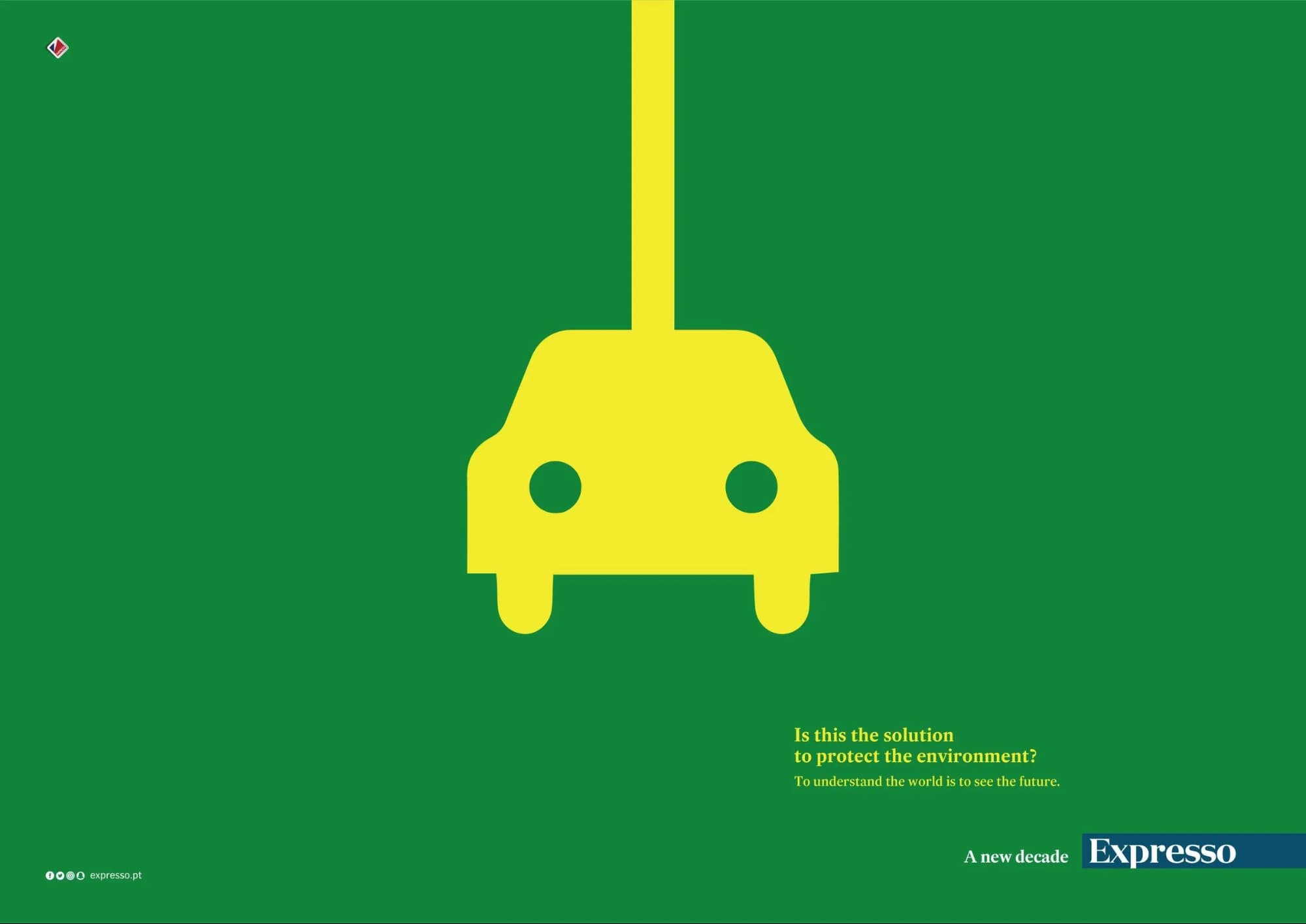
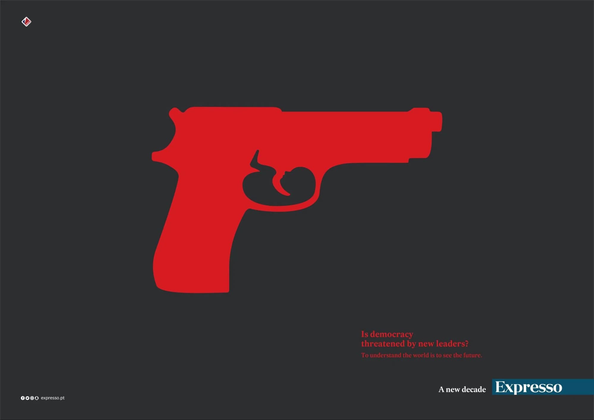
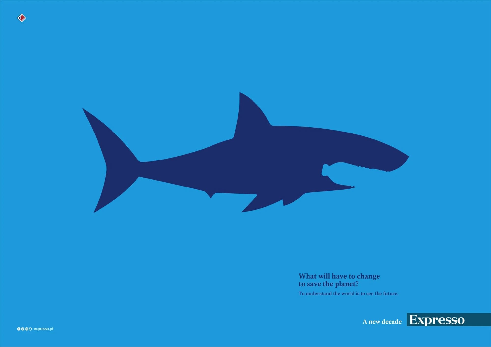
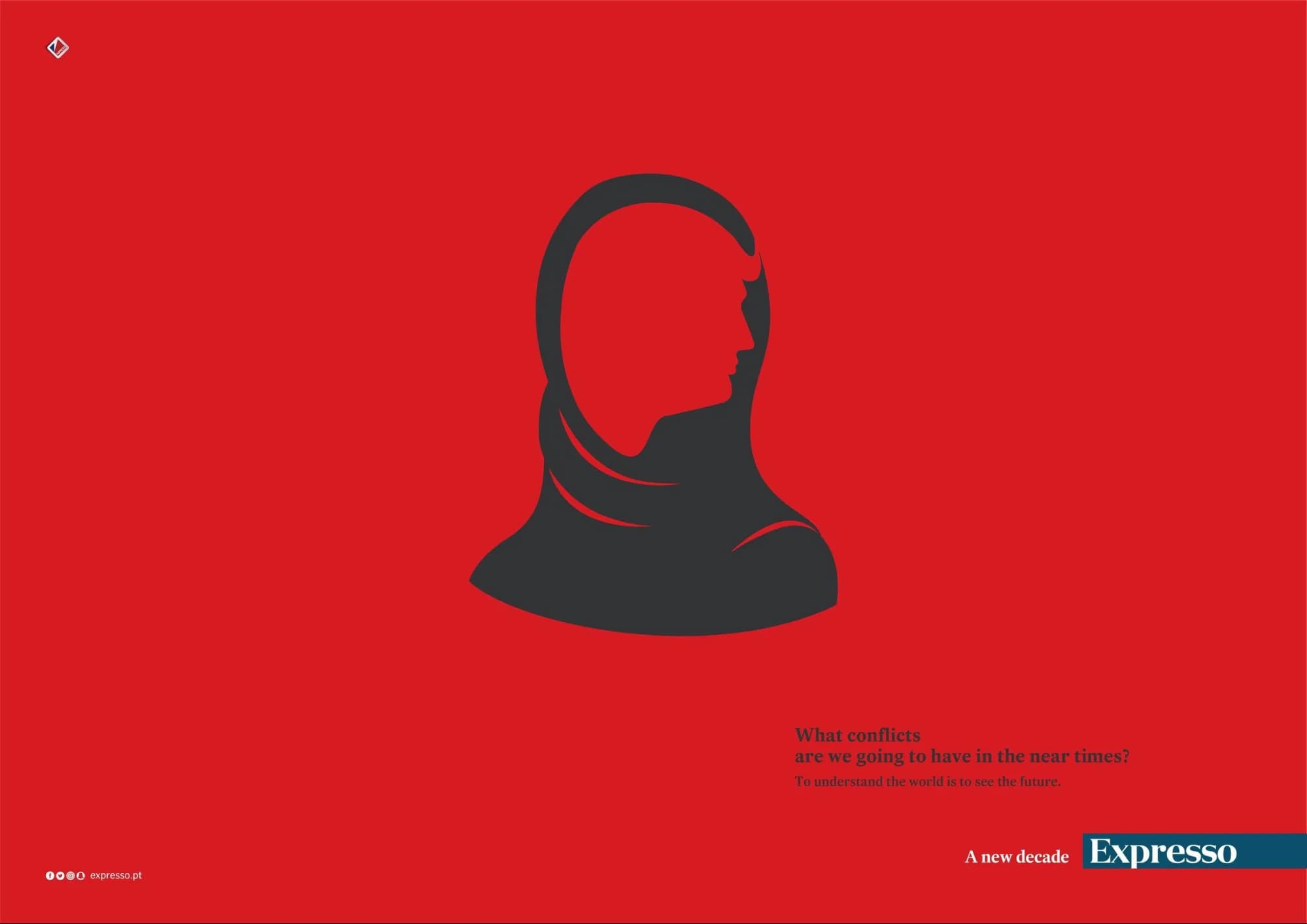
The Portuguese newspaper Expresso did this masterfully in one of its latest campaigns.
They kept it simple: rudimentary shapes, a couple of clever tweaks in the negative space, and well-chosen topics that are sometimes conflicting or controversial to create that all-important sense of pressure.
2. Shoot first, ask questions later
You didn’t seriously think this article would not mention the cliché that a picture is worth a thousand words. We tried at least to find the best place for it.
Print advertisement can be used not only to sell a product, but also to raise awareness, make a point, or fight a controversy.
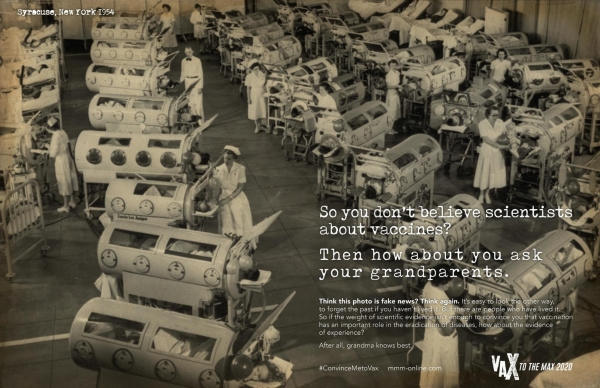
The image in this print ad example is a historical one, as is the essence of the message: the iron lung you saw in the museum was in a hospital not that long ago.
The polio vaccine put it there, and we’re the ones who have to keep it there.
This print ad is subtle and in-your-face at the same time. In this case, the image does the attention-grabbing, and the copy gives the context to fully understand the message.
3. I can relate to that!
And if you can, it may just work as a spectacular print ad.
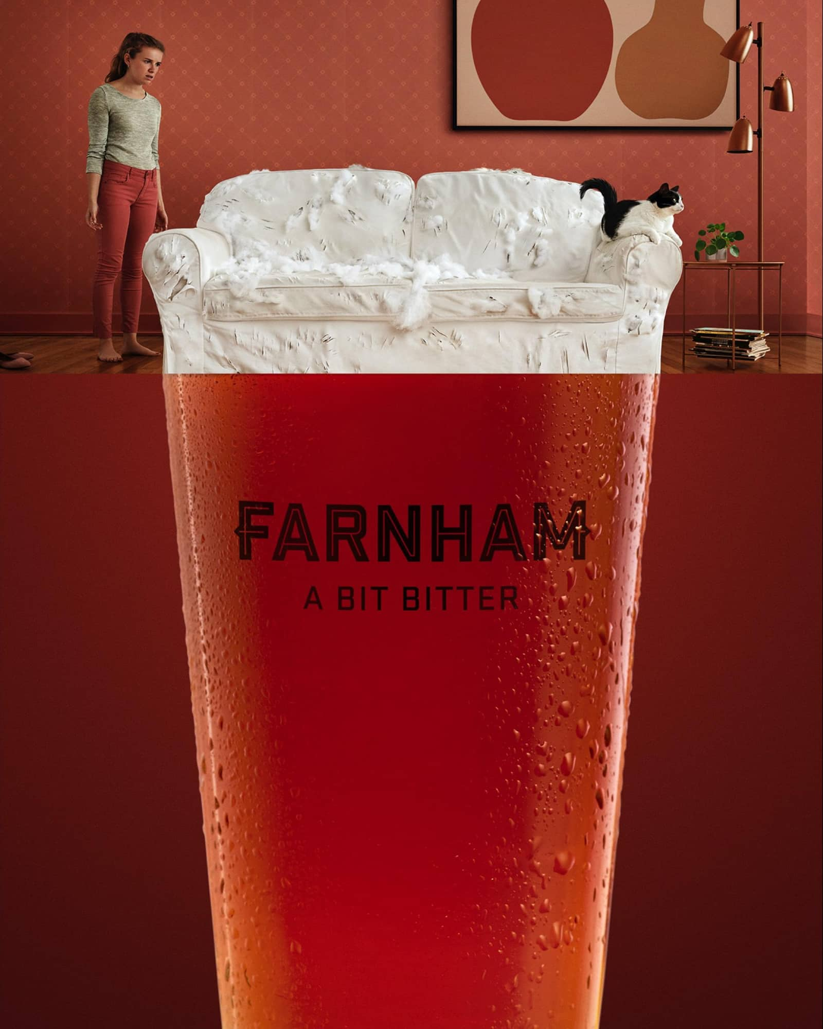
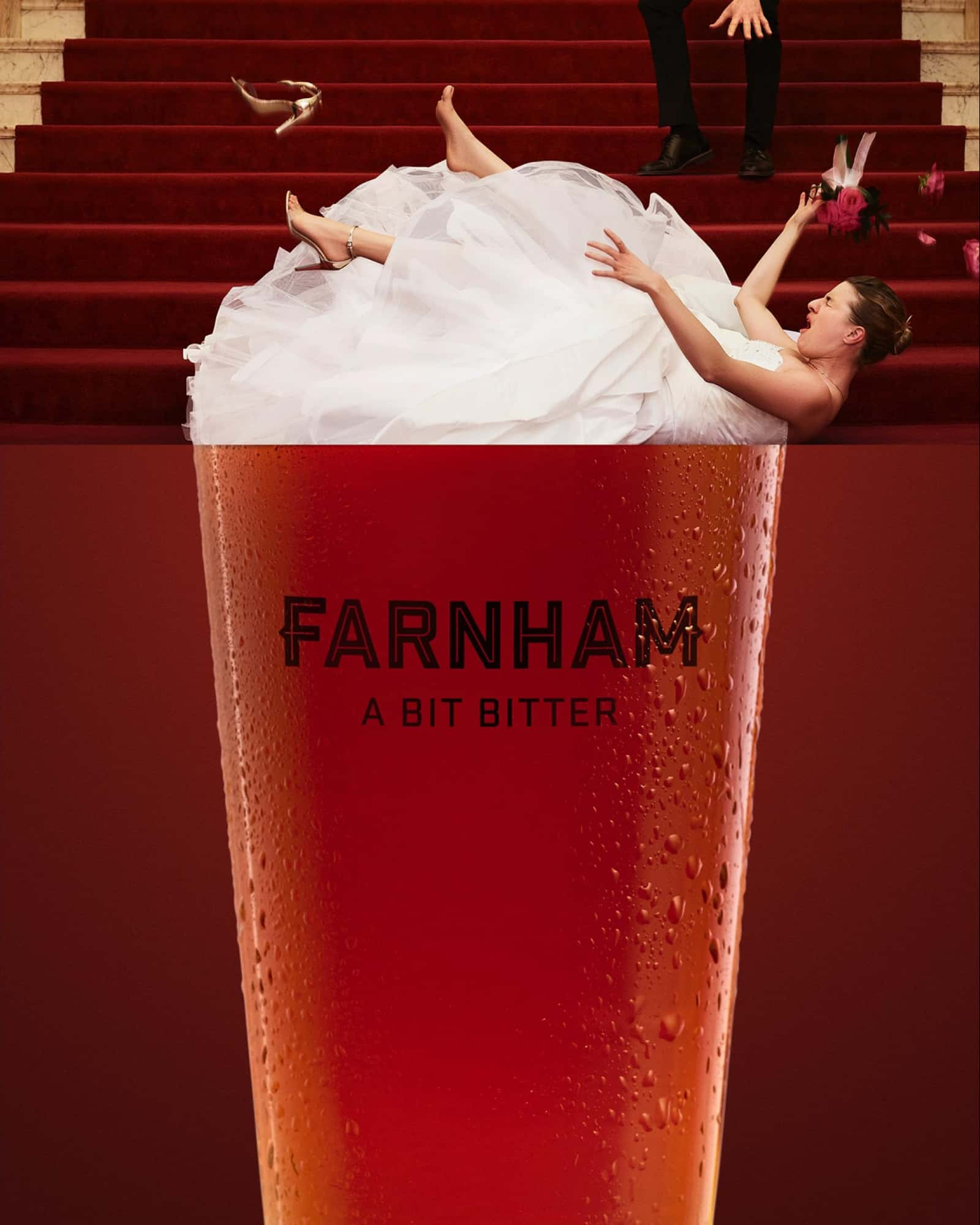
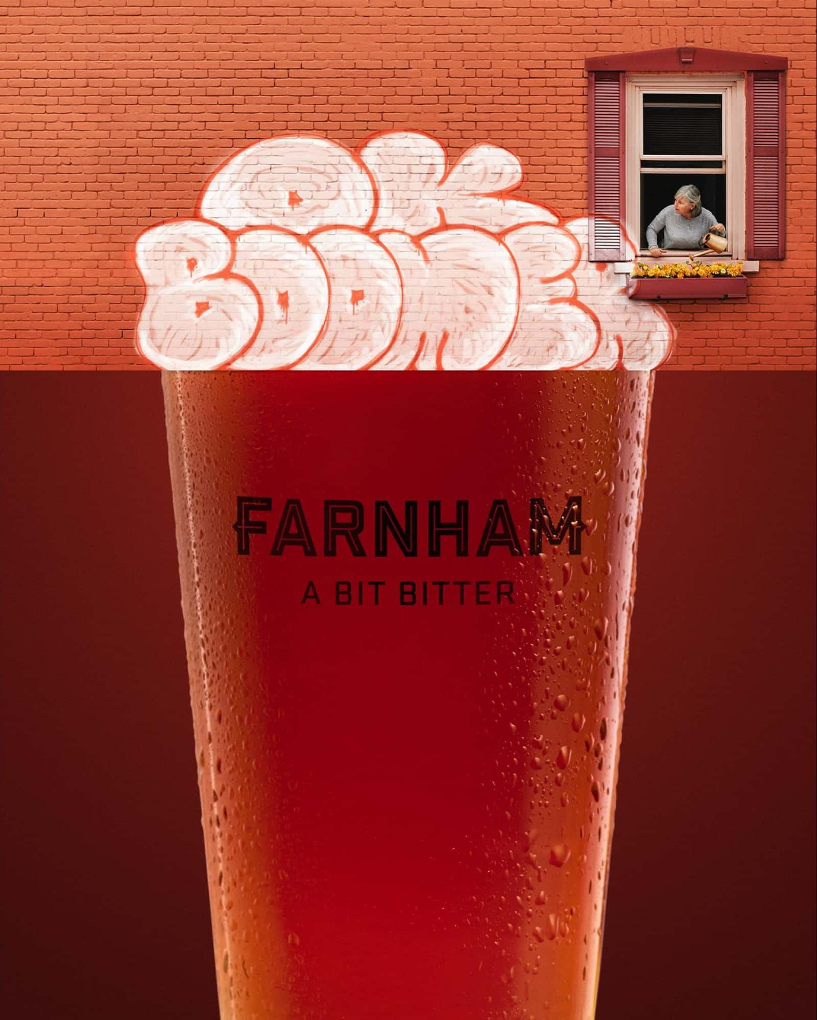
Farnham’s slogan was probably inspired by a harmless bit of criticism. A bit bitter—not something that you wouldn’t expect to hear during, say, a beer tasting event.
But the genius of this print ad concept is that they took the trivial and transposed it to a different context that resonates with their audience.
What they ended up with is a full-bodied print ad campaign with the refreshing taste of unfiltered self-irony and a thick foam of humor.
4. Showcase your product in a new light
A little change of atmosphere never hurt anyone. Your product may also benefit from a new environment.
Low-angle action shots with water splashing from a fancy car’s suspiciously clean and well-lit wheel? Yawn.
Weather forecast: sunny with a slight chance of a tire-downpour? Tell me more!
The brand Continental is aware that however sophisticated their tires are, most of their consumers are only interested in one thing: to know that they do their job, whether it’s hot or cold outside.
5. Highlight the “danger”
When someone says “beware,” we’re instantly hooked. “Alright, beware of what?”. And from here on its smooth sailing, because you’ve got the attention you were looking for.
The more harmless your product, the more creative you can get if you give it a twist and try to find the funniest, most unexpected way it can put its consumers in harm’s way.
You don’t even need to reinvent anything to be original. There are always plenty of ironies to tap into in your industry’s classic advertising clichés.
That’s precisely what Suave did, calling attention to the dangers of showing off your silky smooth curls.
6. Have fun with your logo
Once you have the brand recognition to pull off something like this Spotify print advert, you can have loads of fun with your own brand elements and reinforce that bond with your consumers.
Guy Mizrahi, the creator of this print, cleverly used the three curved lines in the logo and asked what else it reminded people of.
Some ideas along this line, combined with a clever slogan, and the rest is history.
7. Embrace the classics
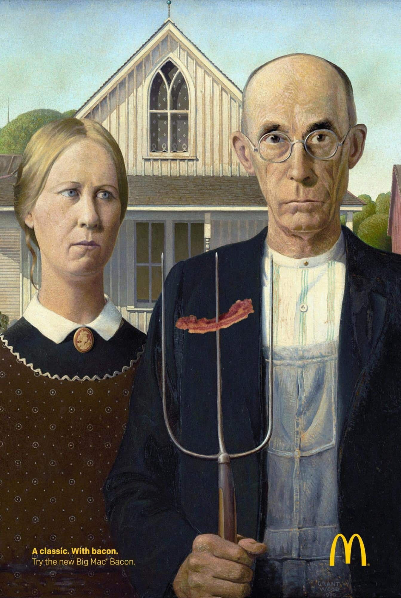
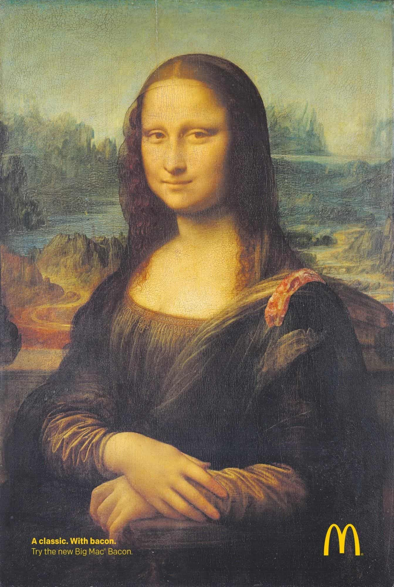
Leveraging the recognizability of a classic work of art can boost your brand’s awareness. If your product is already a crowd favorite, you can also do the same to emphasize its value.
This is a potent recipe in and of its own, but McDonald’s managed to take this one step further by combining not two but three classics in their print ad series.
To be fair, this wasn’t a high-risk campaign since we know everything is better with bacon, and putting it in the Big Mac wasn’t going to be a flop anyway.
However, mentioning their product on the same page with the Mona Lisa or American Gothic was still a bold move. One that worked, might I add.
Go out there and find something that’s instantly recognizable, and if it has anything to share with your product, you can apply the same principle.
Or, if all else fails, add bacon to it.
8. Add an unusual texture
This one is more of an awareness campaign, but the same principle can be used for any purpose where you want to grab attention.
The copy reads:
Some marks don’t belong on your skin. Use sunblock and see a doctor if you notice any lesions on your skin.
And the rest is quite self-explanatory.
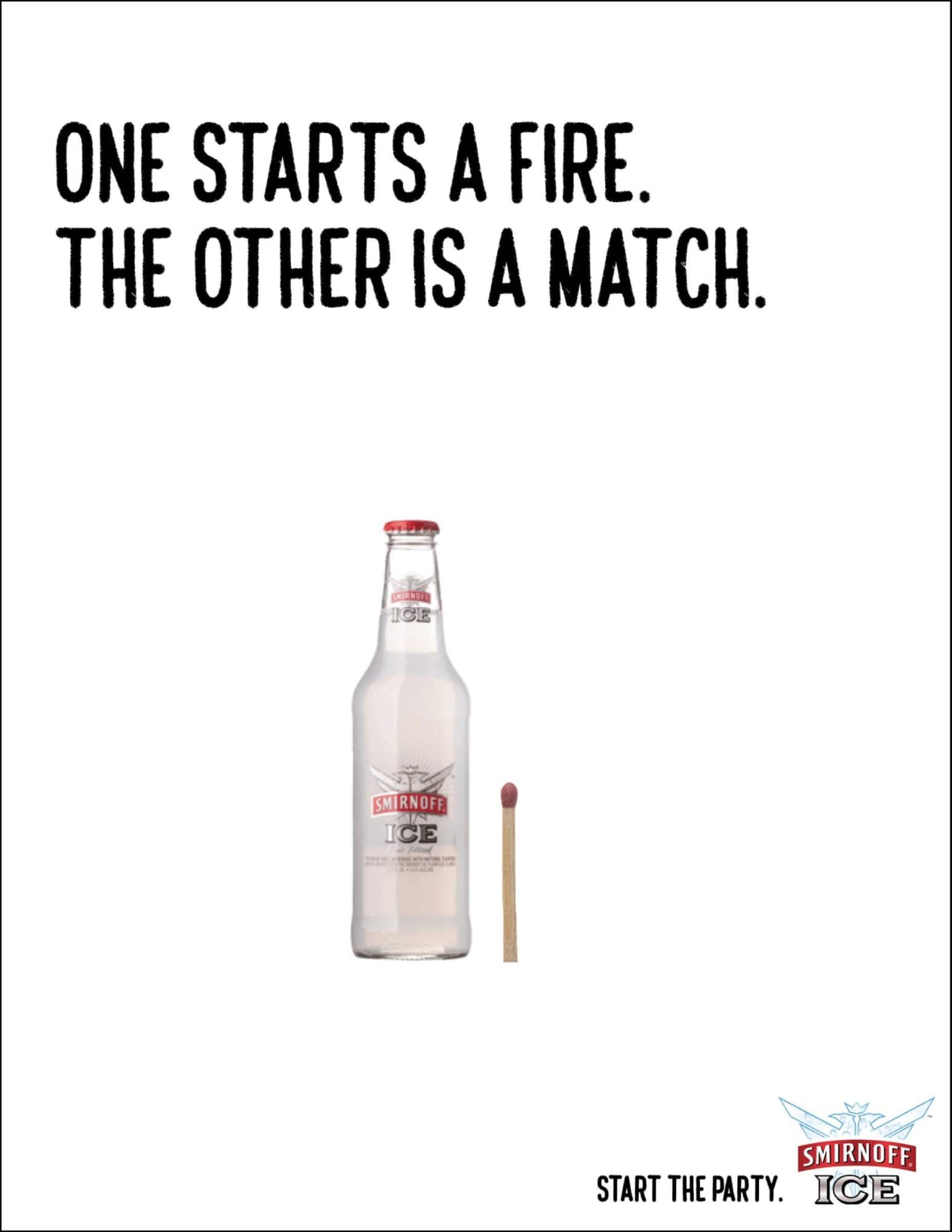
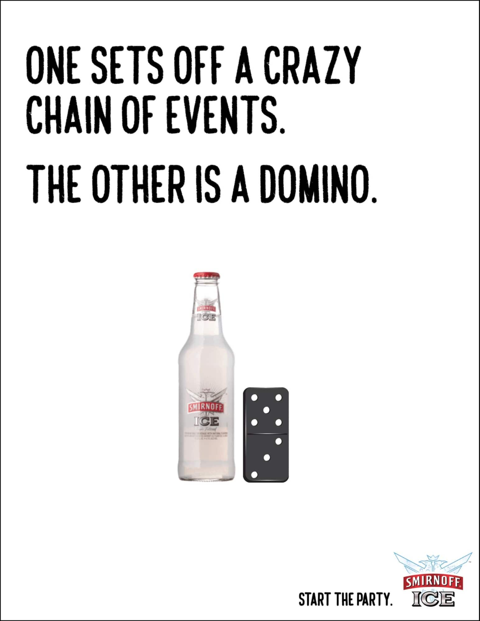
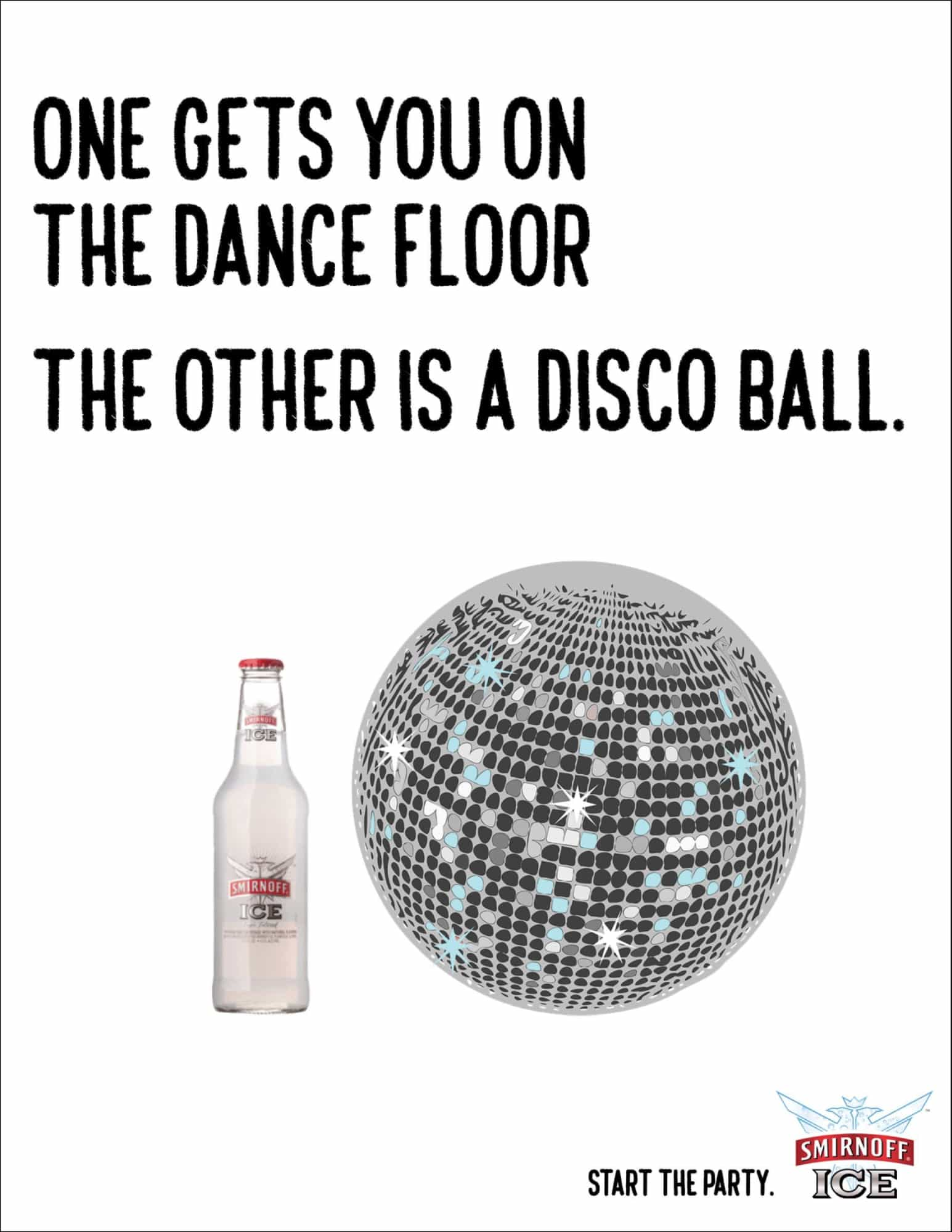
9. Set the stage for an “aha” moment
You know those movies when you are 100% sure who the killer was all along, and a plot twist leaves you doubting the detective skills you had believed to be extraordinary?
Smirnoff grabbed the same storytelling technique and squeezed into the smallest package it fits into a print ad.
The same way you feel the urge to rewind to the murder scene, these ads are guaranteed to make you look twice.
And the smoking gun was there all along.
10. Add some tension
Cover your eyes, it’s going to get really ugly in a split second.
Oh, wait, it’s a print ad.
It’s fascinating how much stress a still image can convey. These Axe ads are incredibly effective because although they’re moments frozen in time, you know exactly what comes next, and you can almost see it happen.
You can apply this same principle to your ads without foreshadowing a horrible accident, though.
The critical ingredient is predictability and the tension it creates.
Conclusion
Print ads have come a long way since the days of the early pioneers.
But although the challenges have somewhat shifted, today’s creative print ads have to check the same basic boxes as Caxton’s historical handbill did to be successful: they have to bring that novelty factor in making the audience look twice, and know who they’re targeting.
I hope you liked this short trip down memory lane and found these print ad examples inspiring for your next project.
Now I want to know: what is the best print ad you’ve ever seen?


