School banners can serve many purposes when using them as an advertising tool. They can attract future students, make waves for your school teams and clubs, promote upcoming events or achievements.
A compelling education banner can help you attract your audience’s attention by standing out from other schools.
Regardless of the banner’s purpose, a few rules apply for every school banner design.
Here’s what you should pay attention to:
3 Basic Elements to Pay Attention to When Creating a School Banner Design
1. The message
Your education banner can be for school sports, a back to school banner, high school banner, etc. One of the most important things you need to think about is the message that will appear on it.
It not only has to be clear, but it also needs to be written in a way that will help the target audience identify with your message.
Think about the problems that your audience is trying to solve, their main pain points, the solution you’re offering, and the benefit.
After you do this, you’ll know what language to use to communicate your message clearly.
2. The visual
The message is equally as important as the education banner design. They go hand in hand, so you shouldn’t neglect the visual aspect of your school banner.
Here are some of the most essential elements of design to consider:
- Colors
The school advertising banner design should definitely include your school’s color palette, so people will know how to spot yours, among others.
Colors set the tone of your school’s visual identity and branding, so you want to be consistent.
Combine the colors in a way that matches your school’s palette, so you can attract your audience’s attention through a well-designed school banner design.


- White space
White space refers to the area surrounding design elements and is an essential component of good banner design. It can help people scan the design and the text, increases legibility, and creates a certain aesthetic appeal.
When the design elements are too close together, people may get confused and won’t be able to read your banner correctly.
The key is to think about your banner’s overall composition. Apply the rule of less is more and keep only the essential elements.
- Fonts
The font you use is also an important part of your banner’s readability. For a visually pleasing school advertising banner, you should use one or two fonts at most that go well together.
Feel free to check out our ideas when it comes to cool banner fonts.
Once you decide on those two fonts, try to maintain consistency and use the same ones for your future banners.
3. The call to action
The CTA button is one of the most important elements of your banner design.
Your headline stops people from scrolling. The body text holds people’s attention, but the CTA is the one that will bring people to your website.
To make them click on it, make the text short, and use a color that stands out from the other elements.
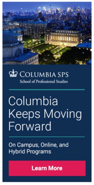
In the example below, the text for the CTA reads Learn More in white, and it’s placed on a pink background, which makes it pop.

15 Examples of School Banner Design Done Right
If you don’t know exactly how your banner should look, these school banner ideas will help.
1. Columbia School of Professional Studies
This education banner is keeping the tradition with Columbia blue. The copy is short and engaging, readable, and the call to action button is emphasized thanks to the bright pink color.
2. California Institute of Arts & Technology
With a black background and white for the copy, this education banner design can definitely draw people’s attention. In just a few words, the banner tells people the benefits they can get from enrolling at the California Institute of Arts & Technology.

3. Massachusetts Institute of Technology
The MIT went here with a short, intriguing slogan and copy that reveals only the online course topic and the fact that it lasts six weeks.
The image used is the visual representation of the slogan.

4. The University of Chicago
A logo, a slogan, and a few words highlighting the main idea. This is the recipe The University of Chicago used for this display banner.

They followed the same pattern for their Giving Day Event.

5. Texas A&M University
This banner for Texas A&M University is aiming directly at one’s evolution through education. The overall color composition of the banner is neutral, with a pinch of burgundy.

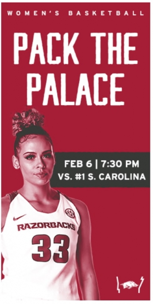
6. University of Arkansas
These display education banners for the University of Arkansas went for the same color palette and kept the message short.

7. University of Virginia
The University of Virginia used the color blue in the banner below and a little orange, which is a complementary color. Thanks to the pop of color, the banner design manages to stand out and creates a pleasant visual harmony.

8. University of Wisconsin
In this banner for the University of Wisconsin, they incorporated different colors that acted as a background for the text.
The colors are perfectly blended with the white text and the university’s logo, which is also white.
Despite the multi-color usage, the banner ensures readability because the copy is short and on point.

9. University of California, Berkeley
The school banner design that advertises the University of California uses the iconic Sather Tower from its campus.
It’s their way of saying that the online course will be no different than physically participating in their classes.

10. University of Phoenix
Sometimes simplicity is key. If you’re out of school banner ideas, get inspired by this one used by the University of Phoenix, which proves that a compelling copy can be everything a school banner design needs.

11. University Of Edinburgh Business School
A nice wordplay may attract all the attention you need. In this school banner, the University of Edinburgh Business School used the “in” from Edinburgh to make a preposition that completes a full sentence.
The colors used help the reader understand the meaning of the copy: Make it in Edinburgh.

12. LSE – London School of Economics and Political Science
Here’s a classic black and white school banner with a splash of red. You can’t go wrong with this combination. The copy is also just right—short enough to make it all look good, but at the same time, it says the essential details a student needs to know.

13. Rotterdam School Of Management
The school banner design for Rotterdam School of Management combines the city’s modern look with Rotterdam’s history. The signature from the top of the banner is that of the northern Renaissance’s most outstanding scholars, Erasmus Roterodamus.
They take pride in their history and use it to their advantage.

14. University of Kent
A simple copy that says everything a prospective student needs to know applied to a simple colored background can be enough. The University of Kent used a simple school banner design, which is mostly informative.
If the copy is used correctly, this kind of education banner can go a long way.

15. University of Sussex
Animated school banners can definitely draw more attention than static ones. Just take a look at the example below.
The University of Sussex made an eye-catching banner with smooth transitions. The combination of dark pink with white text blends perfectly.
10 School Banner Advertising Templates
If you need a school banner design but don’t know where to start or how to create it, here are ten examples of school banner templates for you to use and customize fast and easy, according to your preferences and school identity.
Conclusion
With a school banner design that stands out, you’ll be able to reach your goal, whether we talk about recruiting students, promoting an event, or just informing people about something new that happened in your school.
Incorporate the three elements mentioned at the beginning of the article, get inspired by the examples presented, or feel free to use one of our templates to have a design ready in minutes.

