If you want to design a brand identity you have to know that it will never be easy. However, if you are willing to invest all the time and energy required, you will learn a lot and you will also get to have a lot of fun.
There is a lot of pressure behind this kind of work.
Moreover, you need to choose the way you want to complete the task and design the brand that will represent your business:
- Define your brand’s vision and write it down on a paper
- Research the market and the competition
- Sit down, take a pen and a piece of paper, and start designing
- Create a mood board
- Choose your color palette, typography, and some graphic elements
- Create a brand guideline
- Determine your brand’s image and other related graphic elements
I know that is easier to talk about doing this stuff, at least in theory. However, to be honest, it can take days, weeks, and sometimes even months.
This happens because a brand is something that will represent your company, represent your employers, and represent everything you do inside and outside the company.
Before starting to discuss the proper ways of how to design a brand, on the other hand, you have to know the following thing and know that it is essential in your work:
The logo is not a brand.
The brand is a concept that defines how someone reacts and feel when they interact with your company. Just think about big brands like Google, Nike or BMW.
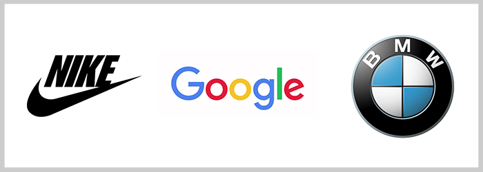
I bet, however, that everyone who reads this article knows at least a few things about the first 3 ones, right?
Summary
- What is brand identity?
- Design your logo
- Choose the perfect Typeface
- Create branding materials for your business
What is brand identity?
Brand identity means how a company presents itself and wants to be recognized by its consumers.
The difference between “brand”, “branding” and “brand identity” is that brand is how the world sees that company. Branding is the actively build an image of the company and brand identity is the perfect compilation of all brand elements to portrait the right image of itself to the world.
This article is for people who are not professional designers or professional brand creators. It’s for the ones that want to design a brand but don’t have the special blessed design skills they thought they needed in order to complete the task. Hence, it is not for big brand designers but for those who are building it from scratch.
Before we jump in and take a look at the most important steps one needs to undertake in brand design, I want to make sure that you understand the need for a well-structured plan of actions to guide you through this process. It’s a plan that you will find here, explained, in detail.
1. Define your brand vision
Whatever you call it, value proposition, brand vision, mission statement or just value, you have to sit down, take your time and write it down on a paper. In time, you’ll learn that pen and paper are indispensable tools for this process and for other similar tasks you may have in the future.
Some of you may still be wondering about what brand vision is. Here is a short definition that will help you better structure your ideas:
A brand vision reflects the ideas behind a company that help guide the present and future. In other words, the brand vision is a short and simple statement that declares the company’s purpose.
Here are a few examples from some of the biggest companies:
- Tesla – To create the most compelling car company of the 21st century by driving the world’s transition to electric vehicles.
- TED – We believe passionately in the power of ideas to change attitudes, lives and, ultimately, the world.
- Airbnb – Tapping into the universal human yearning to belong — the desire to feel welcomed, respected, and appreciated for who you are, no matter where you might be.
- Toyota – To be the most successful and respected car company in America.
- Facebook – People use Facebook to stay connected with friends and family, to discover what’s going on in the world, and to share and express what matters to them.
Simple words. Powerful ideas. Big dreams.
But what’s the difference between a brand vision and a brand mission?
Brand vision – statement that focuses on the future and what the company wants to become.
Brand mission – statement that focus on today and what the company does.
When you write down your brand vision think about the next 4 important questions:
- What does your company do?
- How do you help people?
- What do you want to achieve?
- How are you planning on achieving your goals?
These 4 simple questions will help you write down the outlines of your brand vision.
TIPS: Don’t try to write it down in just 5 minutes. Think about it. Meditate on it. Write it down again and again and make multiple drafts before settling for one. Talk with the people around you that understand you and what you are planning for the future of your company. Ask them what they think about this vision.
Now, that we know what a brand vision is and how to write it down, let’s move to the creative part of your brand design – the logo.
2. Design Your Logo
For the records, I’m not a professional designer either. I am just a content marketer who loves to test and experiment. Also, during my first years as a marketer, I had some design work to do as well.
Therefore, I am giving advice from a marketing perspective, a marketer that jumped in and took a 15 days challenge where I designed 15 logos using marketing keywords. So yes, I have a few experience on how to use Adobe Illustrator, Adobe Photoshop, on how to do a branding presentation and sell some logo designs.
A. Do the Research
When you want to start designing your logo, you have to start by conducting some research. Go on Google and see what other logos from your industry look like. You can just type [industry name] + logo and there you have it.
For example, I searched “advertising agency logo” and this is what I got.
If you just want to create a simple logo by using a basic typeface and nothing else, Google may be your best place to go for research. However, if you want to dive deeper into this topic and see how the professional designers are creating their logos, I recommend you 3 other important sources: Dribbble, Behance and Pinterest. These are the social networks of choice for designers, illustrators and brand makers.
Doing research is not as easy as it may seem at first. You are not just scrolling around visuals all day. You need to do more than that and this is why I will recommend you to start saving and creating folders for your brand. Think about the future logo in colors, graphic elements, typography. You can use Google Drive to upload all your researched visuals you find and like and then come back to them for inspiration and reference.
B. Choose the right brand design aesthetic
This is the first next step you have to do after you’ve completed the initial research and you want to design your brand: establish a design aesthetic for your brand.
There are 5 brand identity design styles from which you can choose:
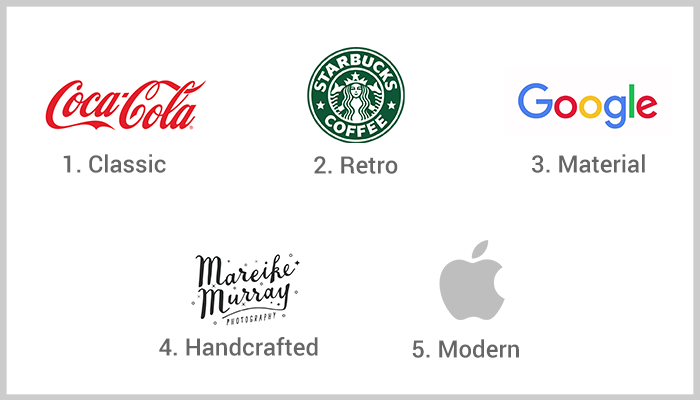
- Classic – in this category fall big brands such as GoodYear or Coca-Cola. The only disadvantage is that you can be outdated quickly. However, if you stay strong to it and communicate it well with marketing and branding campaigns, you won’t need any rebranding soon.
- Retro – brands like Starbucks embraced this style. It’s not that is not trendy or not cool, it’s that the company took the test of time to establish theirs as an important brand in our minds.
- Material – the godfather of this style is Google. Their innovative and modern technique uses grids, shadows, lights and other elements mixed together in order to create a modern graphic.
- Handcrafted – that’s a very good fit for small brands and even more for brands of companies who produce or sell a handcrafted product.
- Modern/Minimalist – the most popular example in this category is Apple. The modern minimalist style is recommended for companies that want to grow and embrace new industries and markets. In other words, it is for companies that are looking forward to evolve and transcend the present times and limitations.
Now that you have envisioned it and know what kind of design style you want for you brand, there is only one more step to make – start designing the logo.
There are 7 types of logos you can create:
- Abstract mark – the type of design that contains something abstract, something unique and easy to recognize.
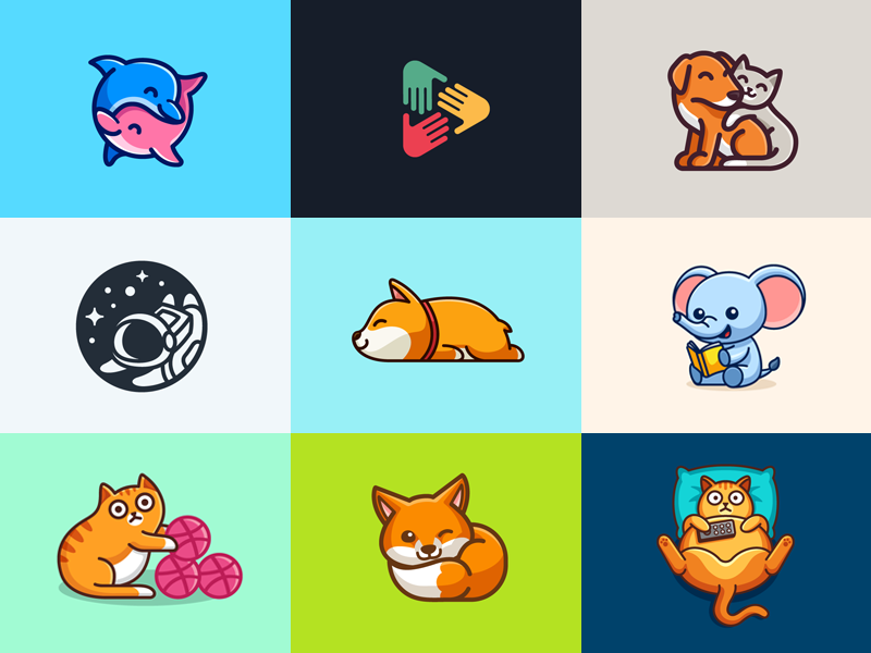
- Mascot logo – these are the kind of logos sport teams (NBA, NFL) are using. The big brand KFC also uses a mascot type log with their visual communication.
- Combination mark – this is the direct result of a combination between an abstract mark and a mascot logo.

Emblem logo – the kind of logo you will see representing the Universities and other academic institutions such as Harvard or Stanford.
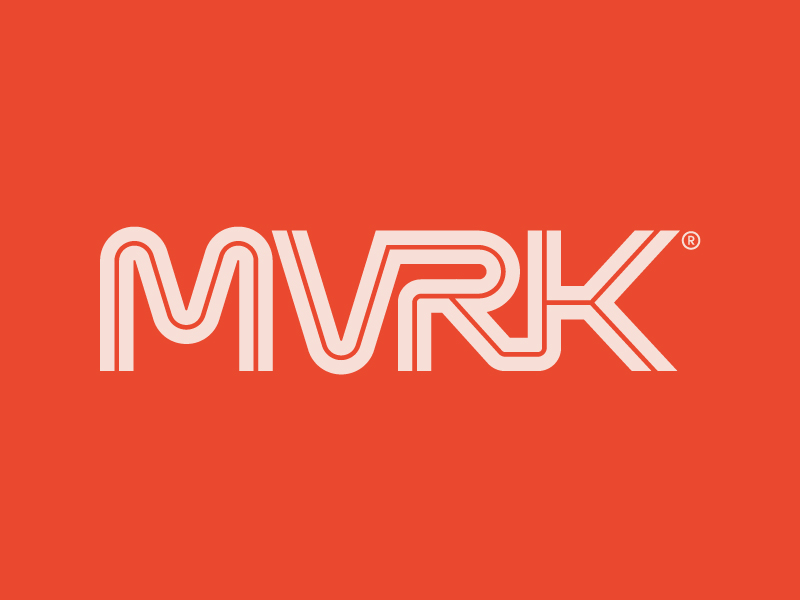
Lettermark – a typography-based logo that uses only a few letters, sometimes an acronym. The first examples that come to mind are IBM, NASA or HBO.
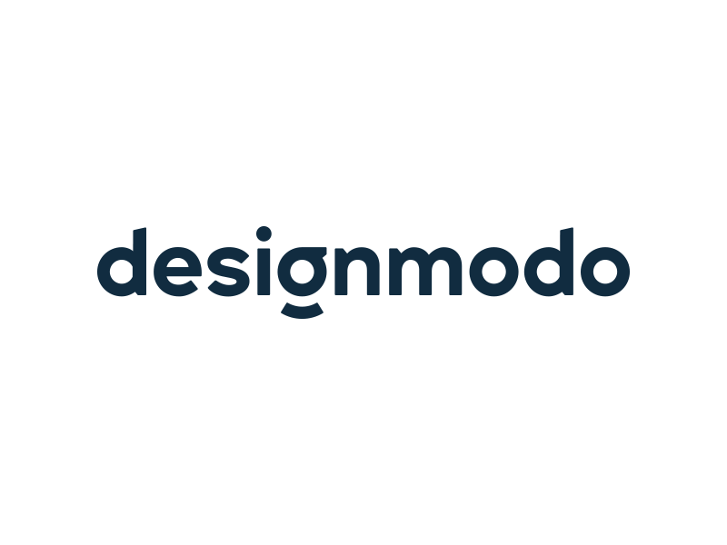
Wordmark – identical to lettermark, but with one small difference. In this case, the wordmark logo is a font-based design that displays a company name: Facebook, Google or Netflix.

Pictorial mark – pictorials are logos that people recognize usually by popularity and by association. They do not contain letters or words because they do not need to, people being able to recognize them as they are. Examples: Apple, Nike or Spotify.
C. Find the best color for your brand
Colors are an important element in your and every other’s brand design. There is an entire psychology behind choosing the right color palette for your logo and the overall visual identity of a company or product.
This is why I am recommending you to work with professionals on this part or use websites like ColorHunt that can help you choose the right color and copy the color code.
Also, it is not advisable to commit to a single monochrome color. Therefore, it is important to make sure that you understand the color theory well enough and how to use the color wheel:
- Complementary – 2 main colors that are opposite
- Analogous – 3 colors that are close from one to another
- Triadic – 3 colors equally spaced around the circle
Do you know that colors can impact emotions and behavior? Well, let me tell you the truth: Yes, they do. That’s why they play an important role in brand identity.
Here are only a few small things we can tell about colors:
- Red — importance, intensity
- Orange — affable, vitality
- Yellow — enjoyment, optimism
- Green — nature, balance
- Light Blue — calm, confidence
- Dark Blue — expertise, procedure
- Purple — authority, opulence
- Pink — femininity, innocence
- Brown — earth, old-fashion
- White — clean, healthy
- Gray — neutrality, bitterness
- Black — powerful, mature
I recommend you choose a base color and combine it with a maximum of two colors.
If you want to know more about visually appealing colors that go well together, take a look at our article that has 40 examples of striking color combinations you can use for your work.
You’ll see that you can create a good color combination out of vivid colors or pastel colors, which, contrary to some people’s opinions, can still be powerful.
Now that we know everything about colors and design aesthetics, let’s move forward and talk about the typeface you choose for your branding.
3. Choose the perfect typeface
Fonts and typography may prove to be very important for your brand as well. They get to complete your logo and make it easy to read and recognizable by the audience.
In the design industry there is a lot of talking about how to choose the right font, why choose a specific kind of font or how to use it after you found the perfect fit.
All you have to know is that there are 4 types of fonts:
- Serif fonts – if you want to have a classic look and high-end.
- Sans serif fonts – if you choose the modern and clean look.
- Script fonts – the reminiscent of hand lettering font
- Display fonts – decorative and highly stylized fonts
How to select a cool font for your brand?
First of all, you need to know what kind of logo you want (at this point, I guess you already understand the importance of my advice regarding design aesthetics). Do you want a classic look? Do you want a modern style? Will it be a clean and easy to read logo? Or, do you want it to look more like handwriting?
This is why, besides the above aesthetic related ideas, you will also need to focus on choosing the perfect font for your brand. Here are some tips:
- Easy to read: you want your brand to be easy to read. You need readability. People ignore the things that seem not to be familiar to them. So, make sure that your font is easy to read. How can you do that? You choose the font, write it down on your computer, step back and ask someone to read it. If they can read it, you are ok with it!
- Recognizable: think about Gillette lettermark logo. Easy to recognize whenever you get to see it, right? That’s how your font should be.
- Complementary to your logo: it means that the font should help your logo stand out and get the attention it needs.
And to understand better why typography is so important in a brand identity design, I invited Marius Ciuchete (a well-known web designer) to tell us the effect of good typography:
“Just like symbols, fonts can trigger feelings.
Think of a script font (the handwritten type) – that would make you think of something personal, something that involves feelings.
An invite to a celebration? A motivational quote perhaps? Would you use that font to design a logo for a law firm? Of course not. Now do the same thing: think of a Serif font. And then observe how luxury brands like Prada, Luis Vuitton or Vogue would come to mind.
There is psychology linked to certain fonts. Choosing the right font to represent your business can be a time consuming, (sometimes) painful process, and requires a lot of exploration. And because it’s a combination of art, science, and psychology, typography is pretty sophisticated.
Typography matters. The number one thing you have to do is ensure that the font you use fits your market. Research your brand and its audience, and define the feelings you need the new logo to evoke:
- Start with the basic rule of exploration. See how the logotype would look like in Serif, Sans-Serif, Slab Serif, on Script or Display. Exhaust all options before you take a final decision and proceed to the obvious next step (kerning).
- Look at scalability, make sure the font is legible when scaled down, especially with script fonts!
- 99% of the cases, one font is ideal. If your logo requires diversity, try taking into consideration other faces of the same font.
- An excellent kerning job goes a long way. Try to fine-tune the negative space between all the characters, and the final outcome will look streamlined, unified, complete.
- Decide what would be an excellent secondary font for pairing (usually this is used for slogans).
- Now think about the alignment. Choose wisely between Left Aligned, Right Aligned or Center Aligned.
- Take a few steps back and prioritize readability. Is it still legible?
Learning and obeying these typography guidelines can profoundly improve your workflow and will make the difference between a mediocre job or an excellent outcome.”
4. Create branding materials for your business
Now that you have finished designing your brand identity, let’s see what other things you can do.
First, I am always recommending to people who designed a brand identity, to buy their brand name online domain. Thus, if your brand is called “Red Coffee House” you should get your online domain redcoffeehouse.com or something very similar should the domain is already registered by another company. It is important to do so and create your own website. It is also important to have its address identical or very similar to the original brand name.
Secondly, you should keep in mind that social media is a great promotional space. It is recommendable to go and create your own Facebook Page, your own Instagram account (make sure it’s business account), Twitter, Youtube and all the other social media platforms you will use to connect and promote your business.
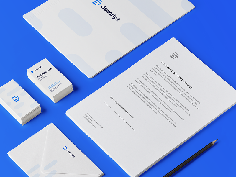
Thirdly, create all the branding materials you think you will need during this first phase. It is possible that you will attend future events, connect with other people so it would be a great strategy for you to handle your business card. Create your first business card and make sure that every time you get out of your home, out of your office or receive a visitor, you have a few cards with you.
Conclusion
Creating a brand identity for your company is something you have to deal with if you are starting a new company or if you want to rebrand it from the ground. These few simple ideas will guide you through this process and this is why they are important in any context, regardless of your industry.
A business needs a visual identity and every branding concept and strategy starts with this.


