Circles can make the world go round, especially when it comes to graphic design. Round shapes are among the most versatile geometric elements in graphic design, and they can be used to create stunning works of art.
If you want to learn some of the most essential tips and tricks you can use to integrate round shapes in your visuals, then keep on reading.
We’ll take a look at some cool circle designs by famous designers. Then, I’ll show you how some of the most important brands use circles to promote a message and give coherence to their ads.
But first, let’s take a journey through the history, meaning, and symbolism of circles to better understand what they can transmit.
Psychology and Circle Meaning in Design
Designers often appeal to the psychology or symbolism of circles when including them in their work. So let’s see what circles mean in design and what they suggest as symbols.
From a psychological point of view, circles represent the notions of unity, integration, wholeness, and they give us a sense of completion, confidence, and harmony.
They have no beginning and no end, and they also don’t have angles. That’s why a circle is a powerful element, yet safe, soft, and mild.
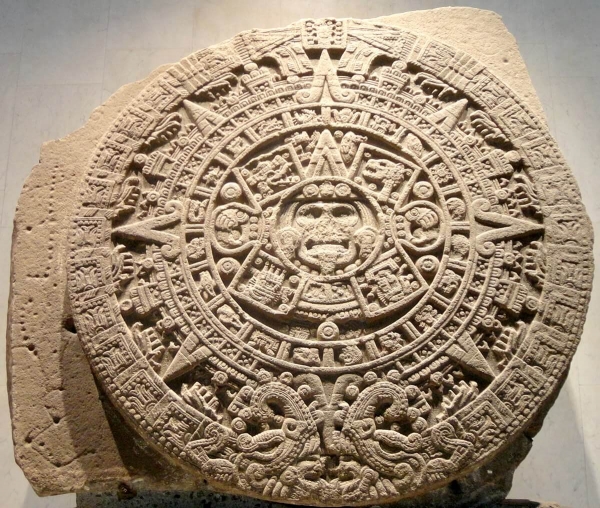
When it comes to symbolism since the beginning of time, circles were always associated with cosmic objects such as the sun, the moon, or the Earth.
They mean magic, imagination, and mystery. Here’s an example from the history of art, the great Aztec Sun Stone.
7 Tips on How to Create Circular Graphic Designs
Next, we’ve prepared a list with some of the most important tips you can use to make your circle graphic design look fabulous and stand out.
We’ve analyzed some popular posters and graphics to show you how using a simple element such as the circle can give your work meaning, and unity.
Remember, less is more. You don’t have to use all our tips at once, choose what fits the design you’re working on and make it count.
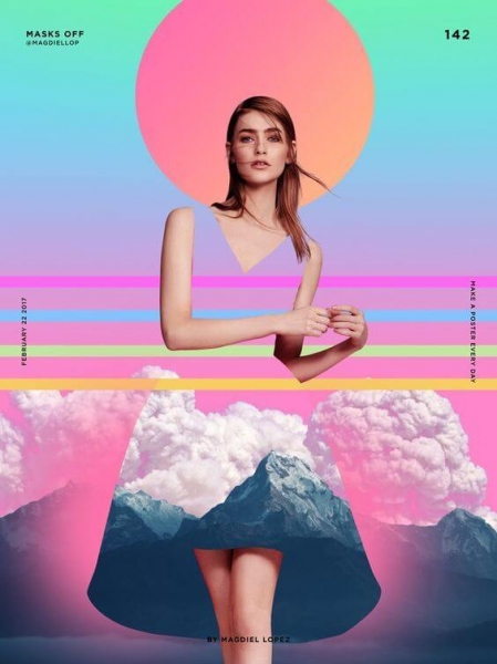
1. Use circles to highlight your subject
A simple way to showcase the most crucial part of your design is by drawing a circle around it. Using a circle to highlight a face or a character is a technique that’s been around since forever, and it can be found even in religious iconography.
This use case can give your image a sense of mystery and a compositional unity.
Graphic designer Magdiel Lopez often uses circles in designs along with bold colors and futuristic shapes to give a sense of mystery, magic, and poetry to posters.
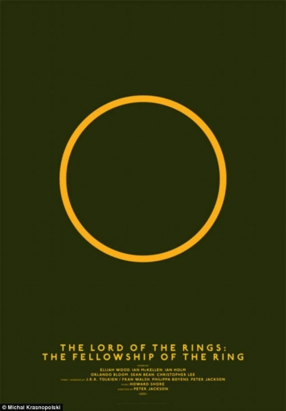
2. Go for a minimalist approach
A basic graphic circle can have many meanings, and it’s up to you to use it in the most significant way. A minimalist approach can go a long way if your subject is well known, and you can let the ad copy help the audience decode the meaning.
This alternative minimalist poster of The Lord Of The Rings movie is an excellent example of how a simple circle design can be a great reminder of a story.
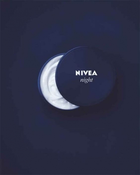
3. Use circles as symbols
As mentioned before, circles have a cosmic significance, and you can use this symbolism to talk about your product. Just like Nivea did with this great ad for their night cream.
The packaging was used to illustrate the half-moon, and so the company managed to emphasize when the product should be applied.
4. Use semi-circle designs
Circles don’t have to be complete to look cool. Removing parts of your round circle design or using semi-circles can help your visual stand out even more.
Notice how a semi-circle design can be more dynamic and vivid than a whole circle. The significance also changes, as the half-circle drawing is leaving the viewer curious, engaged, and wanting more.
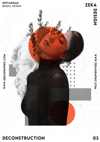
5. Add color to your circles
If you feel like your design is getting out of hand and feels too crowded, go for a pop of color. Choose a bright color for the circle and keep everything else black and white.
You can’t go wrong with this combo.
Thanks to the eye-catching contrast, you’ll get a clean aesthetic that keeps the focus on what’s important, just like in this Zeka Design poster example.
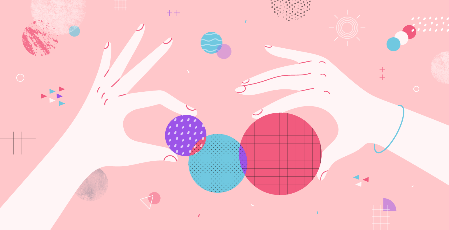
6. Don’t limit to one circle
Using multiple circles of the same size creates a beautiful pattern, a sense of order, or it can add mystery. Also, you can always play with color and transparency to give depth to your image.
Look at this great movie poster and get inspired to use colorful circles and create a pattern.
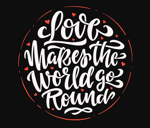
7. Emphasize the message
If you are trying to make your message pop and be read, you can always add the text within a circle. If you pair it with a hand-lettering font that has round edges, you’ll add consistency to the visual.
Here’s a beautiful example where the lettering and shape complete the message, giving a sense of unity to the entire design.
6 Excellent Examples of Circles in Advertising
Circles can be used in advertising to showcase a product, highlight a feature, or symbolize a concept.
Let’s take a look at some creative examples of ads using circular shapes and learn how to use them in high converting ads.
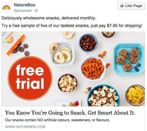
1. Highlight your offer
Circles work great when you create an ad where you don’t want to add too much text, and yet you want to draw your audience’s attention to it. The best way to do it is by following the example below and add a circle where you insert your call to action.
Here’s an ad from Naturebox that really looks delicious.
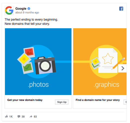
2. Put the focus on illustrations
Your illustrations can be brought together by circles, giving a sense of unity.
Take a look at how Google uses circles in design to complete the illustrations for this carousel ad. Since Google’s logo and entire visual strategy relies on circles, it makes sense for them to integrate this concept into their ads, too.
3. Emphasize a person
Here’s a great example from HubSpot, where they used various circles to highlight the main character of their ad. The circles suggest community, communication, and confidence.
If your ad has a portrait, consider adding a circle around the person’s head to attract attention and maximize its impact.

4. Use circles as frames
Ever wondered why most testimonials or team pages use circles to frame the people? Hint: it’s not just because faces look better in round shapes. In this context, circles give confidence and make people trust those faces more.
This is a great idea you can use right away in your ads, testimonial pages, team pages, or about us page.
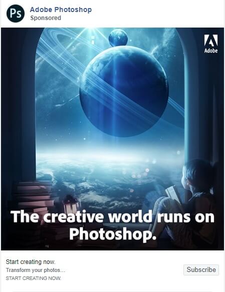
5. Use circles as cosmic symbols
Does your ad talk about creativity? Then the sky is the limit. Use the symbols of the circles to make your audience dream and feel like they can do anything with the power of imagination.
Here’s a great ad from Adobe Photoshop that illustrates the power of circles as cosmic symbols.
6. Turn circles into progress bars
Circular and semi-circular graphics work great as progress bars when you want to emphasize evolution, growth, or advancement of any kind. While a circle represents a whole, an additional inner part of the circle can illustrate the progress in a simple yet effective way.
Use a geometric circle design along with an indicator of progress (numbers or percentages) to draw attention to your ad.

6 Circle Design Templates You Can Customize Right Away
If you’ve decided to include circles in your designs, but you don’t feel like you have the skills to create a design from scratch, the best thing you can do is learn by using and modifying existing templates.
You can do that starting from Creatopy’s circle templates. Here is a selection of the best ones you can use right now. Just click on the template you want to edit, create an account—in case you don’t already have one—and start editing.
A medical template with a circular frame talks about care, confidence, and love. Use this template when you want to promote a medical facility or medical services.

All kinds of services can be promoted using circular frames that give a sense of community. With a design like this one, you’ll be able to emphasize your core values.

If you want to organize giveaways, promotions, or contests, concentric circles are the way to go. They attract the user’s attention and make them want to go straight to the target.

Nothing says health and nature better than a series of round shapes. Give your banner design a makeover and use circles to round-up it up.

Bold colors and semi-circle designs are great for creative industries such as music or fashion. Let your imagination flow and edit a template like this one.

Circle frames on a white background can give your food and lifestyle blog a fresh, clean look. Give it a try with this cool template.

Conclusion
So we have come full circle. I hope this material gave you the inspiration you need to start creating some fantastic work using round shapes. As you saw, there are endless ways for you to use circles in designs and create engaging visuals.
Now it’s your turn. Let us know if you found this article useful and what are your best tips to design with circles.