*Disclaimer: This experiment was conducted back when Creatopy was named Bannersnack.
According to Statista, there are over 7 million active advertisers on Facebook.
Some of them are most likely targeting the same audience as you are. When you have competition, you may think that increasing your Facebook and Instagram ad spend can bring better results.
But that’s not necessarily true.
In this case study, I want to show you that it’s possible to get a pretty decent ROI when doing Facebook and Instagram advertising on a budget.
Disclaimer: The COVID-19 pandemic has affected the Facebook ad spend in numerous companies all across the globe. With that being said, the conditions have changed since last year, so we may not achieve the same results in this context.
Without further ado, let’s get into it and see how we managed to get 350% ROI by investing $2,480 in Facebook and Instagram ads.
1. Overview
2.1. Targeted placement: Facebook desktop
2.2. Targeted placement: Facebook mobile
2.3. Targeted placement: Instagram
3.1. Targeted placement: Facebook desktop
3.2. Targeted placement: Facebook mobile
3.3. Targeted placement: Instagram
Infographic

Embed this Infographic on your site (copy code below):
| <div style=”clear:both”> <a href=”https://www.creatopy.com/blog/facebook-ads-instagram-ads/”> <img src=”https://www.creatopy.com/blog/wp-content/uploads/2020/05/how-to-design-facebook-ads-.png” title=”[Case Study] Facebook and Instagram Ads On a Budget: +350% ROI With a $2,500 Budget” alt=”[Case Study] Facebook and Instagram Ads On a Budget: +350% ROI With a $2,500 Budget” border=”0″ /> </a> </div> <div>Courtesy of: <a href=”https://www.creatopy.com/blog/creative-copy-converts/”>Creatopy</a></div> |
1. Overview
Time frame analyzed
For this case study, the period analyzed was from September 1st to December 31st, 2019.
Targeting
For the analysis, we chose two ad groups—HTML5 ads and banner generator, which are top-rated features among our users.
For each placement (Facebook desktop, Facebook mobile, and Instagram), we had different campaigns.
We analyzed the two ad groups in all three campaigns so we can get a better perspective of the specifics of each placement.
Budget and ROI
Our total budget was $2,480, and the ROI was $11,370, which means that we achieved a 350% return on investment.
The amount spent on each ad group is different. Since both ad sets are part of the same campaigns, for each one, we used campaign budget optimization (CBO).
2. HTML5 Ad Group
2.1. Targeted placement: Facebook desktop
We invested $274.39 and used several ads to see which combinations work best.
Here are the overall results we got from the HTML5 ad group where we used Facebook desktop as placement:
- 25,296 reach
- 80 website registrations (15 click-through and 65 view-through)
- $508 in purchases ($32 value for click-through and $476 value for view-through)
- 85.14% ROI
Now, let’s see the different ads we used and what we noticed for each case.
Test #1: different visuals
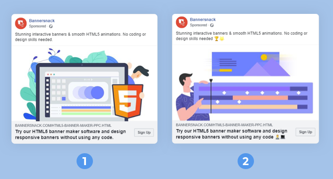
Here are the results for this first ad, with a spend of $48.41:
- $44 in purchases (all view-through)
- 18 registrations (13 view-through and 5 click-through)
- -9.11% ROI
Here are the results for the second ad, with a spend of $72.85:
- $312 in purchases ($280 view-through and $32 click-through)
- 20 registrations (17 view-through and 3 click-through)
- 328.28% ROI
Both ads are in a landscape format and have the same text with a small difference—one of them has two emojis.
The main reason why the second ad performed better is because the image we used was more relevant and suggestive to the user when it came down to the feature we advertised.
Moreover, the ad has the same element that was found on the landing page we used for the HTML5 ads feature.
This goes to show that it’s essential to form a strong connection between the visual and the page users will click on.
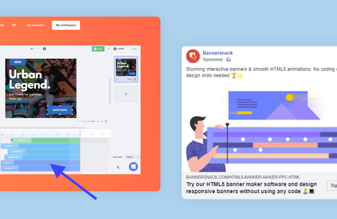
The animation timeline is shown both in the ad visual and on the landing page. Moreover, the color palette used in the ad matches the colors used on the website.
As a result, the second ad had a much higher ROI compared to the first ad in this test group. It brought us almost three times the value invested, while the first ad did not manage to return the amount we spent.
In conclusion, the second ad was clearly the top-performing one because our primary goal consisted of purchases.
Test #2: landscape vs. square
For this test, we made a comparison between the winner ad in the first test (with a landscape image) and a variation of that ad in a square format.
Here are the results we got for the square ad, with a spend of $63.71:
- $44 in purchases (all view-through)
- 19 registrations (17 view-through and 2 click-through)
- -30.94% ROI
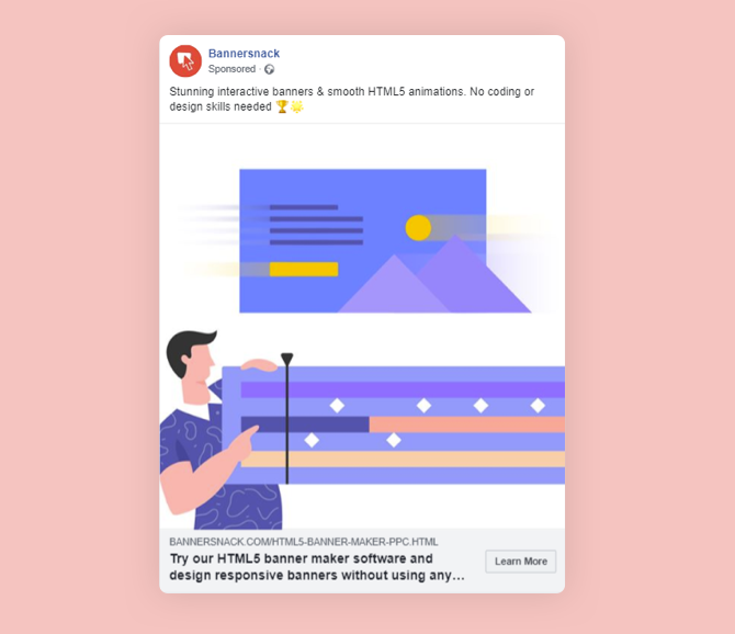
The ROI is much higher for the ad with the landscape image (328.28% vs. -30.94%).
The ads were identical when it comes to the text, and visual used, except the image format was different.
The explanation is that for desktop users, Facebook shows ads both in the news feed as well as in the right-hand column (Right Column ads are a desktop-only format).
Back in September 2019, when we started this campaign, landscape formats were quite popular and successfully used in Facebook advertising.
Now, the trends show that the square format will bring better results, which is why Facebook recommends this size.
Even if we achieved a positive ROI with the landscape ad format, we recommend using square images for your Facebook ads from now on.
Test #3: different text
For this test, we analyzed the winning ad in the first and second test against a variation with different text.
First, let’s look at the results for the second ad of this test, with a spend of $7.70:
- Zero purchases
- 3 registrations (2 view-through and 1 click-through)
- -100% ROI
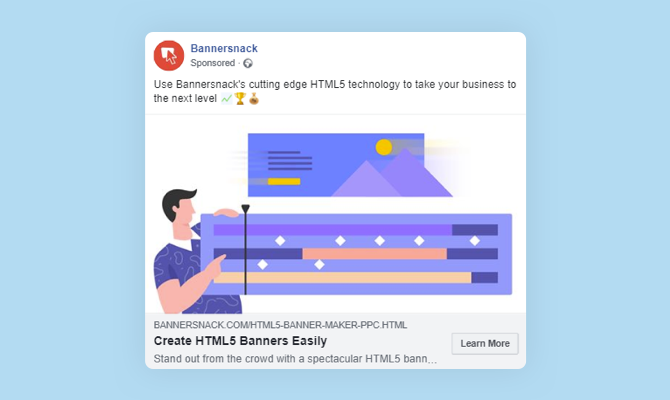
Both ads had the same visual with the exact format and no text on it. The copy of the ad was the only thing different about them.
Let’s analyze the text.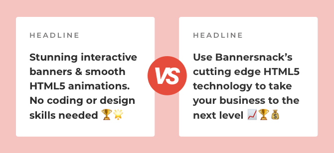
For us, it was quite clear that to draw the attention of potential customers and convince them to convert, we needed to explicitly state the benefit of what we’re advertising.
The ad copy should convey loud and clear what your potential customer will get (Stunning interactive banners & smooth HTML5 animations), and not be focused on the features you provide (Use Creatopy’s cutting edge HTML5 technology).
2.2. Targeted placement: Facebook mobile
We invested $298.50, and, similar to what we did for the Facebook desktop placement, we used several ads to see which combinations work best.
Here are the overall results we got for the HTML5 ad group where we used Facebook mobile as placement:
- 34,532 reach
- 89 website registrations (11 click-through and 78 view-through)
- $1,104 in purchases ($364 click-through and $740 view-through)
- 270.47% ROI
By comparing the desktop ad group to the mobile ad group, we can see that the mobile one had a much higher ROI (85.14% vs. 270.47%).
Now, let’s go through the different ads we used to target our audience that uses Facebook on mobile and what we noticed.
Test #1: different visuals
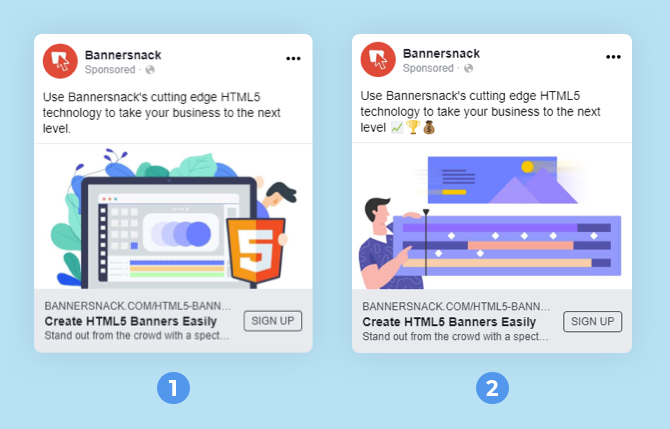
Here are the results for this first ad, with a spend of $29:
- $280 in purchases ($248 view-through and $32 click-through)
- 6 registrations (5 view-through and 1 click-through)
- 865.52% ROI
Here are the results for the second ad, with a spend of $20.75:
- Zero purchases
- 13 registrations (11 view-through and 2 click-through)
- -100% ROI
Both ads are in the landscape format, have the same text (the only minor difference being the emojis added in the second ad), and different visuals, more specifically, the same ones we used for the Facebook desktop placement.
The ad that performed better was the one that had eye-catching colors and elements.
The second ad performed better on desktop and not on mobile because of the details it contains, which are harder to spot when scrolling on mobile devices.
A relevant image that contains only a handful of elements that stand out is more likely to make a potential customer stop scrolling on mobile.
This statement is undeniably enforced by the ROI we achieved with the first ad.
Test #2: landscape vs. square
For this test, we made a comparison between the second ad in the first test and a variation of that ad in a square format.
Here are the results for the second ad, with a spend of $37.31:
- $84 in purchases (all view-through)
- 8 registrations (7 view-through and 1 click-through)
- 125.14% ROI
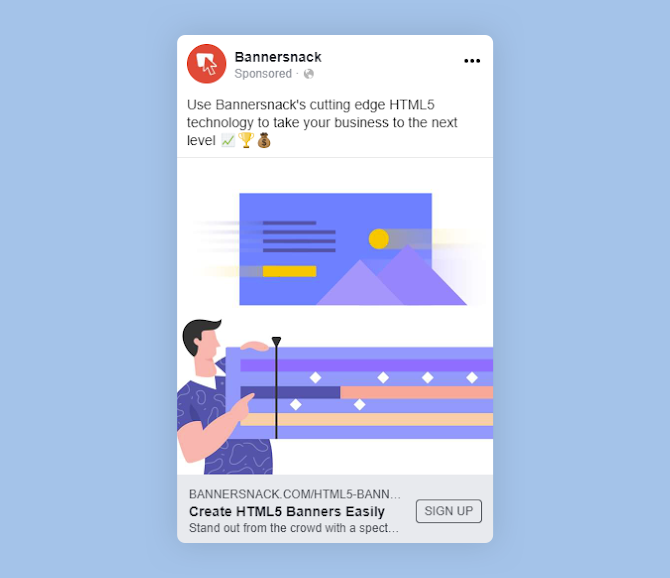
Both ads had the exact same text and visual, the only difference being the image format. For this test, we have seen better results for the square ad.
As I’ve already mentioned earlier, trends show that square images perform better.
The results we achieved on mobile are obvious that this is true, especially on mobile devices.
The amount in purchases was double what we invested in the ads, and we had a few registrations as well.
Test #3: different text
For this test, we analyzed the winning ad from the first test against a variation with different text.
First, let’s look at the results we got for the second ad, with a spend of $58:
- $248 in purchases
- 15 registrations (14 view-through and 1 click-through)
- 327.59% ROI
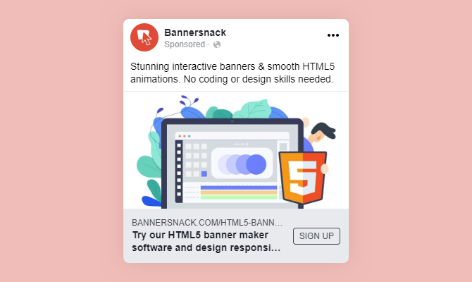
Both ads had the same visual with the exact format and no text on it. The copy of the ad was the only thing different about them.
Let’s analyze the text.
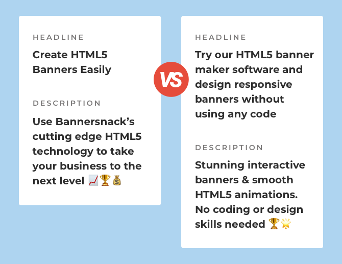
Even if we followed the rule that says to state the benefit of the product advertised, the results showed that, in this case, it was not that important.
Instead, the length of the copy mattered most.
The ad that performed better is the one that had a shorter headline and fit the ad space perfectly. The headline for the second ad, which performed better on desktop, was too long for mobile.
On desktop, the entire text was visible due to the larger format, but on mobile, it’s a different case.
In conclusion, to have the best ROI when running a Facebook advertising campaign on mobile, make sure you use a relevant, short, and concise text for your ads.
A combination of a benefit-oriented message and text length should increase your ads’ performance.
2.3. Targeted placement: Instagram
Here, we invested $429.42. Similar to what we did for the Facebook campaigns, we used several ads to see which combinations bring us the best results.
Here are the overall results we got from the HTML5 ad group, where we used Instagram as placement:
- 32,928 reach
- 139 website registrations (6 click-through and 133 view-through)
- $3,946 in purchases ($64 click-through and $3,882 view-through)
- 819.81% ROI
Now, let’s take a look at the three tests we made and what we noticed.
Test #1: different visuals
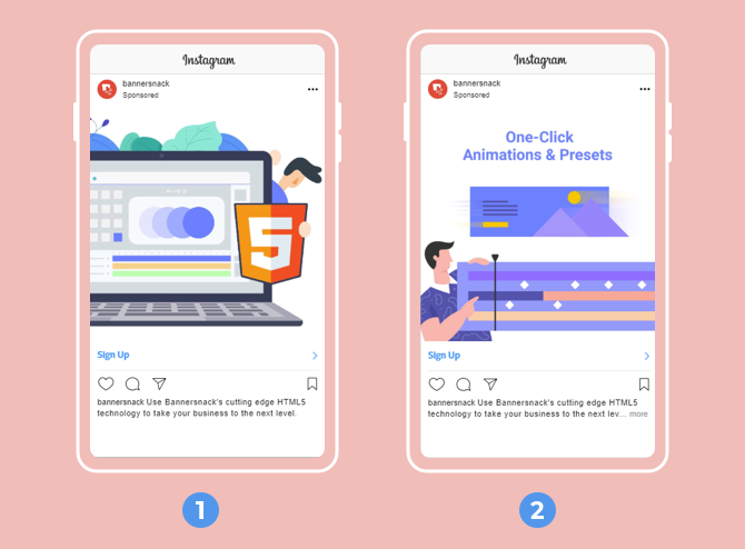
Here are the results for this first ad, with a spend of $36:
- $249 in purchases (all view-through)
- 15 registrations (14 view-through and 1 click-through)
- 591.67% ROI
Here are the results for the second ad, with a spend of $33:
- $1,343.57 in purchases (all view-through)
- 3 registrations (all view-through)
- 3971.42% ROI
For both ads, we used a square format and the same text.
The main reason why the second ad performed better is because the image is more relevant and suggestive when it comes to the feature advertised.
As shown earlier, the second ad has some elements that can be found on the landing page.
This is very important because the stronger the connection between the ad and its destination, the better the results.
Another aspect that might have increased the performance of the second ad is that we added some text on the image. We used only a few words, which improved the ad’s relevancy.
The text is clear and doesn’t occupy too much space on the actual image.
This is very important to keep in mind, so your ad will not get rejected or have limited reach.
Test #2: landscape vs. square
For this test, we compared the winning ad in the first test and a variation of that ad in a landscape format.
Here are the results for the landscape ad, with a spend of $43:
- $96 in purchases (all view-through)
- 17 registrations (all view-through)
- 123.26% ROI
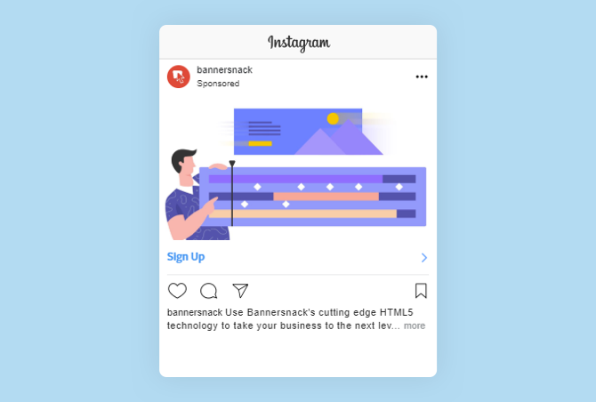
Both ads had the same text and visual—the only different thing is the image format.
The ROI is much higher for the ad with the square image.
This is why we don’t recommend using landscape images for Instagram ads as they take up less than half the space compared to a square image.
Test #3: different text
For this last test, we analyzed the landscape ad from the second test against a variation with a different caption.
First, let’s look at the results we got for the second ad, with a spend of $105:
- $901.85 in purchases (all view-through)
- 38 registrations (all view-through)
- 758.9% ROI
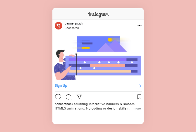
Now, let’s take a closer look at the captions for each ad.
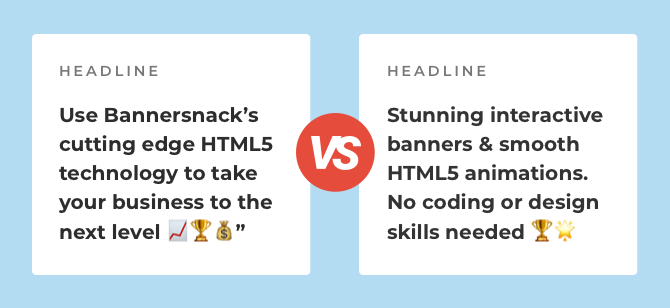
Both ads used the same visual, same size, with no text on it. The description of the ad was the only aspect that set them apart.
As we’ve seen before, the results prove that to catch the audience’s attention and convince them to convert, it’s important to state clearly how your product could benefit them.
Therefore, the second ad had the best ROI, demonstrating once again that people want to know the benefit you’re offering and not the feature.
3. Banner Generator Ad Group
3.1. Targeted placement: Facebook desktop
We invested $706.12 and used several ads to see which combinations work best.
Here are the overall results we got from the HTML5 ad group where we used Facebook desktop as placement:
- 44,792 reach
- 138 website registrations (33 click-through and 105 view-through)
- $1,712 in purchases ($312 click-through and $1,400 view-through)
- 142.49% ROI
Like in the case of the other ad group, we used several ads to see which combinations work best, so I have a lot of things to show you.
Test #1: different visuals
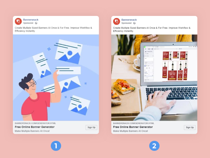
Here are the results for the first ad, with a spend of $124:
- $538 in purchases (all view-through)
- 30 registrations (22 view-through and 8 click-through)
- 333.87% ROI
And here are the results for the second ad, with a spend of $76:
- $12 in purchases (all view-through)
- 11 registrations (6 view-through and 5 click-through)
- -84.21% ROI
Both ads had the same square format, the exact text, and when someone clicked on the CTA button, it would take them on the banner generator landing page.
The major difference between these two ads is the image that we used.
The ad with a higher ROI, which is the first one, has elements and colors that can be found on the landing page we advertised.
You can see what I mean by that in the image below.
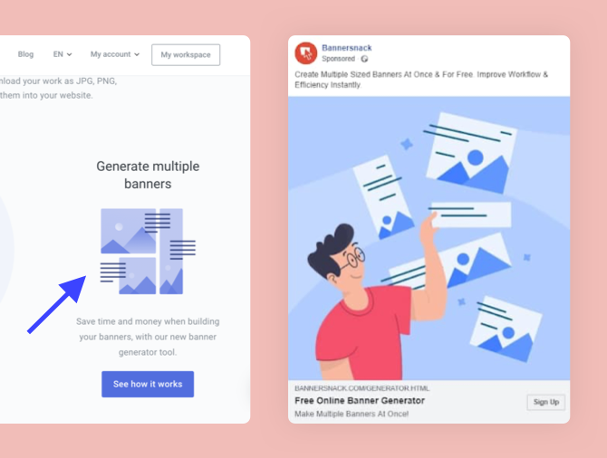
The illustration with the banner sets from the landing page is very similar to what you see in the ad.
In both cases, we have visuals with the same color palette, which enhances the connection between the landing page and the ad itself.
Moreover, blue is the color of wisdom, confidence, intelligence, and tranquility.
All of these attributes are perfectly linked with our idea of an intelligent solution—a time-saving design tool for creative teams.
Blue, used along with red (which is our logo’s color), managed to draw potential clients’ attention.
A vibrant combination of colors will help you achieve this, but remember to use the same color scheme that was used for the landing page design as well.
In conclusion, you should focus on creating an image that’s relevant to what you’re advertising.
Test #2: landscape vs. square
For this test, we compared the winning ad in the first test and a landscape format for the same ad.
Here are the results for the landscape ad, with a spend of $61:
- $88 in purchases (all view-through)
- 21 registrations (19 view-through and 2 click-through)
- 44.26% ROI
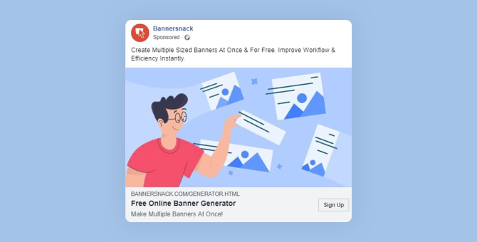
The only difference between the two ads was the format we used.
The ROI was much higher for the square ad, and that could be mainly because these perform better in general.
In our case, there’s a big difference between the square and landscape format in terms of results (333.87% vs. 44.26%).
Test #3: different text
For this one, we analyzed the winning ad from the first test against a variation with different text.
First, let’s look at the results we got for the second ad, with a spend of $13:
- Zero purchases
- 3 registrations (all view-through)
- -100% ROI
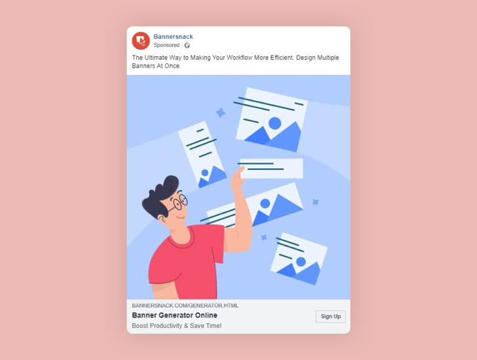
Now, let’s analyze the text.
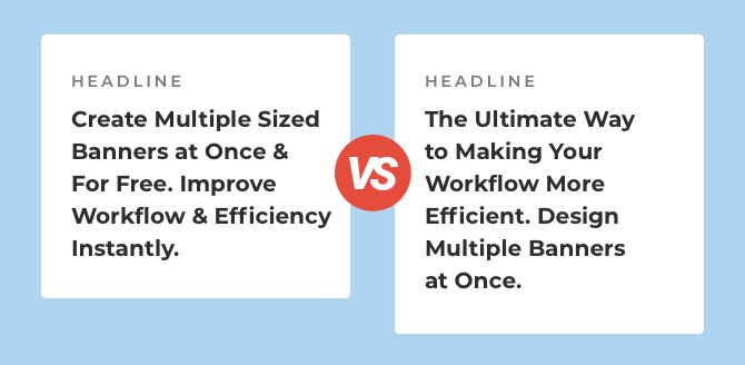
In the first ad, the beginning of the sentence is more clear (Create multiple sized banners at once), than the second ad (The ultimate way to make your workflow more efficient).
It specifies only at the end how a potential user can make their workflow more efficient.
People may not read the entire text, so you may lose their interest if you don’t mention right from the very beginning what you’re offering. By starting with the benefit, you get them hooked.
Another important aspect to mention is the use of the word free.
Free is one of the most persuasive words you can use in copywriting. As you can see, we used this word twice in the winning ad.
Moreover, the option to test a product for free before deciding to buy is extremely appealing, so this alone can help you convert more people.
3.2. Targeted placement: Facebook mobile
We invested $502, and, similar to what we did for Facebook desktop users, we used several ads to see which combinations work best.
Here are the overall results we got for the HTML5 ad group where we used Facebook mobile as placement:
- 46,121 reach
- 129 website registrations (14 click-through and 115 view-through)
- $3,995 in purchases ($216 click-through and $3,779 view-through)
- 695.82% ROI
By comparing the same ad group on desktop vs. mobile, we can see that the mobile one had a much higher ROI (142.49% vs. 695.82%).
Now, let’s look at the three tests we performed and analyze the results.
Test #1: different visuals
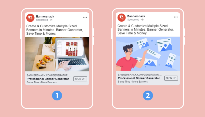
Here are the results for the first ad, with a spend of $65:
- $1,774 in purchases (all view-through)
- 22 registrations (20 view-through and 2 click-through)
- 2629.23% ROI
And here are the results for the second ad, with a spend of $114:
- $1,167 in purchases (all view-through)
- 27 registrations (23 view-through and 4 click-through)
- 923.68% ROI
Both ads are in the landscape format and have the same headline and description.
The only significant difference that you probably already spotted is the images that we used.
Now, you may think that I got the numbers mixed up, but I promise I didn’t.
The first ad indeed performed much better than the second one, even though we achieved the opposite result when targeting the Facebook desktop placement.
On mobile, people expect to see posts from friends and family members, which is why the winning ad blends more naturally in people’s newsfeeds.
During work hours, Facebook users will be scrolling through their newsfeed from desktop, while outside working hours, they switch to mobile.
That being said, if you want to draw your audience’s attention, you need to make sure that your ad doesn’t look like an ad.
Make it look like it’s part of their newsfeed.
Despite this, the second ad performed quite well in terms of purchases and registrations.
Test #2: landscape vs. square
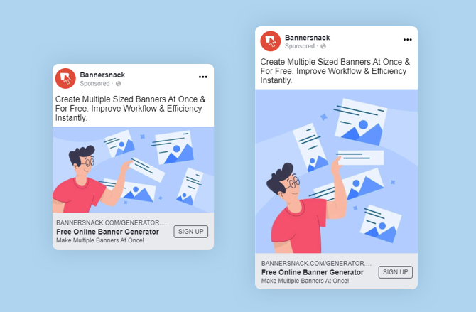
Here are the results we got for the landscape ad format, with a spend of $46:
- $300 in purchases (all view-through)
- 10 registrations (9 view-through and 1 click-through)
- 552.17% ROI
And here are the results for the square format, with a spend of $16:
- Zero purchases
- 2 registrations (all view-through)
- -100% ROI
The ROI was much higher for the landscape format, but that’s only because our ad campaign started back in September 2019, when this format was more successful than the square one.
Now, Facebook recommends using the square format. Our most recent campaigns showed that this is true.
Test #3: different text
For the final test, we compared the winning ad from the first test against a variation with different text.
Here are the results for the second ad, with an ad spend of $40:
- $216 in purchases (all view-through)
- 8 registrations (all view-through)
- 440% ROI
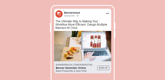
The first ad, which is the one with the highest ROI, states clearly at the beginning of the sentence what’s being advertised.
The second ad is kind of vague in the beginning, so it’s unlikely that many people will go ahead and read the entire sentence.
The key is to draw the interest of potential clients right from the start.
Also, the first ad emphasizes the users’ benefits by mentioning you can “save time & money.”
3.3. Targeted placement: Instagram
It’s time to analyze the final campaign of this case study.
On Instagram, we invested $266.
Here are the overall results we got from the banner generator ad group where we used Instagram as placement:
- 18,968 reach
- 85 website registrations (81 click-through and 4 view-through)
- $109 in purchases (all view-through)
- -59.02% ROI
Now, let’s take a closer look at the two tests we made and analyze them.
Test #1: different visuals
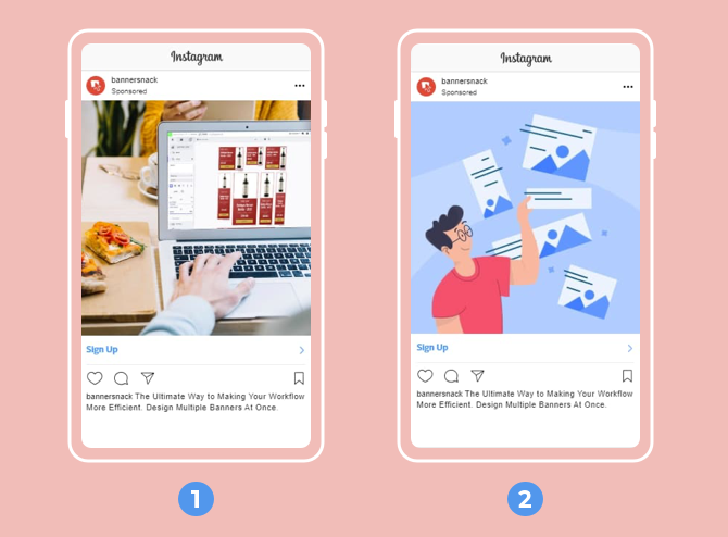
Here are the results for the first ad, with a spend of $48:
- Zero purchases
- 15 registrations (14 view-through and 1 click-through)
- -100% ROI
Here are the results for the second ad, with a spend of $64:
- $44 in purchases (all view-through)
- 18 registrations (16 view-through and 2 click-through)
- -31.25% ROI
The only thing different about these ads was the image.
Similar to the campaign where we used Facebook desktop as placement, the second ad performed better in terms of purchases.
Regarding the registrations, we noticed that the first ad has a slightly lower cost per registration than the second one.
That can be due to the image that blends in with the Instagram feed and can be easily mistaken as a friend’s post.
Test #2: different text
For this final test, we analyzed the winning ad from the previous text against a variation with different text.
Here are the results for the second ad, with a spend of $30:
- $33 in purchases (all view-through)
- 8 registrations (7 view-through and 1 click-through)
- 10% ROI
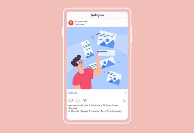
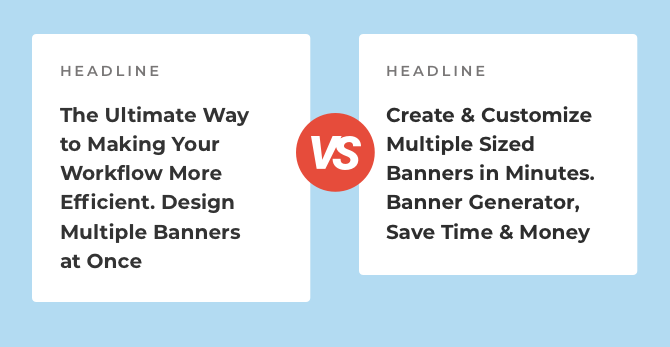
Let’s analyze the different copy we used for these two ads.
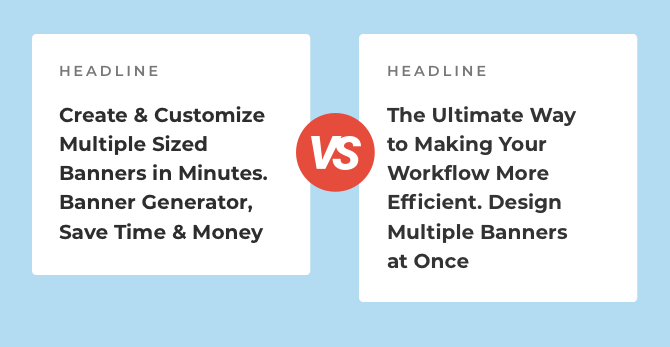
In the first ad, the beginning of the sentence is kind of vague (The ultimate way to make your workflow more efficient), while in the ad above, it’s more clear what we’re advertising.
So the key to an Instagram ad that converts is to state right from the very beginning what potential clients can do with your product.
4. Key Takeaways
Now that we reached the end of this case study, it’s time to draw some conclusions.
First off, in descending order according to the ROI we achieved, here are the three placements we analyzed:
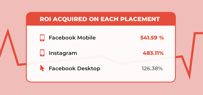
- Facebook mobile – 541.59%
- Instagram – 483.11%
- Facebook desktop – 126.38%
Facebook users spend more time on desktop during work hours, which might explain why the ROI is so low in this case.
Here are some of the main conclusions we draw from our analysis:
- When using Facebook mobile as placement:
- Use bright colors that draw the attention in an instant
- Don’t use too many details in the images, so the user is not distracted from the big picture
- Use short, concise copy so that the headline and primary text will fit perfectly in the designated space
- Use an image that will blend perfectly with the newsfeed and avoid ad-looking visuals
- When using Facebook desktop as placement:
- Use the square format for your ads, which is the one recommended by Facebook as well
- When using Instagram as placement:
- Pair a stunning image with a relevant and concise text
- Create an image that blends into the newsfeed as it’s more likely to create engagement than one that looks like an ad
- Don’t use landscape images because they take up less than half the space compared to a square format
Here are some general key takeaways to take into account for your next Facebook and Instagram advertising campaigns:
- Campaign budget optimization (CBO) is key when you’re on a budget and want to achieve the best results.
- Benefit-oriented ad copy outperforms ad text that is focused on explaining the feature.
- Be consistent by using the same color scheme in the ad, like the one from the landing page you use.
- Use different strategies when it comes to ad copy and visual sizes for desktop and mobile because the users’ behavior is very different.
- Make your ad image more powerful by adding a few compelling words that highlight the benefit.
- Avoid using too much text on the image so your ad will not get rejected or limit its reach.
- Make a strong visual connection between the image used for the ad and the landing page advertised.
- Use emojis when appropriate, as they are more likely to boost engagement.
- Test out different images and ad copy, especially when advertising on various platforms.
- Start the copy by emphasizing the benefit of what you’re offering/promoting.
- Online advertising trends change all the time, so don’t forget to stay up-to-date.
5. Final Thoughts
Even when you’re on a tight budget, you can still run successful advertising campaigns on Facebook and Instagram.
What matters most is how you design and execute your campaigns.
We hope that this case study, our experience, and tips are going to give you the confidence you need to realize you can achieve amazing results when you’re on a budget.
*As a final note, I would also like to say a huge THANK YOU to my colleagues Ana Darstaru (Chief Editor) & Robert Andor (Marketing Designer) for helping with this case study.
