Did you ever think how exposed you are to graphic design ads every day? Even when you think you’re not taking in any information, you actually are. Living your life implies being exposed to a lot of data. Whether it is written, spoken, or visual, we take in information without even realizing it.
According to a study from 2015, Americans are exposed to a minimum of 4000 ads per day. I know, it sounds like a lot, but if we think about it in-depth, it makes sense. Taking a closer look at their experiment, the major instruments that influence this, are the TV news, drive-time radio, reality shows, the internet (while surfing), and social media.
On a daily basis, each and every one of us encounters at least 2 of these instruments. Without even mentioning the ones that we expose ourselves to, intentionally. Like reading a magazine, or a certain blog or website.
Alright, now that we established the exposure under which we find ourselves, whether we want or not, it’s time to face the truth. We live in a digital world that is slowly but surely taking over. But what is the reason behind this?
Why do we feel the need to go more digital by the day? I would say it’s the speed with which we can access information.
Think about it. A while ago, if you wanted to visit a foreign country, you would have had a few options. Getting a guide, traveling with a tourism agency, or creating your own traveling/route map, for which you had to do your research in advance, were your only alternatives.
Nowadays, you have all this information at your disposal in a matter of seconds. Routes, places to visit, restaurants, and many more. Anything that you can imagine. And not only you can reach it, but anyone in this whole world can get access to all this information instantly. Isn’t that crazy? Crazy good of course!
Now, some people say that some things just can’t be replaced. The numbers are all in favor of the digital creative ads in comparison with the print ads. And even though, the print is still the most trusted form of information and advertising, the balance inclines the other way.
The numbers are huge, and they’re not in the yard of the print ads.
There’s nothing to watch on the TV
Now the big question is:
Is print going on a highway to hell or a stairway to heaven? Or can print and digital coexist?
Let’s face it. When the TV was invented, everybody said that theatre plays will die. And look at us, almost 100 years later and the theatre is still around. Why? Cause people like change. They get bored easily. Didn’t you say at least a hundred times “there’s nothing to watch on the TV”?
Yes, plays are not as popular as they used to be, but they’re still around and will be for a while. Keep in mind, people are different. And different people like different things.
Some prefer the feeling of the paper in their hands, others like to have options and be able to change from a blog to the other. And there’s nothing wrong with that. Now if you are a marketer and wondering which way to go, we’ll further point out, in comparison, various specific aspects for both print and digital ads.
The language of body types
Printed ads must communicate their message very clearly from the get-go. Whether it’s a huge billboard or an ad in the newspaper, there are times when people see them at a glance. The risk here is that your potential customer can’t always go back to it (literally go back and see it).
Of course, you can take a second look at the banner ad in the paper, but how about the billboard. Who will ever go back to the billboard they saw an ad on, in which they were interested? Now, this is when your copy game should be at it’s best.
Write a clear, brief, on point message, that grabs people’s attention by simply taking a glance at your print advertisement.
- Digital
The digital world is a little bit more flexible. You don’t really feel the pressure of making an impression like it’s your last chance. Of course, you still have to keep in mind this aspect. The copy is very important. But in the digital world, you are both being chased while being the hunter.
The main advantage here is that your potential customers can come back to you, if interested, and moreover, they can reach out to you directly for more information (website, social media, email). It’s like going on a first date having the certainty that you will get a second one.
True colors
We’re not here to talk about colors in particular since every brand is different and has, or at least should have their own range of colors. We’re here to talk about the cost of colors. In this case, it can be a big game-changer. Black and white printing costs are way cheaper, but the impact won’t be as big. And since the visual aspect is what catches the eye the most, you can’t take a chance.
Make sure you don’t compromise the colors/color scheme in the hopes of saving money. Investing is part of the process of grabbing your target’s attention, which in the end, will bring you money. The impact of your visual should be as big as possible.
The colors are like a hook that is fishing for attention. It’s like when you put on nice clothes in the hopes of impressing your crush. You invest time and thoughts in your looks, right?
You should do the same when it comes to the colors of your print ad design. Ink and paper are also taken into consideration because it offers a different type of customer experience, but this applies only to small printed banner ads, such as the ones in newspapers or magazines. The best graphic design ads ideas come from a little gameplay with colors and shades.
- Digital
Online ad designs have the advantage of being playful. You can easily play around with the colors of your choice without feeling like you’re gambling with your budget. Also, online ad designs tend to be more graphic. Adding more graphic elements, illustrations or even photos can improve the ad’s impact.
Web graphic design ads don’t offer that sensorial experience, but the compensate (big time) with the quality of their visual elements. You can’t have them all, right?
Size matters
I know, you’ve probably been told different all your life, but on behalf of all marketers in the world, I’m here to tell you that size matters. And it can make quite a difference.
First of all, if you want to create a printed banner ad design, you have to think about the positioning of your banner. There are certain rules you should keep in mind when it comes to positioning and size.
The most common sizes for printed graphic design ads are:
- 8.5’’ x 11’’ (aka poster flyers)
- 11’’ x 17’’ (suitable for phone boots and street posts)
- 19’’ x 27’’ (best known for concerts or events)
- 27’’ x 39’’ (for outdoor advertising with high traffic – found in malls and on highways)
A banner that is too large for an interior environment will feel overwhelming, while one that is placed on a highway and is too small, can easily get lost. The issue here is the size in proportion to the font as well. The size of the font should be in accordance with the banner size. For instance, viewed from 5ft away, a PVC banner should have a 3-inch font and the size should go up by half of an inch with each additional foot the banner will be viewed from.
- Digital
The situation is a little different in the case of online graphic ads. Most online banner ads are responsive, so no matter the environment, the font aspect and graphic proportions are no longer an issue. No matter the device your potential customer is getting in contact with your banner ad, they will be automatically optimized. One less thing you have to worry about.
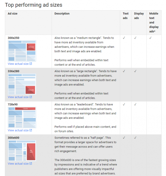
The digital world offers you a wide variety of graphics design ad sizes, but some of them, are rated as more performant than others. According to Google Adsense, the top-performing online banner ad sizes are:
- 728×90px — leaderboard
- 300×600px — half page
- 300×250px — medium rectangle
- 336×280px — large rectangle.
These are the sizes that are more appealing to the human eye, and they adapt better to any type of device.
IT’S NOT YOU, IT’S ME…
We’ve all been there. The scenario sounds like this, a bad break up, in which one of you says “It’s not you, it’s me”. And the next thing you know, you’re thinking about what does she/he have that you don’t. Well, in this case, there are a few things that the best graphic design ads have, that the printed ones don’t.
So call me maybe
The call to action plays a huge part in the influence that the online graphic ad design has on the customer. Not only it is very intuitive, but it allows people to either look up for more information (if needed) or buy immediately, thus turning them from potential buyers into customers in less than a couple of minutes.
Here, the interaction and response are incredibly fast-paced. Use this weapon wisely and don’t try to fool your target. If by clicking on your CTA, people don’t find what they expect to find, they will bounce asap.
Keeping up with the Animations
The debut of online banners was made by static banners. Basically, they were like printed banners, except they were reproduced in an online environment. Later on, the digital world evolved, and animations came into play. In comparison with the static, animated online banners are more attractive and bring to the table a hint of…let’s say, less boring.
If you want to be at the top of your game on the market, you should at least try animated banners. After all, you want to make sure you’re keeping up with the trends and the way your customers are consuming graphic design ads.
People’s behavior changes and so should you.
Moreover, online banner designs allow you to add sound and video effects. It’s like you’re there and you can almost talk to your customer directly. Now, this can be a huge game-changer.
Baking class
Online graphic design ads, not only allow you to reach multiple people in different parts of the world at the same time (so you are no longer restricted), but they also provide a very powerful tool, tracking.
You can keep track of who, when, and from where they clicked on your banner, and whether or not their click turned into a purchase. This gives you the chance to keep improving your banners as you go (things that are not possible with print), in order to adapt to your customers’ way of purchasing.
It’s like baking. You have the guidelines (the recipe) but as you keep going (you taste it, you keep adding more sugar or any other ingredients) you adapt it according to your needs and taste until you reach your goal, the perfect cake, or in our case, a top-performing banner.
Creating animated banners that deliver, requires lots of testing and adjustments.
Whether you want to go exclusively for graphic design ads or for printed banner ads, make sure it will be the best option for your target audience.
Think about where you could amplify your results better.
Where can you find your buyers? Are they more traditional or more interactive and willing to communicate? How do they like to be approached? What are their expectations? What are their main interests? And once you answer all of these questions, you will find your answer.


