If you’re tired of using the same old colored background in your ads and you’d like to explore some cool patterns and textures, this collection of graphic design patterns will help you out.
Scroll down to find a pretty selection of patterns, their descriptions, and applications so you can better understand where and when to use them.
Summary
- Geometric patterns
- Abstract patterns
- Modernist graphic design patterns
- Minimalist patterns
- Flora & Fauna design patterns
- Watercolor patterns
- Characters patterns
- Illustrations & cartoons patterns
- Patterns that complement your product
- Vintage patterns
- Multicolored design patterns
- Monochromatic patterns
- DuoTone patterns
- Gradient patterns
- Collage patterns
- Mixed patterns
- Die cutting patterns
- Typography patterns
- Pixelated patterns
- Traditional (folk) patterns
1. Geometric patterns
Credit: UrbanArts
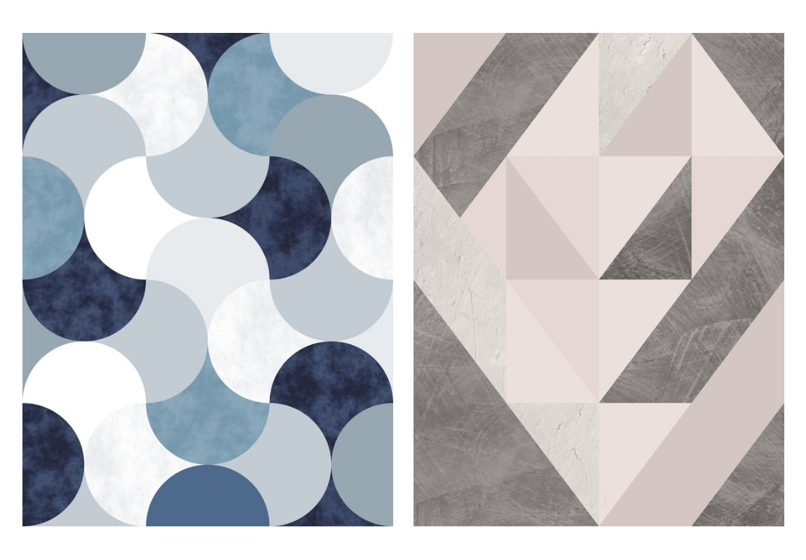
Geometric patterns use various shapes and combine them in a repeated and cohesive way. The most common shapes we will see in geometric patterns are triangles, rectangles, hexagons, circles, and rhombuses.
By playing with the shapes and adding color, an artist/designer can create a truly expressive pattern design that can either be used on its own or complement other elements.
As we can see in these examples, Daniel Perfeito did a remarkable work by playing with shapes and tones of colors to create modern graphic patterns.
2. Abstract patterns
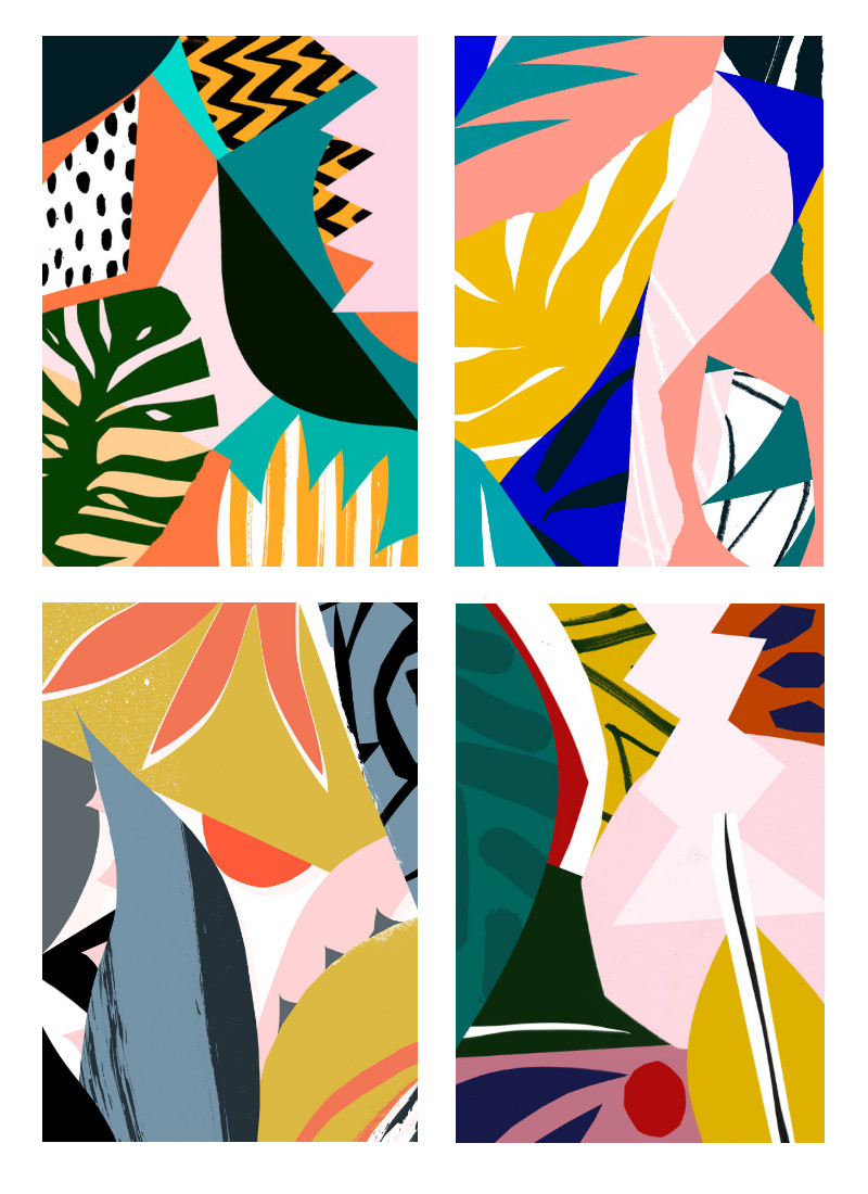
Credit: Tom Abbiss
Abstract design patterns can add a touch of modern art to any design and appeal to our imagination. Whether you’re creating an ad or an artwork, abstract patterns can help you to create a contemporary look. Be careful, though, abstract patterns can make a layout look super busy. So, make sure to balance it out with other less-busy elements or backgrounds.
I like how Tom Abbiss Smith created these patterns. They all seem to trigger our imagination to run wild and guess what could possibly be hiding in there.
3. Modernist graphic design patterns
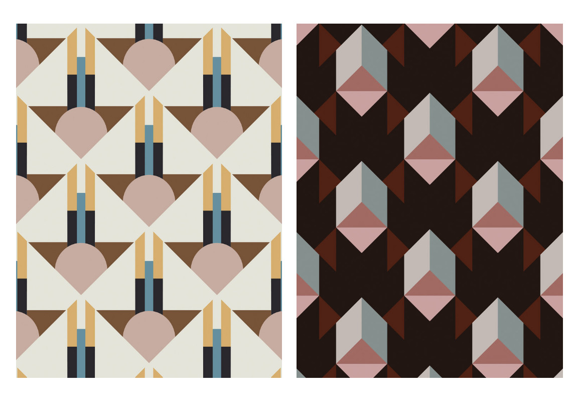
Credit: Jupiter10
Inspired by the early 20th century Art Deco movement, these modernist patterns are all about geometry and bright colors. The repeated constructions of symmetric shapes create a unique visual world. These patterns are usually elaborated to the point of perfection. They can successfully go well by themselves as wallpapers, frames or decorative patterns. When combined with other elements or advertising messages, they compete for attention.
4. Minimalist patterns
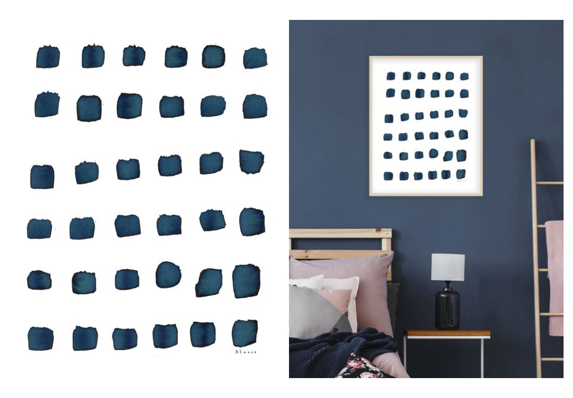
Credit: Dreamy Meisme
Minimalist art has space at its core. Elements are important too, but the fewer, the better. White space (also called “negative space”) is the most important element. White space allows the eye to rest and the mind to breathe. Minimalist patterns are different than other types of patterns in that they don’t ask for attention themselves, they set the stage for some other elements to be center-stage.
Minimalist patterns have gained a lot of attention (paradoxically) in recent years thanks to the advertising industry, because they can allow truly simple and elegant designs, enabling the brand to be the focus.
5. Flora & Fauna design patterns
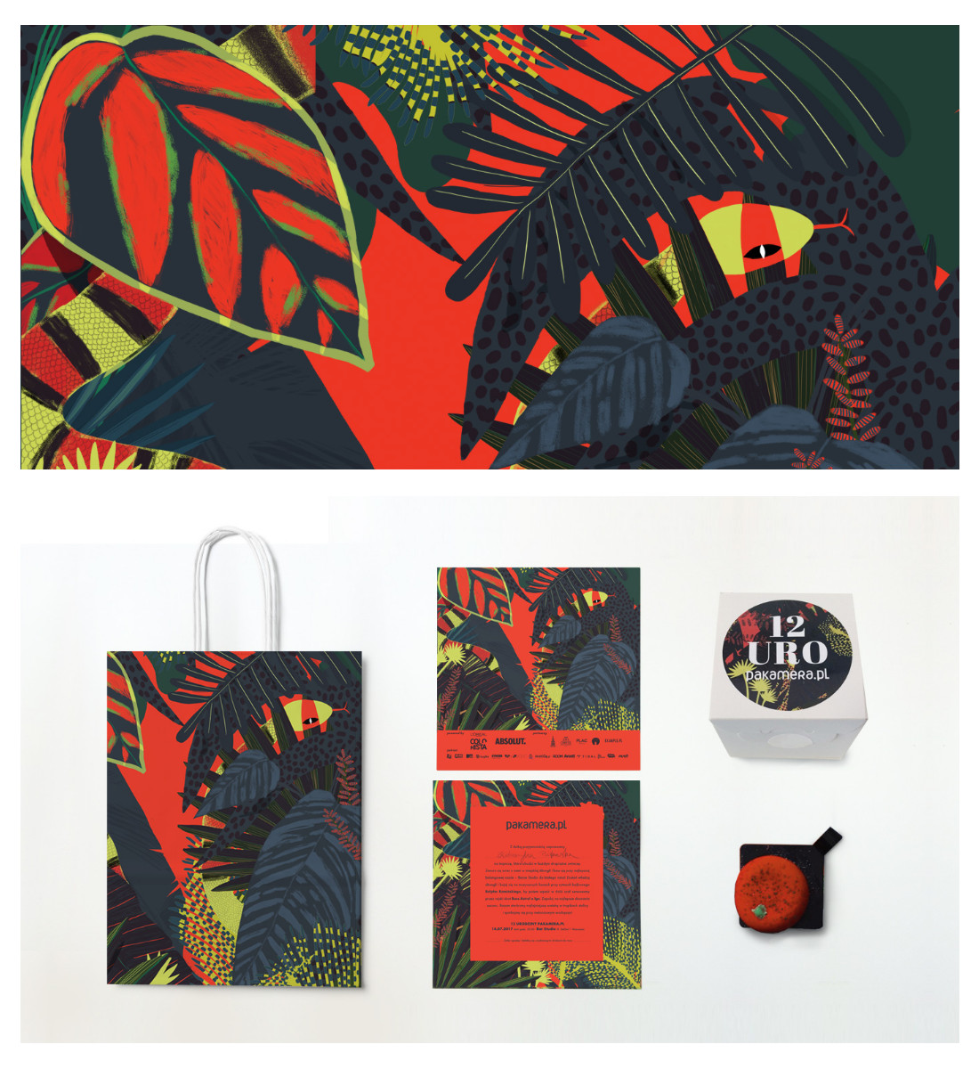
Credit: Gravika
Mother Nature’s abundance of plants and flowers species has always been an inspiration for artists. It is still an A-class muse in the 21-st century and advertising makes the most of its creativity and expressivity. From lush tropical flora to medicinal herbs, graphic depictions and interpretations of plants make our world more beautiful and products, more buyable.
If you want to create floral patterns for your ads, go ahead, nature will always be in fashion!
6. Watercolor patterns
Credit:Youandigraphics
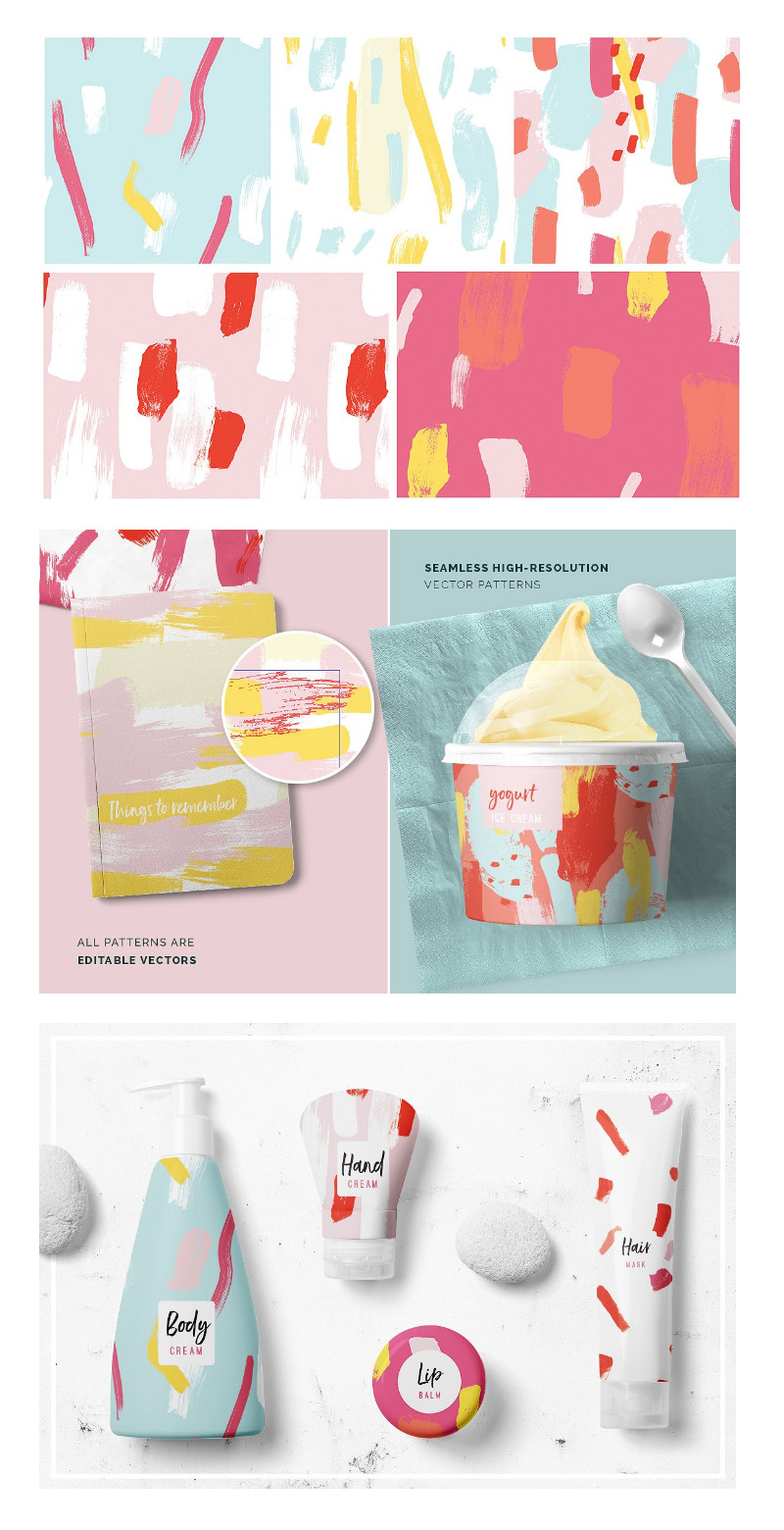
Watercolor design has been around for a few years now, and we can see it everywhere from notebooks to business cards, websites and display ads. Watercolors add a natural touch to a design and can result in truly beautiful and eye-catching compositions.
Watercolor patterns can be a great choice for ads’ backgrounds. Depending on the colors you use, you can complement and emphasize your logo, headline or product pictures.
Watercolor patterns work great with hand lettering fonts and have the potential to create a unique and artistic design.
7. Characters patterns
Credit: Ewa Brzozowska
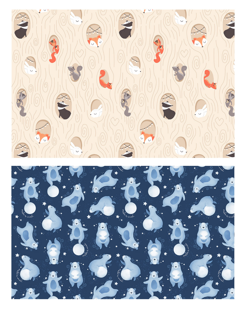
Whether we’re talking about cute little bunnies, foxes or bears, animated characters can populate a layout in a lively and jolly way. Of course, characters patterns are perfectly suited for children’s brands but they can also work well for playful brands such as Red Bull or Oreo.
If you’re planning to use cute characters in your ads’ designs, make sure they don’t compete with your brand for a user’s attention, but rather accompany it to tell its message.
8. Illustrations & cartoons patterns
Credit: Andrew Groves
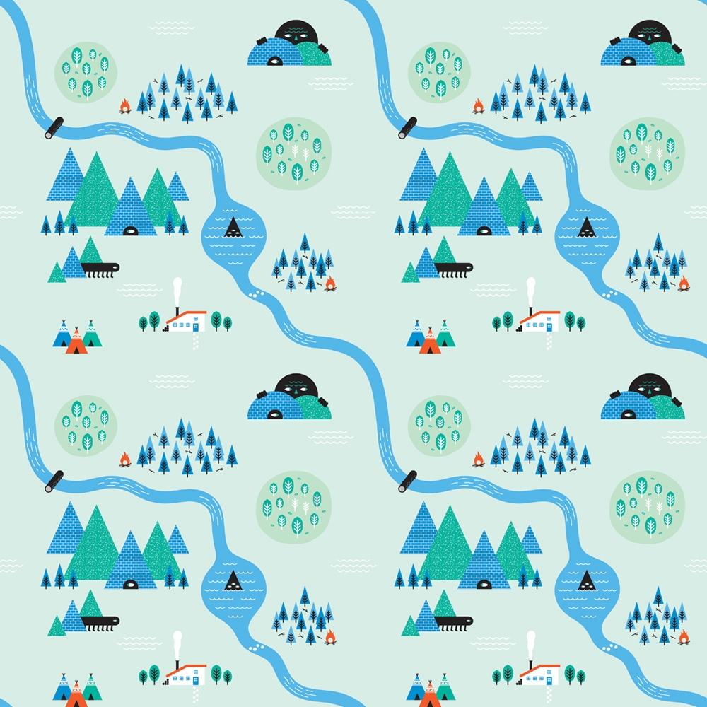
Illustrations patterns are a close relative of cartoon characters patterns, except that the artists/designers add more elements to them, building small-scale cities or communities.
These patterns appeal to children and parents and they’ll never get boring.
Use them for packaging, branding, flyers, brochures, posters and display ads.
9. Patterns that complement your product
Credit: Stitch
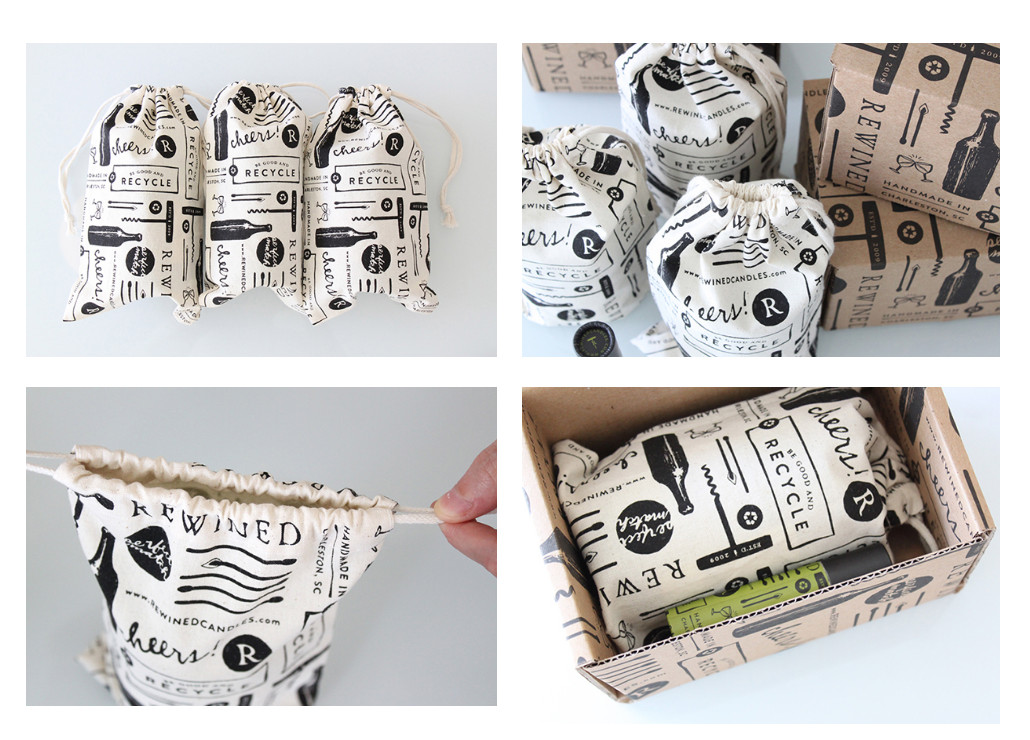
Another way to create cool branded patterns is to use elements from the same universe as your product. For example, the design team who created Rewined’s branding used a variety of elements related to wine (a corkscrew, a bottle, and glasses) to create this beautiful packaging pattern. It tells the story of wine drinking in a relaxed atmosphere and it invites the viewer to indulge in rewarding savory ritual.
10. Vintage patterns
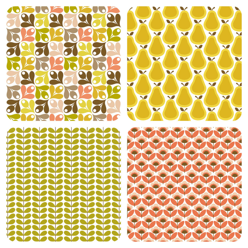
Credit: Jessica Hislop
If you’re fascinated by the vintage style and would like to add a vintage touch to your designs, you can create retro patterns using a multitude of shapes and colors.
I’ve illustrated the vintage style with some flowery patterns from the 60s and 70s to make it easy for you to understand, and maybe adopt it.
Because this style was a rebellion against long-established traditional styles, it dealt a lot with self-expression. The vintage design featured a lot of geometry, Scandinavian-inspired flowers and an earthy color mix made of green, yellow, orange and blue as a complementary.
11. Multicolored design patterns
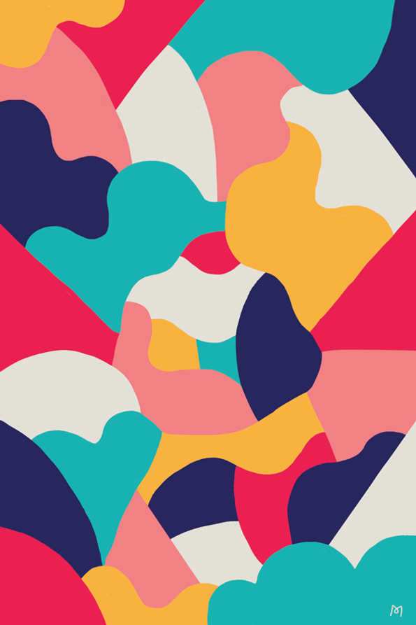
Credit: Lucky Pony
Multicolored patterns are not chaotically colored patterns. If we look closer, we notice that there’s always a color scheme underneath the packed-full, screaming canvas.
The secret with multicolored patterns is that you must choose a family of colors, be that pastels, neon colors or earthy tones.
These jolly patterns are amazing attention grabbers. You can use this pattern style to promote your bold brand and create an incredible branding identity, and visual ads.
12. Monochromatic patterns
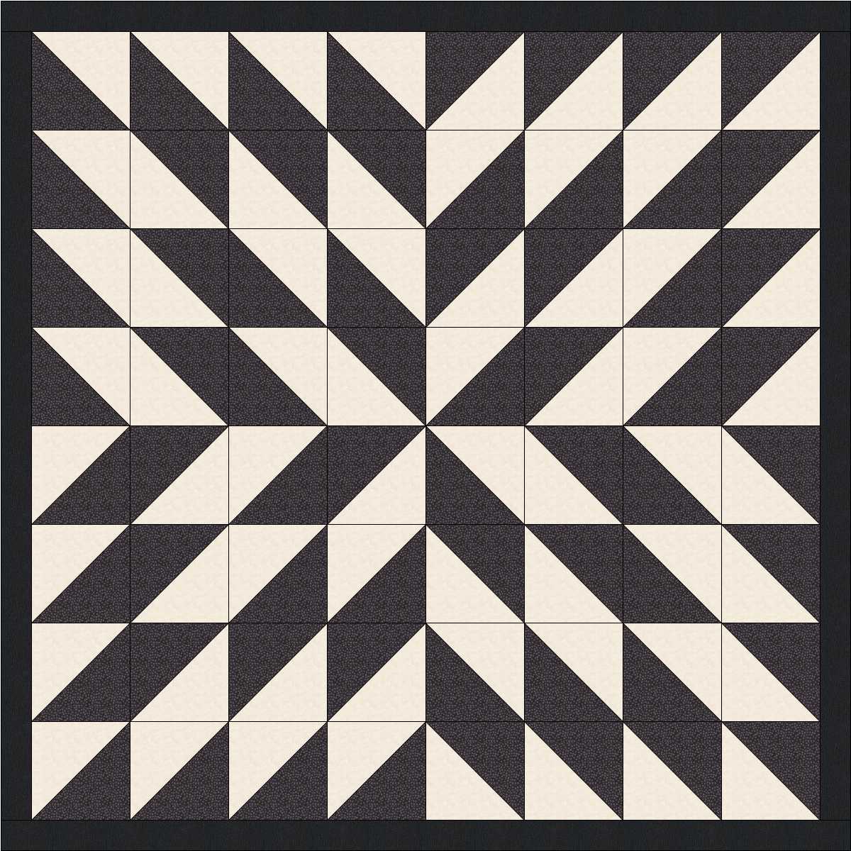
Credit: Quilting Board
Monochromatic design patterns have so much to offer. Because they’re more simple and clean, they offer an opportunity for other elements (like a logo, headline etc.) to be the focus of attention.
Monochromatic patterns are not black and white patterns. You can use whatever color you wish, as long as you stick to one color.
13. DuoTone patterns
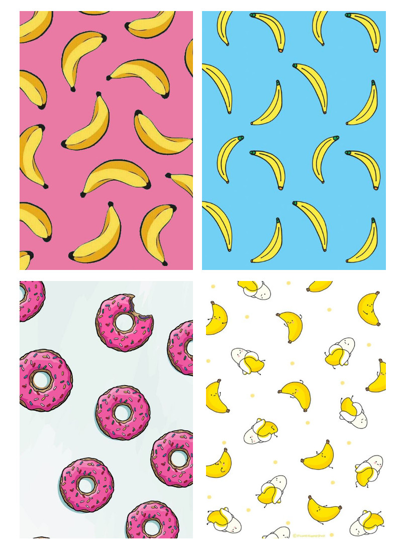
As opposed to Monochromatic designs, DuoTone use only two colors. The DuoTone technique is very impactful without being too busy. It can help you create a brand identity that is fluent and easy recognizable.
14. Gradient patterns

Gradients are transitions of colors from one tone to another, or from one color to another. This technique was born in the 90s, when multiple shades of colors were added to create depth and an eye-catching effect. Gradients have gained a new phase of success thanks to its adoption into the web design area.
Gradients can help you create a bold effect or, on the contrary, a very subtle presence. It all depends on how you use it and the colors you choose.
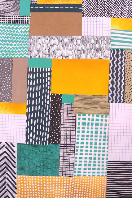
15. Collage patterns
Credit: Abbey Withington
The collage technique has been used for centuries, but it gained more attention at the beginning of the 20th century, when Pablo Picasso used it in his artworks.
Today, collage can mean anything from putting together patches of fabric on a canvas to creating a graphic collage made of pieces of textures and colors, using software programs like Photoshop.
If you want to use this technique in your designs, you must know what it conveys. First of all, collage will add a touch of handmade to your design. Then, it may convey a message depending on what pieces you put together. Sometimes artists use collage to make a statement.
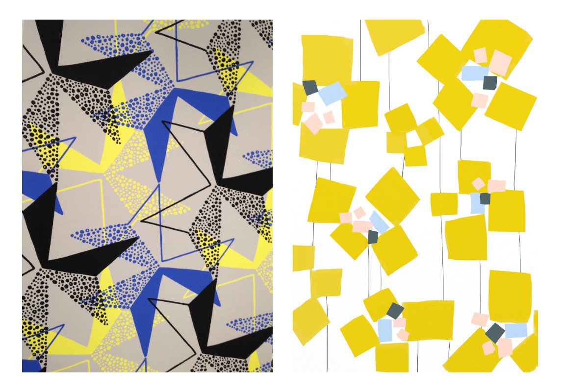
16. Mixed patterns
 Credit: Image 1: Design Milk ; Image 2: Ophelia Pang
Of course, you can use various principles from the pattern techniques listed above to create your own patterns. You can mix complementary colors with geometrical shapes, like in the examples above. If you feel inspired, go ahead and experiment! Play with colors, shapes, and meanings.
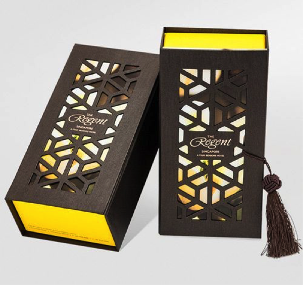
17. Die cutting patterns
Credit: TaylorBox
Some people are into die cutting. If you’re one of them and would like to give your designs a truly unique look, you can play with die cutting and patterns. Die cutting lets you create various styles, from elegant and premium (like the example above) designs to playful and jolly visuals.
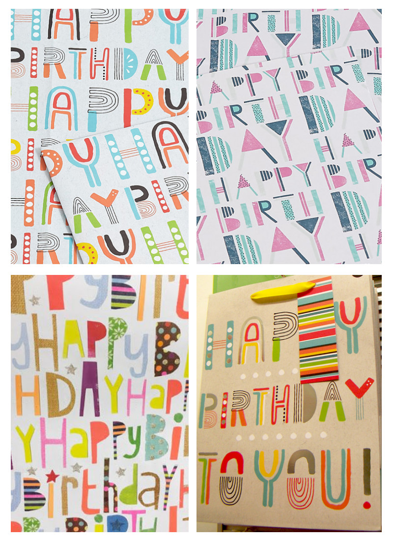
18. Typography patterns
Credit: PrintPattern
Another way to create beautiful branding materials and make sure your brand name or message gets to your audience is to use typography patterns.
Before you proceed to create typography patterns, make sure you choose a font that is both suited to your brand personality and legible enough for the viewers.
19. Pixelated patterns
![]()
Credit: FastCompany
Originated in the 90s, pixelated patterns can still be found today in web design or online ads. Somewhat related to geometric patterns, pixelated patterns come with a digital vibe. So, if you’ve got some digital products, these types of patterns are a perfect suit.
20. Traditional (folk) patterns
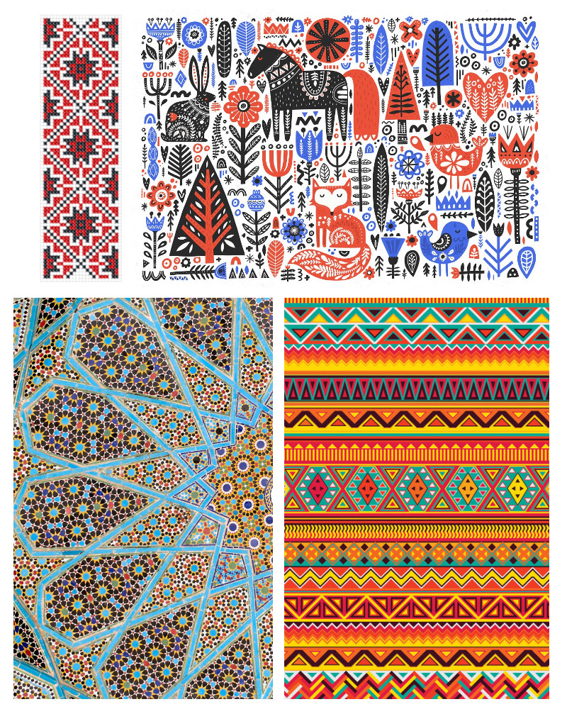
Credit image 1: Ardelean Emilia – Traditional Romanian patterns ; Credit image 2: Favete Art – Traditional Scandinavian patterns ; Credit image 3: Ilikewallpaper – Traditional Iranian patterns ; Credit image 4: Emily Burney – Traditional Aztec patterns
Traditional (or folk) patterns have been successful throughout the ages and modern design doesn’t seem to ignore them. You can find these patterns or interpretations of traditional patterns in today’s branding design and visual ads.
If you work for a local brand, that’s even better. You can take inspiration from your country’s traditional patterns and come up with a modern interpretation.
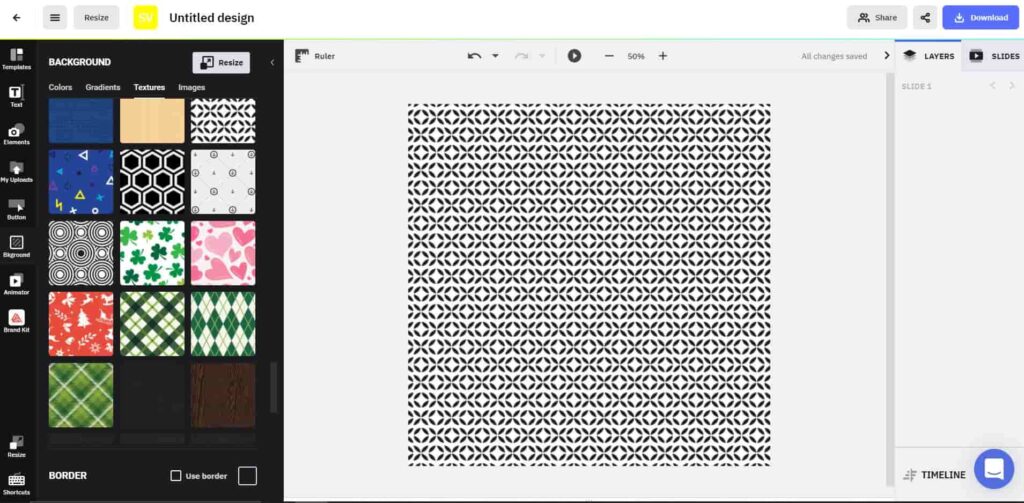
Creatopy offers a full range of patterns and textures suited for all types of ads, industries, and goals. If you’d like to explore the patterns available in Creatopy, log in to your account (or sign up for free), go to the dashboard, choose a size format for your future design, click on the Bkground tab on the menu from the left-hand side, then go to Textures.
I hope this collection of graphic design pattern examples will help you to create beautiful designs and ads!
Illustration by Anita Molnar
