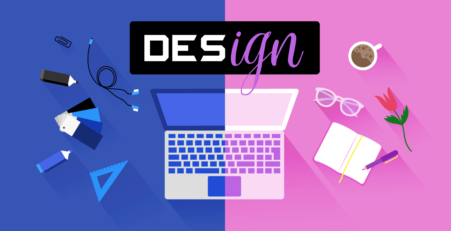
The world is abundant in stereotypes, and the field of graphic design is no exception.
Subconscious attitudes often impact the way a product is marketed, resulting in multiple design stereotypes that are visible even to the untrained eye.
The most common example is the use of the color pink for girls and blue for boys.
When looking at a visual ad, the commonly held idea is that different things appeal to certain genders.
Therefore, you’ll notice that ads targeted at women will have more feminine fonts or colors and vice-versa.
But what makes a design feminine or masculine, and is there such a thing as gender-neutral design?
We’ll go ahead and dive right into this topic by discussing colors, fonts, website layouts, product design, and icons.
The Most Common Graphic Design Stereotypes
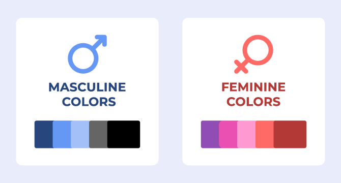
1. Feminine colors & masculine colors
In advertising, there are numerous examples of just how much gender stereotypes are being used, especially when it comes to colors.
The perceptions we grow with stick with us our entire life, which is why color stereotypes are incredibly popular in online design.
Take a look at the color scheme below, and you’ll probably spot right away how the masculine colors are predominantly darker, while the feminine colors are brighter and more vivid.
According to a 2007 study published in the August 21 issue of Current Biology, both men and women like the color blue.
However, women usually tend to prefer shades of blue that have red in them, while men prefer blue with shades of green.
This is best exemplified by these ads from Gillette, a famous brand that has product lines for both men and women.
By looking at the examples below, it’s clear that the company uses color stereotypes to target different audiences.
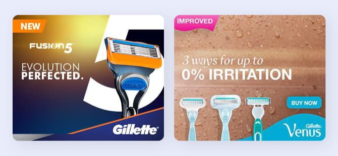
You’ll notice that, while both ads make use of the color blue, the one for Gillette Venus, aimed at women, features a lighter shade of blue. The one targeted at men, uses a darker shade of blue, with a purple undertone.
At the same time, there’s the use of pink in the Gillette Venus ad signaling the new and improved version, while in the other ad for men, the color orange was used instead.
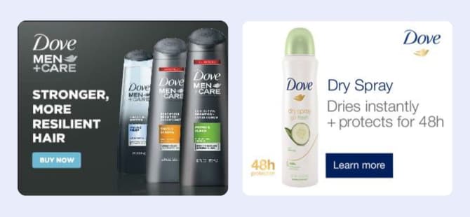
We can identify the same color stereotypes in ads created by Dove, a personal care brand that offers products for men and women.
On the right side, we have an ad targeted towards women that has a white, clean background. Even the color of the packaging is mainly white with pastel colors.
On the left side, we have the ad targeting men that has a dark grey background, and the products have a matching color scheme.
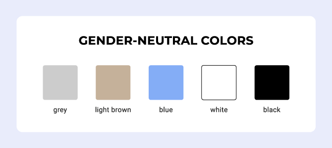
2. Gender-neutral colors
Even though color stereotypes are commonly used in online ads, more and more companies have shifted towards employing a more gender-neutral approach.
The gender-neutral color scheme includes colors such as light brown, black, light gray, white, and blue.
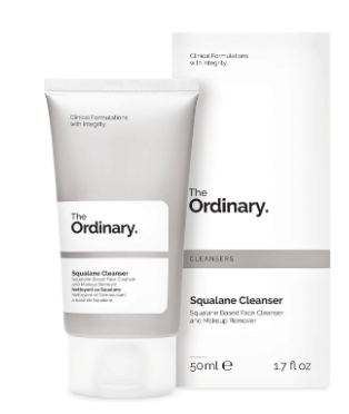
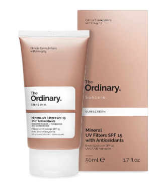
The Ordinary is a skincare brand that does a great job of implementing a gender-neutral design.
The minimalist design of the products is combined with neutral colors such as white, light grey, blue accents, and brown tones, which convey the idea that they can be used by both men and women.
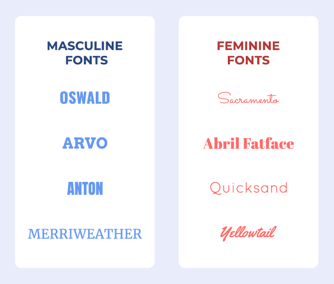
3. Feminine fonts & masculine fonts
When it comes to fonts, feminine and masculine ones are relatively easy to recognize due to their stylistic effects.
Feminine fonts are, most of the time, cursive, smooth, and feature thin lines. They’re also more elegant and can look more sophisticated than the masculine ones.
On the other hand, masculine fonts have geometric and straight lines, sharp edges, and a bold look.
You can see in the image below a few examples of masculine and feminine fonts.
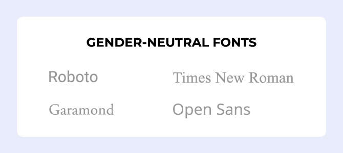
4. Gender-neutral fonts
Yes, gender-neutral fonts do exist, even though there are not as many.
These are considered classic fonts and can be used when you target both genders.
Helvetica, Roboto, and Garamond are just a few examples you can rely on.
Probably the most popular and widely used gender-neutral typeface is Helvetica.
It has been used by numerous brands over the years, such as Panasonic, Lufthansa, Toyota, and others.
However, even in the case of Helvetica, you need to pay attention to which variation you use.
For a more feminine approach, you can use Helvetica UltraLight that has thin lines, while Helvetica ExtraBold is, as the name suggests, more masculine, featuring bold lines.
5. Feminine website layouts & masculine website layouts
While many have shifted towards a more genderless theme, there are still a few websites out there that are explicitly targeted to either men or women, and they’re easy to spot.
A website that’s specifically aimed at women will most often include the color pink as well as other pastel colors such as light blue or light green.
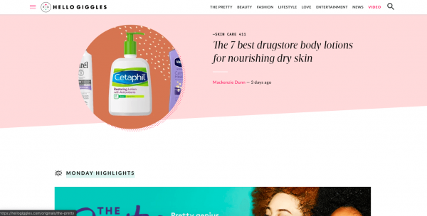
In the example below, you’ll notice the use of such colors, as well as a feminine font.
The website has a feminine layout, and even its name, Hello Giggles, is definitely cheerier and more casual than what you would find on a site that targets men.
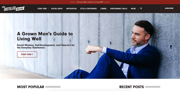
On the subject of gender design stereotypes, the website layout below is probably one of the most representative examples.
It’s targeted towards men and uses a dark red and black layout and bold typeface in the logo and the actual site content.
As a website catering exclusively to men, with advice and tips for self-development, the masculine design featured is very obvious at the very first glance.
6. Gender-neutral website layouts
There are websites where design stereotypes don’t affect the layout.
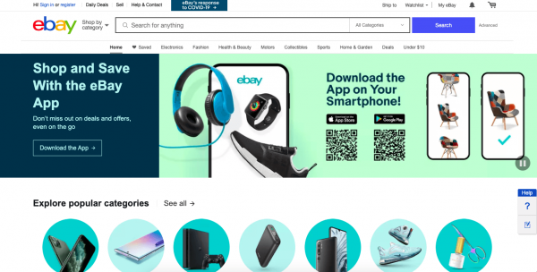
eBay.com is a good example.
Since it caters to all people, regardless of their gender, eBay uses a gender-neutral design approach.
The fonts and colors are neither overly feminine nor overly masculine. This is why eBay does a great job of bypassing gender stereotypes, as far as the website design layout is concerned.
7. Feminine product design and imagery & masculine product design and imagery
Another area where gender stereotypes are heavily used is in product design, as well as product photography.
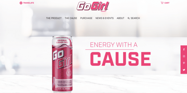
A good example is Go Girl, a women-owned company that sells energy drinks. As you can see in the image below, the product design is abundant in several shades of pink.
The brand dedicates its efforts to promoting breast cancer awareness, which is the main reason why the packaging is pink.
On the other side of the spectrum are the products that target men, where we can see obvious elements that reflect this.
While some products have a subtle masculine design to cater to the product specifically to men, some make it more noticeable, primarily when we’re referring to products that are mainly used by the female segment.
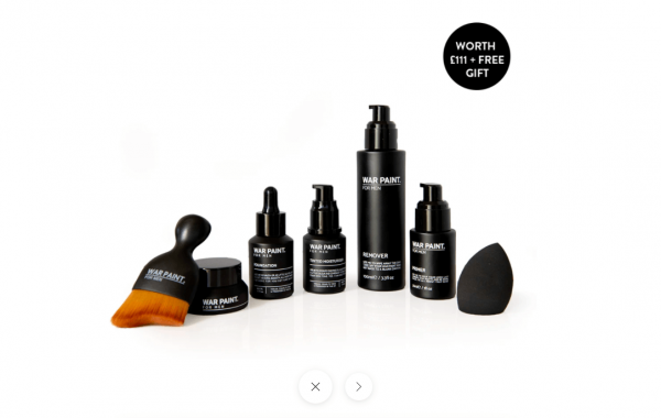
A representative example is War Paint, a company that creates makeup products for men.
Being marketed towards men, the name not only suggests the idea of power but is also paired with the packaging that’s black with just a touch of white.
Compared to other makeup products that we’ve seen on the market, the product design makes it clear that it’s not another makeup brand for women.
The brand found a way to showcase its products so that it will appeal to the target audience—men.
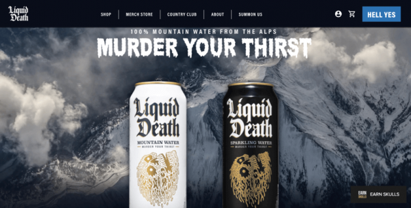
Another product that is specifically targeted at men is Liquid Death, which is a brand of bottled water.
And they’re honest about this in their marketing. They admit that their product is “a completely unnecessary approach to bottled water.”
However, their goal is not to offer a better product but to be original and just have fun with it.
With product design and imagery that reflects masculinity, the brand does a great job of appealing to men.

8. Gender-neutral product design and imagery
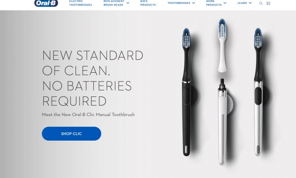
I also have an example of a brand that sells products used by both men and women—oral hygiene products.
On its website, Oral-B uses neutral colors such as grey, blue, and black to showcase its toothbrushes.
This is a great example that does not make a distinction between men and women’s products.
9. Feminine icons & masculine icons & gender-neutral icons
Icons are another design element that can be used in different situations.
A feminine icon will have more smooth and curved lines, along with feminine colors.
On the other hand, a masculine icon will most likely display sharp and straight edges and, of course, a more masculine palette of colors like the ones we talked about earlier.
![]()
![]()
Neutral icons, on the other hand, are represented by glyphs or outlines icons.
They are simple, have no specific color, and could either have round or sharp corners, depending on your needs.
![]()
![]()
If you seek inspiration for your next project, the Elements Library from Creatopy features a wide variety of icon designs that you can choose from.
Conclusion
Men and women do respond differently to specific triggers, be them colors, fonts, product design, and even icons.
Before deciding whether the gender-neutral design approach is right for your business, you should first try to understand your target audience and clients as best as you can.
Get to know them to find out what they prefer, but don’t forget that the products you’re selling will definitely weigh in on your decision.
Now I want to know: what’s your brand’s current approach?
Is gender-neutral design something you’ll consider in the future?