Creating something visually pleasing does require a fair amount of talent and inspiration, but it’s not as subjective as we’re often led to believe.
While tastes differ, human perception is programmed at a primal level to notice and admire harmony, whether it’s the sound of music or the shapes and colors that surround us. Social media colors are no exception.
If you want to get noticed on social media, the first and biggest challenge is to stop your audience from scrolling.
We’re talking about split seconds of attention, so there’s little time to grab the eye with a witty copy or other, more subtle design elements.
This is why your design should also utilize the more basic building blocks, such as color and clever color combinations.
Table of Contents
- Use a neutral background to highlight what’s important
- Explore the power of analogous schemes
- Embrace the dark tones and get away with it
- Let one hue dominate
- Bring back the classics
- See with your taste buds
- Serve up a palate cleanser
- Challenge the norm
- Highlight the stars of the show with neutral tones
- Make a statement with complementary colors
- Make it brighter
- Rediscover the mother of all contrasts
- Set monochrome in motion
- Don’t be afraid to bend the rules
- Repeat patterns
- Break out your pastels
- Add pastel colors to give your main hue a new dimension
- Break the mold
- Summon the elements
- Think outside the cliché—pink is not the only feminine hue
- Give a picture some analogous power
- Play with powerful contrasts—a pinch may be all you need
- Separate warm and cool by function
- Combine several color schemes
- Remember: Red = Passion
- Add a patch of warmth
- Change the hues
- Add a little warmth
- How to Use Color Theory in Graphic Design
- Frequently asked questions
- Conclusion
28 Color Combinations to Inspire Your Next Social Media Ad
1. Use a neutral background to highlight what’s important
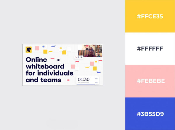
If you expected a bold statement with vibrant colors and harsh contrasts right off the bat to demonstrate everything we’ve discussed so far, I apologize for this first example.
But this doesn’t mean the banner’s designers didn’t give the color combinations much thought.
On the contrary—the colors, and perhaps, more importantly, the lack thereof, convey an important message. Miro’s tool offers increased productivity in a professional environment, and its promise is to help you focus on what’s important.
The white background is a clear indication of the distraction-free, efficiency-focused environment, and the soft tints of the three main colors have ergonomy written all over them.
In case you were wondering, the yellow, blue, and pink color combination, we see here is a classic triadic scheme.
2. Explore the power of analogous schemes
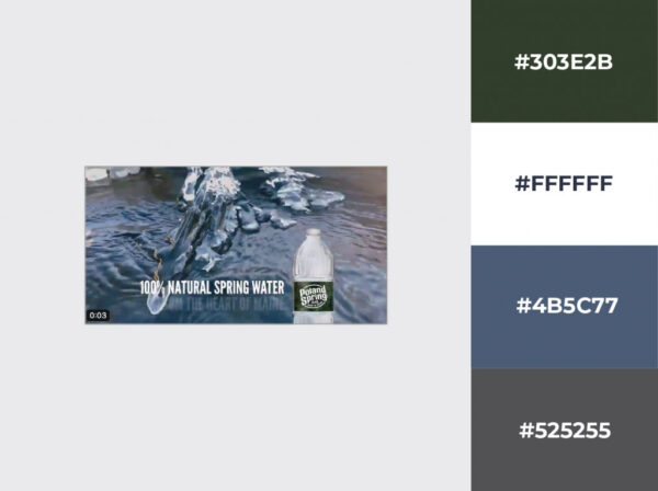
If you mean no-nonsense, an analogous color scheme is the way to go. The dark moss green and grayish ice blue instantly teleport your mind to the mountains even without seeing the context.
The well-chosen background is there only to confirm your first intuition: you’re in for a refreshing experience.
It’s interesting to see how differently they’ve used white compared to the previous example. There’s no empty space per se in this design, but that touch of pure white threads it all together without overwhelming the image—just a tasteful hint toward the extreme.
But it’s just as crucial to the design: just imagine that text in any other color…
3. Embrace the dark tones and get away with it…
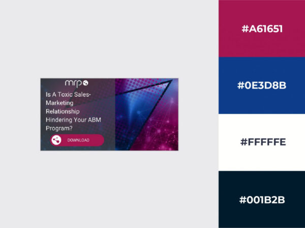
…by adding white. Once again, the power of white reveals itself.
Dark blue, dark magenta, and pitch-black would probably be too much, although they’re in perfect harmony. Add some white copy, and all of a sudden, it looks modern and palatable. You can achieve a similar effect using the richness of a black wallpaper design to bring out key content.
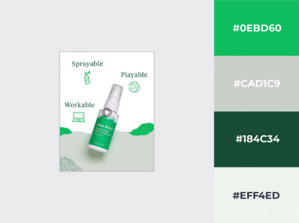
4. Let one hue dominate
You can go even more basic than an analogous color scheme—using just one color and experimenting with different intensities for adding depth.
In this monochromatic color scheme, the vibrant green is the only color you notice at first, and it’s probably the only one most people will remember.
However, without the numerous variations on the same theme, it wouldn’t have such a powerful impact. It’s like individual notes in music that give you a beautiful chord when played at the same time.
Once you have a primary color that you want to use, it may be worth playing around with the tint and shade slider before exploring more sophisticated schemes. One hue may be all you need.
5. Bring back the classics
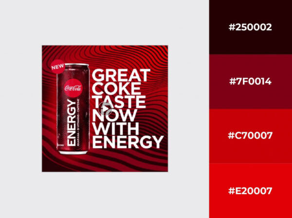
Not necessarily a combination that follows the principles discussed at the beginning of the article, but it’s a real classic, so we can’t ignore the red, black and white combo when talking about the best color combinations.
It’s a fairly obvious choice for Coca-Cola, given their brand colors that have been around since forever.
Even their product itself has a black-reddish color, but they’re not the only ones who have used this combination successfully over the years.
Just think of KFC, LEGO, Vodafone, or The White Stripes.
6. See with your taste buds
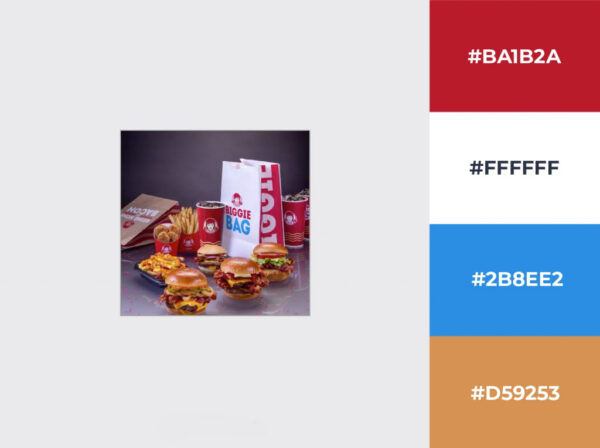
I know it would be quite weird but bear with me. No other color says intensity quite like red. And by the looks of it, the flavors that are being advertised here are nothing short of intense.
Let’s see what Wendy’s did here.
Their products themselves are mainly orange-brown—not the most appetizing color by any means, so the advertising challenge is given.
You can either wait for smellevision to become a thing and let your product sell itself, or reach for the color wheel. Red sits quite close, which is just what a juicy burger tastes like.
With a beautiful blue from the opposite end to counterbalance the warm hues, you’ve got yourself a mouth-watering split complementary color scheme.
7. Serve up a palate cleanser
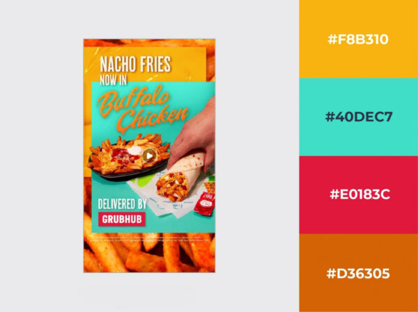
To be able to truly appreciate different flavors, it’s a trick as old as gastronomy itself to nibble on some neutral-flavored, light snack in between two servings.
Need I say more?
8. Challenge the norm
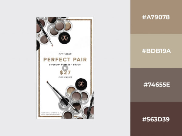
Would you buy a brown car? How about a brown fridge? Even brown food is challenging to sell, so how are you supposed to stop someone from scrolling and consider a product that only comes in shades of brown?
By embracing it, of course. Brown is undoubtedly a problem child, but if treated with the love and respect it rarely ever gets, it can spell quality with a confidence that makes gunmetal gray cry for its mommy.
The secret? Give it loads of white space to make it pop, sneak some golden shades into the design, and let the power of the analogous color scheme take over.
9. Highlight the stars of the show with neutral tones
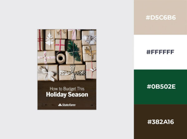
Brown has probably never received this much spotlight. I promise we’ll move on after this.
Since I mentioned the spotlight, the interesting thing about this particular design is how brown is, in fact, nowhere near it, although it covers most of the real estate on this banner.
Brown, gray, and other neutral tones can be used to shift the attention to more vibrant colors, such as the classic red-green power combo.
And yes, there is an elephant in the room.
Let’s rip off this band-aid once and for all: brown is basically the ugly friend that makes the rest of the gang look attractive.
10. Make a statement with complementary colors
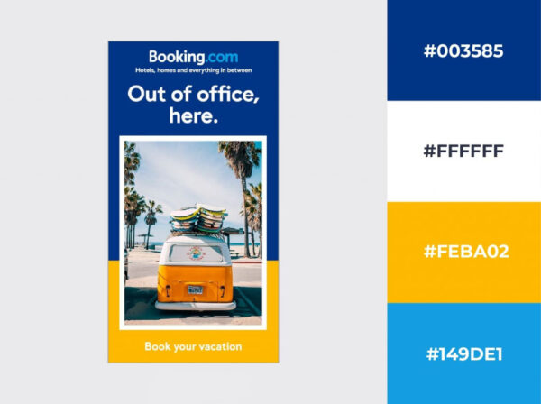
As I said earlier, opposites attract, and if your audience is looking for a break from whatever they do all year, using complementary colors is probably a good way to catch their attention.
This one utilizes the hues at full saturation, so you can almost feel the warmth of the beach sand between your toes.
At the same time, they could just as easily advertise a winter getaway using the same technique to hint at the frozen wonderland of a ski paradise with a cool cyan blue and the crackling fire indoors with a warm orange.
If you want to skip the pitch and appeal directly to the desire for change, you can make a compelling statement by limiting yourself to just two colors sitting opposite of each other on the color wheel.
11. Make it brighter
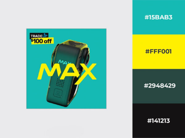
Here’s another variation on the blue and yellow color combination that couldn’t look more different from the previous example, yet it’s just as functional, if not more striking even.
It’s all about contrast once again, but not only the contrast of cool and warm, but also that of pale and bright. It’s also worth mentioning how the black and yellow in the corner copies the color pattern of the rest of the image.
12. Rediscover the mother of all contrasts
When it comes to contrasts, black and white have the ultimate tension, and at the same time, the perfect balance.
Like a dirty game played with the utmost elegance—a synergy that the colors of the rainbow can never achieve.
This power is difficult to describe in words, and probably pointless, to be honest.
It’s much easier if you take the last photo you’ve shot with your phone and convert it into B&W. Add a watermark using the “[your last name] + Photography” formula and create a Facebook page, too, while you’re at it.
No, seriously, the fact that amateur photographers around the world have entirely abused the fun out of this simple two-click technique is a testament to grayscale’s incredible power to make the trivial stand out.
Just use it in moderation.
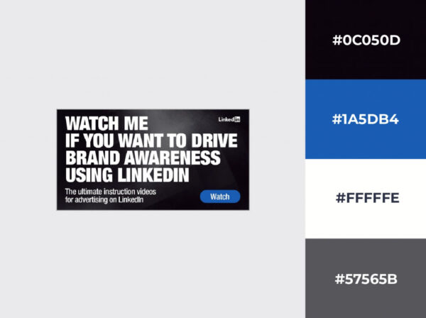
13. Set monochrome in motion
Monochrome, you colorful one—it sounds like a contradiction in terms, but monochrome is much more versatile than most of us realize. It doesn’t have to be black and white.
This ad is so simple, yet so effective. All they did is convert an ordinary photo to monochromatic, using a blue color palette instead of black. The simplistic design concept is taken further into the tight and clean copy displayed in plain white.
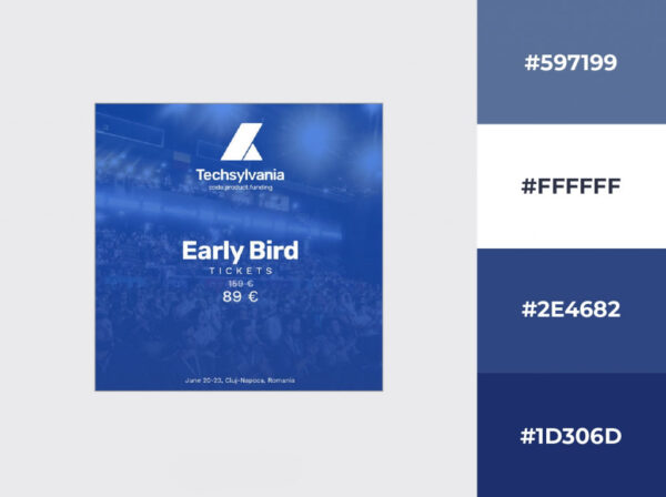
14. Don’t be afraid to bend the rules
They say once you know the rules, you can break them. Or at least bend them slightly to see how far they can go.
This military green and lively orange color combination, for example, would only pass for a classic triadic color scheme if the designer also added a purple of some sort.
But the design works just as well without the purple. In fact, it works better with just two colors. So, what two colors go well together? Once again, it looks like “less is more” is the only rule that stands above the rest.
Remember that these color schemes are guidelines to make your job easier, but you don’t need to play by the rules just for the sake of playing by the rules.
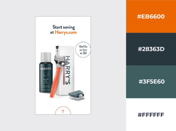
15. Repeat patterns
You don’t even have to get lost in theory every time you make a banner. Just use the colors you already have and repeat the patterns.
The result is guaranteed to be uniform and pleasing to the eye.
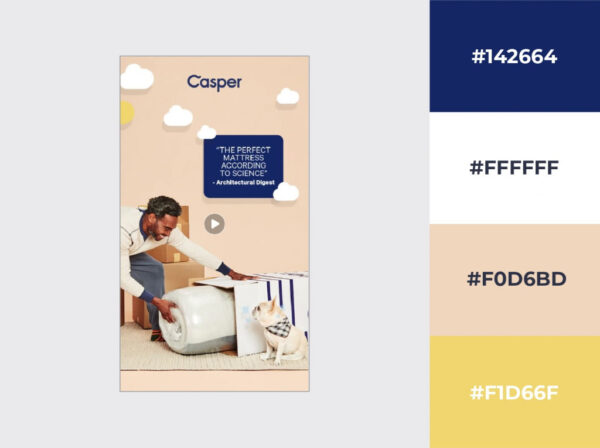
16. Break out your pastels
Add some white to your colors, and you open up a whole new chapter of color psychology. Pastel colors are soothing, peaceful, romantic, and, most importantly, they instantly remind people of new beginnings.
Weddings, Easter, or anything that has to do with springtime, and of course, babies.
And the spring analogy makes perfect sense.
What else would you get after seeing nothing but gray for months on end, but before the appearance of the vibrant colors of summer? Beautiful pastels, of course.
Find the best one that matches your design intent and use the color wheel to come up with cute color combinations.
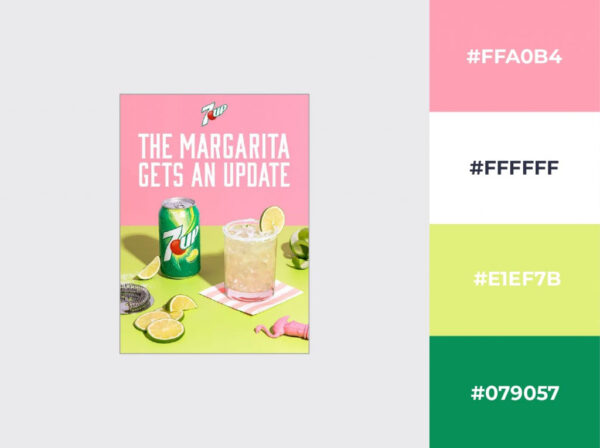
17. Add pastel colors to give your main hue a new dimension
Pastels can star in the lead role in particular situations, but their true calling is playing a supporting role. That is where they get to show their versatility.
If you want to make a color pop but a harsh contrast would be too aggressive for your campaign, play around with different tints of the same color.
If you add enough white, you get some real cute pastel versions that get your primary color noticed while keeping a soft, calm vibe.
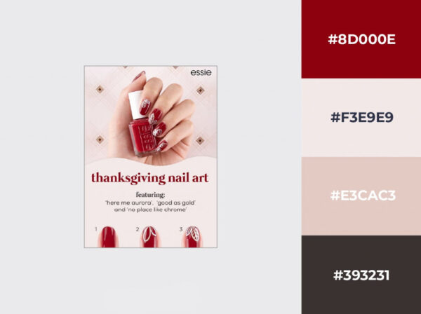
18. Break the mold
Who said that the winter season should be all about the cold tones? On the contrary—if all your competitors use the same colors to give their advertising a certain vibe, you can get yourself noticed by doing the dead-opposite.
Just think outside the box—the snow doesn’t have to be white, the sky doesn’t have to be blue, and your ad doesn’t have to fit the cookie cutter.
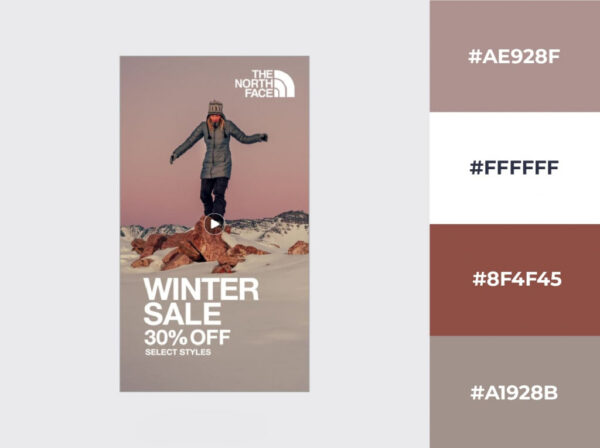
19. Summon the elements
If you want to accentuate the element of trust in your advertising, familiarity is key. And if you want familiarity, nature is the best source of inspiration.
This example below combines earth and water tones for an instantly calming effect.
And would you have guessed? The sandy brown and light blue color combination you’d also see on the beach on a cloudy day matches the complementary scheme to perfection.
Coincidence? I think not.
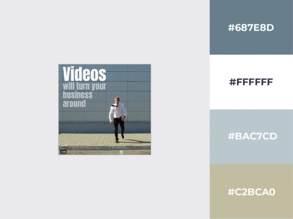
20. Think outside the cliché—pink is not the only feminine hue
There is no doubt some colors have been overused. Instead of letting frustration take over, use it to your advantage. Go out there and prove that there’s an entire world of other colors for any occasion.
Don’t shy away from using masculine accents, even in a predominantly feminine-themed ad.
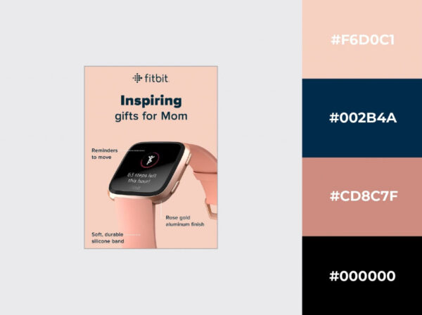
Navy blue matches the rose gold in this ad perfectly, and it doesn’t take away from the message at all. On the contrary.
21. Give a picture some analogous power
Inspiration rarely ever comes on cue, but you can always use existing material if you don’t feel like designing something from scratch. Transform, for example, a boring stock photo into something exciting.
It’s best to avoid bright colors for the foundation of the design, so you have more wiggle room working on your color design.
Analogous schemes work best for such projects, because otherwise, the result may look overcrowded.
22. Play with powerful contrasts—a pinch may be all you need
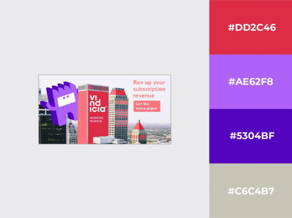
We’ve seen a couple of examples of complementary colors being used very generously, almost overwhelmingly. They work well like that.
But the true testament to the power of a good color combination is if you use them sparingly, and they still work.
If the background is monotonous enough, they just might. It’s worth a try because if you find the balance, the impact can be quite strong.
23. Separate warm and cool by function
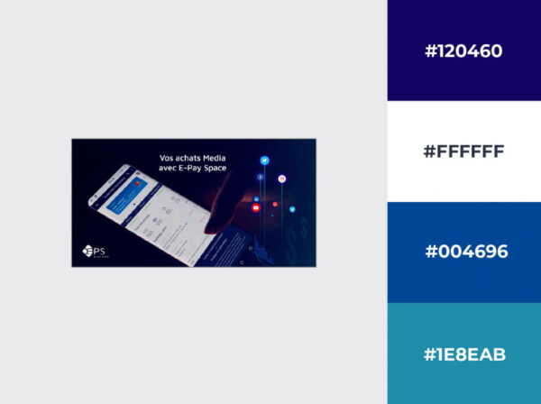
Finding color combinations that work well together is quite easy using the color wheel. But you don’t have to start improvising once you have your colors—you can keep up the methodical approach when applying them to your design.
In this example, the warm hues do the attention-grabbing while the cooler tones convey the information.
Tints appear in the background from both ends of the spectrum, but that’s just for a healthy balance.
24. Combine several color schemes
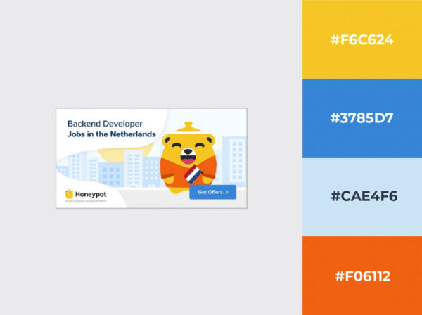
You don’t necessarily have to start your search for complementary colors with only one color.
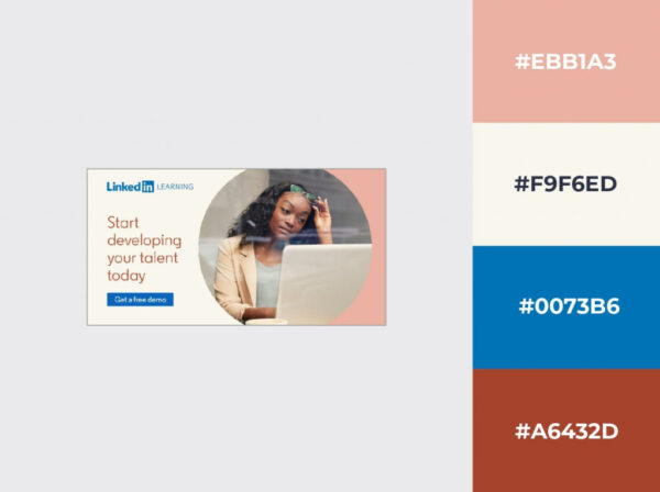
LinkedIn clearly used their signature blue to find a matching color for the rest of the text, but they also introduced a pale pink into the mix, just to tie it all together with the dominant colors of the photo.
25. Remember: Red = Passion
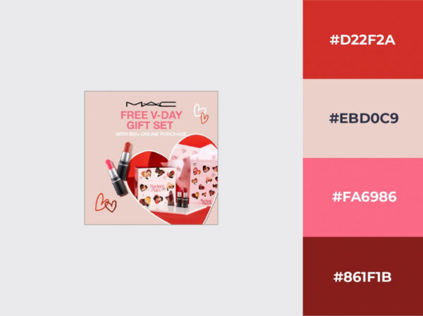
Thinking outside the box is healthy for any creative mind, but sometimes staying on the beaten path makes more sense. That’s not to say you can’t put science to work.
Fiddle around with the analogous color scheme and the different tints, and you can create something unique even for the most worn-out themes.
26. Add a patch of warmth
The element of surprise is an effect that you should keep in your sleeves at all times. It doesn’t have to be a huge shock every time, though.
Nobody would be surprised after a while, would they?
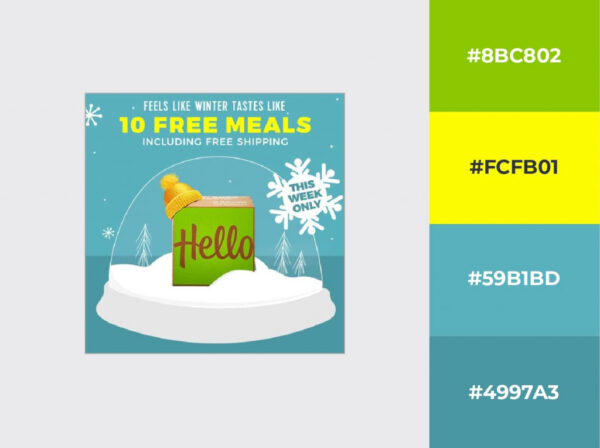
It’s quite simple in this case: the designer of this banner simply used an analogous scheme to keep the design consistent, but they made sure to reach wide enough to capture some warm colors to counterbalance the dominant blue tints.
Not something you see every day, but it still works.
27. Change the hues
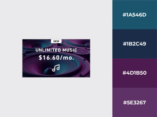
Sometimes it’s as simple as grabbing that hue slider and shifting it ever so slightly.
If the original colors were in a good balance, chances are you’ll get something unique that you can work with, or at least build upon.
28. Add a little warmth
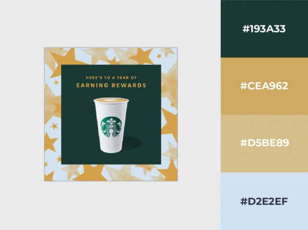
If your brand’s signature color is as cool (I mean cold, but also kewl) as that of Starbucks, it may be a good idea to look for something warmer to make it really stand out.
If its complementary color doesn’t really work with your design—which happens quite often, by the way—you can look for inspiration in your product itself.
This cappuccino brown looks like the perfect choice, although the complementary color would theoretically be pale pink.
The moral of the story: use the color wheel, but don’t be afraid to bend the rules because no one’s going to check. I mean, we might, but we won’t judge.
Certain hues are synonymous with specific product types or industries but don’t fall into the trap of aligning your color palette with your industry’s stereotypes.
It’s always more lucrative for the color combinations to portray a specific value that your product represents than aligning your ads and banners with the current trend in your domain.
How to Use Color Theory in Graphic Design
All of this sounds good, but there are only so many things you can do with these basic color schemes, right?
Wrong.
Much like the multiplication table in math, these oversimplified color mixing charts only give you the basic examples that you can then build sophisticated designs on.
The first decision to make is how many base colors you want your design to feature. The old wisdom that less is more applies here too, but don’t think of this as a limitation.
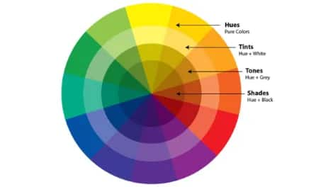
You can always play around with shades, tints, and tones by adding a touch of black, white, or gray, respectively.
This way, the number of possible combinations becomes infinite.
It can sound overwhelming, but this is precisely why designers and artists around the world keep coming back to this simplistic approach for guidance to create the best color combinations.
Frequently asked questions
1. Why are color combinations important in social media design?
Color combinations are essential because they can quickly grab attention, evoke emotions, and communicate a brand’s identity. Effective use of color can differentiate your content from others, making it more memorable and engaging for viewers. By strategically using colors, you can create a cohesive and appealing visual aesthetic that resonates with your target audience.
2. What Colors Are Appropriate for Your Brand?
In a 2006 study, two Cardiff Business School researchers demonstrated that a thoughtfully chosen color can bring inherent and immediate value to a brand.
In other words, if your brand’s colors match your brand values, you’ve already brought your audience one step closer to converting.
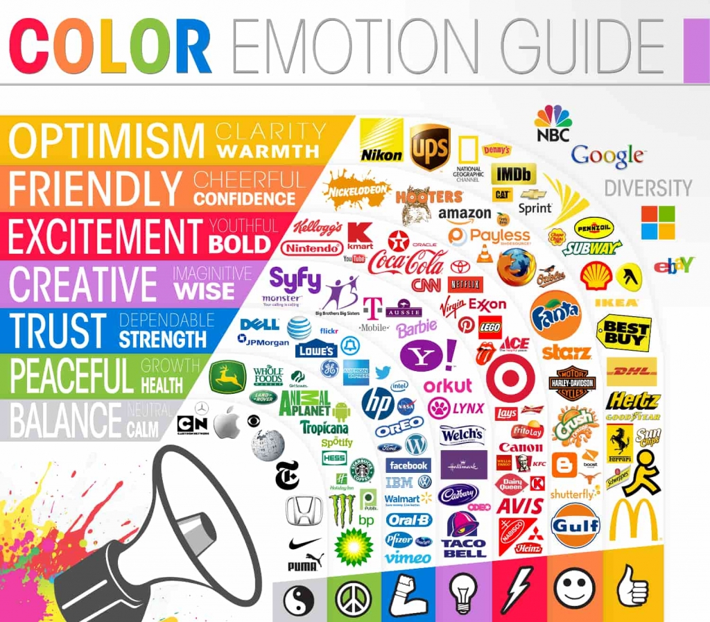
Although the cited study focused on logo and brand colors, you can leverage the power of chromatics in social media graphics too and evoke the emotions you’re after—without saying a word. It’s all about color psychology.
The intuitions, feelings, and values each hue represents would be another book’s worth of material. Still, Help Scout‘s brilliant infographic boils it down to the very essence with highly relevant examples.
3. How can colors impact user engagement on social media?
Colors can significantly impact user engagement by making your content visually appealing and easy to read. Bright, contrasting colors can draw attention to key messages or calls to action, while a well-chosen palette can evoke emotions that align with your brand’s message, leading to increased likes, shares, and comments.
4. What Color Combinations Go Well Together?
It’s probably been a while since you last had a recap of color theory. Remember the color wheel?
By simply arranging the colors of the rainbow into a circle, you get a straightforward but truly powerful tool that you can use to make conscious design decisions.
We could write an entire book on color schemes, but for a design to work, it’s enough to get a handful of color combination techniques straight.
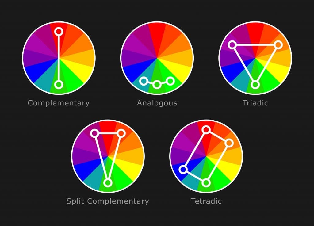
- If you want to keep it very basic and go with a high contrast color combination, remember that opposites attract. Choose any color and the one that sits opposite to it on the color wheel, and you’re guaranteed to have a simple yet powerful color combo. This is what we call complementary colors.
- If you want to add a bit more depth, a split complementary color scheme works best, where instead of the color sitting dead opposite to your primary choice, you use two of its close neighbors on either side.
- If you push this to the extreme, until your three colors are at the same distance from each other on the wheel, you get what’s called a triadic color scheme. Instead of two, you get three colors that go well together and form a softer contrast. Add the fourth one while keeping this symmetry, and you have a tetradic color scheme.
- If your design requires a more unified color theme without sharp contrasts, you can simply combine several adjacent colors on the wheel to create an analogous color scheme.
5. Are there any tools recommended for selecting colors?
Yes, many designers use tools like Adobe Color, which allows for experimenting with various color combinations and finding harmonious palettes. Other online tools, like Coolors and Color Hunt, can also help you generate and explore different color schemes that suit your brand and message.
Conclusion
Beauty is in the eye of the beholder, which is a cliché that has infuriated artists forever.
The ancient Greeks went as far as using arithmetic to prove that the most influential artist of all,Mother Nature,e keeps repeating the same proportions to our great visual pleasure.
They hit the nail right on the head with the discovery of the golden ratio more than two millennia ago, and we’ve been consciously using it in sculpture, architecture, and even web design ever since.
The same is true of color theory.
Perceiving the harmony of colors is something we’re born with, but since recreating it doesn’t come as naturally to all of us, scientists and artists throughout history spared no effort to find the key to it.
Harmony is very much an exact science now, and today’s creatives are lucky enough to be living in a time when the most basic principles of design have already been studied and confirmed countless times.
We only need to apply them.
Are you as obsessed with the best color combinations as we are? What’s the most inspiring color combination you’ve seen lately?
Let us know in the comment section below.

