Banner ad design is not rocket science, and we’re here to prove that.
It is our mission to support people like you in learning about banner design and provide you with high-quality resources and inspiration so you can create successful banner ads that drive results.
This article will help you understand how banner ads work and will equip you with the knowledge you need to craft effective banners starting today.
Table of Contents
- What Is a Banner ad?
- How do Banner Ads Work?
- What are the Main Benefits of Banner Advertising?
- Why are Banner Ads Still Important?
- When Was the First Banner Ad Created?
- What are the Main Types of Banner Ads?
- What are the Best Practices for Using Banner Ads?
- How do you Create a Banner ad?
- What Are the Most Popular Banner Formats and Sizes?
- What are the Costs Associated with Banner Advertising?
- Conclusion
What Is a Banner Ad?
A banner ad, or a web banner, is an advertisement displayed on a web page that aims to drive traffic to the advertiser’s website. The ad is linked to the advertiser’s website, where the user is expected to perform an action, like purchasing a product, creating an account to try out the product, downloading a case study, or signing up for an event.
If you’re looking for a definition of what is a banner that is a bit more formal, here’s what Wikipedia says:
A web banner or banner ad is a form of advertising on the World Wide Web delivered by an ad server. This form of online advertising entails embedding an advertisement into a web page. It is intended to attract traffic to a website by linking to the website of the advertiser. In many cases, banners are delivered by a central ad server.
Investopedia also gives us a comprehensive definition of banner ads:
Banner ads are image-based rather than text-based and are a popular form of website advertising. The purpose of banner advertising is to promote a brand and/or to get visitors from the host website to go to the advertiser’s website.

How do Banner Ads Work?
Businesses use online banner ads to build brand awareness and to also convert them. Once users click the ad, they land on the advertiser’s website, where they are invited to perform an action like buying a product, subscribing to a newsletter, signing up for an event, or downloading an asset.
The process of showing the ads on a publisher’s website is done via display networks, such as Google Display Network. Display networks are a collection of websites and apps that enable advertisers to set up targeted display campaigns and show ads to a specific audience based on the campaign’s demographic, geographic, behavioral, and interest settings.
For example, a travel agency can use a banner advertising strategy to promote its summer vacation packages to different destinations.
First, they will need to design a set of banners that illustrate these destinations and communicate the price. Then, the agency will choose the type of websites they want to display their ads on, according to their strategy.
What are the Main Benefits of Banner Advertising?
- Banner advertising offers numerous advantages that make it a popular choice among businesses looking to enhance their digital marketing strategies. Here are the key benefits:
- Drive brand awareness. You can grow your brand awareness using banner ads so people can easily recognize your product or service. Brands like IBM, Apple, Target, or Nike use banner ads to grow their business through brand advertising.
- Generate leads. Online banner advertising is a great way to build your user base.
- Retarget your audience. If somebody came on your website but left without signing up to your product or newsletter, you can retarget them with banner ads.
- It’s a cost-effective way to promote a business. With options like pay-per-click (PPC) and pay-per-impression (PPI) models, businesses can control their advertising spend and ensure they only pay for actual user interactions or views, maximizing the return on investment (ROI).
Why are Banner Ads Still Important?
Banners are a big part of the advertising world. They work because people react better to visual content or a message that is accompanied by an image.
Our brains are wired to process images much faster than text. Actually, if we dive deep into history, we find that widespread understanding of the written word is only 560 years old, with Gutenberg’s invention of the press happening in 1455. So we can say that decoding images is as old as the human race.
Now coming back to banners, I’d say the number one reason banners do work, and always will, is because it’s a type of visual content that can easily lure the eye.
Moreover, thanks to the amazing targeting capabilities available today, users will mostly see personalized banner ads that are created based on their online behavior.
Plus, retargeting makes tracking online users possible and nurturing them (by constantly showing them ads) through all the stages of the sales funnel until they convert.
For example, I searched for a vacuum cleaner on Google one morning. By the time I was sipping my coffee and scrolling my Facebook feed, I was already served ads for various vacuum cleaners from Amazon, eBay, and other online appliance stores. Throughout the day, I was served ads for vacuum cleaners from various sellers in my mail, messenger, and favorite news website. I clicked some of the banner ads and visited the online shops. Then, the next day, I got even more ads for vacuum cleaners. Eventually, I had to make a decision: am I going to buy one or not yet? So, I bought one.
When Was the First Banner Ad Created?
In October 1994, the first online banner ad was launched. It was published on www.hotwired.com (currently wired.com) as part of a campaign by AT&T.
The ad simply said: “Have you ever clicked your mouse right HERE?” And an arrow pointing to the answer “You will.”

It was as simple as that. No image, no product, no brand logo, no call to action. It was rudimentary, but it surpassed everyone’s imagination. After four months, 44% of the people who viewed the ad clicked on it. That’s a click-through rate that most advertisers could only dream of today. And this is all due to today’s fierce competition among brands and ad fatigue.
We will discuss this in a chapter below, including how to stand out with creative banner ads.
What are the Main Types of Banner Ads?
Banner ads come in various formats and sizes, each serving different purposes and offering unique advantages. Here are the main types of banner ads used in digital marketing:
1. Static Banner Ads
Static banner ads are simple image-based ads that do not include any animation or interactive elements. They typically contain a combination of text, images, and a call-to-action (CTA). These ads are straightforward and easy to create, making them a popular choice for many advertisers.
2. Animated Banner Ads
Animated banner ads use animation to grab the viewer’s attention. These ads can include moving text, images, or other graphical elements. The animations can be simple, like a fading text effect, or more complex, involving multiple frames and detailed graphics. Animated ads are more engaging than static ads and can convey more information in a limited space.
3. Interactive Banner Ads
Interactive banner ads encourage user interaction by including elements like quizzes, games, or other clickable features. These ads engage users by making them participate in an activity, which can lead to higher engagement rates and better retention of the brand message.
4. Rich Media Banner Ads
Rich media banner ads are advanced ads that can include video, audio, or other interactive elements. These ads are highly engaging and can provide a more immersive experience for users. Rich media ads can be used to tell a story or demonstrate a product, making them effective for brand awareness and engagement.
What are the Best Practices for Using Banner Ads?
If you’ve already decided to include banners in your online marketing mix, you already know that the online environment is a crowded place. Companies of all shapes and sizes are trying to compete for their audience’s attention. That’s why you need to focus on being creative when it comes to designing your ads.
The ad creation process is fundamental. So, we’ve put together a list of creative tips & tricks so you can craft banner ads more effectively.
1. Come up with a unique creative idea
Illustrate your product’s benefits in a unique way so it makes people curious to learn more about it. Find a creative idea that will surprise people and allow them to remember your ad and brand.
2. Keep your banner within your brand’s guidelines
Follow the brand guidelines when you create banner ads. Use colors from your brand’s color palette and images that are suited and relevant to your brand. Don’t forget to incorporate colors or elements that are representative of the company.
3. Use eye-catching images
High-quality, eye-catching images can help your banner ad stand out and appeal to your target audience. You can use vivid colors to lure the eye, people in different scenarios or using your product, or even a beautiful setting (outdoor or indoor).

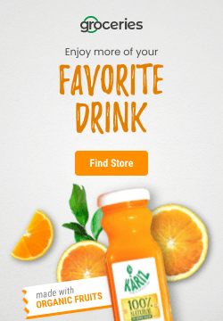
4. Place your product center stage
Your product should always be in the spotlight. When crafting a banner ad, organize your elements so that they complement your product.
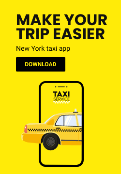
Sometimes, the best strategy is minimalism. That means making the product the main character of your ad and using a simple background. Just like this:
5. Animate to break through banner blindness
Increase your chances of getting your ads noticed by creating animated banner ads. Because people are so used to seeing online ads, it’s easy to ignore them, so you need to find strategies that will make them stand out on a page.
Here’s an example:

6. Use the message to entice & connect
Your message should be clear and highlight the unique value of your product/service. With online banners, the ad copy should be short and clear.
Split your message into:
- An engaging headline that will pique people’s interest;
- A short one or two-line copy that offers more details on your product/service;
- A call to action that encourages people to take action.

7. Offer a discount/download
People will be more interested in your ad if you’re offering a discount or if you’re giving something for free. Increase your CTR and conversion rate with a compelling promotion.

How do you Create a Banner ad?
Easy! You don’t have to be a professional designer to design an ad. You can create static or animated banner ads without any coding skills. It’s easy to learn how to make a banner.
To make sure your ad is effective, there are some simple principles you should consider when designing it:
- Who is your main target and what do you want from them? Before you design a banner ad you need to know who is your core target audience and what you want from them. Maybe you want them to land on your website, buy your limited sale product, or try your service for free. Think about that!
- What is your value proposition? Knowing what your value proposition is will help you write the ad copy and incorporate an attractive, enticing call to action.
- Where will you publish your ad? Will you publish it on Google’s Display Network or on other programmatic advertising networks (such as AdRoll)? Knowing this will help you make sure all the technicalities are in order and that you create a design that fits well within the platform you’re publishing it on.
- Pay attention to the standard web banner ad size. Because the publishers are usually using the standard banner ad sizes on their websites. So, if you pick another size you limit the reach of your banner ad campaigns. For example, Google has their own accepted banner ad sizes and they will not publish anything that’s not within the specs.
- Use readable fonts. You want the user to understand what you want to offer and what they can get if they click on your banner ad. Some of the best ad fonts to use include Roboto, Montserrat, Arial, Open Sans and Oswald.
- Use high-quality photos. Very low-quality banner ad photos and images can create mistrust between the brand and the user.
- Use your brand colors. If you want to design professional banner ads and you want people to recognize your brand on the internet I recommend you to stay close to your brand’s color palette.
- Don’t overcrowd your banner ad. The simpler the banner ad the easier you can communicate the right message to your audience.
- Don’t forget to use a branding element (logo, company name, or website address).
- It doesn’t matter how big you are in your industry. You need to use one of your branding elements to show the user that your company is behind that banner ad.
If you want a more detailed guide, you can check our guide: Learn how to create a banner in 5 simple steps.
What Are the Most Popular Banner Formats and Sizes?
To run ad campaigns on different ad networks, it’s important to know that each one has certain banner formats and size specifications. If your banners don’t meet their requirements, you risk having them rejected.
Google Ads, for example, has different ad formats and sizes available for you to upload depending on the campaign type and goal you choose.
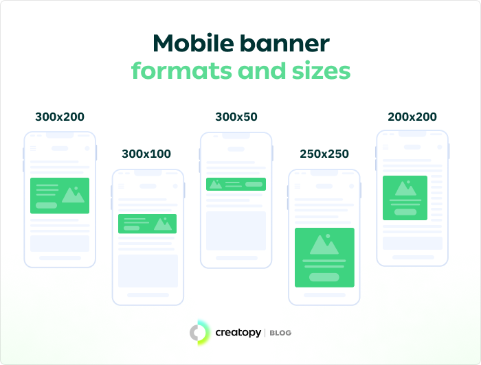
1. Most popular banner formats and sizes for mobile
The most common banner formats and sizes for mobile are: 300 x 200 pixels; 300 x 50 pixels; 300 x 100 pixels; 250 x 250 pixels; 200 x 200 pixels.
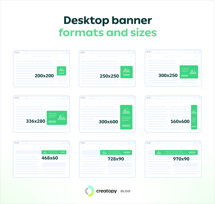
2. Most popular banner formats and sizes for desktop
The most used banner formats and sizes for desktop are: 250 x 250 pixels; 200 x 200 pixels; 300 x 250 pixels; 336 x 280 pixels; 300 x 600 pixels; 160 x 600 pixels; 468 x 60 pixels; 970 x 90 pixels.
What are the Costs Associated with Banner Advertising?
Banner advertising can be quite cost-effective, depending on the kind of promotion you’re trying to do. The cost can vary from a few cents per click to hundreds of dollars per click and it all depends on the type of site you’re advertising on and the target audience you are trying to reach.
Essentially, programmatic advertising will allow you to bid on the internet space you want to get, so you can determine your budget and goals. It is worth noting, however, that in the case of very competitive bids, a low budget might not yield the results you’re looking for.
There are multiple types of banner ad costs:
- Cost per mille (CPM). This type of cost is mostly used when you don’t have a goal in mind and just want to create brand awareness. It means that you will pay a fixed rate for every 1,000 impressions (views) of your banner ads.
- Cost per click (CPC). The cost is calculated by the number of clicks you get on your banner ad. You will be paying a fixed price for each click, according to your budget.
- Cost per action (CPA). This is the cost of an action taken by a visitor that lands on your website. The price you pay per lead, purchase or sign up will depend on the type of action taken. A successful banner ad campaign will depend on the right combination of design, content and placement so pay attention to all these elements and you will get the results you want.
- Cost per view. This is when you pay for each view of your ad. No matter what type of campaign you’re running, it’s important to track the performance of your banner ad to get the insights you need and optimize it accordingly.
Discover related useful articles:
- Banner design inspiration
- Learn about Video Banner Ads
- Guide on Animated Banners
- Cool fonts for your Banner
Conclusion
Banner ads, although often overlooked, hold immense potential for driving traffic to your website and reaching a wider audience.
As you can see, it’s not rocket science.
With the right advertising plan, killer ad designs, and catchy copy, you’ll be well on your way to boosting your KPIs and getting some serious ROI through online advertising.