Posters are one of the earliest forms of advertising, and it’s clear that they’re not going anywhere.
Whether they are printed or used in the digital space, posters are ideal for promoting everything from food delivery to movies, events, fundraisers, school projects, and more.
Nowadays, posters are still being used in advertising to grab people’s attention.
But that’s easier said than done. In case you are wondering how to make an advertisement poster, you’re in the right place.
Use our online poster maker and follow this step by step guide on how to make a poster online.
How to Make a Poster
1. Define its purpose
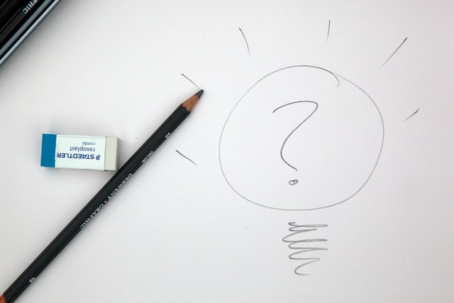
To make it easier for you to define the purpose of your poster, answer these two questions:
- Who’s the audience you want to attract?
- What’s the message you want to send?
Knowing your audience is vital because it’s going to help you create a message that will have the desired impact. At the same time, this will ensure that what you’re communicating is relevant to those people.
Even if the message doesn’t necessarily refer to the actual text, it’s also essential to define the message you want to send.
This is going to have an impact on the colors you choose, the choice of words, and other design elements you may want to use.
2. Create a draft
After you have all the information above written down, it’s time to start creating the initial draft of your poster design.
When it comes to the information you add in the poster, pay attention not to overwhelm the audience with too many details.
Go back to the message you want to communicate and figure out the essential information that should be included.
If you’re working in a team, then at this point, you can collaborate with a copywriter or marketer so they can guide you on what you can include as far as text goes.
3. Choose a color palette
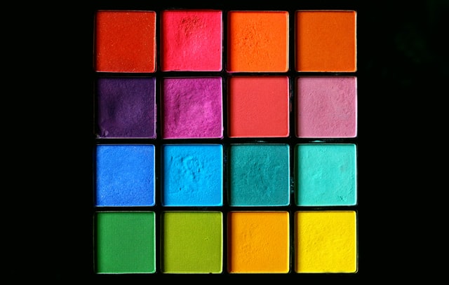
The color combination you choose for your poster is going to be the first thing people notice, especially from far away. So you want to make sure you attract attention, but in a good way.
If you’re a beginner, then feel free to use the 60-30-10 color proportions, a basic rule in color theory.
This means that you want to choose a primary color (red, blue, or yellow), and two complementary colors.
The primary color should take no more than 60% of the poster design, while the other complementary colors 30% and 10%.
If you want to experiment more, then go ahead and add two more colors.
4. Add images, graphic elements, or illustrations
Now it’s time to add the main image you want to use, as long as other graphic design elements that would work well on your poster design.
You want to choose an image that’s relevant to your audience and the message you want to send. Ideally, you should use an original one, and not a stock image.
At the same time, you want to pay attention to the focal point in the photo. It’s essential to choose one that’s going to allow you to surround it with text.
5. Add the text
At this stage, you can go ahead and add the text, considering your audience the main message you want to send.
Aside from that, here are a couple of other aspects you need to take into consideration when adding text:
- The font you choose can significantly impact the mood you want to convey through the message, but don’t combine more than to different fonts in your poster design.
- The layout of the text is also important because it tells your audience where to look and what to read first.
Sometimes, even the smallest details can make the difference between a neat, professional poster and a sloppy one.
By following these tips, you will be on your to create a stunning poster design.
Free Poster Templates and Ideas
The earliest forms of posters date back a few centuries, but it was in the early 1800s that the posters, as we know them, emerged.
Historically, posters were used for informative purposes, but also to promote cultural events, such as the famous Toulouse-Lautrec posters.
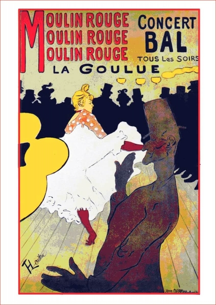
Fast forward to the World War I period, posters had political and propaganda purposes, like this example.
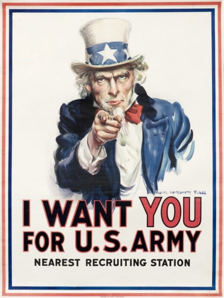
Now that we’ve been on a trip down memory lane with a brief history of posters, it’s time to get into the examples.
We know that learning is easier when you have inspiration, so we added a series of free temples available in Creatopy and a few inspirational examples from brands we all know and love.
Travel poster template
If you have a travel agency, or you wish to promote a hotel or a trip, a travel poster template is a way to do it.
Here’s a cool travel poster template you can edit to promote your trip in an eye-catching, yet professional approach.
You can never go wrong with shades of oceanic blue and a dreamy landscape. Add your own images and text to personalize this template.
Holiday poster template
If you are preparing a discount, a deal, or a party for your special day, we have some great templates for you. Here’s a beautiful botanical poster design you can use for numerous occasions.
The botanical design trend started in 2019, and it’s here to stay, so it can be ideal if you want to create a poster for a natural, bio, and sustainable brand.
Events poster template
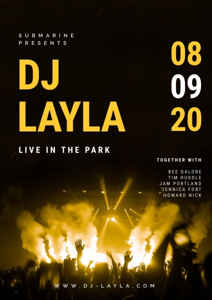
If you have an event to promote, whether it’s a theme party, a discount, a concert, a festival, or an exhibition, you can find great templates to use in our gallery.
With modern fonts, cool contrasts and vivid colors, you’ll be sure to make your event noticed and increase the interest in no time.
The concert poster template above can be used to promote your event using high color contrasts and bold typography.
Artistic event poster template
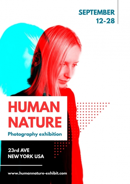
If you have an artistic event to promote, duotone is the way to go.
Here’s a modern twist on an already classic design trend. Use the duotone filtres and minimalist text approach from this cool poster and create an artistic design without the hassle.
Remember to limit the color combination to no more than three and write down the relevant information in key places to get it noticed.
Business events poster template
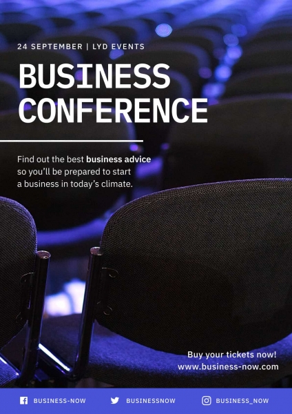
In the business world, it’s all about being trustworthy, but this doesn’t mean you can’t play with colors to create eye-catching posters.
After all, you still need to get people’s attention and make them interested in your event. Boring business posters don’t sell tickets.
You can use the template above for any conference, lecture, or business event, even if they take place online.
The bold blue color catches people’s attention while still suggesting you mean business. Just click on the “Start from this” button to personalize this template, add your own information, and branding elements.
Auto & moto events template
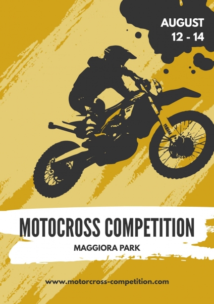
There’s nothing that says “full speed ahead” like a great poster. Here’s a beautiful motocross competition poster template you can adapt to match your event.
With a limited color palette and a graphic stripped down to the minimum, this type of design will get everyone’s attention.
Retail discount template
You might think all Black Friday designs are the same, but there’s more to a good discount poster design than meets the eye.
You have to pay attention to all the elements and make sure the discount you’re offering stands out so that you attract more foot traffic to your store.
7 Tips to Follow When Designing Posters + More Poster Ideas
If you need more inspiration to get your creative juices flowing, here are some fantastic original posters from brands we all know and love.
Get inspired by these creative designs and follow our tips and tricks to nail your poster design every time.
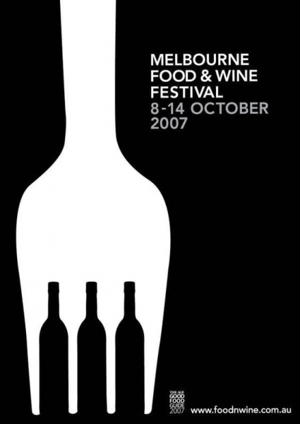
1. Use negative space
If you need to combine two elements, using negative space is always a smart idea that will make your audience look twice.
Here’s how the Melbourne Food & Wine Festival managed to do that by combining the bottles of wine and the fork design.
Play with elements and illustrations to get the desired effect, but don’t overdo it. Keep things simple and add only the items that are necessary to make your visual story stand out.
2. Play with typography
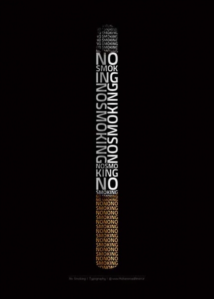
Typography art looks great on posters. The use of creative word games and shapes to tell a story can create an incredible puzzle of words and images that complete each other.
Just take a look at the example below.
3. Use contrasts
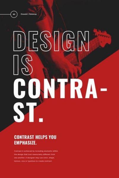
You have only a few seconds to get someone’s attention with poster design. Sometimes your poster will be placed alongside many others, so you have to make sure it gets noticed within a glimpse.
Thanks to bold contrasts, your design will pop and get the attention it needs.
Use complementary colors, black and white contrasts, and bold text that will get your message across.
4. Keep it simple
In the world of poster design, less can be more, especially when we’re talking about a minimalist approach.
If you want to send a powerful message, you can easily use only images or illustrations and make your poster come to life.
You don’t have to add a lot of elements, such as fonts, text, or use a sophisticated color palette to tell a story.
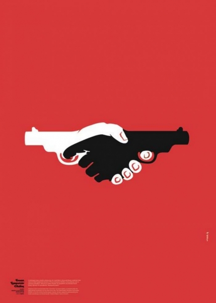
Image Source: behance.net
5. Use layers of photography and text
They say images speak louder than words, but why not use both?
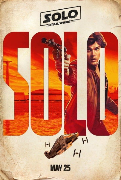
Take a look at a classical approach to this trend in the Solo: A Star Wars Story teaser movie poster and get inspired to create your next masterpiece.
The poster has a western-style feel, featuring a beautifully painted portrait of the main character. Also, it’s got a definite retro vibe with the red-orange shades completing the old paper texture.
6. Add dynamism with uneven elements
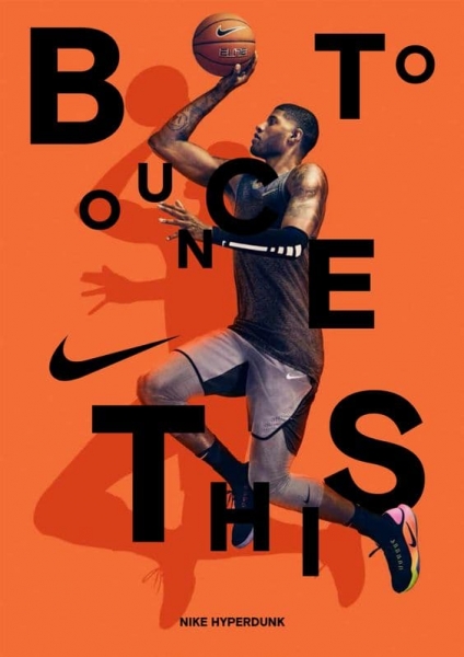
Make your poster pop with a dramatic font, and bold colors, like Nike did with the basketball player posters. The unaligned letters underline the message of the poster and add movement to the entire design.
If you complete your poster with a photograph that suggests movement or speed, your design will look like it’s got a life of its own.
7. Use visual metaphors
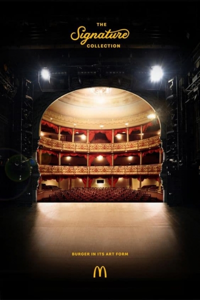
If you need to talk about your products subtly, you can always go for visual metaphors. Suggest something, rather than just say it out loud with a distinct word or an image.
Here’s how McDonald’s illustrated the concept “A Symphony for your senses” by combining the interior of an opera house with the shape of their famous Big Mac.
Conclusion
So there you have it—our how-to guide, best practices, and tips to help you create beautiful posters for any type of occasion.
Now, all you have to do is to discover our platform, browse through the poster templates, and start creating your own poster design.


