Facebook cover photos are a great way to add personality to your business page. They have a tremendous visual impact because it’s the first thing people notice on your page.
An outstanding Facebook cover photo can actually make a difference. But it’s not just about the numbers. Remember how you smiled when you saw your favorite brand’s Facebook cover photo for the first time? That’s why it’s essential to have the perfect cover photo.
A brand’s Facebook cover photo must be highly impactful and perfectly optimized. Easier said than done, right?
But we’re giving you a hand by making the correct Facebook cover size for 2025 easy to understand and master.
In this article, you will find everything you need to know to create the perfect Facebook cover photo:
Table of contents:
- What is the Facebook cover photo size in 2025?
- Facebook cover photos on desktop vs. mobile
- How to make a Facebook cover in Creatopy
- Creative Facebook cover photo ideas and examples
- Best practices for Facebook cover photos
- Common mistakes when creating a header
A. What Is the Facebook Cover Photo Size in 2025?
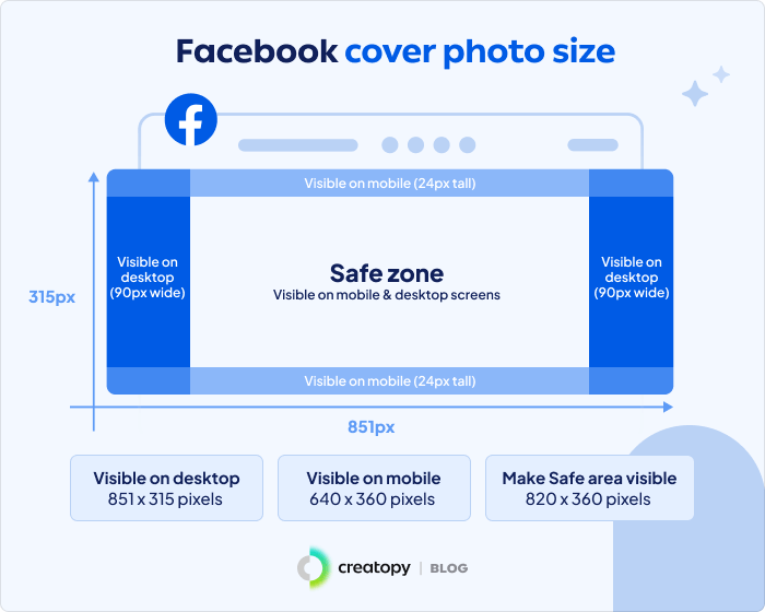
The Facebook cover photo size is 851 x 315 pixels for desktop and 640 × 360 pixels for mobile devices. The image must have a 16:9 aspect ratio, up to 100 kilobytes in size, and come in a PNG file format.
The Facebook cover photo will show differently on mobile and desktop.
So, we advise you to place your images, graphics, and text in the safe area in the middle. This way, you avoid getting your cover cut on the sides for the mobile view and on top and bottom for the desktop view.
The dimensions for the safe area are 820 x 360 pixels, so use this to ensure your image looks great, no matter the device.
B. Facebook Cover Photos on Desktop vs. Mobile
Let’s see how a Facebook cover photo shows on desktop vs. a mobile device.
Your Facebook header will get the sides cropped on mobile, while the height will expand.
Now, considering that 97.4% of U.S. Facebook users access the platform from mobile devices, it is important to have a cover that displays all the elements. Optimizing the same cover photo for both mobile and desktop devices can be challenging due to their different display requirements.

When you design your Facebook header, remember that the profile picture will cover half of the left side. So, place any important information on the right-hand side.
On desktop, Facebook displays a wider cover image while cropping the top and bottom.
So, it is best to use the Facebook cover image size of 820 x 360 pixels and concentrate your design in the safe area. This way, you avoid getting important elements cut out from the picture, like your logo, product image, tagline, or call to action.

Check out our resources for a first-class presence on Facebook:
- Complete guide to Facebook ad sizes and specs
- Guide to Facebook advertising
- Facebook group cover photo size
- Facebook carousel ad examples
C. How to Make A Facebook Cover in Creatopy
Let me show you how easy it is to make a Facebook cover in Creatopy, even if you’re not a designer.
1. Sign in to your Creatopy account.
2. Click on Templates.
3. Before selecting the size, make sure you pick the right Project in which you wish to create your design. Choose the Project from the right side of the screen, where it says “Save design in:”.
4. In the search bar under Start Creating, type in “Facebook cover” and click on it.
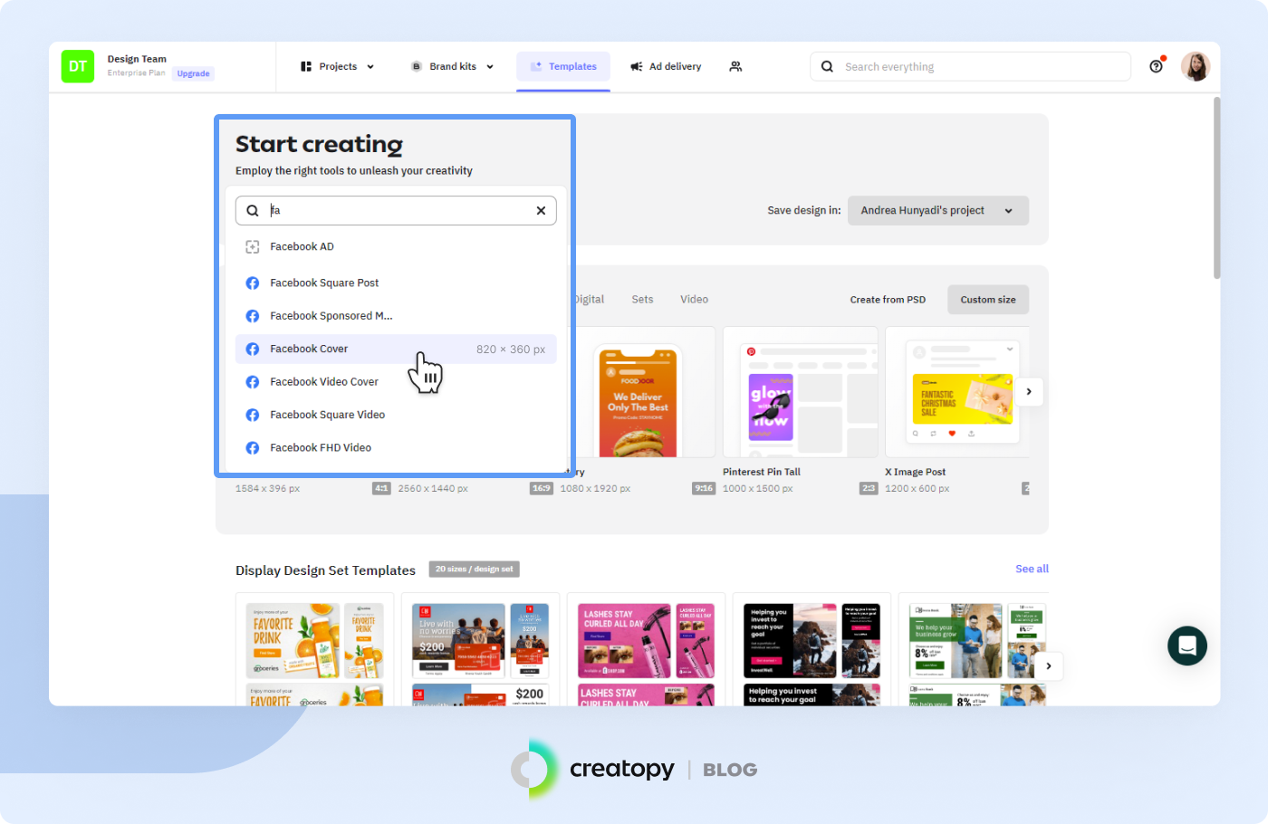
5. Next, you can choose to start with a blank design or choose one of our gorgeous Facebook cover photo templates.
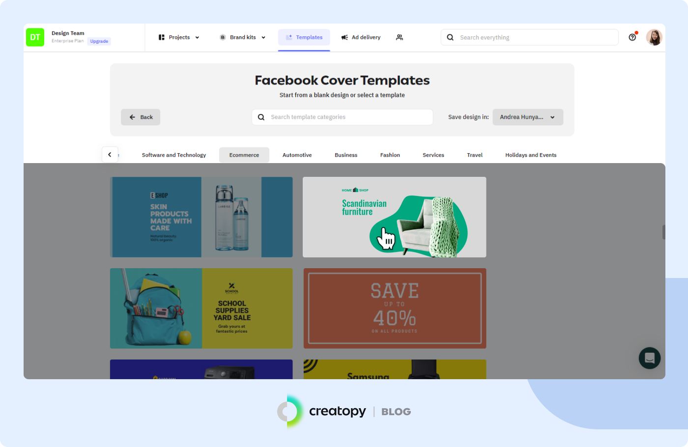
6. For this example, we selected a template. Then, it’s time to customize it: change the photo, replace the background, add your own color palette, logo, message, and call to action.
7. Download your Facebook cover as a PNG file as the final step.

D. Creative Facebook Cover Ideas and Examples
1. Use the power of colors to draw attention
Creatopy makes it easy for you to play with colors and create truly spectacular header images. However, if you don’t want to experiment and prefer to stick to your brand’s color palette, that’s totally fine, and we support you in creating on-brand visuals. For this, you can use the brand kit in Creatopy, where you can upload your logo, color palette, visual elements, and font.

2. Humanize your Facebook page with illustrations
Use illustrations to promote your upcoming events or offers. They’re human, friendly and help people better connect with your brand. Browse through Creatopy’s pack of illustrations to find something suitable for your business.
This style can work great for beauty, health, ecommerce, or kids’ clothing brands.

3. Place your product in the spotlight
If you’re launching a new product, Facebook is a great place to show it off. Use a cover template already built around a product and customize it with your product picture, logo, and text.
This layout type suits online stores, restaurants, and beauty brands.

4. Add a personal touch
Customize your images with visual elements to make them unique and playful. Browse through our database of visual elements to find something that works well for your brand and campaign. Choose between shapes, icons, masks, lines, illustrations, and logos.

E. Best Practices for Facebook Cover Photos
1. Focus on the safe area
Place all of your important information in the safe area (820 x 360 pixels), so that all users can see it, no matter the device they use. Try to add everything slightly to the right, so that it won’t get covered by the profile picture on mobile devices. You can put your headline or call to action in the center of the visual. Leave all secondary elements on the sides.

2. Brand consistency is important, so find the right mix
If you can find ways to keep your page on-brand, do it. Recreate your brand’s universe and invite people into your unique world the moment they land on your page.
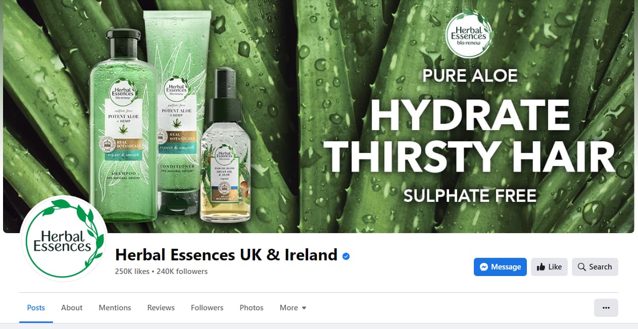
Here’s an example of a great Facebook cover from Herbal Essences that matches the profile picture. They’ve used the brand’s main color for both images to emphasize the company’s values and maintain consistency between the cover photo and profile pictures.
3. Showcase your products
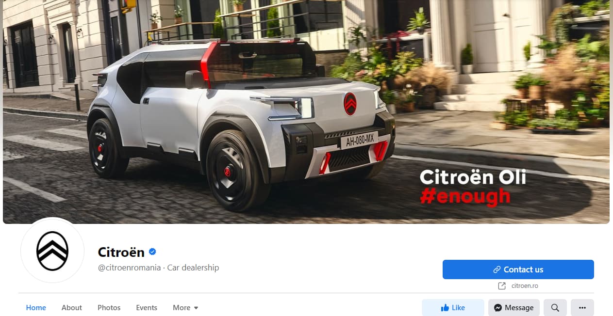
Don’t shy away from showcasing your products on Facebook. Use a high-quality photo of your product, add a headline, and let your product shine.
Choose a picture where your product is central, and put your headline or call to action on the right-hand side.
4. Experiment until you find the right placement
It may take a while until you find the right combination for your Facebook cover. So, my recommendation is: don’t rush, take your time to experiment with several cover images, and upload one that displays well on both mobile and desktop.


F. Most Common Mistakes When Creating Facebook Headers
1. Using the same image for all the social media networks
This can be a problem because each social media platform has its own requirements for cover images, profile images, post images, ads, and so on.
Many brands tend to create a single image and use it everywhere on social media, from their business page to stories and carousel ads. This is especially problematic for a page’s cover photo on Facebook. The result is that these pictures will get cropped or stretched and distorted, as you can see in the example below.
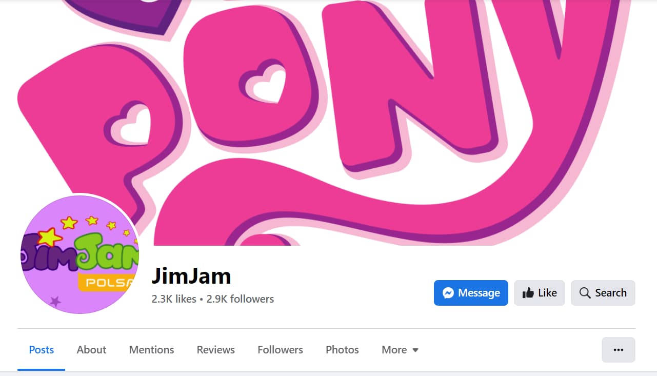
2. Not showing the products properly
The cover might look great when it’s clicked on, but in this case, a visitor or follower will see a partially cropped cover image that shows a white wall and a legless table with some legless chairs. This can be easily fixed by repositioning the products displayed so they are fully visible.

3. Not thinking about mobile devices
This can happen even for some of the world’s biggest brands, as you can see in the screenshots below.
These Facebook covers have a great design, but unfortunately sometimes it’s not enough if it’s not entirely visible for someone visiting a Facebook page.



Frequently asked questions
Use an image that precisely fits the recommended dimensions to ensure your Facebook cover photo is displayed without cropping. As of 2025, the ideal size for a Facebook cover photo is 820 pixels wide by 360 pixels tall. By using an image with these exact dimensions, you can avoid cropping issues. This size ensures that your cover photo will display correctly on both desktop and mobile devices without any portions being cut off.
What’s a good cover photo for Facebook?
Choosing the right cover photo for your Facebook profile or page depends on its purpose and the message you want to convey. Here are some helpful tips and ideas to assist you in selecting an impactful cover photo.
1. Branding:
Include your brand’s logo, colors, and tagline. Make sure the cover photo reflects your brand identity.
2. Products or Services:
Showcase your main products or services with high-quality images demonstrating their use.
3. Promotions and Announcements:
Utilize your cover photo to advertise special offers, new products, or upcoming events. Keep it updated regularly to keep your audience in the loop.
4. Customer Testimonials:
Display positive quotes from satisfied customers and their photos (with permission).
Key Takeaways
Managing a brand’s Facebook page should be easy and fun, now that you have the exact Facebook banner size.
Use the recommended Facebook cover photo dimensions page to make sure it looks great on all devices. Test several different images to see how they fit, and only upload a picture that fits perfectly on both desktop and mobile.
Make a great impression on every single user visiting your page.

