Trying to choose the best color combinations for your online banners can be a daunting task, given the crowded display advertising market.
So here you are, trying to put together a stunning banner that will measure up to your client’s expectations, outshine the big brands, and appeal to online users to click the button.

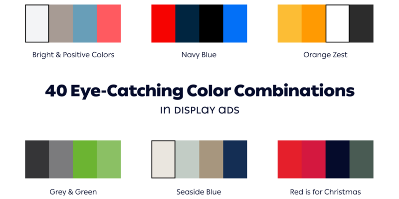
No worries. I am inviting you to walk through the theory of colors and have a look at our list of 40 curated color palettes that hopefully will provide you with all the knowledge you need to make an online banner that stands out from the crowd.
The main principles of the color theory
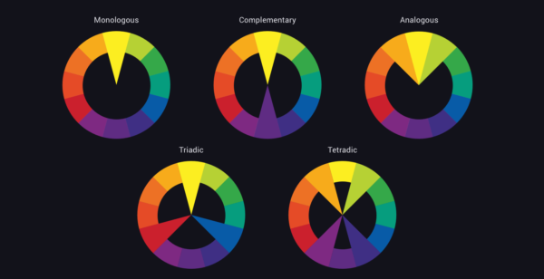
Digital design may be an offspring of the 20th century, but it employs the same color theory as the age-old science of painting.
Here they are, briefly:
- Monologous color palette: when we choose a color and use several shades of this color to complete a composition, we call it a monologous combination of colors. For example, using deep tones of black can create a striking, minimalist effect—ideal for ads where you want the message to stand out. Consider using a black wallpaper design for a bold and clean look.
- Complementary combinations: Complementary colors are colors sitting opposite in the color wheel. When put together, they complement each other and provide a sharp effect.
- Analogous color schemes: These colors sit next to each other and when used together in the same layout, they convey harmony.
- Triadic or Tetradic combinations: These colors are evenly placed on the color wheel and you can find them using a triangle or a square shape.
Here is a memorable quote from the famous painter, Marc Chagall, that will help you remember the principles of the color wheel and combine colors in your designs:
All colors are the friends of their neighbors and the lovers of their opposites.
Marc Chagall
The power of colors in digital media.
In a study called The Impact of Color in Marketing, researchers found that people can make up their mind about product choices based on colors alone in less than 90 seconds. What’s even more interesting is that the “use of colors can contribute not only to differentiating products from competitors but also to influencing moods and feelings – positively or negatively – and therefore, to attitude towards certain products.”
Have a look at these 40 cool color schemes and learn how to combine colors from top brands.
1. The carefree life: bright & positive colors

Using pale shades of sky blue and earthy brown is a sure way to induce a state of calm and relaxation. No wonder Airbnb used this palette for their display ads. Their promise could be summed up to: this is the kind of life and experiences you’d enjoy when booking accommodation through our platform, one-on-one hosting, friendship, and above all the quietness of an isolated shore, far from the madding crowd of the city.
And, if you were wondering what’s with the pink button, here’s the answer: first of all the color’s official name is Wild Watermelon and second, it adds playfulness to the scenery.
In their design vision, AirBnb states they strive to use a universal visual language, given their worldwide presence. Also, each tiny communication material (such as this banner) should comply with their design guidelines, which include colors, typography, icons, and information architecture.
2. Navy Blue
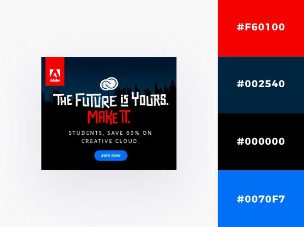
We’ve been used to associate this dark shade of blue with the uniforms of the navy officers and thus with the qualified and skilled establishments. Actually, dark blue has been used as a color for the navy officers’ uniform since 1748 when the British Royal Navy introduced it for the first time.
Black is also the color of nobility and elegance. But Adobe doesn’t play the game of the elites here. The trick is that Adobe is playing with concepts, by playing with colors and fonts: young generation (red, blue), education (dark blue), skills, the aspiration to high-class (black).
3. Orange zest

Orange is the happy marriage of yellow and red and it conveys warmth, positivity, joy, and enthusiasm.
As such, Amazon found it suitable for the joy of the shopping fever.
Further, they used white and black to balance this sweet indulgence and twist the ad a bit into a more serious atmosphere. White balances the feast while black introduces an element of premium treats.
4. Grey & Green – The technology of health
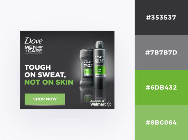
Though we tend to associate green with nature, this is an urban color scheme, due to the surprising combination with city grey. Green is the color of grass, trees, and forests, of spring and crops. In our recent culture (20th & 21st centuries) green has been used to symbolize well-being, healthy or organic.
On the other hand, grey is the color of steel (and of metals in general) industrial and technological revolution, and of the urban landscape.
The combination of the two may come as a surprise, but they unite to create a new universe: the world of the health technology. That is precisely Dove’s message: a technology that was developed to care for the skin as nature intended.
5.Seaside blue

This blue palette is evocative of the tranquility of the seaside. The combination of soft blue and golden sand creates a summery atmosphere with a relaxing feeling to it.
It can help you promote homeware products, interior design services, clothing, water, and children’s brands.
6. Red is for Christmas
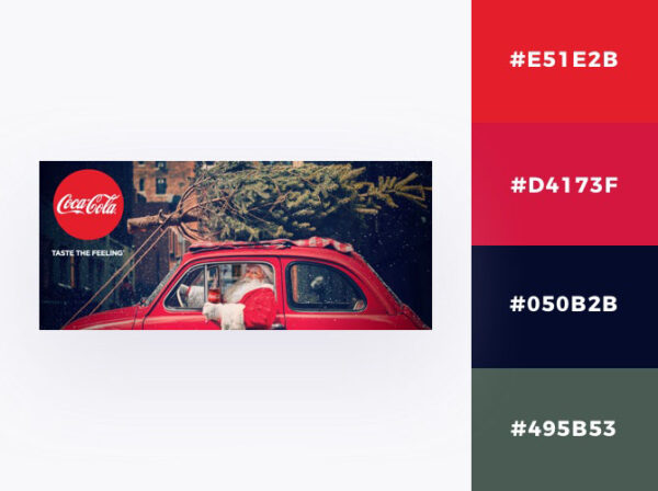
Red is traditionally associated with passion and green with health or the environment, but when the two come together they shout out loud “Christmas”. Of course, Christmas is no stranger to desire. We are all full of wishes around that time of the year.
As you can see this is not the springtime fresh green. This shade of green it’s called Viridian Green (Viridis in Latin means green), and it’s medium in saturation and relatively dark in value. It is the green of the Christmas tree and Santa’s elves.
7. Less is more – White color pallets

This minimalistic grey pale palette combined with vivid blue offers comfort to the eye, in a world of tiring visual clutter. As with all things minimal, the feeling we get is space. That is exactly what DropBox offers: digital storage space.
8.Honey yellow

This yellow color scheme, inspired by sweet honey, is perfect for when you need to create a bright context for your products. Yellow conveys positivity and it is associated with the Sun and summer. It can enliven your ad and take it from ordinary to extraordinary.
Use this color palette to promote anything related to summer or during the summer, bee products, women’s and children’s brands, sweets, and natural supplements.
Related articles:
28 Color Combinations That Work Like Magic in Social Media
Design Stereotypes: What Defines Feminine Design or Masculine Design?
How to Use Geometric Patterns To Create Brilliant Designs
9. Carnival dance
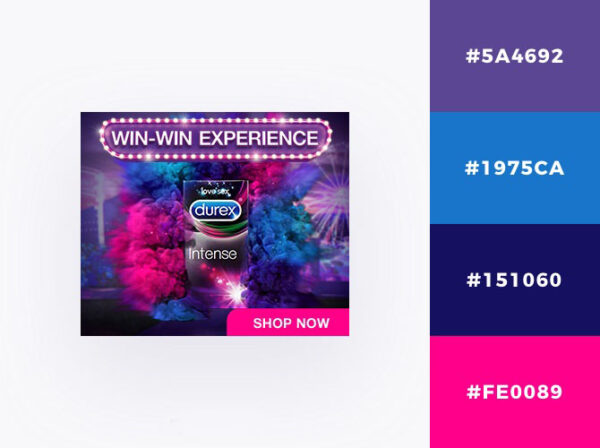
This cheerful color palette combination transports us to the electrifying parades of the Rio Carnival. We can also find this explosion of bold colors in party decorations, confetti, and fireworks. The Blue and Purple set the stage for a fun atmosphere, while the Deep Pink drops the bomb: it’s going to be a wild party. The dark blue is there to temper the composition and give it a nightly atmosphere.
10. Fresh new day

If you want to convey freshness and cleanliness, use light blue, green, and white. This batch of colors is a winner when it comes to health or cleaning products. Subconsciously, blue and green remind us of nature, of oceans and rivers, and arise the desire to bathe or wash. In this case, red is the brand’s primary color, but red is also green’s complementary pair. Red makes the ad active and attractive.
11. The contrasting couple

Black and yellow are probably one of the most contrasting pair of colors. Yellow expresses warmth and demands attention, while black is sober and introverted. Yet, when used together they complete each other and create a loud couple. An attention-seeking couple. Remember this combination is used for traffic signs. It demands careful consideration and consideration is what it gets.
12. Sprouting time
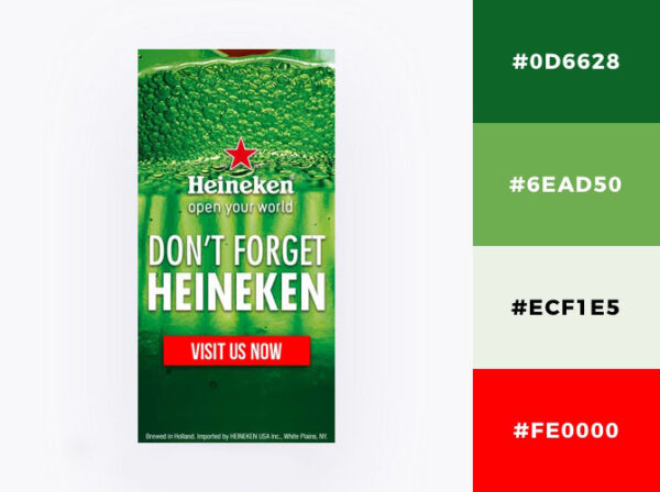
Meet Crusoe, the greenest green of them all. When you have this kind of vivid green and several of its siblings all together you probably want to talk about health, natural ingredients, and taste. And thirst. Use this palette if you’re selling food or drinks and don’t forget to match it with a bold red button.
13. Red rose bouquet
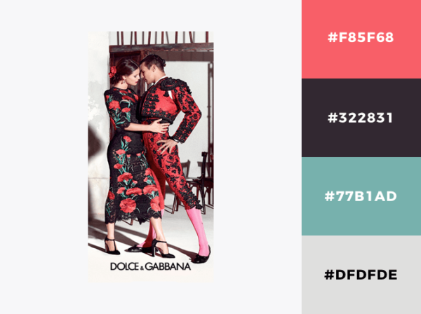
This bold combination is inspired by nature’s most elegant flower, the red rose. Here, the daring red is accompanied by a softer relative, plum mauve, and its grandeur is matched only by the classy black.
This is an eye-catching color scheme, no doubt about it. But as attention-grabbing as it may be, this red and black palette is not suited to all types of products and brands.
It goes well with fashion and beauty brands.
14. Cozy little space

This pale palette is an invitation to coziness and relaxation. When used as the main color in a composition, light grey takes the burden off the viewers’ shoulders. It makes space seem neutral and light. Of course, life can get pretty boring with so much grey around, that’s why getting a vibrant kick of Vivid Violet will considerably change the atmosphere.
15. Sunny days

Yellow is associated with the Sun, warmth, joy, happiness, and positivity. It also symbolizes enthusiasm, playfulness, and can be easily connected to childhood. Yellow is definitely a playful color, and many children brands use yellow in their branding: Johnson’s baby, Toy Story, Winnie the Pooh, Lego, and Play-Doh.
However, yellow can cover lots of industries from kids toys to tourism agencies and clothing brands. It all depends on the design and additional colors.
So, if you want to use a yellow palette for your banner, make sure you also incorporate 1-2 strong colors to highlight essential parts such as your button, headline, or body text.
16. Delicate pastels

Pastel colors are suited for girly brands or to promote bakeries selling sweet desserts and are light, delicate, and cute colors. They create the atmosphere of a dreamy, aspirational world and trigger an array of warm emotions. They’re heart-melting. We do not encounter pastel colors on a daily basis in our home and work environments, that’s why a pastel banner has the potential to stand out and impress the right audience.
17.Exotic island
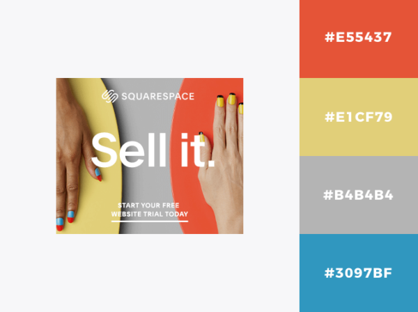
For your background color, combine vivid yellow and tropical orange, add a bit of sky blue, and you’ll get the perfect summery palette.
This combination of colors will create the ideal tropical summer background for your product or brand and will help you convey a positive feeling.
Use it if you’re selling summer-related products, holiday deals, and teenagers’ brands.
18. Rose sensuality
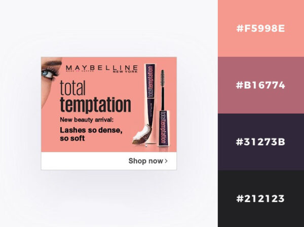
Women’s brands need a touch of rose sensuality to reach their audience’s hearts. Women are attracted to all pink and red shades, and that’s because women’s sensual parts are pink rose. Actually, we are all attracted to these colors, and that is a subconscious process. Pink and red are appealing. Women color their lips and nails in red and blush their cheeks to look more attractive.
If we look at nature, many delicious fruits wear various shades of pink, red, and plum: strawberries, peaches, plums, cherries, and watermelon.
In banner design, you need around 4-5 colors to create an appealing composition. That’s why when using shades of pink, also include something dark for your button or headline, like dark blue or black.
In case you fell in love with the two pink shades and would like to use them, their names are Mona Lisa ( 3F5998E) (what a suggestive name!!) and Turkish Rose (#B16774).
19. Somewhere over the rainbow
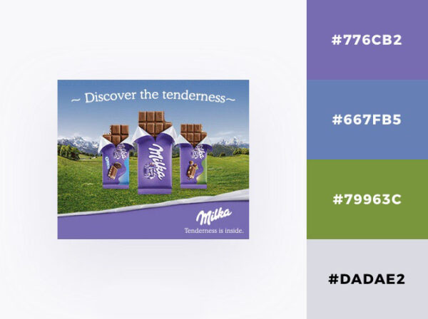
Purple is the fruit of passionate red merging with quiet cold blue. It is a secondary color and it can rarely be found in nature. The lavender flower is purple as well as some morning glory flowers and magnolia trees.
Purple has been associated for millennia with high status and royalty due to the fact that it is not a natural color and the process of obtaining this color was expensive and therefore reserved for the elites. However, the industrial revolution popularized it and made it affordable to the masses. Today, we can find the color purple everywhere from clothes to food brands. Depending on the tone, purple conveys different meanings: dark purple is associated with luxury and high-class, whereas light lavender symbolizes tenderness and delicateness.
In the picture above, you can see how Milka uses light purple to convey tenderness and exquisiteness. Their slogan actually states: “Dare to be tender!”
More, studies revealed that 75% of pre-adolescent children prefer purple to all other colors. No wonder Milka chose purple as its main brand color! And if we think about it, Milka is not the only chocolate brand using this color. Cadbury is another big purple chocolate brand.

If you want to build a banner starting from purple, make sure to find some other compatible friends like blue, green or grey, but be careful not to duplicate the Milka paradise. This brand’s visual branding is so powerful that people tend to associate the combination of purple and green with the happy cows grazing in the Alps.
20. Playful colors

If you’re considering using pale blue for one of your banners you must know what this color stands for. While blue is a cold color, light blue is associated with a clear sunny summer sky. It offers a state of calmness and peace. The lighter the color is, the more playful it can become. Especially if there are other playful colors in the composition to accompany it. Like pink, for example.
This palette right here is ideal for children’s brands, pets brands, and sweets. It creates a world of nurturing pampering and sweet indulgence.
21. Primary colors: red, blue and yellow

Blue, red, and yellow are all primary colors, which means that when combined they give birth to all the other colors of the color wheel. They are the main colors and the eye loves them. Using a white background and small patches of primary colors is visually relaxing and there are only a few brands out there that dare to use this minimalistic style and, the truth is, you can go for this kind of visual communication when you rely on your product’s intrinsic value.
22. Mountain sky view: blue palette

Blue is associated with the sky, the ocean, and the ice. It signifies depth, infinity, and mystery. The darker the color is, the more intense, serious, and deep it becomes. Very dark blue is a masculine color, and it is also connected to the intellect and high skills.
When found in a color combination like the one above, blue is evocative of the majestic beauty of nature, the great wide universe, and also of the power of masculine polarity.
This palette can be used by airlines, tourism agencies, men’s brands (clothing, skin & hair care, shaving), cleaning products, and companies selling construction materials (especially roofing).
23. Nude pink palette

This feminine palette of pink tones is all about sensuality and beauty. Inspired by nature’s flowers (roses) and fruits (plums), the combination is pleasing to the eye.
It can successfully promote beauty brands, women’s clothing products, and also delicious foods such as chocolate or sweets.
24. White in compositions
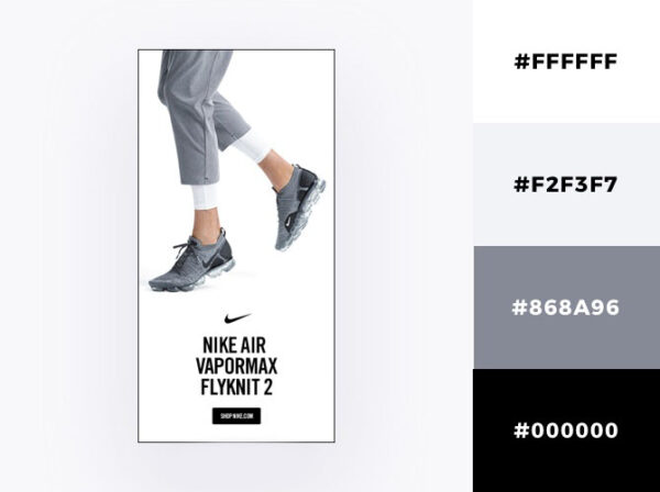
White traditionally symbolizes purity, heaven, divine, perfection, and cleanliness. It is the color of snow, fluffy clouds, and bridal dresses.
Although technically white is considered a non-color, in a composition, white creates space, balances, and allows other colors to be center stage. Using white in your color scheme will help you create a layout that conveys simplicity and elegance. White is also the color of modesty or of the people who know their worth but do not brag.
There’s an old Zen saying: “Those who speak do not know. Those who know do not speak.”. This proverb sublimely summarizes the essence of the color white. And remember that white (or space) is at the core of the Zen painting tradition.
The use of white in advertising stands for premium quality, luxury, and coolness. Premium brands can afford to use white in their advertising campaigns because their strength lies in their product. And everyone knows it. No need to brag about it.
25. Love at first sight
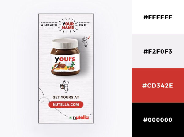
Red is and will always be a star, no matter the stage it may be distributed to. It is the color of fire, blood, heart, cherry lips, velvety roses, and red apples (symbol for temptation). It symbolizes passion, burning desire, sensuality, excitement, and courage.
You’ll find tons of red buttons in display advertising because red appeals to the viewers to click. (Remember the red corrida cape toreadors use to trigger the bulls?)
A test ran by Performable.com proved that red buttons are most appealing to the users: in a comparative analysis, a red button outperformed a green button by 21% conversions.
Red is magnetic and it is deeply embedded in our subconscious mind. In terms of banner performance, red is the clickbait you need to drive people to your website.
Use a color scheme such as the one above (red, black, white, and light grey) to promote food & drinks, clothes, beauty products, children’s clothes and toys, flower shops, or cars. Count on red to do its job. And get creative with black, grey and white. Play with them to fill the background, to animate your elements or enliven the texts.
26. Orange & Blue palette

Orange and blue are famous for being complementary. While blue is a cold color, orange is hot and sunny. When the two meet, they create an eye-catching visual, that will not get ignored.
Whether you’re a children’s brand, or in the food, travel, or fashion industry, you can use this color scheme to stand out and make some noise.
27. Summer sea
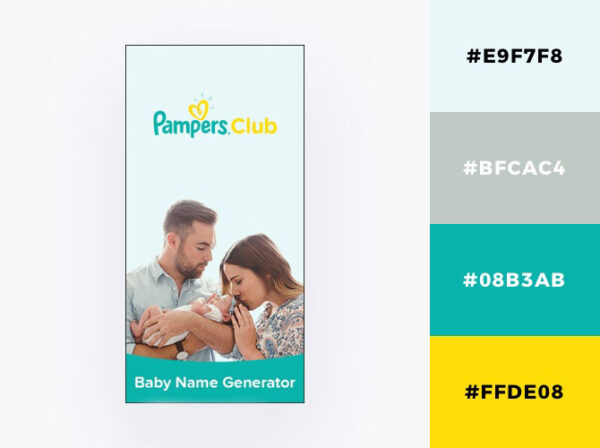
This summery color scheme invites us to lay back and enjoy the sun and the turquoise sea. The pale blue is evocative of the serenity of the sky while the sandy grey tempers the composition with a down-to-earth tone.
Use this combination of colors for your banner if you’re selling holiday package deals, children’s toys, or care products or if you’re an airline company.
28. Milk & honey

Looking at this color combination, one might feel the urge to run into a coffee shop and indulge in a creamy cappuccino. The sweet tones of brown remind us of grannie’s homemade milk and honey biscuits and hot cocoa milk.
The lighter brown’s (#EAC87C) official name is actually food-inspired: Marzipan. This is a mouth-watering color, and it can successfully promote anything food-related, or to be more precise, anything ingredient-related, meaning any product that relies on its superstar ingredients.
If you want to use these brown colors, make sure to incorporate black for your text and white/light grey to propel brown into the viewer’s focus of attention.
29. Blue sea

With such a rich range of blue tones, this blue sea color palette is the definite choice for brands related to water. From Dark Cyan to Light Steel Blue, this combination is extremely expressive and evocative of the aquatic environment.
30. Shades of desire – Shades of red
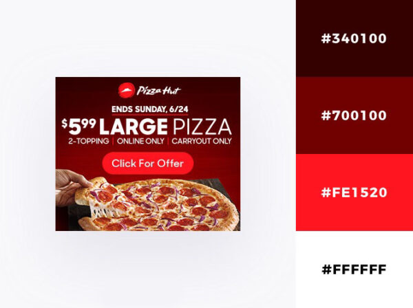
We’ve talked about the symbolism of red before, and as we’ve seen, this color is largely used in advertising to instill desire. From beauty products to pizza restaurants, designers use red to appeal to our most intimate and basic needs: sex and hunger.
This color palette was probably inspired by the red salami or by the ketchup (pizza’s best friend), but you can use it to promote your brand/product too and play with the various tones to get a stunning effect. Use this color scheme if you want to promote beauty products, women’s clothes & accessories, and food.
Use white for your text and/or for your button to make them stand out.
31. Lavender fields under the starry sky
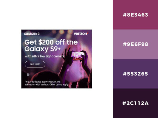
Purple offers a generous spectrum of tones. Sitting between red and blue on the color wheel, it embodies characteristics from both its parents: the energy of red and the integrity of blue. At one end, neighboring red, we find a feminine mauve, while at the other end, next to blue, there’s cold indigo.
You can use this purple color combination to convey extravagance or enthusiasm. It can very well be utilized to signify exuberance and euphoria, depending on which shade you choose as your main color.
32. Caramel indulgence – Shades of brown

Here’s another delicious color palette that makes us long for a sweet escape to the confectionery shop around the corner. At the same time, these seductive tones of brown and red can be used to promote furniture, interior decorations, makeup, or clothes.
Use red to signal your CTA and button and white to tell your story.
33. Luscious red

Red is a magnetic color, that’s why it is so used by the lingerie industry. When you pair luscious red with golden yellow and black, you get a color scheme that screams “sex appeal”.
Use this palette to advertise your lingerie or fashion brand and you’ll see a massive increase in engagement and sales.
34. Tropical vacation
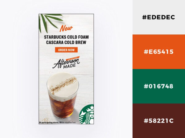
Take the tropical warmth of orange Persimmon, add the breezy feeling of leafy green, the lightness of pale grey sky, and the solid ground of earthy brown and you get a five-star tropical holiday.
This refreshing color scheme is ideal to promote your product/brand during the summertime or to promote products related to summer: drinks, food, holiday resorts, holiday deals, leisure activities, and so on.
35. Countryside footpaths

These raw, earthy shades of brown work perfectly with dark blue and pale bluish grey. The result is a nature-inspired palette that allures us down the memory lane, to the narrow and muddy footpaths of the countryside.
This combination can successfully promote any furniture, delivery, or chocolate brand. Actually, the palette derives from UPS’ brand colors, but you can borrow it and creatively play with the tones to promote your own brand/product. It can be used to convey various meanings from natural/organic, wooden, countryside, earthy, delicious to chocolate ingredients.
36. This jolly couple
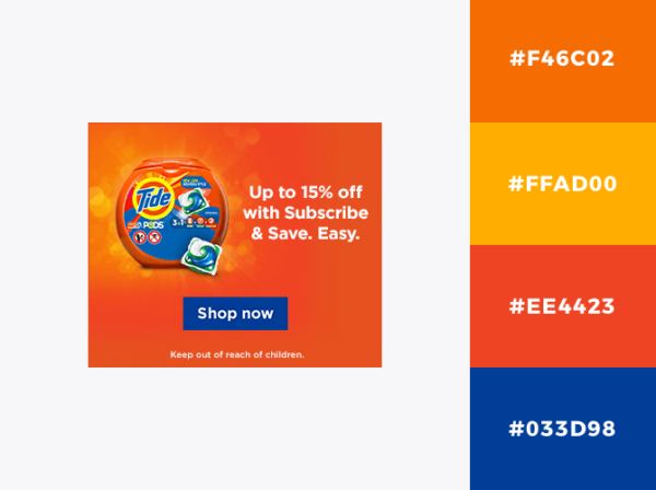
With so many shades of orange, this blue & orange palette wins the award for the hottest couple. By just playing with the gradient effect you can get more tones involved in your design and create a unique atmosphere. For example, here we got crimson orange, a vivid orange situated very close to red on the color wheel, and on the left side of the layout, there’s coral, an orange that neighbors yellow.
Fact: thanks to its unique expressivity, Coral has been named the official color of the year 2019! Isn’t that amazing?
Use this scheme to promote your brand and make a great impression.
37. Midnight sky

Dark blue is associated with knowledge, power, integrity, trust, authority, and masculinity. It is a cold and strong color, and it can be used in B2B communication, or to talk with audiences interested in studies and acquiring new skills.
At the beginning of this article, we’ve seen that dark blue has been the official color of the navy officers’ uniforms for centuries, and thus has gained an association with high-skills, authority, power, and establishments.
When using Midnight blue in your banner design, make sure you choose 1-2 lighter and warmer colors for your button, typography, and icons. You can go for yellow and white, just like VISA’s designers did here.
38. Marshmallow pastels

This sweet combination of pastel colors will get noticed even on the most cluttered web page. It’s sweet, it’s appealing, and most importantly, it reminds us of our little childhood joys: a visit to the candy shop, marshmallows parties, and spring fair goodies. Everything wrapped up in pink paper with curly ribbon on top.
Sweet as it may be, this palette is pretty bold, especially when you want to use it to promote products like cars.
You can use this scheme to advertise your confectionery shop, bakery, children’s brand, women’s makeup, or clothing brand.
39. Blue & brown color palette
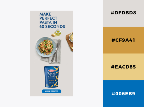
If you want to use a scheme that employs blue as the main color, make sure to balance it properly with other suited colors. Another way to balance blue while avoiding to over warming it with orange is to use brown in the composition and softer tones of yellow.
This palette right here is perfectly balanced and evokes a day in the outdoors, when the sky is clear blue and the ground suited for a hike.
40. Ocean deep blue

What we’ve got here is basically a gradient blue palette employing various shades of blue, from dark blue to Mediterranean blue and indigo to create a depth/shadow effect. This is Yahoo’s brand color scheme, but it can be used to communicate anything from freediving courses to universities, men’s clothes, books, or bottled water.
Choose your main color and play with the tones, or create a gradient design, just like in the banner above, either way, the result will be neat and clear.
Gradient color themes can make your life so much easier while offering a visually pleasant effect. So, keep this scheme in mind whenever there’s an opportunity for you to use a monochromatic color combination.
Show us your true colors!
Mastering color combinations in display ads is a multifaceted endeavor that requires understanding various color theories and principles. By delving into analogous color combinations, complementary color combinations, triadic color combinations, and tetradic color combinations, advertisers can strategically leverage warm and cool colors to evoke specific emotions and enhance brand messaging. Exploring the interplay between different shades within warm colors and the harmonious balance of primary and secondary colors unlocks endless possibilities for creative expression and visual impact. Ultimately, by applying the insights and techniques outlined in this guide, advertisers can elevate their display ads to heights of effectiveness and engagement, captivating audiences and driving desired actions.
Another worth mentioning aspect is that your brand’s color scheme should reflect the preferences of our audience as well. If you didn’t look into that yet, start creating your buyer persona in 5 easy steps, and get going. Alright, enough with the theory. Get ready to start designing a banner. I hope you are now more aware of the importance of color combinations in display advertising and that you will use all the tips in this article to create a badass banner.
If you’d like to get the job done fast and furious, sign up for a free account with Creatopy and get comfy in your personal workspace by uploading your brand’s assets.
Also, let me know in the comments section below which one of the color palettes listed here is your favorite!
Illustration by Anita Molnar

