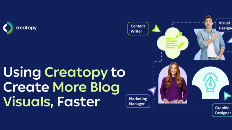
Creative AutomationHow We Scaled Our Blog’s Visuals Without a Dedicated Designer 7 minutes readLike many ...
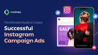
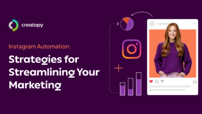
AdvertisingInstagram Campaign Ads: The Ultimate Guide to Creating High-Converting Social Campaigns in 2025