Finding the perfect font pairing is easier than finding your soulmate. Usually, you can spot bad font combinations from a mile away, even if you’re not a graphic designer. You simply look at a design, and it’s clear that the font pairings don’t work. The right fonts—paired with a strong visual like a clean black wallpaper background—can instantly elevate the entire design.
While it’s significantly more challenging to make such assumptions about two people being together, one thing we’re definitely good at is helping you decide which are the best Google font combinations for your project or to make social media banners that will look smashing.
You obviously want it to match your brand’s identity and be aesthetically pleasing at the same time.
After all, you can’t send the right message if your audience finds it harder to read it. Or even worse, people will just ignore it because it won’t seem like you put much effort into it.
The good news is that our goal is to help you avoid this kind of reaction:
Table of contents
- Montserrat Black & Raleway Regular
- Lobster & Open Sans Regular
- Ubuntu Bold & Nanum Gothic
- Bebas Neue & Source Sans Pro
- Arvo & Roboto Regular
- Monoton & Rubik
- IBM Plex Sans Bold & IBM Plex Sans Condensed
- Courgette & Libre Baskerville
- Roboto Black & Roboto Mono Light
- Abril Fatface & Work Sans
- Merriweather Black & Lora Regular
- Roboto Mono Bold & Spectral Light
- Oswald Bold & Nunito Semibold
- Permanent Marker & ABeeZee
- Archivo Black & Hind
- Gravitas One & Poppins
- Alfa Slab One & Chivo
- Architects Daughter & Abel
- Fjalla One & Merriweather Sans
- Rokkitt Black & Raleway
- Poiret One Bold & Didact Gothic
- Bangers & Playfair Display
- Ultra & Slabo 13px
- Francois One & Karla
- Fugaz One & Lato
- Bevan & Pontano Sans
- Nixie One & Prompt
- Sacramento & Barlow
- Sansita Black & Overpass
- Vollkorn SC Black & PT Sans
- 3 Tips to Help You Choose the Perfect Font Combinations
- Frequently asked questions
30 Font Pairings to Use in Your Designs
1. Montserrat Black & Raleway Regular
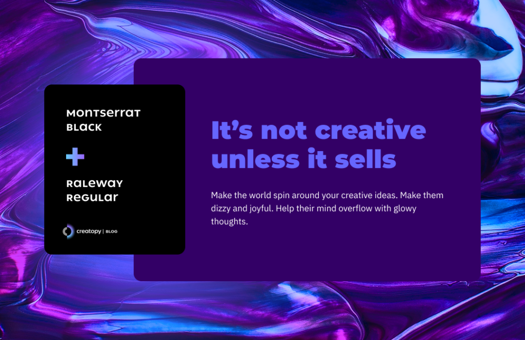
Montserrat is a font designed by Julieta Ulanovsky, Sol Matas, Juan Pablo del Peral, and Jacques Le Bailly, who wanted to grasp in a font’s style the traditional Montserrat neighborhood of Buenos Aires. Because urbanization changes almost everything in a city, they wanted to save a bit of its tradition in a typeface.
In this geometric yet informal and pleasant to the eye sans-serif typeface, you’ll find different weights, according to where you plan to use it. For headlines, Montserrat Black works like a charm.
The Montserrat family has two other versions: Alternates and Subrayada. Alternates has all the letters more rounded, while Subrayada (which means underlined in Spanish) works in headlines, as it resembles a display font that catches any viewer’s eye. So, you can create a beautiful Montserrat font pairing without leaving this font family.
If you’re looking for something else and want a perfect Google font pairing, mix this classic font with the Raleway typeface.
Raleway is a sans-serif font, initially designed by Matt McInerney in just one thin weight, and it will help you create the ideal look in a Montserrat font pairing. The Raleway family expanded into nine weights with the help of Pablo Impallari and Rodrigo Fuenzalida.
This font has a display font alternative, Raleway Dots, which you can use for bold, glossy headlines.
If you want to create a gorgeous Montserrat font pairing, the elegant simplicity of Raleway typeface works ideally here. They both have strong personalities but don’t exclude each other. They instead help each other shine in a perfectly balanced look.
2. Lobster & Open Sans Regular
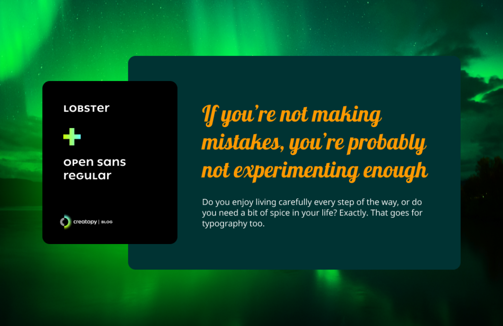
The Lobster font was designed by Pablo Impallari, and it’s a delightfully bold condensed script font, which makes an attractive yet slightly playful headline.
The Lobster typeface is an OpenType format (which means it’s scalable, and it offers support for the international character set) with numerous variants of the same letter that automatically offers hundreds of ligatures and options for any platform that supports these formats.
Because Lobster font is perfect for headlines but would make a longer text difficult to read, you can pair it with Open Sans font.
This is a humanist sans serif typeface, designed by Steve Matteson, which has a clean, open, and round format, making it pleasantly readable on print, web, and mobile screens.
Besides its different weights, Open Sans has a Condensed alternative, which can work for headlines.
3. Ubuntu Bold & Nanum Gothic
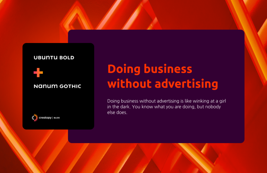
The Ubuntu Font Family is designed by the Dalton Maag company. It’s an OpenType font, keeping some of the characteristics of Ubuntu software. It’s a sans serif typeface, offering increased legibility on every screen.
So, you can use it in its lightweight for longer text or make it bold and write your headline in this font. It works either way. This font has two other fonts in the Ubuntu font family: Ubuntu Condensed and Ubuntu Mono.
And to add another pairing to the successful Google font combinations, mix the Ubuntu font with Nanum Gothic.
The latter is a contemporary sans serif font, designed by Sandoll Communications, very friendly, and very much recommended for the digital space.
Nanum Gothic is part of the Nanum fonts, which have a set of high-quality Unicode fonts designed for the Korean-language script (Hangeul) that also support Latin.
4. Bebas Neue & Source Sans Pro
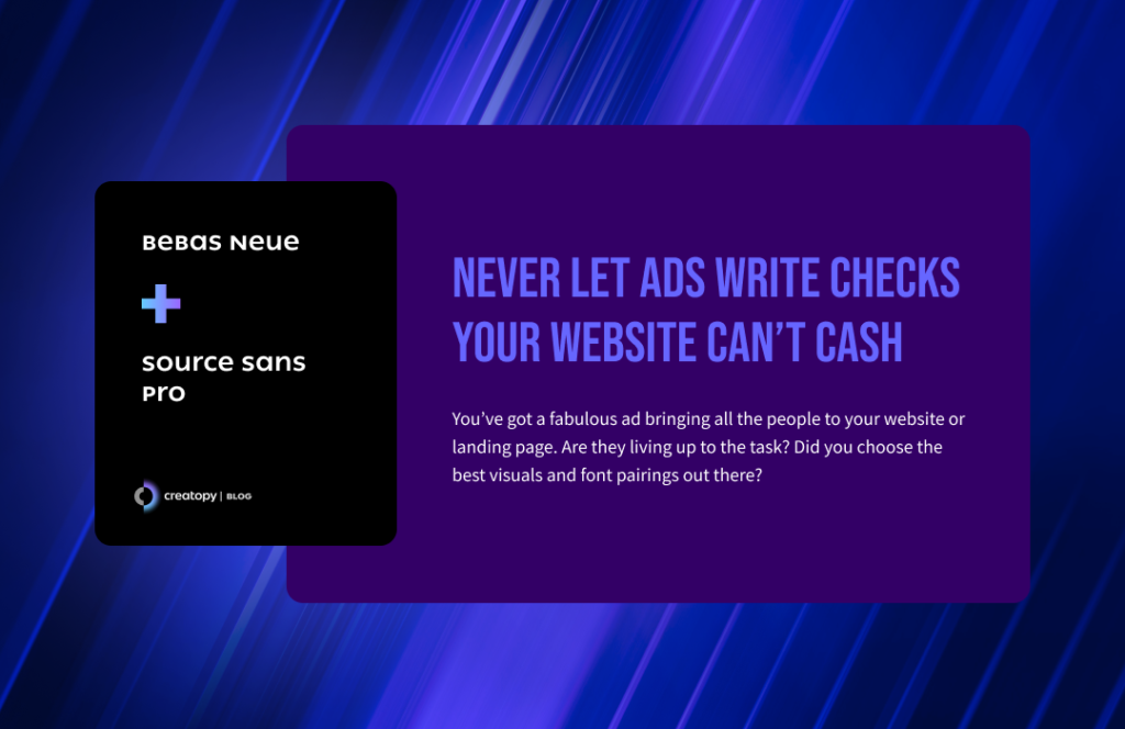
Bebas Neue was designed by Ryoichi Tsunekaw with a clean, condensed style for its letterforms, making this font just perfect for headlines.
It’s a bold, uppercase-only display font that shows confidence just by looking at it. This is the reason why it also works like magic in social media visuals or in YouTube thumbnails.
Pack it with Source Sans Pro and get that kind of equity we all strive for in our texts. It dulls the strong vibe of Bebas Neue in a positive way.
The Source Sans Pro is a sans serif font designed by Paul D. Hunt. It’s a safe and suitable choice for longer texts. And when you add the Bebas Neue font pairing, you’ll impress everyone.
5. Arvo & Roboto Regular
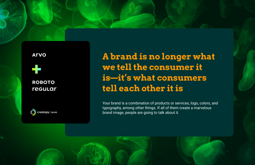
Arvo is a geometric slab-serif font that you can use for both digital and print. It was designed by Anton Koovit, and it has a lot of potential to make your design noticed.
If you use it in its bold format, you can see this daring typeface making any headline perfect. So to create one of the best Google font combinations, place it together with Roboto.
Roboto was designed by Christian Robertson, and it’s probably one of the most versatile fonts out there. The flawless sans serif font is mostly geometric, with open curves that make it so popular.
All the Roboto font’s letterforms are placed with a natural width, making any text extremely easy to read, being suitable for any publication.
The Arvo and Roboto font pairing may be one of the best font pairings you could use.
6. Monoton & Rubik
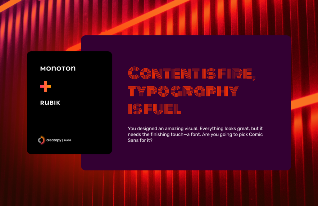
Talking about great font combinations, here’s one I love.
Monoton is a display Webfont designed by Vernon Adams similar to metal press Prisma font. Its decorative look can make any title seem retro and madly alluring.
In order to make it legible, the Monoton font has to be used in sizes above 30 points.
It works exceptionally well for titles and any headline that you wish to make radiant and glowy. If you’ve seen the TV series Euphoria, you know about the font they used for the title inside the episodes. It’s very similar to the Monoton font, and it looks great.
The highly decorative Monoton font works really well with the sans serif Rubik font.
Rubik was designed by Phillipp Hubert, Sebastian Fischer, and Meir Sadan with rounded corners, making this font easily readable in extensive text and versatile, pairing nicely with a great variety of other fonts.
Rubik font has a monospace alternative, Rubik Mono One, which can be your other choice for a strong headline.
7. IBM Plex Sans Bold & IBM Plex Sans Condensed
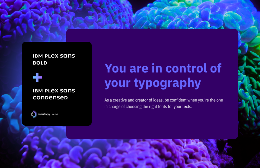
IBM Plex is a font family designed by Mike Abbink and Bold Monday, an independent Dutch type foundry.
The Plex font family is described perfectly as something that illustrates the unique relationship between humankind and machine.
So, if you’re in search of the best font pairings and need a font that has a digital look but extremely approachable and adaptable, pick any variation from the IBM Plex font family. There are four: IBM Plex Sans, Plex Serif, Plex Mono, and Plex Sans Condensed.
You can even pick two of them and create one of the best Google font pairings. I chose to pair the Plex Sans Bold in its bold style with IBM Plex Sans Condensed, and the result is quite appealing.
8. Courgette & Libre Baskerville
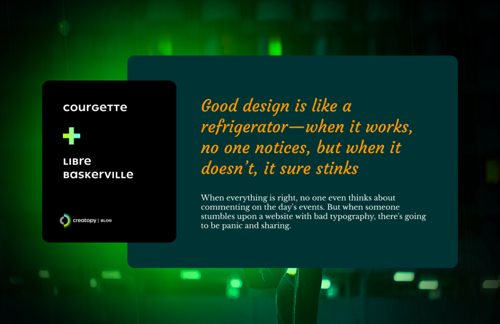
Courgette is an elegant italic-script typeface with low-stroke contrast. The font was designed by Karolina Lach, and although it has this classic look that works best for titles in larger sizes, this font was designed to look good on the web, too, so you can use this font for smaller-sized body texts if they’re not too extensive.
This makes it one of the best script fonts you could choose for your designs.
The delicate look of the Courgette font can be mixed with the Libre Baskerville font and create a gorgeous Google font pairing.
Based on the American Type Founder’s Baskerville from 1941, Libre Baskerville, designed by Impallari Type, is an open-source serif typeface with wide counterforms that make the reading on-screen easy. This is also what differentiates Libre Baskerville font from other serifs that are not advisable for longer texts.
Whenever you need a simple yet stylized Google font pairing, this is a safe choice.
9. Roboto Black & Roboto Mono Light
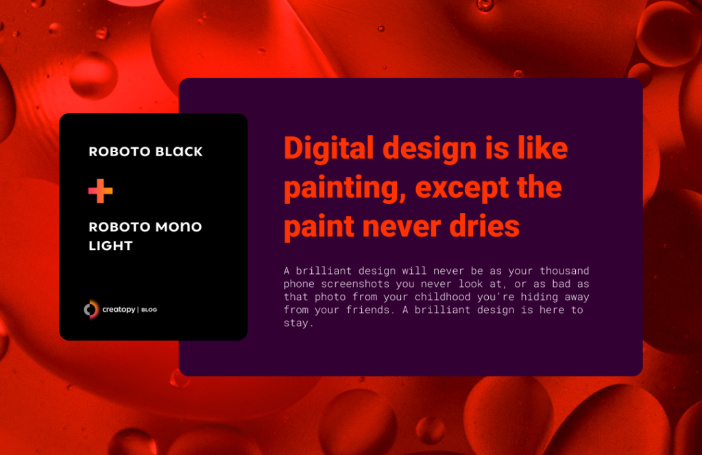
When in doubt, use a Roboto font pairing, and you’re surely in the safe zone with style. And what can be safer than pairing two Roboto font styles?
Here’s one delightful font pairing: Roboto Black for a memorable title packed with Roboto Mono Light for the body text.
You’ll get that timeless look of a typewriter text on paper, easily readable, hard to forget.
10. Abril Fatface & Work Sans
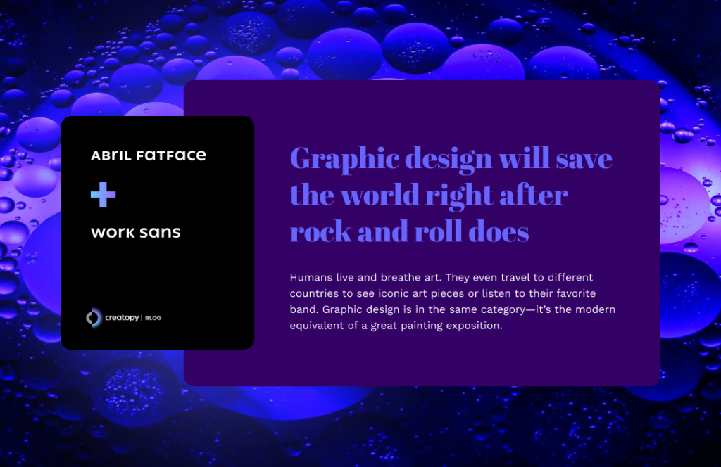
Abril Fatface is a Modern serif font designed by Veronika Burian and José Scaglione. With a bold look yet elegant and soft curves, this is the perfectly proportional font for titles.
If you think this font has a sophisticated look, you’re right. It’s inspired by the titles in the advertising posters from France and Britain.
Such a beautiful font can be easily paired with Work Sans to keep the round, curvy style of the text’s overall aspect.
Designed by Wei Huang, Work Sans font is slightly inspired by the early Grotesque fonts, optimized for both digital and print materials.
These fonts that go together will bring an exquisite look to your text, making people reminisce about the early days of advertising.
11. Merriweather Black & Lora Regular
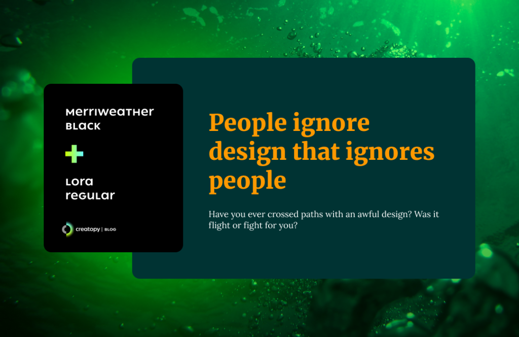
Merriweather is a serif font designed by Sorkin Type. Despite its serif characteristics, this font has lightly decorated letterforms, making them readable in smaller and longer on-screen texts.
But the place where this font shines is when it’s used as a headline. Choose the fonts’ black variation and put the spotlight on your title.
You can also choose Merriweather Sans if you’re a fan of sans serif fonts.
Merriweather Black works really well with Lora font, which is a delicate typeface with roots in calligraphy.

Designed by Cyreal, Lora’s letterforms are balanced, characterized by brushed curves and soft serifs, suitable for body text in both digital and print versions.
12. Roboto Mono Bold & Spectral Light
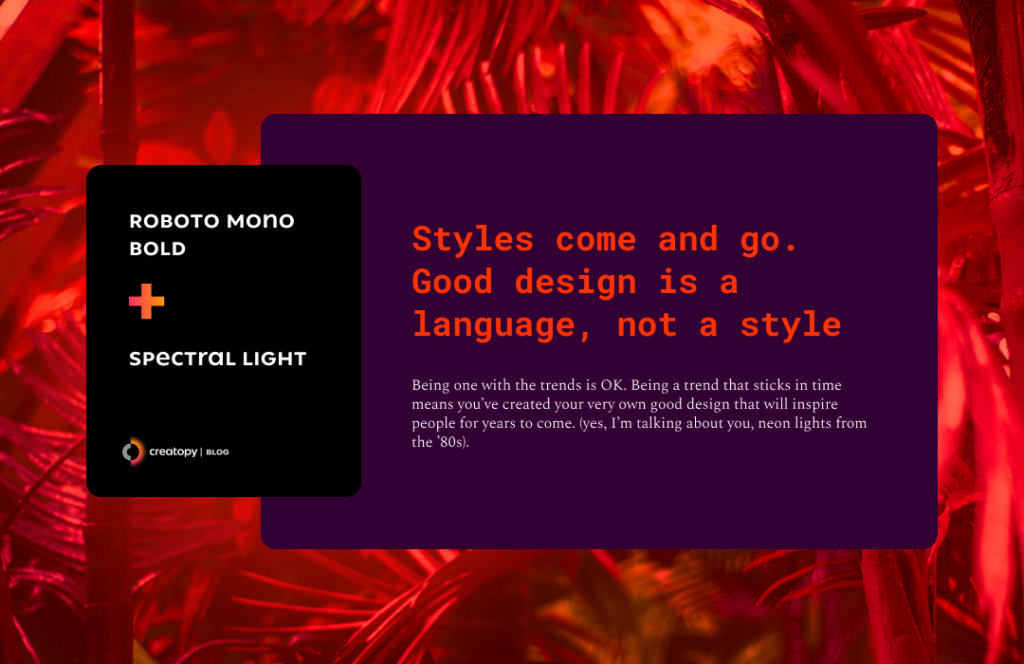
Another appealing Roboto font pairing is when you place it together with the Spectral Font in its Light format.
This time I chose the Roboto Mono Bold variation, which is still highly suitable for increased readability on various screen devices and print alike.
The monospaced addition to the Roboto family makes any headline look like a combination of digital with a classical-looking typewriter text. This is due to the addition of serifs on the ‘I,’ ‘l,’ and ‘i’, while wider glyphs like ‘C’ and ‘O’ are narrowed to fit the monospaced environment.
Roboto Mono paid special attention to glyphs that are used in writing software source code. For example, the digit ‘1’, lowercase ‘l’ and capital ‘I’ are easily differentiated, as are zero and the letter ‘O’.
Contrasts usually attract attention and if you want that for your text, create a beautiful Roboto font pairing together with a Spectral font in its Light format.
Designed by Production Type, the Spectral font is a serif typeface created to give a beautiful, elegant look to long texts in any type of environment.
If you want to pair the Spectral font with another font from the same type family, you can choose Spectral SC for the headlines. It will still create one of the most successful Google font combinations.
13. Oswald Bold & Nunito Semibold
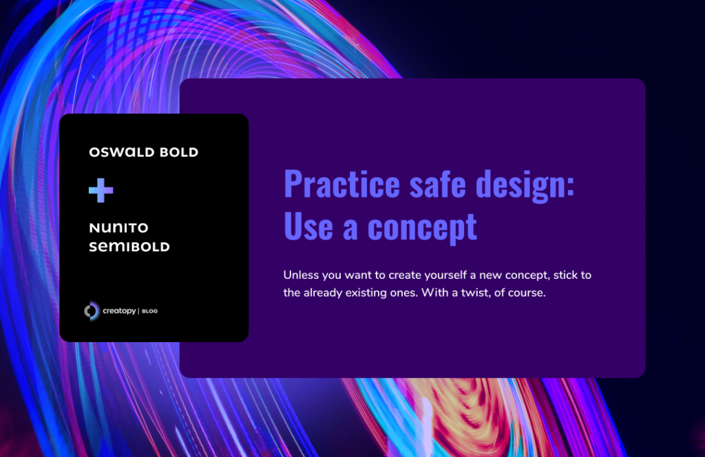
Oswald is a sans serif font in the style of Alternate Gothic font and its even older predecessor, Franklin Gothic.
The Oswald font was designed by Vernon Adams with continuously added improvements based on users’ feedback. The designer mostly narrowed the spacing and kerning to make the font more condensed.
With these changes, the font’s bold version looks exceptionally well when used in titles, headlines, and short but impactful text. This means you can create stunning Oswald font pairings for your text.
This font would look good with Avenir font pairing, but since that font is not available in the Google fonts library, the closest alternative to it is to choose the Nunito font, designed by the same Vernon Adams.
Nunito is a sans serif font with rounded terminals that give the casual yet delightful look to a display font. I chose the semibold version of this font, as it works really well with the bold version of the Oswald font, creating an overall lively look for the text.
The other version of this font is Nunito Sans, with straighter lines for its letterforms.
14. Permanent Marker & ABeeZee
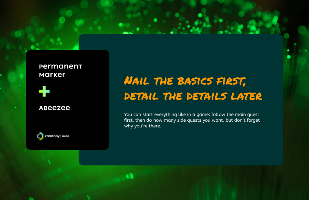
If you need playful font pairings to create a dynamic look for your text, here’s one of the best Google font combinations for you.
Permanent Marker is a font designed by Font Diner, and it looks exactly like its name says: like you just wrote your title with a marker.
Because it’s so playful, it’s advisable to use it only in headlines or in short texts, but you can easily pair it with another cheerful font, ABeeZee.
Designed by Anja Meiners, ABeeZee is actually a serif font that helps children learn. With its friendly shapes, this font makes it simple for children to read and write.
If you want to create a look for the texts that will make children attentive, use this playful Google font pairing.
15. Archivo Black & Hind
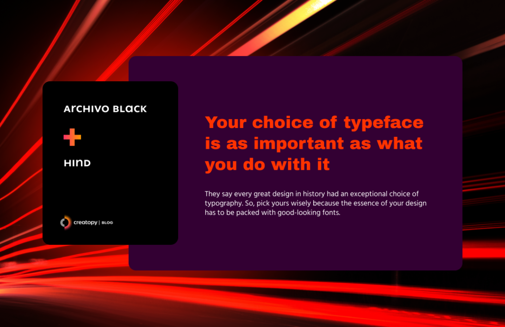
Archivo Black is the font for your headlines. It was even initially designed specifically for them.
It’s a grotesque sans serif typeface that comes from Omnibus-Type Foundry, ready to give life to any text and to remind us of the 19th-century article titles.
You will find Archivo font with its two variations: Archivo and Archivo Narrow. If you want to pair the Archivo Black headline with one of these two, you’ll get an excellent font combination.
If you want to pair it with a font from another family type, the Futura font pairing will work like a wonder. But, this is not part of Google fonts, so you’ll have to go with its closest alternative: the Hind font.
The Hind font was designed by the Indian Type Foundry for use in User Interface design. The font was constructed with humanist-styled letterforms, with vertical strokes that make a flat and clean distinction between the letters.
This font supports Devanagari and Latin scripts, and it’s a neat font to use for body texts.
16. Gravitas One & Poppins
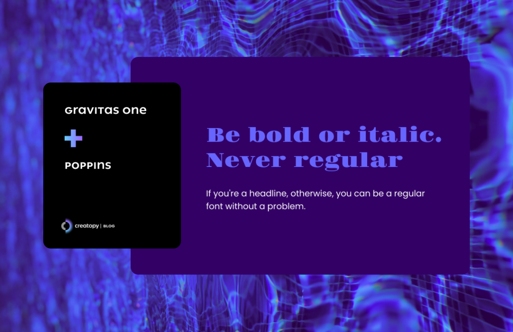
Here’s another example of the best font pairings you can use for your designs.
Gravitas One was designed by the Sorkin Type, inspired by the Fat Face style fonts used for advertising posters during the Industrial Revolution in England.
The fonts’ letterforms are designed with a strong tension between the bold vertical shapes and the thin letter horizontal lines and sometimes strokes, creating an attention-grabbing effect for all your headlines or highlights.
Poppins is a geometric sans serif typeface designed by the Indian Type Foundry that works perfectly with the Gravitas One font.
Poppins’ rounded letters create an extremely versatile effect for your text, easily and pleasantly readable. And the font pairing with Gravitas One is really spot-on.
17. Alfa Slab One & Chivo
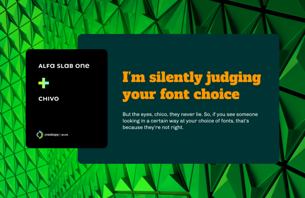
Alfa Slab One is a font designed by JM Solé with bold and heavy lettering. You’ll find this font only in its black density, as it is a typeface with a great personality, appropriate for a title that is meant to be seen, not overlooked.
The Alfa Slab One font can make an excellent font pairing with Chivo, a new grotesque Sans Serif designed by the Omnibus-Type Foundry. This is another font with character, but if you use it in its regular form, it has the potential to augment your text’s boldness, not steal the spotlight from your Alfa Slab One headline.
Chivo’s letters have details that make the text look remarkable. So these two are fonts that go well together.
18. Architects Daughter & Abel
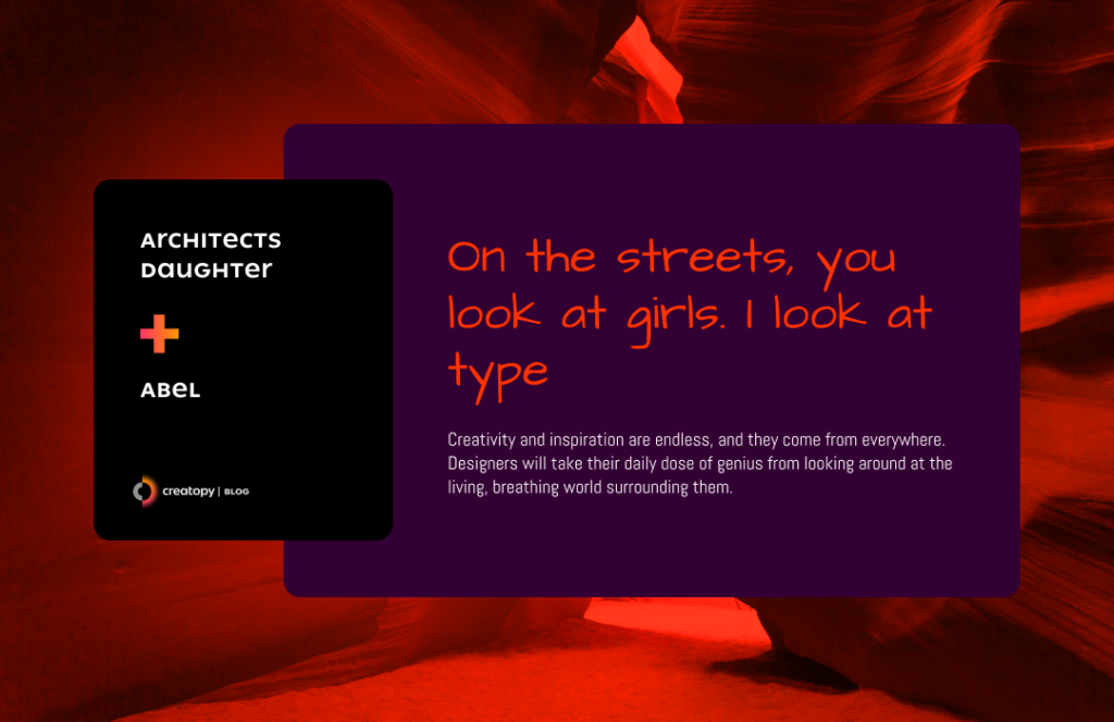
As the font‘s name says, the daughter of an architect inspired it. Designed by Kimberly Geswein, this handwriting style font has the power to make you immediately think of casual reading.
So, if you need a title that makes all the readers attentive, choose this pen-like intriguing font in its bold format.
Then, pair it with Abel font, and you’ve got yourself one of the best font combinations. It was designed by MADType, and its original purpose was to shed a glow on all the newspaper and poster headlines, but its adaptable nature and angled lines make it perfect for web body text.
19. Fjalla One & Merriweather Sans
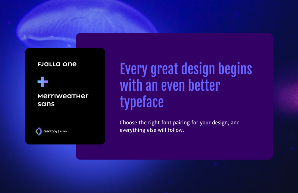
Fjalla One is a display sans serif font designed by the Sorkin Type. Its condensed, bold look is perfectly adapted to any screen and print alike, which means it can work in various sizes. Due to its display characteristics, Fjalla One is best to be kept for the headlines.
Merriweather Sans is the font to choose for your body text in combination with Fjalla One. This one is also designed by the Sorkin Type, and it’s a perfect choice for body text, as it can be easily readable even in small size.
Merriweather Sans is a semi-condensed, sans serif font with slightly rounded letters, working as a beautiful contrast for Fjalla One.
Merriweather is also the serif alternative if you want your text to look a bit more traditional.
So, if you were searching for fonts that go well together, here they are.
20. Rokkitt Black & Raleway
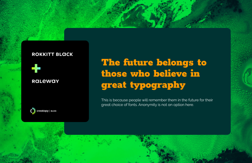
Rokkitt design was initiated by Vernon Adams, and it bears the characteristics of a geometric slab serif (aka Egyptian fonts).
This is a display font that will give charisma to your headlines and headings, especially if you use its black variation.
It can also be used in more extensive texts but in its normal format.
And to make a Google font combination to remember, pack the Rokkit font with Raleway, an elegant sans serif typeface designed by Matt McInerney, and create one beautiful Raleway font pairing.
The clear distinction between Rokkit and Raleway will give the exact effect you want for a pleasantly striking font pairing.
Another great alternative is to use the display Raleway Dots for your headlines paired with the sans serif Raleway.
21. Poiret One Bold & Didact Gothic
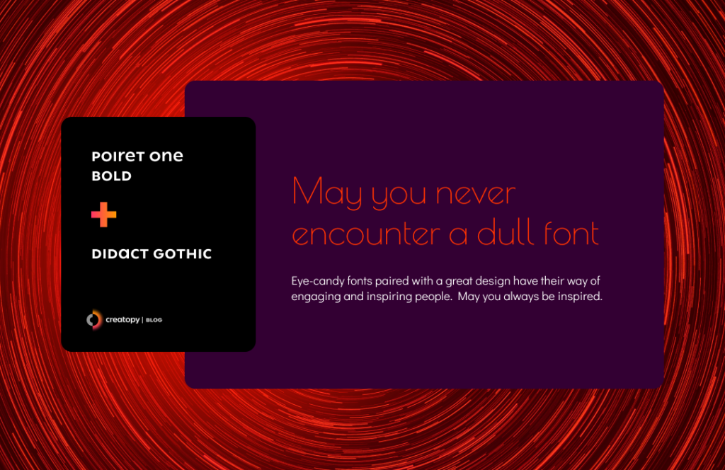
Here’s a Google font pairing that looks taken straight out of a great artsy book (I assume).
Designed by Denis Masharov, Poiret One is a font that can be used in its bold variation for the headline, an elegant geometric grotesque, stylish, and decorative reminds us of the Art Deco period. I would say it’s perfect for the vintage fonts lovers out there.
Pair it with Didactic Gothic, a sans serif font designed by Daniel Johnson and Cyreal to get a simple yet delicate text overall. Due to its increased legibility, this font is used in elementary classrooms.
This font is also an alternative if you wanted a Century Gothic font pairing.
22. Bangers & Playfair Display
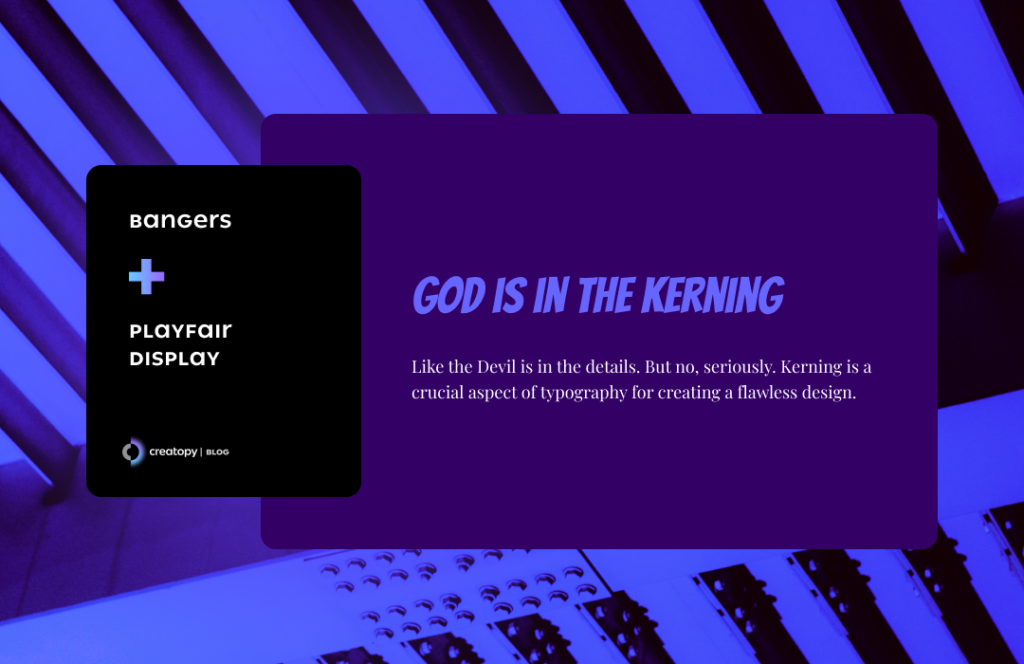
Bangers is the font to use if you need to bring the comic book style to your text. It was designed by Vernon Adams, inspired by the superhero comics.
The bold, display features of this font can be paired with the Playfair Display. This transitional font design marked the shift to printing technology during the European Enlightenment and the change in style from written letterforms to this elegant serif font.
You may think the contrast between these two fonts is too big, but if you use Playfair Display in a bigger size, they work together like they’re telling a story. This latter font can be mixed with other free typography fonts that are spirited, have a lot of character, or they’re reminiscent of a certain fantasy world that you wish to bring into your visuals.
And there you have it: one of the best Google font combinations for all your playful designs.
23. Ultra & Slabo 13px
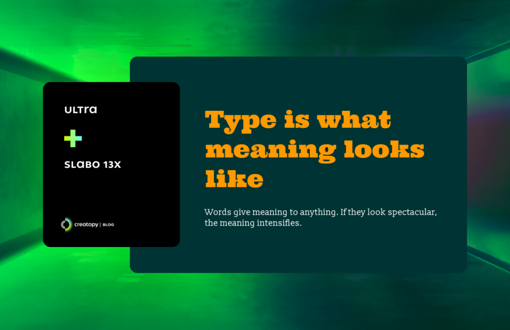
As the name suggests, Ultra is an ultra-bold slab font that gathers the features from Egyptian fonts and Clarendon fonts.
Because of its bold style and daring presence, the Ultra font works for titling that will make your audience stop scrolling and pay attention.
To make an overall spirited text, you can mix the Ultra headline with Slabo 13px font. The latter one is a size-specific font designed by John Hudson. Despite being a serif font, it was destined to be used mainly in the digital space, as its soft, airy look works well on screen.
I was just reading an online fashion magazine, and the font used in the article was very similar to this one. So, it must be one good font combination.
The other version of Slabo font is the Slabo 27px. So you can dare for an even more powerful presence.
24. Francois One & Karla
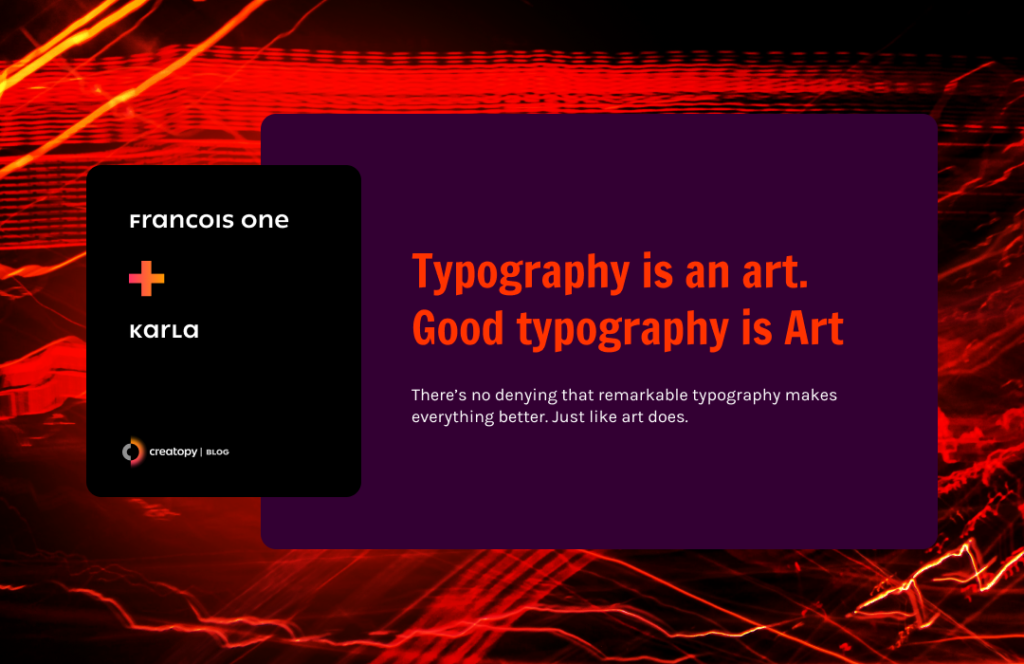
Francois One was designed by Vernon Adams, and it is inspired by various sans serif gothic fonts. But this one was taken one step further and adapted for use on the web and also to look sharp in the bold display format.
This means your headlines, highlights, and other short texts will look stunning. And to keep on the same effect throughout the entire text, pair it with Karla, a grotesque sans serif designed for the Latin and Tamil scripts.
Jonny Pinhorn, the designer of the Karla font, managed to create this highly versatile font that is legible even in its extra-bold italic format. For whatever you want to use, be confident that it is a safe bet and created a good font combination.
25. Fugaz One & Lato
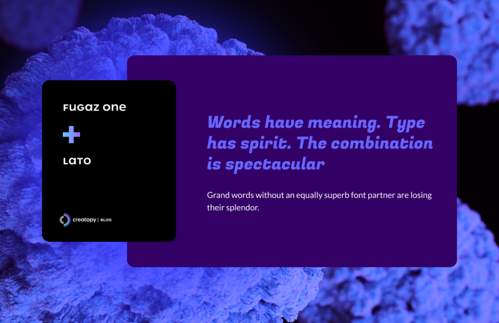
Fugaz One is an italic, sans serif font with geometric features that also take this font in the decorative area. It has a unique way of displaying the lowercase f.
Whenever you need to spice up any short text or titles, this font designed by the LatinoType will bring all its dynamism into them.
Such a strong presence needs a bit of summer breeze, so you can pair it with the font Lato—which means summer in Polish.
It was designed by Łukasz Dziedzic as a sans serif font. It encapsulates warm, rounded letterforms with its sturdy presence in any text.
These two cool fonts that go together like a retro feeling in the summer will bring style into any text.
26. Bevan & Pontano Sans
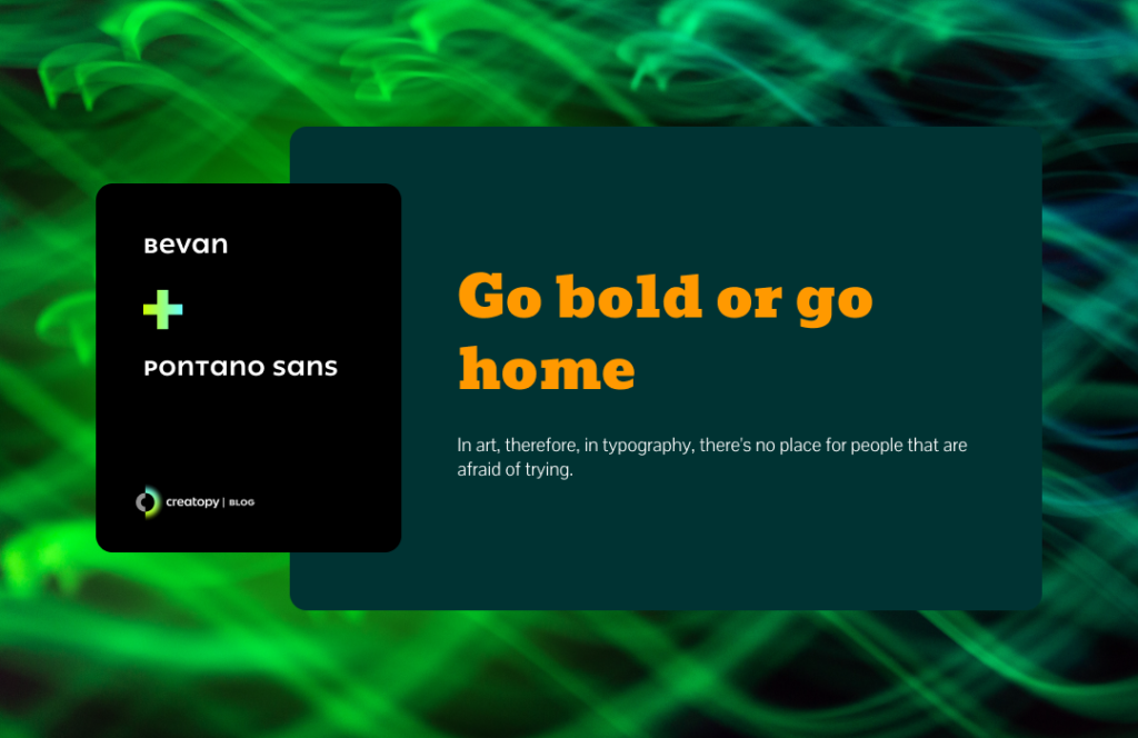
Bevan is another font designed by Vernon Adams, and it is a reinterpretation of a traditional slab serif display designed by Heinrich Jost in the 1930s.
The initial font was brought to the modern age, made to look good on screens by opening up the counterforms and adjusting the stems.
Bevan can create a beautiful font pairing with Pontano Sans, which is a sans serif font designed by the same Vernon Adams. This font’s simplicity and lightness will complement the Bevan font like no other, helping your text be easily readable.
Also, you can use it for online and offline purposes.
27. Nixie One & Prompt
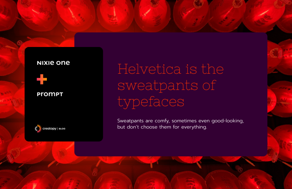
If you opt for a different kind of title, something thinner, lighter, but still with a great impact, you should go for Nixie One. This gorgeous display font was designed by Jovanny Lemonad, and it reminds us all of a traditional typewriter text but with bigger, rounder letterforms.
Designed by the Cadson Demak Type Foundry, Prompt is a geometric sans serif font with horizontally condensed letterforms that are also round and visible anywhere, online and offline.
When you create a Google font pairing between Nixie One and Prompt, you’ll have a perfectly harmonized text from the beginning to the end.
The Prompt font supports Thai and Latin languages.
28. Sacramento & Barlow
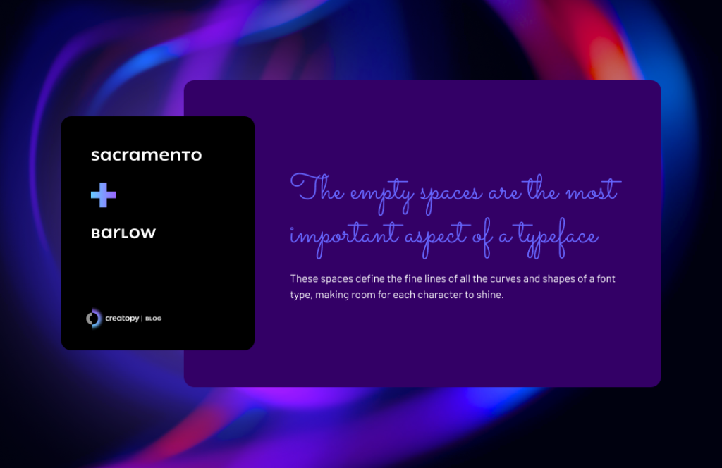
Whenever you want a more graceful-looking headline but with a strong presence nonetheless, you should opt for a fine hand lettering font, and Sacramento is a good choice.
Sacramento is a font designed by Astigmatic, inspired by the hand-lettering artist brochure work of the ’50s and ’60s. It has thin, delicate lines that imitate perfectly the handwriting in a sharp, thin pen.
A superb Google font combination would be Sacramento with Barlow font. The latter is a low contrast, grotesque typeface that looks almost as delicate as Sacramento when you choose the normal, light, extra light, or thin variation.
You’ll find that the Barlow font family also has Semi Condensed and Condensed options. This allows you to create Google font pairings with these fonts from the same family.
29. Sansita Black & Overpass
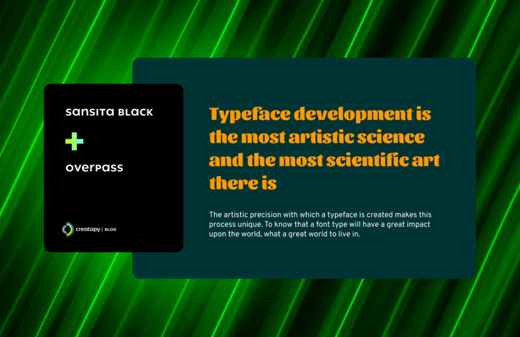
There could be the possibility you don’t know if you should choose typography or calligraphy for your headlines. Have the best of both worlds by choosing the Sansita font, which is a mix of the two.
The beauty of this font designed by Pablo Cosgaya is that you can use it also for short body text whenever you wish for something playful yet bold. For your tilting, use Sansita in its black variation, and you’ll have one of the most successfully looking headlines.
The Sansita font has an alternative: Sansita Swashed. This also works extremely well for headlines due to its bold, italic format.
Overpass is a sans serif font based on the Highway Gothic typefaces, designed by Delve Withrington with Dave Bailey and Thomas Jockin.
This proportioned font comes to perfectly balance the Sansita headline.
You can also opt for a Google font combination between Overpass and Overpass Mono, and you would still create a flawless mixture.
30. Vollkorn SC Black & PT Sans

Vollkorn SC was created by Friedrich Althausen and soon became very popular for both print and digital. When used in its black variation, it’s a heavy and robust presence for all your titling.
This font works for body text too, but only if you enjoy having a text in all caps.
PT Sans is a font based on Russian sans serif types from the second part of the 20th century. Still, it also incorporates characteristics of the humanistic designs from a more contemporary age.
This font was designed inside a project named Public Types of the Russian Federation to help the people of Russia to read and write in their native languages.
But this font also includes Western, Central European, and Cyrillic code pages being a font of great value for the digital age.
You’ll find two alternatives for this family font: PT Sans Narrow and PT Sans Caption.
Vollkorn SC paired with PT Sans could be one of the best font combinations, giving a lot of potential to any text you want to share.
But before we wrap it up, let’s see a few tricks related to the best font combinations that will help you create amazing visuals because sometimes, by using just fonts, you can create perfect display banners, reaching state-of-the-art kinetic typography.
3 Tips to Help You Choose the Perfect Font Combinations
1. Understand font categories
The font categories you’re going to work with are serif, sans serif, handwritten, and display/decorative.
By understanding their characteristics, you will be able to create beautiful contrasts between different font families without ending up with a font combination that makes the text hard to read.
2. Pair fonts from the same overarching families
If you don’t want to take any risks but don’t have a monotonous font pairing either, you can combine two fonts from the same category—for example, two serifs.
Another method would be to mix two variations of the same font: a bold version of the chosen font with its italic style or a sans serif with its mono alternative.
This way, you can get a sophisticated, harmonious font pairing.
The previously mentioned font families have their own styles subcategories. This means you have even more safe choices to make to get a beautiful, controlled contrast.
The serif family can be divided into old style, transitional, neoclassical & didone, slab, clarendon, glyphic.
The sans serif family is composed of grotesque, neo-grotesque, geometric, humanist, square.
The script family styles are formal, casual, calligraphic, blackletter & lombardic.
The display/decorative fonts can be grunge, psychedelic, graffiti.
3. Pair fonts from different families, but make one shine brighter
This simply means you have to establish a visually balanced hierarchy.
Try to find a font that you consider to be the main one combined with a subtler one. If both of them have too much personality, you risk entering the opposite extreme of being monotonous, and you definitely want to avoid that.
Combine a serif with a sans serif, but don’t go overboard with how different they look. Try to discover a common ground for what they express.
For example, don’t choose a super classic handwritten font for the title and then a hyper digitized-looking font for the body text.
Frequently asked questions
What are font pairings?
Font pairings involve combining two or more fonts in a design, document, or presentation. These combinations are carefully chosen to create visual harmony and hierarchy, improving readability and aesthetics. Font pairings typically combine fonts with different characteristics, such as serif with sans-serif, varying weights within the same font family, or fonts with contrasting styles. Well-chosen font pairings can significantly enhance the overall look and feel of any text-based design or content.
Why use font pairings?
Font pairings serve several purposes:
1. Visual Harmony: Pairing fonts combines complementary styles for visual balance and harmony in design.
2. Hierarchy and Emphasis: Different fonts can convey varying levels of importance or hierarchy within a text, establishing clear hierarchies and emphasizing essential elements.
3. Readability: Pairing fonts with contrasting characteristics enhances readability by providing visual variety and differentiation between different text types, such as serif with sans-serif.
4. Aesthetics: Font pairings greatly contribute to a design or document’s overall aesthetic appeal, making it more visually engaging and attractive to the audience.
5. Branding and Consistency: Consistent use of font pairings across various materials helps reinforce brand identity and maintain visual consistency across different platforms and communication channels.
6. Creativity and Expression: Font pairings allow designers to express creativity and personality through typography, adding depth and character to the overall design.
In summary, font pairings create visually appealing, readable, and coherent designs while conveying hierarchy, emphasis, and brand identity.
How to check font pairings?
To check font pairings, you can visually inspect combinations for contrast, harmony, and similarity. You can also use online tools to curate suggestions, consult typography resources for insights, engage with design communities for feedback, utilize design software features for experimentation, create mockups to visualize combinations in context, and gather user feedback to gauge preferences.
Conclusion
And there you have it. These were some of the best font combinations you can start using right now in your designs.
And with a bit of extra creativity and mastering the kerning typography, maybe you’ll even go one step further and create typography art.
Whether you want a modern font pairing or opt for a classical one, you now have the best inspiration to choose complementary fonts that take your design to the next level.
In Creatopy, you have access to Google’s fonts library, so you can go ahead and create your own design and then apply one of these successful font pairings.